---
url: /guide/glossary.md
---
{/* import { Toc } from '@theme'; */}
# Glossary
This glossary is intended to provide descriptive guidance about the meanings of technical terms commonly used in the context of Lynx development. For the latest consensus on a more formal definitions of these terms, please refer to the [Lynx Living Specification](/guide/spec.md).
{/* */}
## SDK
The Lynx [Software Development Kit (SDK)](https://en.wikipedia.org/wiki/Software_development_kit) is a collection of tools, libraries, and APIs that enable developers to build applications for Lynx. It encapsulates two distinct layers -- one native layer: the [Engine](#engine), and one scripting (or frontend) layer: the [Framework](#framework).
### Engine
The part of the SDK that is responsible for converting Lynx pages into pixels onther screen, and provides APIs that forms [the Lynx Platform](#the-lynx-platform).
It is written as a C++ core along with platform-specific layers written in platform native languages (e.g. Objective-C for iOS, Java/Kotlin for Android, etc.), ensuring high performance and access to underlying system resources, and needs to be integrated natively and shipped together with the host application.
### Framework
The part of the SDK that offers the runtime libraries and high-level UI programming model that enable Lynx application developers to write application logic and UI components. It is written in JavaScript and is loaded together with the application code on-demand from the file system or memory.
## The Lynx Platform
Similar to the [Web Platform](https://en.wikipedia.org/wiki/Web_platform), the **Lynx Platform** is the set of APIs and functionalities, e.g. [Elements](#element), [Events](#event), [Styles](#style), [Scripting Runtime Environment](#scripting-runtime-environment), etc., offered by the Lynx Engine to the scripting developers.
### Template
Template is the historical name of bundle of compiled code loaded by Lynx engine to power the execution of a Lynx page (or application).
We may investigate a better name for it in the future.
### Element
### Event
### Style
### Scripting Runtime Environment
Scripting is the process where developers program a script.
A **scripting runtime environment** is used to execute scripts with a scripting engine. In the context of Lynx, there are currently two types of scriping and so correspondingly, two types of scripting runtime environment.
### Background Thread
Background threads are threads that are not the main thread. They are used to execute background scripts.
### Main Thread
The **main thread**, or the "lynx main thread", is where Lynx processes user events and emit "paints". By default (the default threading model of Lynx), the Lynx engine uses a single thread to run main thread scripts, as well as to perform layout, paints, etc.. This means that long-running main thread scripts can block the thread, leading to an unresponsive page and a bad user experience.
### JS Thread
The word historically used to refer to the **background thread**. It is deprecated because it is not clear which thread it refers to as Lynx is now capable of running JavaScript on the main thread via **main thread scripts**.
### UI Thread
The thread corresponds to the physical thread regarded as the main thread of the underlying platform (OS). Similar to Web, the **main thread** of Lynx does not necessarily map directly to the UI thread, depending on Lynx's threading model.
### Lepus
### Lepus VM
### PrimJS VM
---
url: /guide/interaction/storage.md
---
---
url: /guide/start/integrate-lynx-devtool-advanced.md
---
# Advanced DevTool Configurations
## Integrate DevTool Switch Page
We provide a switch page that helps you quickly view or set DevTool. If you want, you can integrate it into your app as well.
> The switch setting page is written in Lynx, and the DevTool component has already packaged the page.
Code example for integrating the devtool switch page:
```objective-c
#import
#import "DebugSettingViewController.h"
#import "DemoLynxProvider.h"
@implementation DebugSettingViewController
- (void)viewDidLoad {
[super viewDidLoad];
LynxView *lynxView = [[LynxView alloc] initWithBuilderBlock:^(LynxViewBuilder *builder) {
builder.config = [[LynxConfig alloc] initWithProvider:[[DemoLynxProvider alloc] init]];
builder.screenSize = self.view.frame.size;
builder.fontScale = 1.0;
}];
lynxView.preferredLayoutWidth = self.view.frame.size.width;
lynxView.preferredLayoutHeight = self.view.frame.size.height;
lynxView.layoutWidthMode = LynxViewSizeModeExact;
lynxView.layoutHeightMode = LynxViewSizeModeExact;
[self.view addSubview:lynxView];
NSString *bundlePath = [[NSBundle mainBundle] pathForResource:@"LynxDebugResources" ofType: @"bundle"];
NSData *templateData = [[NSData alloc] initWithContentsOfFile:[bundlePath stringByAppendingString:@"/switchPage/devtoolSwitch.lynx.bundle"]];
[lynxView loadTemplate:templateData withURL:@"devtool_switch/switchPage/devtoolSwitch.lynx.bundle"];
}
@end
```
```swift
import UIKit
class DebugSettingViewController: UIViewController {
var url: String?
override func viewDidLoad() {
super.viewDidLoad()
let lynxView = LynxView { builder in
builder.config = LynxConfig(provider: DemoLynxProvider())
builder.screenSize = self.view.frame.size
builder.fontScale = 1.0
}
lynxView.preferredLayoutWidth = self.view.frame.size.width
lynxView.preferredLayoutHeight = self.view.frame.size.height
lynxView.layoutWidthMode = .exact
lynxView.layoutHeightMode = .exact
self.view.addSubview(lynxView)
let bundlePath = Bundle.main.path(forResource: "LynxDebugResources", ofType: "bundle")
let templateData = NSData(contentsOfFile: bundlePath!.appending("/switchPage/devtoolSwitch.lynx.bundle"))
lynxView.loadTemplate(templateData! as Data, withURL: "devtool_switch/switchPage/devtoolSwitch.lynx.bundle")
}
}
```
> The switch setting page is written in Lynx, and the DevTool component has already packaged the page.
Code example for integrating the devtool switch page:
```java
public class SwitchActivity extends AppCompatActivity {
@Override
protected void onCreate(Bundle savedInstanceState) {
super.onCreate(savedInstanceState);
LynxView lynxView = buildLynxView();
setContentView(lynxView);
byte[] array = null;
try {
InputStream inputStream = this.getAssets().open("devtool_switch/switchPage/devtoolSwitch.lynx.bundle");
array = readBytes(inputStream);
lynxView.renderTemplateWithBaseUrl(array, TemplateData.empty(), "devtool_switch/switchPage/devtoolSwitch.lynx.bundle");
} catch (IOException e) {
e.printStackTrace();
}
}
private LynxView buildLynxView() {
LynxViewBuilder viewBuilder = new LynxViewBuilder();
viewBuilder.setTemplateProvider(new DemoTemplateProvider());
return viewBuilder.build(this);
}
private byte[] readBytes(InputStream inputStream) throws IOException {
byte[] buffer = new byte[1024];
int bytesRead;
ByteArrayOutputStream output = new ByteArrayOutputStream();
while ((bytesRead = inputStream.read(buffer)) != -1) {
output.write(buffer, 0, bytesRead);
}
return output.toByteArray();
}
}
```
```kotlin
class SwitchActivity : Activity() {
override fun onCreate(savedInstanceState: Bundle?) {
super.onCreate(savedInstanceState)
val lynxView = buildLynxView()
setContentView(lynxView)
try {
val array = this.assets.open("devtool_switch/switchPage/devtoolSwitch.lynx.bundle").readBytes()
lynxView.renderTemplateWithBaseUrl(
array,
TemplateData.empty(),
"devtool_switch/switchPage/devtoolSwitch.lynx.bundle"
)
} catch (e: IOException) {
e.printStackTrace()
}
}
private fun buildLynxView(): LynxView {
val viewBuilder = LynxViewBuilder()
viewBuilder.setTemplateProvider(DemoTemplateProvider())
return viewBuilder.build(this)
}
}
```
You can also customize the page according to your needs, making the configuration of DevTool more diverse.
---
url: /guide/start/integrate-lynx-devtool.md
---
# Integrating Lynx DevTool
When encountering issues during Lynx page development, you can use [DevTool](/guide/debugging/lynx-devtool.md) for debugging.
However, you need to follow these steps to integrate DevTool first.
:::info
It is recommended to integrate DevTool in non-production environments to keep your production builds lightweight.
All code examples in this documentation can be found in the [integrating-lynx-demo-projects](https://github.com/lynx-family/integrating-lynx-demo-projects/tree/release/3.1).
:::
### Adding Dependencies
You need to add two components: `LynxDevTool` and the `Devtool` subcomponent of `LynxService`.
```ruby title="Podfile" {8,11}
# Ensure Lynx DevTool version matches the Lynx version when integrating
target 'YourTarget' do
pod 'LynxService', '3.2.0-rc.0', :subspecs => [
'Devtool',
]
pod 'LynxDevtool', '3.2.0-rc.0'
end
```
### Enabling DevTool
DevTool provides several debugging switches.
Here are three important switches:
* `Lynx Debug` is the switch that controls all DevTool debugging.
* `Lynx DevTool` controls main debugging features: element inspection and JavaScript debugging.
* `Lynx LogBox` manages the [LogBox](/guide/debugging/handle-errors.md).
- When debugging Lynx pages with the DevTool Desktop, both `Lynx Debug` and
`Lynx DevTool` need be enabled
- LogBox helps you quickly identify and diagnose issues
You can configure these switches during [Lynx Environment Initialization](/guide/start/integrate-with-existing-apps.md):
```objective-c title=AppDelegate.m {5-10}
@implementation AppDelegate
- (BOOL)application:(UIApplication *)application didFinishLaunchingWithOptions:(NSDictionary *)launchOptions {
// ...
// Enable Lynx Debug
lynxEnv.lynxDebugEnabled = YES;
// Enable Lynx DevTool
lynxEnv.devtoolEnabled = YES;
// Enable Lynx LogBox
lynxEnv.logBoxEnabled = YES;
return YES;
}
```
```swift title=AppDelegate.swift {5-10}
class AppDelegate: UIResponder, UIApplicationDelegate {
func application(_ application: UIApplication, didFinishLaunchingWithOptions launchOptions: [UIApplication.LaunchOptionsKey: Any]?) -> Bool {
// ...
// Enable Lynx Debug
lynxEnv.lynxDebugEnabled = true
// Enable Lynx DevTool
lynxEnv.devtoolEnabled = true
// Enable Lynx LogBox
lynxEnv.logBoxEnabled = true
return true
}
}
```
:::info
In addition to the three switches introduced earlier, there are more switches that can help you control the behavior of DevTool. Please refer to the [Lynx DevTool Switch Page](/guide/start/integrate-lynx-devtool-advanced.md#debugging-devtool-switch).
:::
### Adding Dependencies
You need to integrate these two components: `lynx-service-devtool` and `lynx-devtool`
```groovy
// Ensure Lynx DevTool version matches the Lynx version when integrating
dependencies {
implementation "org.lynxsdk.lynx:lynx-devtool:3.2.0-rc.0"
implementation "org.lynxsdk.lynx:lynx-service-devtool:3.2.0-rc.0"
}
```
```kotlin
// Ensure Lynx DevTool version matches the Lynx version when integrating
dependencies {
implementation ("org.lynxsdk.lynx:lynx-devtool:3.2.0-rc.0")
implementation ("org.lynxsdk.lynx:lynx-service-devtool:3.2.0-rc.0")
}
```
:::info
It is recommended to use the latest [Lynx version](https://github.com/lynx-family/lynx/releases) when integrating
:::
### Registering DevTool Service
```java title=YourApplication.java {3-4}
private void initLynxService() {
// ...
// register DevTool service
LynxServiceCenter.inst().registerService(LynxDevToolService.INSTANCE);
}
```
```kotlin title=YourApplication.kt {3-4}
private fun initLynxService() {
// ...
// register DevTool service
LynxServiceCenter.inst().registerService(LynxDevToolService)
}
```
### Enabling DevTool
DevTool provides several debugging switches.
Here are three important switches:
* `Lynx Debug` is the switch that controls all DevTool debugging.
* `Lynx DevTool` controls main debugging features: element inspection and JavaScript debugging.
* `Lynx LogBox` manages the [LogBox](/guide/debugging/handle-errors.md).
- When debugging Lynx pages with the DevTool Desktop, both `Lynx Debug` and
`Lynx DevTool` switches need be enabled
- LogBox helps you quickly identify and diagnose issues
You can configure these switches during [Lynx Environment Initialization](/guide/start/integrate-with-existing-apps.md):
```java title=YourApplication.java {3-8}
private void initLynxEnv() {
LynxEnv.inst().init(this, null, null, null);
// Enable Lynx Debug
LynxEnv.inst().enableLynxDebug(true);
// Enable Lynx DevTool
LynxEnv.inst().enableDevtool(true);
// Enable Lynx LogBox
LynxEnv.inst().enableLogBox(true);
}
```
```kotlin title=YourApplication.kt {3-8}
private fun initLynxEnv() {
LynxEnv.inst().init(this, null, null, null)
// Enable Lynx Debug
LynxEnv.inst().enableLynxDebug(true)
// Enable Lynx DevTool
LynxEnv.inst().enableDevtool(true)
// Enable Lynx LogBox
LynxEnv.inst().enableLogBox(true)
}
```
:::info
In addition to the three switches introduced earlier, there are more that can help you control the behavior of DevTool. Please refer to the [DevTool Switch Page](/guide/start/integrate-lynx-devtool-advanced.md#debugging-devtool-switch).
:::
Congratulations! You have completed the DevTool integration. Now, you may launch the Lynx DevTool Desktop and
connect your app via USB to start debugging.
## Next Step
---
url: /guide/start/integrate-with-existing-apps.md
---
import { PlatformTabs } from '@lynx';
import * as NextSteps from '@lynx/NextSteps';
# Integrate with Existing Apps
Currently, Lynx is not suitable for building a new application from scratch. You need to integrate Lynx (engine) with your native mobile app or web app, and load Lynx apps through Lynx views. With a few steps, you can start developing with Lynx in your application.
Choose your target platform to view the specific integration steps:
### Integrate Lynx with Existing Apps (iOS)
import { Info, CodeFold } from '@lynx';
import { Steps } from '@theme';
import { Tab, Tabs } from 'rspress/theme';
- This article assumes that you are familiar with the basic concepts of native iOS application development.
- You can refer to the project: [integrating-lynx-demo-projects](https://github.com/lynx-family/integrating-lynx-demo-projects/tree/release/3.1) for all the code mentioned below.
## 1. Dependency configuration
Using [Cocoapods](https://cocoapods.org/) can easily integrate Lynx into your application
- Cocoapods: >= 1.11.3
- Ruby: >= 2.6.10
### Configuring Deps
1. **Lynx**
The core capabilities of [Lynx Engine](/guide/spec.html#engine) include basic capabilities such as parsing [Bundle](/guide/spec.html#lynx-bundle-or-bundle), style parsing, layout, and rendering views
Get the latest version of Lynx from Cocoapods. Then add Lynx to your Podfile:
```ruby title="Podfile" {1,6-8,10}
source 'https://cdn.cocoapods.org/'
platform :ios, '10.0'
target 'YourTarget' do
pod 'Lynx', '3.2.0', :subspecs => [
'Framework',
]
pod 'PrimJS', '2.12.0', :subspecs => ['quickjs', 'napi']
end
```
2. **Lynx Service**
Lynx Service includes `LynxImageService`, `LynxLogService`, etc. It aims to provide the ability to strongly correlate some host App features, allowing the App to inject custom Services at runtime, or use the default implementation provided by the official. For example, `LynxImageService` is implemented using the [SDWebImage](https://github.com/SDWebImage/SDWebImage) image library by default. Apps that do not integrate SDWebImage components can rely on other image libraries to implement Image Service.
Lynx provides standard native Image, Log, and Http service capabilities, which can be quickly accessed and used by the access party;
Get the latest version of Lynx Service from Cocoapods. Then add Lynx Service to your Podfile:
```ruby title="Podfile" {13-17,20-21}
source 'https://cdn.cocoapods.org/'
platform :ios, '10.0'
target 'YourTarget' do
pod 'Lynx', '3.2.0', :subspecs => [
'Framework',
]
pod 'PrimJS', '2.12.0', :subspecs => ['quickjs', 'napi']
# integrate image-service, log-service, and http-service
pod 'LynxService', '3.2.0', :subspecs => [
'Image',
'Log',
'Http',
]
# ImageService dependencies:
pod 'SDWebImage','5.15.5'
pod 'SDWebImageWebPCoder', '0.11.0'
end
```
### Install Dependencies
Run `pod install` to install dependencies, then open your Xcode project. Additionally, make sure to disable the Sandbox Scripting capability.
:::note
In order to disable the **Sandbox scripting**, in Xcode click on your app, then on **build settings**. Filter for **script** and set the **User Script Sandboxing** to **NO**.
:::
## 2. Lynx Environment Initialization
### LynxEnv Initialization
LynxEnv provides a global initialization interface for the Lynx Engine. Please ensure that the initialization of LynxEnv occurs before any interface call of the Lynx Engine.
For example, it can be initialized in `AppDelegate`
```objective-c title=AppDelegate.m {6}
#import
#import
@implementation AppDelegate
- (BOOL)application:(UIApplication *)application didFinishLaunchingWithOptions:(NSDictionary *)launchOptions {
[LynxEnv sharedInstance];
return YES;
}
```
```swift title=AppDelegate.swift {8}
import UIKit
@UIApplicationMain
class AppDelegate: UIResponder, UIApplicationDelegate {
var window: UIWindow?
func application(_ application: UIApplication, didFinishLaunchingWithOptions launchOptions: [UIApplication.LaunchOptionsKey: Any]?) -> Bool {
LynxEnv.sharedInstance()
return true
}
}
```
## 3. Render LynxView
LynxView is the basic rendering unit provided by Lynx Engine. LynxView is an implementation inherited from iOS native [UIView](https://developer.apple.com/documentation/uikit/uiview). You can quickly construct a LynxView and add it to the [ViewController](https://developer.apple.com/documentation/uikit/uitab/viewcontroller/).
### Create Bundle Loader
Lynx Engine itself does not have the ability to load resources, so it is necessary to initialize LynxEnv, or when constructing [LynxView](/guide/spec.html#lynxview) to pass in the specific implementation of the `LynxTemplateProvider` protocol. Lynx will use the injected resource loader to obtain the Bundle content
You can use various methods to obtain the contents of the Bundle. Here, we choose to embed the contents of the Bundle within the application.
1. First, please either generate the Bundle file from the [Quick Start](/guide/start/quick-start) phase or download the file below to your local machine, and then follow these steps to embed the file:
:::note
Bundle Example:
**https://unpkg.com/@lynx-example/hello-world/dist/main.lynx.bundle**
:::
:::note
Steps to embed files:
- In the target settings of the project, select the target;
- Select the **Build Phases** tab;
- In the **Copy Bundle Resources** section, click the add button (+) to add the file;
:::
2. Impl Bundle Loader
```objective-c title="DemoLynxProvider.h"
#import
#import
NS_ASSUME_NONNULL_BEGIN
@interface DemoLynxProvider : NSObject
@end
NS_ASSUME_NONNULL_END
```
:::tip
Use [Bridging Header](https://developer.apple.com/documentation/swift/importing-objective-c-into-swift) to import the required Lynx header files if you are using a Swift project, since Lynx is a project built with Objective-C.
:::
``` objective-c title="YourTarget-Bridging-Header.h"
#import
#import
#import
#import
```
```objective-c title="DemoLynxProvider.m"
#import
#import "DemoLynxProvider.h"
@implementation DemoLynxProvider
- (void)loadTemplateWithUrl:(NSString*)url onComplete:(LynxTemplateLoadBlock)callback {
NSString *filePath = [[NSBundle mainBundle] pathForResource:url ofType:@"bundle"];
if (filePath) {
NSError *error;
NSData *data = [NSData dataWithContentsOfFile:filePath options:0 error:&error];
if (error) {
NSLog(@"Error reading file: %@", error.localizedDescription);
callback(nil, error);
} else {
callback(data, nil);
}
} else {
NSError *urlError = [NSError errorWithDomain:@"com.lynx"
code:400
userInfo:@{NSLocalizedDescriptionKey : @"Invalid URL."}];
callback(nil, urlError);
}
}
@end
```
```swift title="DemoLynxProvider.swift"
import Foundation
class DemoLynxProvider: NSObject, LynxTemplateProvider {
func loadTemplate(withUrl url: String!, onComplete callback: LynxTemplateLoadBlock!) {
if let filePath = Bundle.main.path(forResource: url, ofType: "bundle") {
do {
let data = try Data(contentsOf: URL(fileURLWithPath: filePath))
callback(data, nil)
} catch {
print("Error reading file: \(error.localizedDescription)")
callback(nil, error)
}
} else {
let urlError = NSError(domain: "com.lynx", code: 400, userInfo: [NSLocalizedDescriptionKey: "Invalid URL."])
callback(nil, urlError)
}
}
}
```
### Construct Basic LynxView
you may construct a basic LynxView as follows:
```objective-c title="ViewController.m" {10-18}
#import
#import "ViewController.h"
#import "DemoLynxProvider.h"
@implementation ViewController
- (void)viewDidLoad {
[super viewDidLoad];
LynxView *lynxView = [[LynxView alloc] initWithBuilderBlock:^(LynxViewBuilder *builder) {
builder.config = [[LynxConfig alloc] initWithProvider:[[DemoLynxProvider alloc] init]];
builder.screenSize = self.view.frame.size;
builder.fontScale = 1.0;
}];
lynxView.preferredLayoutWidth = self.view.frame.size.width;
lynxView.preferredLayoutHeight = self.view.frame.size.height;
lynxView.layoutWidthMode = LynxViewSizeModeExact;
lynxView.layoutHeightMode = LynxViewSizeModeExact;
}
@end
```
```swift title=ViewController.swift {8-17}
import UIKit
class ViewController: UIViewController {
override func viewDidLoad() {
super.viewDidLoad()
let lynxView = LynxView { builder in
builder.config = LynxConfig(provider: DemoLynxProvider())
builder.screenSize = self.view.frame.size
builder.fontScale = 1.0
}
lynxView.preferredLayoutWidth = self.view.frame.size.width
lynxView.preferredLayoutHeight = self.view.frame.size.height
lynxView.layoutWidthMode = .exact
lynxView.layoutHeightMode = .exact
}
}
```
### Add LynxView To The Window:
and then, adding the LynxView to the window.
```objective-c title="ViewController.m" {13}
#import
#import "ViewController.h"
#import "DemoLynxProvider.h"
@implementation ViewController
- (void)viewDidLoad {
[super viewDidLoad];
// ...
[self.view addSubview:lynxView];
}
@end
```
```swift title="ViewController.swift" {10}
import UIKit
class ViewController: UIViewController {
override func viewDidLoad() {
super.viewDidLoad()
// ...
self.view.addSubview(lynxView)
}
}
```
### Render View
After completing the above steps, all the work of initializing LynxView have been completed. Call the `lynxView.loadTemplateFromURL` method to render the corresponding Bundle onto the LynxView.
```objective-c title="ViewController.m" {13}
#import
#import "ViewController.h"
#import "DemoLynxProvider.h"
@implementation ViewController
- (void)viewDidLoad {
[super viewDidLoad];
// ...
[lynxView loadTemplateFromURL:@"main.lynx" initData:nil];
}
@end
```
```swift title="ViewController.swift" {10}
import UIKit
class ViewController: UIViewController {
override func viewDidLoad() {
super.viewDidLoad()
// ...
lynxView.loadTemplate(fromURL: "main.lynx", initData: nil)
}
}
```
Then you will see the following interface on the screen:
Congratulations, you have now completed all the work of integrating Lynx Engine!
## 4. Now what?
At this stage, you have successfully integrated Lynx into your App. Refer to our [developing](/guide/start/quick-start) and [debugging](/guide/debugging/lynx-devtool) docs for in-depth insights on working with Lynx.
### Integrate Lynx with Existing Apps (Android)
import { Info, CodeFold } from '@lynx';
import { Steps } from '@theme';
import { Tab, Tabs } from 'rspress/theme';
- This article assumes that you are familiar with the basic concepts of native Android application development.
- You can refer to the project: [integrating-lynx-demo-projects](https://github.com/lynx-family/integrating-lynx-demo-projects/tree/release/3.1) for all the code mentioned below.
## 1. Dependency configuration
### Configuring Gradle
1. **Lynx**
The core capabilities of [Lynx Engine](/guide/spec.html#engine) include basic capabilities such as parsing [Bundle](/guide/spec.html#lynx-bundle-or-bundle), style parsing, layout, rendering views and the basic code of the javascript runtime that Lynx pages rely on
```groovy title=build.gradle {3-6}
dependencies {
// lynx dependencies
implementation "org.lynxsdk.lynx:lynx:3.2.0"
implementation "org.lynxsdk.lynx:lynx-jssdk:3.2.0"
implementation "org.lynxsdk.lynx:lynx-trace:3.2.0"
implementation "org.lynxsdk.lynx:primjs:2.12.0"
}
```
```groovy title=build.gradle.kts {3-6}
dependencies {
// lynx dependencies
implementation("org.lynxsdk.lynx:lynx:3.2.0")
implementation("org.lynxsdk.lynx:lynx-jssdk:3.2.0")
implementation("org.lynxsdk.lynx:lynx-trace:3.2.0")
implementation("org.lynxsdk.lynx:primjs:2.12.0")
}
```
2. **Lynx Service**
Lynx Service includes `LynxImageService`, `LynxLogService`, etc. It aims to provide the ability to strongly correlate some host App features, allowing the App to inject custom Services at runtime, or use the default implementation provided by the official.For example, `LynxImageService` is implemented using the [Fresco](https://github.com/facebook/fresco) image library by default. Apps that do not integrate Fresco components can rely on other image libraries, such as [Glide](https://github.com/bumptech/glide) to implement Image Service.
Lynx provides standard native Image, Log, and Http service capabilities, which can be quickly accessed and used by the access party;
:::note
Since [Fresco](https://github.com/facebook/fresco) depends on [AndroidX](https://developer.android.com/jetpack/androidx), you also need to configure the following in gradle.properties:
```groovy
android.useAndroidX=true
```
:::
```groovy title=build.gradle {8-24}
dependencies {
// lynx dependencies
implementation "org.lynxsdk.lynx:lynx:3.2.0"
implementation "org.lynxsdk.lynx:lynx-jssdk:3.2.0"
implementation "org.lynxsdk.lynx:lynx-trace:3.2.0"
implementation "org.lynxsdk.lynx:primjs:2.12.0"
// integrating image-service
implementation "org.lynxsdk.lynx:lynx-service-image:3.2.0"
// image-service dependencies, if not added, images cannot be loaded; if the host APP needs to use other image libraries, you can customize the image-service and remove this dependency
implementation "com.facebook.fresco:fresco:2.3.0"
implementation "com.facebook.fresco:animated-gif:2.3.0"
implementation "com.facebook.fresco:animated-webp:2.3.0"
implementation "com.facebook.fresco:webpsupport:2.3.0"
implementation "com.facebook.fresco:animated-base:2.3.0"
implementation "com.squareup.okhttp3:okhttp:4.9.0"
// integrating log-service
implementation "org.lynxsdk.lynx:lynx-service-log:3.2.0"
// integrating http-service
implementation "org.lynxsdk.lynx:lynx-service-http:3.2.0"
}
```
```groovy title=build.gradle.kts {8-24}
dependencies {
// lynx dependencies
implementation("org.lynxsdk.lynx:lynx:3.2.0")
implementation("org.lynxsdk.lynx:lynx-jssdk:3.2.0")
implementation("org.lynxsdk.lynx:lynx-trace:3.2.0")
implementation("org.lynxsdk.lynx:primjs:2.12.0")
// integrating image-service
implementation("org.lynxsdk.lynx:lynx-service-image:3.2.0")
// image-service dependencies, if not added, images cannot be loaded; if the host APP needs to use other image libraries, you can customize the image-service and remove this dependency
implementation("com.facebook.fresco:fresco:2.3.0")
implementation("com.facebook.fresco:animated-gif:2.3.0")
implementation("com.facebook.fresco:animated-webp:2.3.0")
implementation("com.facebook.fresco:webpsupport:2.3.0")
implementation("com.facebook.fresco:animated-base:2.3.0")
// integrating log-service
implementation("org.lynxsdk.lynx:lynx-service-log:3.2.0")
// integrating http-service
implementation("org.lynxsdk.lynx:lynx-service-http:3.2.0")
implementation("com.squareup.okhttp3:okhttp:4.9.0")
}
```
### Configure obfuscation rules ([Proguard](https://developer.android.com/build/shrink-code))
The obfuscation rules for` Lynx Engine` are as follows. It is recommended to refer to the latest source code configuration.
```groovy title=proguard-rules.pro
# LYNX START
# use @Keep to annotate retained classes.
-dontwarn android.support.annotation.Keep
-keep @android.support.annotation.Keep class **
-keep @android.support.annotation.Keep class ** {
@android.support.annotation.Keep ;
@android.support.annotation.Keep ;
}
-dontwarn androidx.annotation.Keep
-keep @androidx.annotation.Keep class **
-keep @androidx.annotation.Keep class ** {
@androidx.annotation.Keep ;
@androidx.annotation.Keep ;
}
# native method call
-keepclasseswithmembers,includedescriptorclasses class * {
native ;
}
-keepclasseswithmembers class * {
@com.lynx.tasm.base.CalledByNative ;
}
# to customize a module, you need to keep the class name and the method annotated as LynxMethod.
-keepclasseswithmembers class * {
@com.lynx.jsbridge.LynxMethod ;
}
-keepclassmembers class * {
@com.lynx.tasm.behavior.LynxProp ;
@com.lynx.tasm.behavior.LynxPropGroup ;
@com.lynx.tasm.behavior.LynxUIMethod ;
}
-keepclassmembers class com.lynx.tasm.behavior.ui.UIGroup {
public boolean needCustomLayout();
}
# in case R8 compiler may remove mLoader in bytecode.
# as mLoader is not used in java and passed as a WeakRef in JNI.
-keepclassmembers class com.lynx.tasm.LynxTemplateRender {
private com.lynx.tasm.core.LynxResourceLoader mLoader;
}
# the automatically generated setter classes use the class names of LynxBaseUI and ShadowNode and their subclasses.
-keep class com.lynx.tasm.behavior.ui.LynxBaseUI
-keep class com.lynx.tasm.behavior.shadow.ShadowNode
-keep class com.lynx.jsbridge.LynxModule { *; }
-keep class * extends com.lynx.tasm.behavior.ui.LynxBaseUI
-keep class * extends com.lynx.tasm.behavior.shadow.ShadowNode
-keep class * extends com.lynx.jsbridge.LynxModule { *; }
-keep class * extends com.lynx.jsbridge.LynxContextModule
-keep class * implements com.lynx.tasm.behavior.utils.Settable
-keep class * implements com.lynx.tasm.behavior.utils.LynxUISetter
-keep class * implements com.lynx.tasm.behavior.utils.LynxUIMethodInvoker
-keep class com.lynx.tasm.rendernode.compat.**{
*;
}
-keep class com.lynx.tasm.rendernode.compat.RenderNodeFactory{
*;
}
# LYNX END
```
## 2. Environment Initialization
### Lynx Service Initialization
- Lynx Service provides host feature-related capabilities and it is recommended to complete the initialization of Lynx Service during the `Application#onCreate` lifecycle of the application.
- Lynx Service needs to be actively injected
:::tip
Please specify your custom Application class in the AndroidManifest.xml file, since Lynx needs to perform some global initialization operations when the application starts.
```xml title="/app/src/main/AndroidManifest.xml" {2}
```
:::
```java title=YourApplication.java {17,20-30}
import android.app.Application;
import com.facebook.drawee.backends.pipeline.Fresco;
import com.facebook.imagepipeline.core.ImagePipelineConfig;
import com.facebook.imagepipeline.memory.PoolConfig;
import com.facebook.imagepipeline.memory.PoolFactory;
import com.lynx.service.http.LynxHttpService;
import com.lynx.service.image.LynxImageService;
import com.lynx.service.log.LynxLogService;
import com.lynx.tasm.service.LynxServiceCenter;
public class YourApplication extends Application {
@Override
public void onCreate() {
super.onCreate();
initLynxService();
}
private void initLynxService() {
// init Fresco which is needed by LynxImageService
final PoolFactory factory = new PoolFactory(PoolConfig.newBuilder().build());
ImagePipelineConfig.Builder builder =
ImagePipelineConfig.newBuilder(getApplicationContext()).setPoolFactory(factory);
Fresco.initialize(getApplicationContext(), builder.build());
LynxServiceCenter.inst().registerService(LynxImageService.getInstance());
LynxServiceCenter.inst().registerService(LynxLogService.INSTANCE);
LynxServiceCenter.inst().registerService(LynxHttpService.INSTANCE);
}
}
```
```kotlin title=YourApplication.kt {15,18-27}
import android.app.Application
import com.facebook.drawee.backends.pipeline.Fresco
import com.facebook.imagepipeline.core.ImagePipelineConfig
import com.facebook.imagepipeline.memory.PoolConfig
import com.facebook.imagepipeline.memory.PoolFactory
import com.lynx.service.http.LynxHttpService
import com.lynx.service.image.LynxImageService
import com.lynx.service.log.LynxLogService
import com.lynx.tasm.service.LynxServiceCenter
class YourApplication : Application() {
override fun onCreate() {
super.onCreate()
initLynxService()
}
private fun initLynxService() {
// init Fresco which is needed by LynxImageService
val factory = PoolFactory(PoolConfig.newBuilder().build())
val builder = ImagePipelineConfig.newBuilder(applicationContext).setPoolFactory(factory)
Fresco.initialize(applicationContext, builder.build())
LynxServiceCenter.inst().registerService(LynxImageService.getInstance())
LynxServiceCenter.inst().registerService(LynxLogService)
LynxServiceCenter.inst().registerService(LynxHttpService)
}
}
```
### LynxEnv Initialization
LynxEnv provides the global initialization interface for the Lynx Engine. Please ensure that the initialization of LynxEnv occurs before any interface calls to the Lynx Engine. It is recommended to complete the initialization of LynxEnv during the Application#onCreate lifecycle of the application.
```java title=YourApplication.java {9,12-19}
import com.lynx.tasm.LynxEnv;
public class YourApplication extends Application {
@Override
public void onCreate() {
super.onCreate();
initLynxService();
initLynxEnv();
}
private void initLynxEnv() {
LynxEnv.inst().init(
this,
null,
null,
null
);
}
}
```
```kotlin title=YourApplication.kt {8,11-18}
import com.lynx.tasm.LynxEnv
class YourApplication : Application() {
override fun onCreate() {
super.onCreate()
initLynxService()
initLynxEnv()
}
private fun initLynxEnv() {
LynxEnv.inst().init(
this,
null,
null,
null
)
}
}
```
:::tip
The parameters for the LynxEnv initialization method are described as follows:
- **appContext**: The context object for the application lifecycle, i.e., ApplicationContext.
- **libraryLoader**: The loader for native so files, the default value can be null, which will use the system default loader.
- **templateProvider**: The global AppBundle loader, the default value can be null;
- **behaviorBundle**: The list of custom components, the default value can be null. If there are customization requirements, please refer to [custom-native-component](/guide/custom-native-component)
:::
## 3. Render LynxView
### Create Bundle Loader
Lynx Engine itself does not have the ability to integrate downloading resources, so the existing app needs to provide the specific implementation of `AbsTemplateProvider`, and inject it when initializing LynxEnv or constructing [LynxView](/guide/spec.html#lynxview). Lynx will use the injected resource loader to obtain the Bundle content
You can use various methods to obtain the contents of the Bundle. Here, we choose to embed the contents of the Bundle within the application.
1. First, please place the Bundle file generated in the [Quick Start](/guide/start/quick-start) stage in the src/main/assets directory, or you can download the file below to your local machine and place it in the same directory:
:::note
Bundle Example:
**https://unpkg.com/@lynx-example/hello-world/dist/main.lynx.bundle**
:::
```
app
└── src
└── main
├── java
├── res
└── assets
└── main.lynx.bundle
```
2. Impl Bundle Loader
```java title="DemoTemplateProvider.java" {}
import android.content.Context;
import com.lynx.tasm.provider.AbsTemplateProvider;
import java.io.ByteArrayOutputStream;
import java.io.IOException;
import java.io.InputStream;
public class DemoTemplateProvider extends AbsTemplateProvider {
private Context mContext;
DemoTemplateProvider(Context context) {
this.mContext = context.getApplicationContext();
}
@Override
public void loadTemplate(String uri, Callback callback) {
new Thread(new Runnable() {
@Override
public void run() {
try (InputStream inputStream = mContext.getAssets().open(uri);
ByteArrayOutputStream byteArrayOutputStream = new ByteArrayOutputStream()) {
byte[] buffer = new byte[1024];
int length;
while ((length = inputStream.read(buffer)) != -1) {
byteArrayOutputStream.write(buffer, 0, length);
}
callback.onSuccess(byteArrayOutputStream.toByteArray());
} catch (IOException e) {
callback.onFailed(e.getMessage());
}
}
}).start();
}
}
```
```kotlin title="DemoTemplateProvider.kt" {}
import android.content.Context
import com.lynx.tasm.provider.AbsTemplateProvider
import java.io.ByteArrayOutputStream
import java.io.IOException
class DemoTemplateProvider(context: Context) : AbsTemplateProvider() {
private var mContext: Context = context.applicationContext
override fun loadTemplate(uri: String, callback: Callback) {
Thread {
try {
mContext.assets.open(uri).use { inputStream ->
ByteArrayOutputStream().use { byteArrayOutputStream ->
val buffer = ByteArray(1024)
var length: Int
while ((inputStream.read(buffer).also { length = it }) != -1) {
byteArrayOutputStream.write(buffer, 0, length)
}
callback.onSuccess(byteArrayOutputStream.toByteArray())
}
}
} catch (e: IOException) {
callback.onFailed(e.message)
}
}.start()
}
}
```
### Construct LynxView
`LynxView` is the basic rendering view provided by `Lynx Engine`. `LynxView` inherits from the native Android [View](https://developer.android.com/reference/android/view/View). You can quickly construct a LynxView and add it arbitrarily to the native Android view tree.
```java title=MainActivity.java {12-13,16-20}
import android.app.Activity;
import android.os.Bundle;
import com.lynx.tasm.LynxView;
import com.lynx.tasm.LynxViewBuilder;
public class MainActivity extends Activity {
@Override
protected void onCreate(Bundle savedInstanceState) {
super.onCreate(savedInstanceState);
LynxView lynxView = buildLynxView();
setContentView(lynxView);
}
private LynxView buildLynxView() {
LynxViewBuilder viewBuilder = new LynxViewBuilder();
viewBuilder.setTemplateProvider(new DemoTemplateProvider(this));
return viewBuilder.build(this);
}
}
```
```kotlin title=MainActivity.kt {11-12,15-19}
import android.app.Activity
import android.os.Bundle
import com.lynx.tasm.LynxView
import com.lynx.tasm.LynxViewBuilder
class MainActivity : Activity() {
override fun onCreate(savedInstanceState: Bundle?) {
super.onCreate(savedInstanceState)
val lynxView = buildLynxView()
setContentView(lynxView)
}
private fun buildLynxView(): LynxView {
val viewBuilder = LynxViewBuilder()
viewBuilder.setTemplateProvider(DemoTemplateProvider(this))
return viewBuilder.build(this)
}
}
```
### 3.1 Render view
After completing the above steps, all the work of initializing LynxView have been completed. Call the `lynxView.renderTemplateUrl` method to render the corresponding Bundle onto the LynxView view.
```java title=MainActivity.java {9-10}
public class MainActivity extends Activity {
@Override
protected void onCreate(Bundle savedInstanceState) {
super.onCreate(savedInstanceState);
LynxView lynxView = buildLynxView();
setContentView(lynxView);
String url = "main.lynx.bundle";
lynxView.renderTemplateUrl(url, "");
}
}
```
```kotlin title=MainActivity.kt {8-9}
class MainActivity : Activity() {
override fun onCreate(savedInstanceState: Bundle?) {
super.onCreate(savedInstanceState)
val lynxView = buildLynxView()
setContentView(lynxView)
val uri = "main.lynx.bundle";
lynxView.renderTemplateUrl(uri, "")
}
}
```
Then you will see the following interface on the screen:
Congratulations, you have now completed all the work of rendering the LynxView!
## 4. Now what?
At this stage, you have successfully integrated Lynx into your App. Refer to our [developing](/guide/start/quick-start) and [debugging](/guide/debugging/lynx-devtool) docs for in-depth insights on working with Lynx.
### Integrate Lynx with Existing Apps (Web)
import { PackageManagerTabs, Steps } from '@theme';
import { Info } from '@lynx';
Lynx for Web implements the Lynx engine in web browsers. With Lynx for Web,
you can easily integrate Lynx apps into any existing web project, regardless
of whether the project uses React, Vue, Svelte, or plain HTML.
## 1. Build web artifact
We need you to have read and created a Lynx project according to [Quick Start](/guide/start/quick-start).
### Add web configuration
1. Enter the previously created Lynx project:
```bash
cd
```
2. Add web configuration (`environments.web`) to `lynx.config.ts`:
```ts
import { defineConfig } from '@lynx-js/rspeedy';
import { pluginReactLynx } from '@lynx-js/react-rsbuild-plugin';
export default defineConfig({
plugins: [pluginReactLynx()],
environments: {
web: {
output: {
assetPrefix: '/',
},
},
lynx: {},
},
});
```
### Build
Run:
You will see an additional `dist/main.web.bundle` file in this project, which is the final web build artifact.
## 2. Integrate with a new web project
Now that you have a Lynx for Web build artifact, we need to create a web project to use it. Here we use Rsbuild.
### Create a web project
Create a new project at the same level as the Lynx project above and run:
Follow the prompts to create a React project.
### Configure the project
1. Navigate to the created project:
```bash
cd
```
2. Install dependencies
3. Import these dependencies in `src/app.tsx`
```tsx
import './App.css';
import '@lynx-js/web-core/index.css';
import '@lynx-js/web-elements/index.css';
import '@lynx-js/web-core';
import '@lynx-js/web-elements/all';
const App = () => {
return (
);
};
export default App;
```
4. Update `rsbuild.config.ts`
:::warning
`server.publicDir` needs to be replaced with your actual Lynx project path.
:::
```ts
import { defineConfig } from '@rsbuild/core';
import { pluginReact } from '@rsbuild/plugin-react';
import path from 'node:path';
import { fileURLToPath } from 'node:url';
const __filename = fileURLToPath(import.meta.url);
const __dirname = path.dirname(__filename);
export default defineConfig({
plugins: [pluginReact()],
server: {
publicDir: [
{
name: path.join(
__dirname,
'../',
// Please replace this with your actual Lynx project name
'lynx-project',
'dist',
),
},
],
},
});
```
### Start the project
Run:
Visit `http://localhost:3000` to see your Lynx application.
## Next Steps
---
url: /guide/start/quick-start.md
---
# Quick Start
Welcome to the Lynx documentation! We will create a Lynx project and start developing.
## System Requirements
* [Node.js 18](https://nodejs.org/en) or later.
* Requires Node.js 18.19 when using TypeScript as configuration.
## Installation
### Create a new Lynx project
We use Rspeedy (a Rspack-based Lynx build tool) to build Lynx projects.
It is recommended to start a new project using [`create-rspeedy`](https://npmjs.org/package/create-rspeedy),
which sets up everything automatically for you. To create a project, run:
After completing the prompts, `create-rspeedy` will create a folder with your project name.
### Prepare Lynx Explorer
Lynx Explorer is a sandbox for trying out Lynx quickly.
We currently only provide pre-built binaries for the iOS simulator. If you need to run Lynx Explorer on a real iOS device, you'll need to build it from source. Please refer to the [Build Lynx Explorer for iOS](https://github.com/lynx-family/lynx/tree/develop/explorer/darwin/ios) guide.
:::info
A version of Lynx Explorer is also available on the [App Store](https://apps.apple.com/us/app/lynx-go-dev-explorer/id6743227790), published by community contributors.\
While this version is not reviewed and maintained by the Lynx team, we're thankful to the community for making it more convenient for developers to try out Lynx on iOS.
:::
1. **Install Xcode**
Open up the Mac App Store, search for [Xcode](https://apps.apple.com/us/app/xcode/id497799835), and click Install (or Update if you have it already).
2. **Download LynxExplorer**
Download [`LynxExplorer-arm64.app.tar.gz`](https://github.com/lynx-family/lynx/releases/latest/download/LynxExplorer-arm64.app.tar.gz).
Then extract the downloaded archive:
```bash
mkdir -p LynxExplorer-arm64.app/
tar -zxf LynxExplorer-arm64.app.tar.gz -C LynxExplorer-arm64.app/
```
3. **Install LynxExplorer on Simulator**
Open Xcode, choose **Open Developer Tool** from the Xcode menu. Click the **Simulator** to launch a simulator. Drag "LynxExplorer-arm64.app" into it.
Download [`LynxExplorer-x86_64.app.tar.gz`](https://github.com/lynx-family/lynx/releases/latest/download/LynxExplorer-x86_64.app.tar.gz).
Then, extract the downloaded archive:
```bash
mkdir -p LynxExplorer-x86_64.app/
tar -zxf LynxExplorer-x86_64.app.tar.gz -C LynxExplorer-x86_64.app/
```
3. **Install LynxExplorer on Simulator**
Open Xcode, choose **Open Developer Tool** from the Xcode menu. Click the **Simulator** to launch a simulator. Drag "LynxExplorer-x86\_64.app" into it.
Scan the QR code to download the pre-built app from the [GitHub Release](https://github.com/lynx-family/lynx/releases/latest).
Or, you may build from source by following the [Build Lynx Explorer for Android](https://github.com/lynx-family/lynx/tree/develop/explorer/android) guide.
:::info
A version of Lynx Explorer is also available on the [Play Store](https://play.google.com/store/apps/details?id=com.funcs.io.lynx.go), published by community contributors.\
While this version is not reviewed and maintained by the Lynx team, we're thankful to the community for making it more convenient for developers to try out Lynx on Android.
:::
### Start developing
1. Navigate to the created project:
```bash
cd
```
2. Install the NPM dependencies with package manager:
3) To start the development server, run:
You will see a QR code showing up in the terminal, scan with your Lynx Explorer App or if you are using the simulator, just copy the bundle URL and paste it on the "Enter Card URL" input in the Lynx Explorer App and hit "Go".
4. Make your first change
Open the `src/App.tsx` file in your code editor and make a change.
You should see the UI on your Lynx Explorer being updated automatically.
### Debugging
Visit [Lynx DevTool](https://github.com/lynx-family/lynx-devtool/releases) to download and open the Lynx DevTool desktop application. Use a USB cable to connect the debugging device, and start debugging.
Visit [Debugging](/guide/debugging/lynx-devtool.md), learn how to debug your Lynx app.
## Next steps
Here are a few things that we recommend exploring next. You can read them in any order.
### ReactLynx
ReactLynx is the official React framework designed specifically for Lynx, offering a familiar and idiomatic React development experience.
### Describing UI
Lynx makes it easy to create rich UI using familiar Web technology.
Learn how to describe UI in the Lynx engine.
### Integration
Learn how to integrate Lynx with existing iOS/Android/Web Apps.
---
url: /guide/start/tutorial-gallery.md
---
# Tutorial: Product Gallery
We will build a product gallery page together during this tutorial. This tutorial does not assume any existing Lynx knowledge. The techniques you'll learn in the tutorial are fundamental to building any Lynx pages and applications.
:::note
This tutorial is designed for people who prefer to learn by doing and want to quickly try making something tangible. If you prefer learning each concept step by step, start with [Describing the UI](/guide/ui/elements-components.md).
:::
## What are we building?
Let's first have a look at the result! To see the page live, download and install [LynxExplorer](/guide/start/quick-start.md#ios-simulator-platform=macos-arm64,explorer-platform=ios-simulator) on your device, then scan the generated QR code below.
## Setup for the tutorial
Check out our detailed [quick start](/guide/start/quick-start.md) doc that will guide you through creating a new Lynx project.
You may notice that the project is using TypeScript. Although Lynx and ReactLynx support both TypeScript and plain JavaScript, we recommend TypeScript for a better development experience, provided by static type checking and better editor IntelliSense.
You'll see lots of beautiful images throughout this guide. We've put together a package of sample images you can download [here](https://lf-lynx.tiktok-cdns.com/obj/lynx-artifacts-oss-sg/lynx-website/download/Pictures.tar.gz) to use in your projects.
## Adding Styles
Since the focus of this tutorial is not on how to style your UI, you may just save some time and directly copy the below `index.css` file:
```css title="index.scss"
.gallery-wrapper {
height: 100vh;
background-color: black;
}
.single-card {
display: flex;
align-items: center;
justify-content: center;
}
.scrollbar {
position: absolute;
right: 7px;
z-index: 1000;
width: 4px;
background: linear-gradient(to bottom, #ff6448, #ccddff, #3deae7);
border-radius: 5px;
overflow: hidden;
box-shadow:
0px 0px 4px 1px rgba(12, 205, 223, 0.4),
0px 0px 16px 5px rgba(12, 205, 223, 0.5);
}
.scrollbar-effect {
width: 100%;
height: 80%;
}
.glow {
background-color: #333;
border-radius: 4px;
background: linear-gradient(
45deg,
rgba(255, 255, 255, 0) 20%,
rgba(255, 255, 255, 0.8) 50%,
rgba(255, 255, 255, 0) 80%
);
animation: flow 3s linear infinite;
}
@keyframes flow {
0% {
transform: translateY(-100%);
}
100% {
transform: translateY(100%);
}
}
.list {
width: 100vw;
padding-bottom: 20px;
padding-left: 20px;
padding-right: 20px;
height: calc(100% - 48px);
list-main-axis-gap: 10px;
list-cross-axis-gap: 10px;
}
.picture-wrapper {
border-radius: 10px;
overflow: hidden;
width: 100%;
}
.like-icon {
position: absolute;
display: grid;
justify-items: center;
align-items: center;
top: 0px;
right: 0px;
width: 48px;
height: 48px;
}
.heart-love {
width: 16px;
height: 16px;
}
.circle {
position: absolute;
top: calc(50% - 8px);
left: calc(50% - 8px);
height: 16px;
width: 16px;
border: 2px solid red;
border-radius: 50%;
transform: scale(0);
opacity: 1;
animation: ripple 1s 1 ease-out;
}
.circleAfter {
animation-delay: 0.5s;
}
@keyframes ripple {
0% {
transform: scale(1);
opacity: 1;
}
100% {
transform: scale(2);
opacity: 0;
}
}
```
and import it as a global styles:
```js
import '../index.css';
```
This make sure your UI look great when you are following this tutorial.
:::info Styling variations in Lynx
Lynx supports a wide variaties of styling features, including global styles, CSS Modules, inline styles, Sass, CSS variables, and more! Please refer to [Rspeedy - Styling](/rspeedy/styling.md) page for how to pick your best styling configurations.
:::
## Your First Component: An Image Card
Now, let's start by creating the first image card, which will be the main part of this page.
Great, you can now see the image card displayed. Here, we use the [``](/api/elements/built-in/image.md) element to display your image. You only need to give it a width and height (or specify the aspectRatio property as shown here), and it will automatically resize to fit the specified dimensions.
This component can receive a picture property, allowing you to change the image it displays. In fact, all components can receive external inputs like this, giving you control over them.
:::details The src Attribute of Images
The Lynx `` element can accept a local relative path as the `src` attribute to render an image, which is the most important attribute of the `` element. All images in this page are sourced locally, and these paths need to be imported before use.
However, if your images are stored online, you can easily replace them with web image addresses by changing the value of the src attribute to the corresponding web image link.
:::
## Adding interactivity: Like an Image Card
We can add a small white heart in the upper right corner and make it the like button for the image card. Here, we implement a small component called `LikeIcon`:
We want each card to know whether it has been liked, so we added isLiked, which is its internal data. It can use this internal data to save your changes.
```tsx title="LikeIcon.tsx" {2}
...
const [isLiked, setIsLiked] = useState(false);
...
```
Then we add the bindtap event to ``, so that when the user clicks the heart, it triggers this event and changes the state of `isLiked`:
```tsx title="LikeIcon.tsx" {3,7}
...
const onTap = () => {
setIsLiked(true);
}
return (
...
)
...
```
:::details What is "bindtap"?
If you come from a web development background, you might be more familiar with naming conventions like onclick (HTML attribute) or onClick (in the React community). Lynx follows a different convention: due to the static nature of its architecture, it uses `bind*` and `catch*`. Learn more on the [Event Handling](/guide/interaction/event-handling.md) page.
:::
Finally, we use `isLiked` to control the like effect. Because isLiked is a state, `LikeIcon` will respond to its changes, turning into a red like icon, and the `` used to render the animation effect will be conditionally rendered:
```tsx title="LikeIcon.tsx"
...
return
...
{isLiked && }
{isLiked && }
...
```
To give this like a better visual interaction effect, we added animations, which are all in index.scss. You can also learn more about animations in the [Animation](/guide/styling/animation.md) section. Then replace it with your preferred style!
## Displaying More Images with ``
To show all your beautiful images, you may need help from ``. This way, you will get a scrollable page that displays a large number of similar images:
:::details Special child elements of list
Each child component of `` needs to be ``, and you must specify a unique and non-repeating key and item-key attribute, otherwise it may not render correctly.
:::
Of course, we also provide other scrolling elements, such as ``, to achieve similar effects. Here, we use a waterfall layout as the child node layout option. `` also accepts other layout types, which you can refer to in [list](/api/elements/built-in/list.md).
:::info
You can refer to this [Scrolling](/guide/ui/scrolling.md) documentation to learn more about scrolling and scrolling elements.
:::
## Auto-Scrolling via Element Methods
If you want to create a desktop photo wall, you need to add an auto-scroll feature to this page. Your images will be slowly and automatically scrolled, allowing you to easily see more images:
We use the `useEffect` hook to call the [`autoScroll`](/api/elements/built-in/list.md#autoscroll) method.
```tsx title="Gallery.tsx"
useEffect(() => {
listRef.current
?.invoke({
method: 'autoScroll',
params: {
rate: '60',
start: true,
},
})
.exec();
}, []);
```
:::details What is "invoke"?
In Lynx, all native elements have a set of "methods" that can be called via their ref. Unlike on the web, this call is asynchronous, similar to message passing. You need to use invoke with the method name method and parameters param to call them.
:::
## How about a Custom Scrollbar?
Like most apps, we can add a scrollbar to this page to indicate how many images are left to be displayed. But we can do more! For example, we can replace the default progress bar of `` with our preferred style:
Similar to the `bindtap` event used to add the like functionality, we add the bindscroll event to ``, which will be triggered when the `` element scrolls.
```tsx title="Gallery.tsx" {16}
...
const onScroll = (event: ScrollEvent) => {
scrollbarRef.current?.adjustScrollbar(
event.detail.scrollTop,
event.detail.scrollHeight
);
};
...
...
```
The NiceScrollbar component provides an internal method adjustScrollbar, which we call to adjust the scrollbar's position whenever the bindscroll event is triggered.
:::info
We use many React techniques in this component, such as `forwardRef` and `useImperativeHandle` for calling the `adjustScrollbar` method. If you are not familiar with them, you can refer to the React official documentation to better understand them.
:::
```tsx title="NiceScrollbar.tsx" {14-19}
...
const adjustScrollbar = (scrollTop: number, scrollHeight: number) => {
const listHeight = lynx.__globalProps.screenHeight - 48;
const scrollbarHeight = listHeight * (listHeight / scrollHeight);
const scrollbarTop = listHeight * (scrollTop / scrollHeight);
setScrollbarHeight(scrollbarHeight);
setScrollbarTop(scrollbarTop);
};
...
```
:::details \_\_globalProps
We use [globalProps](/api/lynx-api/lynx/lynx-global-props.md) in this method, where you can use `screenHeight` and `screenWidth` to get the screen height and width.
:::
:::details list-item's estimated-main-axis-size-px
You may have noticed this attribute [estimated-main-axis-size-px](/api/elements/built-in/list.md#estimated-main-axis-size-px). This attribute can estimate the size of elements on the main axis when they are not yet rendered in ``. This is very useful when we add a scrollbar, as we need to know how long the scrollbar needs to be to cover all elements.
Of course, `` also supports automatic layout. You can remove this attribute and see the effect—your scrollbar will automatically adjust its length as the elements change from preset height to actual height.
```tsx title="src/AddNiceScrollbar/Gallery.tsx" {5}
...
{pictureData.map((picture: Picture, index: number) => (
))}
...
```
We provide a utility method to estimate the size of the image on the main axis based on the current `` layout information and the image dimensions:
```tsx title="src/utils.tsx"
export const calculateEstimatedSize = (
pictureWidth: number,
pictureHeight: number,
) => {
// Fixed styles of the gallery
const galleryPadding = 20;
const galleryMainAxisGap = 10;
const gallerySpanCount = 2;
const galleryWidth = lynx.__globalProps.screenWidth;
// Calculate the width of each ImageCard and return the relative height of the it.
const itemWidth =
(galleryWidth - galleryPadding * 2 - galleryMainAxisGap) / gallerySpanCount;
return (itemWidth / pictureWidth) * pictureHeight;
};
```
:::
At this point, we have a complete page! But you may have noticed that the scrollbar we added still lags a bit during scrolling, not as responsive as it could be. This is because our adjustments are still happening on the background thread, not the main thread that responds to touch scrolling.
:::details What are the background thread and main thread?
The biggest feature of Lynx is its dual-thread architecture. You can find a more detailed introduction in [JavaScript Runtime](/guide/scripting-runtime/index.md#javascript).
:::
## A More Responsive Scrollbar
To optimize the performance of the scrollbar, we need to introduce [Main Thread Script (MTS)](/react/main-thread-script.md) to [handle events on the main thread](/guide/interaction/event-handling.md#main-thread-event-processing), migrating the adjustments we made in the previous step for the scrollbar's height and position from the background thread to the main thread.
To let you see the comparison more clearly, we keep both scrollbars:
Now you should be able to see that the scrollbar on the left, controlled with main thread scripting, is smoother and more responsive compared to the scrollbar on the right that we implemented earlier. If you encounter issues in other UIs where updates need to happen immediately, try this method.
We also provide another tutorial, guiding you through a deep dive into implementing a highly responsive swiper in [Tutorial:Product Detail](/guide/start/tutorial-product-detail.md).
## Wrapping Up
We remove the redundant scrollbar used for comparison, and our Gallery is now complete! Let's take a look at the final result:
Configurations! You have successfully created a product gallery page! 🎉 Throughout this tutorial, you’ve covered the basics of writing interactive UIs on the Lynx platform and some of the differences between using it on the Web.
---
url: /guide/start/tutorial-payment-details.md
---
# Tutorial: Payment Details
After completing the [Gallery](/guide/start/tutorial-gallery.md) tutorial, you should have mastered the basics of Lynx. Now, let's learn some more advanced features through a payment details page, including:
* Building an interactive scrolling list
* How to create 3D interactive animations
* How to pass data between different components
## What are we building?
Let's first take a look at the final effect of this application. To experience it, please download and install [Lynx Explorer App](/guide/start/quick-start.md#ios-simulator-platform=macos-arm64,explorer-platform=ios-simulator) first, then scan the QR code below.
## Let's Get Started
Let's look at the composition of this page. If you want to build such a page, you can break it down into these three components and implement them step by step:
1. Card Details
* The card can perform flip animation
* Here we'll learn how to use CSS animations to create smooth flip effects
2) Card List, wrapped in a [scroll-view](/api/elements/built-in/scroll-view.md) element
* Can scroll up and down to browse all cards
* When clicking a card, the top card details will update with corresponding card information
* Here we'll learn how to build an interactive scrolling list and how to pass data between components
3. The top amount display and bottom buttons, these components are relatively simple, we'll implement them using the [view](/api/elements/built-in/view.md) element.
Let's focus on three technical points: building an interactive scrolling list, implementing 3D flip animation effects, and passing data between components.
### Building an Interactive Card List
First, let's create a bank card list. This list needs to display basic information for each card, including:
* Bank type (like Bac, Boc, etc.)
* Card number (showing first and last four digits)
* Cardholder name
* Whether it's a primary card
Let's organize this information into a data structure:
```tsx title="BankCardScrollView.tsx"
export interface BankCard {
type: string; // Bank type (like Bac, Boc, etc.)
number: string; // Card number
name: string; // Cardholder name
}
```
Then, prepare some card data for display:
```tsx title="BankCardScrollView.tsx"
const cards = [
{ type: "bac", number: "4558 **** **** 6767", name: "Alex Quentin" },
{ type: "boc", number: "6222 **** **** 8058", name: "Alex Quentin" },
...
];
```
Next, let's use the `` element to create a vertically scrollable list to display all card information:
```tsx title="BankCardScrollView.tsx" {6}
export default function BankCardScrollView() {
return (
Payment method
{cards.map((card, idx) => (
handleCardSelect(card)}
>
{card.type.charAt(0).toUpperCase() + card.type.slice(1)}
))}
);
}
```
To let users know which card they've selected, we need to add an icon to indicate selection:
```scss title="BankCardScrollView.tsx"
```
Then, we need to define a `selectedCard` state to track the currently selected card:
```tsx title="BankCardScrollView.tsx"
const [selectedCard, setSelectedCard] = useState(cards[0]);
```
After that, we need to add a `handleCardSelect` function in the `` component to handle card selection events:
```tsx title="BankCardScrollView.tsx"
const handleCardSelect = (card: BankCard) => {
setSelectedCard(card);
};
```
When a user clicks a card, it will trigger the `handleCardSelect` function, which will update the `selectedCard` state:
```tsx title="BankCardScrollView.tsx" {3}
handleCardSelect(card)}
>
...
```
Let's combine the above logic. When a user selects a card, it will show a small check mark on the right to indicate the current selection:
```tsx title="BankCardScrollView.tsx {5,17}"
export default function BankCardScrollView() {
const [selectedCard, setSelectedCard] = useState(cards[0]);
const handleCardSelect = (card: BankCard) => {
setSelectedCard(card);
};
return (
Payment method
{cards.map((card, idx) => (
handleCardSelect(card)}
>
{card.type.charAt(0).toUpperCase() + card.type.slice(1)}
{selectedCard === card && (
)}
))}
);
}
```
Now, we've completed building this interactive card list. Let's see how it works!
### 3D Flip effects
Now let's recreate this interesting 3D flip effect. First, we need to understand the key steps to implement this effect — CSS animation.
:::info CSS Animation Collections in Lynx
Lynx supports various CSS animation collections. To explore more animation techniques, check out [CSS Animation](/en/api/css/properties/animation.md).
:::
To achieve this flip effect, we need two key steps:
First, let's create a `` component
1. Define the flip animation:
* Use [keyframes](/en/api/css/at-rule/keyframes.md) to describe the process of flipping the card from front to back (and vice versa), which includes rotation keyframes.
* The [transform](/en/api/css/properties/transform.md) property defines the rotation angle of the element.
```scss title="Cards.scss" {11,15,21,25}
.front {
animation: backToFront 0.5s both;
}
.back {
animation: frontToBack 0.5s both;
}
@keyframes frontToBack {
0% {
transform: rotateY(0deg) translateZ(1);
}
100% {
transform: rotateY(180deg) translateZ(0);
}
}
@keyframes backToFront {
0% {
transform: rotateY(-180deg) translateZ(0);
}
100% {
transform: rotateY(0deg) translateZ(1);
}
}
```
2. Make the card responsive to clicks:
* Trigger the flip animation when the bottom button is clicked
* Control whether the card shows front or back by switching className
```tsx title="Cards.tsx" {5,10}
export default function Card({ isFront, isFirstRender }: CardProps) {
return (
...
...
);
}
```
This way, we've created a practical and fun card flip effect! Every time users click the bottom button, they'll see a smooth flip animation, making the entire interaction experience more lively and engaging.
### Component Data Interaction
You might have noticed an issue: when clicking a card in the list, the card details don't update with the new card number. We need to solve this synchronization problem.
In this application, we have two main components:
* Card List: the `` component that displays all available bank cards
* Card Details: the `` component that shows detailed information of the currently selected card
When a user clicks a card in the list, the card details at the top need to synchronously update to display that card's information. To achieve this functionality, we need to enable data transmission between these two components.
First, let's define a callback function to notify other components which card the user has selected:
```tsx title="BankCardScrollView.tsx" {9}
export interface BankCardScrollViewProps {
onCardSelect?: (card: BankCard) => void;
}
```
Then, we call this callback function in our previously defined `handleCardSelect` function:
```tsx title="BankCardScrollView.tsx" {3}
const handleCardSelect = (card: BankCard) => {
setSelectedCard(card);
onCardSelect?.(card);
};
```
Next, we add `onCardSelect` as a property in the `` component:
```tsx title="BankCardScrollView.tsx" {2}
export default function BankCardScrollView({
onCardSelect,
}: BankCardScrollViewProps) {
const [selectedCard, setSelectedCard] = useState(cards[0]);
const handleCardSelect = (card: BankCard) => {
setSelectedCard(card);
onCardSelect?.(card);
};
return (
Payment method
{cards.map((card, idx) => (
handleCardSelect(card)}
>
...
))}
);
}
```
After handling the `` component, we need to handle the `` component to update the card number when switching cards in the list.
It receives a `selectedCard` property to display the details of the currently selected card, showing the last four digits of the card number.
```tsx title="Card.tsx" {4}
interface CardProps {
isFront: boolean;
isFirstRender: boolean;
selectedCard: BankCard;
}
```
Let's define a utility function to extract the first and last four digits of the card number.
```tsx title="Card.tsx"
const getCardNumberParts = (number: string) => {
const parts = number?.split(' ') || [];
return {
firstFour: parts[0] || '4558',
lastFour: parts[3] || '6767',
};
};
```
Then, we'll use this utility function to display the first and last four digits from the selectedCard number.
```tsx title="Card.tsx" {17,19}
export default function Card({
selectedCard,
isFront,
isFirstRender,
}: CardProps) {
const { firstFour, lastFour } = getCardNumberParts(selectedCard.number);
return (
...
{firstFour}**** ****{lastFour}{selectedCard?.name || 'Card holder'}
);
}
```
Finally, let's combine these two components in the parent component:
1. Use `selectedCard` state to store the currently selected card
2. Update this state when the `onCardSelect` of `` notifies that a new card has been selected
3. Pass this state to `` to display the selected card's information
```tsx title="index.tsx" {12,26}
function BankCards() {
const [selectedCard, setSelectedCard] = useState({
type: 'visa',
number: '4558 **** **** 6767',
name: 'Alex Quentin',
});
const [isFront, setIsFront] = useState(true);
const [isFirstRender, setIsFirstRender] = useState(true);
const handleCardSelect = (card: BankCard) => {
setSelectedCard(card);
setIsFront(true);
};
const handlePayNow = () => {
if (isFirstRender) {
setIsFirstRender(false);
}
setIsFront(!isFront);
};
return (
);
}
```
This way, we've established an efficient collaboration mechanism:
1. User selects a card from the card list
2. Card list immediately notifies the parent component
3. Parent component updates the state and notifies the card details component
4. Card details component immediately updates its display
Let's see this seamless coordination in action:
We'll add the top amount display, and we're done!
## Summary
Through implementing this payment details page, you've mastered these core technical points:
* Building interactive lists
* Developing complex CSS animation effects
* Implementing data transmission between components
Now you're ready to develop more complex applications with Lynx.
---
url: /guide/start/tutorial-product-detail.md
---
# Tutorial: Product Detail
In this tutorial, we'll implement a swiper component to teach you how to write high-performance interactive code. You'll learn:
* [Direct Node Manipulation](#direct-node-manipulation): You'll learn how to listen to events and update node styles
* [Use Main Thread Script to Reduce Latency](#use-main-thread-scripts-to-reduce-latency): You'll learn how to optimize interaction performance with main thread script
* [Communication Between Main Thread and Background Thread](#communication-between-main-thread-and-background-thread): You'll learn how to enable communication between main thread and background thread functions
* [Values Across Main Thread and Background Thread Script](#values-across-main-thread-and-background-thread-script): You'll learn about data flow when using main thread and background thread script together
## What Are We Building?
Let's have a look at what we're building! To try it out, download and install the [Lynx Explorer App](/guide/start/quick-start.md#ios-simulator-platform=macos-arm64,explorer-platform=ios-simulator), then scan the QR code below.
## Direct Node Manipulation
Here's a product detail page example that includes a swiper and some product details. The `` accepts images and displays them in a row. Currently, it can't scroll - let's make it interactive.
To achieve this, we need to complete two tasks:
1. Listen to touch events
2. Update scroll position
### Listen to Touch Events
Let's start by listening to touch events to calculate the current scroll progress.
When a touch starts, we record the initial touch coordinates. This allows us to calculate the distance moved (represented by `delta`) when the finger moves.
```tsx title="index.tsx" "{4-6,8-10}"
function Swiper() {
const touchStartXRef = useRef(0);
function handleTouchStart(e: TouchEvent) {
touchStartXRef.current = e.touches[0].clientX;
}
function handleTouchMove(e: TouchEvent) {
const delta = e.touches[0].clientX - touchStartXRef.current;
}
return (
{/* ... */}
);
}
```
Next, we use `currentOffsetRef` to track the swiper component's offset, adding it to `delta` to get the final offset.
```tsx title="index.tsx" "{13}"
function Swiper() {
const currentOffsetRef = useRef(0);
const touchStartXRef = useRef(0);
const touchStartCurrentOffsetRef = useRef(0);
function handleTouchStart(e: TouchEvent) {
touchStartXRef.current = e.touches[0].clientX;
touchStartCurrentOffsetRef.current = currentOffsetRef.current;
}
function handleTouchMove(e: TouchEvent) {
const delta = e.touches[0].clientX - touchStartXRef.current;
const offset = touchStartCurrentOffsetRef.current + delta;
}
}
```
### Updating Scroll Position
Once we get the offset, we can update the scroll position. Add an `updateSwiperOffset` function and call it when the finger moves.
```tsx title="index.tsx" "{9}"
function Swiper() {
function updateSwiperOffset(offset: number) {
// Update scroll position
}
function handleTouchMove(e: TouchEvent) {
const delta = e.touches[0].clientX - touchStartXRef.current;
const offset = touchStartCurrentOffsetRef.current + delta;
updateSwiperOffset(offset);
}
}
```
Next, we use [Node Manipulation](/en/guide/interaction/event-handling/manipulating-element.react.md) to get the `swiper-container` node and use [`setNativeProps`](/en/api/lynx-api/nodes-ref/nodes-ref-set-native-props.md) to update the `transform` property, thereby updating the scroll position.
```tsx title="index.tsx" "{5-9,14}"
function Swiper() {
const containerRef = useRef(null);
function updateSwiperOffset(offset: number) {
containerRef.current
?.setNativeProps({
style: {
transform: `translateX(${offset}px)`,
},
})
.exec();
}
return ;
}
```
Now the `` component can scroll with finger movements!
::: details Why not use state to update progress?
You might think of using `state` to update the progress, like this:
```tsx title="Swiper.tsx"
function Swiper() {
const [offset, setOffset] = useState(0);
return (
{/* ... */}
);
}
```
However, in scenarios requiring frequent updates, this approach would cause constant component re-rendering, affecting performance. A better approach is to directly manipulate nodes, as shown in the example.
You can refer to [Direct Node Manipulation](/en/guide/interaction/event-handling/manipulating-element.react.md) to learn more.
:::
### Simplifying Code with Hooks
The `` component's code is getting complex. We can use hooks to encapsulate the logic into two parts, simplifying the component code and improving maintainability:
1. Encapsulate the [touch event listening](#listening-to-touch-events) code into `useOffset`, centralizing all scroll-related logic in this hook
2. Encapsulate the [scroll position update](#updating-scroll-position) code into `useUpdateSwiperStyle`, centralizing all `` component style update logic in this hook
```tsx title="Swiper.tsx"
function Swiper() {
const { updateSwiperStyle, swiperContainerRef } = useUpdateSwiperStyle();
const { handleTouchStart, handleTouchMove, handleTouchEnd } = useOffset({
onOffsetUpdate: updateSwiperStyle,
});
return (
{/* ... */}
);
}
```
Finally, the code is more concise.
## Use Main Thread Script to Reduce Latency
You may have noticed that sometimes the scrolling doesn't feel smooth. This is because touch events occur in the **main thread**, while event listener code runs in the **background thread**, causing delayed touch event responses. This phenomenon is particularly noticeable on low-end devices.
We can use [Main Thread Script](/en/react/main-thread-script.md) to optimize this issue. After converting to main thread script, the scrolling becomes much smoother!
To achieve that, we need to migrate frequently triggered code to main thread script, including:
1. Event listener code
2. Node position update code
Let's modify both `useOffset` and `useUpdateSwiperStyle`.
### `useOffset`
Add the `main thread` identifier to `handleTouchStart` and `handleTouchMove` to convert them into **main thread functions**.
```tsx title="useOffset.ts"
function useOffset() {
const touchStartXRef = useMainThreadRef(0);
function handleTouchStart(e: TouchEvent) {
'main thread'
...
}
function handleTouchMove(e: TouchEvent) {
'main thread'
...
}
}
```
Convert `bindtouchstart` and `bindtouchmove` to `main-thread:bindtouchstart` and `main-thread:bindtouchmove` to listen to events in main thread script.
```tsx title="index.tsx"
{/* ... */}
```
### `useUpdateSwiperStyle`
Convert `useRef` to `useMainThreadRef`.
```tsx title="useUpdateSwiperStyle.ts" "{2}"
function useUpdateSwiperStyle() {
const swiperContainerRef = useMainThreadRef(null);
function updateSwiperStyle(offset: number) {
'main thread'
...
}
return {
swiperContainerRef,
}
}
```
Pass `swiperContainerRef` to `` through the `main-thread:ref` attribute to access the node in the main thread.
```tsx title="index.tsx"
{/* ... */}
```
The main thread node provides many capabilities, as shown in [`MainThread.Element`](/en/api/lynx-api/main-thread/main-thread-element.md). Here we call the `setStyleProperties` method to modify the `transform` property, updating the `` component's position.
```tsx title="useUpdateSwiperStyle.ts"
function useUpdateSwiperStyle() {
const swiperContainerRef = useMainThreadRef(null);
function updateSwiperStyle(offset: number) {
'main thread';
swiperContainerRef.current?.setStyleProperties({
transform: `translateX(${offset}px)`,
});
}
}
```
With this, we've completed the main thread script conversion. Now high-frequency functions run in the main thread, making the interaction smoother.
::: details Use Main Thread Script Sparingly
Only use main thread script when encountering response delay issues with frequently triggered events!
* Introducing main thread script increases code complexity because main thread script and background thread script run in isolated environments and need "special bridges" to communicate.
* Main thread script run high-frequency code in the main thread, increasing its burden. Overuse may cause main thread lag.
:::
## Communication Between Main Thread and Background Thread
Here's a progress indicator example that shows which page you're on when scrolling.
Currently, it only has styling but lacks progress update logic. We'll use this example to demonstrate how to enable communication between main thread and background thread:
### Main Thread Calling Background Thread
The core of the progress indicator is the `` component, which accepts a `current` prop indicating the current page.
```tsx title="Swiper.tsx" "{7}"
function Swiper() {
const [current, setCurrent] = useState(0);
return (
{/* ... */}
);
}
```
Now we just need to update `current` when scrolling.
We add an `onIndexChange` callback to `useOffset` to update `current` during scrolling.
```tsx title="useOffset.ts" "{12}"
function useOffset({
itemWidth,
onIndexUpdate,
}) {
const currentIndexRef = useMainThreadRef(0);
function updateOffset(offset: number) {
...
const index = Math.round(offset / itemWidth);
if (currentIndexRef.current !== index) {
currentIndexRef.current = index;
onIndexUpdate(index);
}
}
}
```
And pass `setCurrent` as the `onIndexUpdate` callback to `useOffset`.
```tsx title="Swiper.tsx" "{4}"
const [current, setCurrent] = useState(0);
const { handleTouchMove } = useOffset({
onIndexUpdate: setCurrent,
});
```
This way, when scrolling past a page, `useOffset` will call `onIndexUpdate` to update `current`, thereby updating the progress indicator.
But wait, why is there an error?!
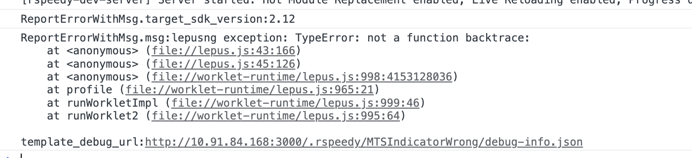
:::info Main Thread and Background Thread Functions Need Special APIs to Call Each Other
Main thread script and background thread script run in separate runtimes. Functions in one runtime cannot directly call functions in another runtime. They need "special bridges" to communicate:
* From background to main thread: Use [`runOnMainThread`](/en/api/react/Function.runOnMainThread.md)
* From main thread to background: Use [`runOnBackground`](/en/api/react/Function.runOnBackground.md)
:::
`onIndexUpdate` is a background thread function. When called in a main thread function, we need to use `runOnBackground`
```tsx title="useOffset.ts" "{12}"
function useOffset({
itemWidth,
onIndexUpdate,
}) {
const currentIndexRef = useMainThreadRef(0);
function updateOffset(offset: number) {
...
const index = Math.round(offset / itemWidth);
if (currentIndexRef.current !== index) {
currentIndexRef.current = index;
runOnBackground(onIndexUpdate)(index);
}
}
}
```
Now the progress indicator updates automatically as you scroll!
### Background Thread Calling Main Thread
A useful progress indicator should also support clicking to jump to the corresponding page. Let's add click-to-jump functionality to the `` component.
Add an `updateIndex` method in `useOffset` that uses `runOnMainThread` to call `updateOffset` to update the component position.
```tsx title="useOffset.ts" "{4}"
function useOffset({ itemWidth, onIndexUpdate }) {
function updateIndex(index: number) {
const offset = index * itemWidth;
runOnMainThread(updateOffset)(offset);
}
return {
updateIndex,
};
}
```
Here's the complete code:
Great! Now the progress indicator supports click-to-jump functionality.
## Values Across Main Thread and Background Thread Script
In the following example, we've added a snap effect animation to the `` component. Currently, the snap effect animation isn't ideal, we can add some props to customize it.
We'll use this example to demonstrate value passing between main thread and background thread script.
### Main Thread Script Using Background Thread Script Values
First, we add a `duration` prop to the `` component to control the snap animation duration.
```tsx title="index.tsx"
```
Let's see how it works internally. When touch ends, `useOffset` calls the `animate` function to update the component position with animation effects. `animate` is a main thread function that accepts initial and target values and updates the component position according to the animation curve over the `duration` time.
```tsx title="useOffset.ts" {15-19}
function useOffset({
duration,
}) {
const currentOffsetRef = useMainThreadRef(0);
function updateOffset(offset: number) {
'main thread'
// Update Component Offset
}
...
function handleTouchEnd() {
'main thread'
...
animate({
from: currentOffsetRef.current,
to: calcNearestPage(currentOffsetRef.current),
onUpdate: updateOffset,
duration,
})
}
}
```
Here, both `animate` and `handleTouchEnd` are main thread functions, and they can access the background thread value `duration`.
:::info Main Thread Functions Can Use Background Thread Values
Main thread script and background thread script run in separate runtimes and are isolated from each other.
However, to simplify main thread script development, Lynx automatically passes background thread values that main thread functions **depend on** to those functions, though this process has some limitations:
* The dependent background thread values must be serializable, so functions, `Promise`s, and other non-serializable values cannot be passed.
* Value passing only occurs during component `render`. If background thread values change after `render`, main thread functions won't be aware of these updates.
:::
### Background Thread Passing Main Thread Values
Next, we add a `main-thread:easing` prop to the `` component to allow users to customize the animation curve.
```tsx title="index.tsx" {6}
function easeInOut(x: number) {
'main thread';
return x < 0.5 ? 2 * x * x : 1 - Math.pow(-2 * x + 2, 2) / 2;
}
;
```
Inside the component, the main thread function `easeInOut` is passed to the background thread hook `useOffset`
```tsx title="Swiper.tsx" {2,6}
function Swiper({
'main-thread:easing': MTEasing,
}) {
...
const { handleTouchStart, ... } = useOffset({
MTEasing,
});
}
```
And in `useOffset`, it's passed to the main thread function `animate`.
```tsx title="useOffset.ts" {3,11}
function useOffset({
duration,
MTEasing,
}) {
...
function handleTouchEnd(e: MainThread.TouchEvent) {
"main thread";
// ...
animate({
duration,
easing: MTEasing,
});
}
}
```
:::info Main Thread Values Can Be Passed by Background Thread But Not Used
Main thread values, such as `MainThreadRef` and main thread functions, cannot be directly used by the background thread.
However, they can be passed by the background thread, such as being passed as `props` to components or as function parameters to other hooks or functions, and ultimately used in the main thread.
:::
:::details Add main-thread: Prefix for Props That Need Main Thread Functions
You may have noticed that when passing main thread functions or `MainThreadRef` as attributes, they need the `main-thread:` prefix, like `main-thread:ref` and `main-thread:bindtouchstart`.
By convention, when a prop expects a main thread function, it should have the `main-thread:` prefix, like `main-thread:easing`. We recommend following this convention for custom components too. This helps component users understand that the property requires a main thread function.
However, because variable names containing colons `:` are illegal in JavaScript, you need to rename these props when using them inside components.
```tsx title="Swiper.tsx"
function Swiper({ 'main-thread:easing': MTEasing }) {}
```
:::
Finally, we have a swiper with customizable animation curves.
## Summary
In this tutorial, we started with a simple `` component, gradually optimized its performance, and finally implemented a swiper with customizable animation curves.
We learned about:
* Using direct node manipulation to optimize performance
* Leveraging main thread script to enhance interaction experience
* Implementing communication between main thread and background thread
* Understanding value passing between main thread and background thread script
---
url: /guide/ui/elements-components.md
---
# Composing Elements
A Lynx page may contain various visual elements such as text and images, presented in different layouts to create diverse page styles. This section aims to help everyone understand how to construct the most basic views.
## Element tag: UI Building Blocks
Lynx defines content and structure using a markup language, with the most basic unit being an [element tag](/guide/spec.md#element-tag). The concept of an element tag is similar to [HTML elements](https://developer.mozilla.org/en-US/docs/Glossary/Element), which can be used to encapsulate different parts of the content to present or operate in a specific manner.
Unlike HTML, Lynx uses some unique element tags such as [``](/api/elements/built-in/view.md), [``](/api/elements/built-in/text.md), and [``](/api/elements/built-in/image.md) to display different content. For example, in Lynx, the following source code can be used to display a piece of text:
```html
Hello Lynx
```
### Anatomy of an Element tag
The basic usage of element tags is very similar to [HTML elements](https://developer.mozilla.org/en-US/docs/Learn_web_development/Getting_started/Your_first_website/Creating_the_content#anatomy_of_an_html_element):
Each element tag consists of the following parts:
1. **Start tag**: Includes the name of the element tag (in this case, text) surrounded by angle brackets, indicating where the element tag begins.
2. **End tag**: Similar to the start tag but includes a forward slash before the element tag's name, indicating where the element tag ends.
3. **Content**: The content of the element tag, which for the `` element tag is the text itself.
Combining the start tag, end tag, and content forms a complete element tag.
### Attributes
Each element tag has its own attributes that can be set by adding attribute names and values within the element tag's tag to describe its behavior and appearance.
For example, each element tag can use attributes such as [`style`](/api/elements/built-in/view.md#style) and [`class`](/api/elements/built-in/view.md#class) to set background, border-radius, shadow styles, and support some CSS syntax. The following code sets the background color of an element tag to red:
```html
Hello Lynx
```
In this example, `style` is the attribute name, and `background:red` is the attribute value.
For more attributes, refer to the [API Reference](/api/elements/built-in/view.md).
### Empty Element tags
Some element tags do not have content, such as the `` element tag:
```html
```
It does not use an `` end tag, nor does it have any content inside because the `` element tag uses an attribute `src` to display an image rather than content.
### Nested Element tags
Element tags can be nested within other element tags. For example, multiple `` element tags can be nested inside a `` element tag:
```html
HelloLynx
```
### Element Tree
The element tags in the source code will be parsed by the Lynx engine at runtime and translated into [elements](/guide/spec.md#element) for rendering. Nested element tags will form a tree composed of elements, which we refer to as the [element tree](/guide/spec.md#element-tree). We rely on this tree structure to build and manage more complex interfaces.
## Built-in Elements
The Lynx Engine comes with some built-in elements by default to help you quickly build pages.
### View
The `` is the most basic element, commonly used to wrap other elements and carry some drawing capability. For example, the following code sets the entire view's background color to gray and adds some padding within the view:
```html
Hello Lynx
```
### Text
As mentioned earlier, the `` element is used to display text content. For instance, the following code can be used to display a piece of text:
```html
Hello Lynx
```
### Image
The `` element is used to display images. For example, the following code can be used to display an image:
```html
```
### More Built-in Elements
For all built-in Lynx elements, refer to [Built-in Elements Documentation](/api/elements/built-in/view.md).
## Behind the Elements: Native Rendering
Lynx elements are designed to be platform-agnostic. They are rendered natively by the Lynx Engine into the UI primitives for each platforms, such as iOS and Android views, or HTML elements (including [custom elements](https://developer.mozilla.org/en-US/docs/Web/API/Web_components/Using_custom_elements)) on the Web.
Lynx enables cross-platform application development based on the web technology, with its core being the establishment of a unified rendering system through element abstraction. Understanding the mapping relationship between the native views of the platform and Lynx elements is crucial to mastering the design concepts of elements within this framework. Below are some of the built-in elements and their corresponding concepts or analogues in different platforms:
| Element | Android | iOS | Web analogy | Description |
| :---------------------------------------------------- | :----------------------- | :-------------------------------- | :----------------------------- | :------------------------------------------------------------------------------------------------------------------------ |
| [``](/api/elements/built-in/view.md) | `ViewGroup` | `UIView` | Non-scrollable `
` | Basic view container, often used for layout capabilities, stylization, and wrapping other elements. |
| [``](/api/elements/built-in/text.md) | `TextView` | `UITextView` | `
` | Used for displaying text content. Specific text styles can be aligned. |
| [``](/api/elements/built-in/image.md) | `ImageView` | `UIImageView` | `` | Used for displaying different types of images, including web images, static resources, and local disk images. |
| [``](/api/elements/built-in/scroll-view.md) | `ScrollView` | `UIScrollView` | `
` with `overflow:scroll` | Basic scrollable element that supports horizontal and vertical scrolling. Allows users to scroll to display more content. |
| [``](/api/elements/built-in/list.md) | `RecyclerView` | `UICollectionView` | None | High-performance scrollable element that reduces memory pressure through lazy loading and view reuse. |
| [``](/api/elements/built-in/page.md) | `ViewRootImpl` of a page | `UIViewController.view` of a page | Non-resizable `` | Root node of a page, usually doesn't need to be added manually. |
## Extending with Custom Elements
If built-in elements can't meet your needs, you can expand Lynx's capabilities by implementing native elements customarily. This is one of Lynx's powerful features.
For more details, refer to [Extending Native Elements Documentation](/guide/custom-native-component.md).
## Components: Composition of Elements
In more complex Lynx view structures, various types of elements are often nested and combined layer by layer to form richer and more diverse interface units. This is the core idea of component-based development in front-end frameworks: achieving modular construction of interfaces through reusable encapsulation units.
In ReactLynx, we follow the React development paradigm. By using a function and JSX to assemble the elements and define a component, its design philosophy and basic principles follow the [React Component Design Documentation](https://react.dev/learn/describing-the-ui). For example:
***
In the next chapter, we will add more elaborate styles to the interface.
---
url: /guide/ui/styling.md
---
# Styling with CSS
Cascading Style Sheets (CSS) are used to style and layout Lynx pages. For example, you can change the font, color, size, and position of the content, split the content into multiple columns, or add animations and other decorative elements to make your pages more vivid and interesting.
In addition, Lynx provides numerous properties starting with `-x-` to help you achieve style design more easily.
The following tutorial will demonstrate how to add styles to elements using CSS.
:::tip
If you have no basic knowledges about CSS,
you can go through the [guidance](https://developer.mozilla.org/en-US/docs/Learn_web_development/Core/Styling_basics) from web docs.
:::
## Selectors and inline styles
You can use selectors and inline styles to set values to element's properties.
Such as using `class` attribute with a class selector:
The following example set the background property of the element whose `class` has 'bg-gradient'.
And you can also set the element's properties via `style` attribute directly. In the example before, we use `style` to change the element's position and size.
* [Learn more about styling properties](/guide/styling/appearance.md)
* [Property API references](/api/css/properties.md)
* [Selector API references](/api/css/selectors.md)
### Nesting
With nesting syntax, you can declare classes in an easier way.
You can get this in [Sass](/rspeedy/styling.md#%E4%BD%BF%E7%94%A8-sass), which is already supported in ReactLynx, or other [post css plugins](/rspeedy/styling.md#using-postcss), such as [postcss-nesting](https://github.com/csstools/postcss-plugins/tree/main/plugins/postcss-nesting).
```scss
.a {
background: red;
&-b {
border-radius: 30px;
}
}
/* equals */
.a {
background: red;
}
.a-b {
border-radius: 30px;
}
```
## CSS cascading
The [Cascade](https://developer.mozilla.org/en-US/docs/Web/CSS/CSS_cascade/Cascade) specification defines which value takes effect when multiple selectors applied to the same element, and they got duplicate properties with different values.
For example, properties set by `style` attribute covers those set by style rules (e.g class selector), class with higher [specificity](https://developer.mozilla.org/en-US/docs/Web/CSS/CSS_cascade/Specificity) covers those lower ones.
In the case above,both two selectors, `bg-gradient` and `bg-color` are taking effect on the ``,and they are both changing the `background` property.
Following the specification of the cascade, the class appears later in the document covers the earlier one, thus the rectangle should be red.
## CSS Variables and Opt-in Inheritance
Lynx supports [CSS custom properties](/api/css/properties/css-variable.md) (CSS variables) and opt-in CSS inheritance for dynamic styling and theming.
CSS custom properties are inherited by default, while regular (non-custom) CSS properties require explicit configuration.
See the Theming guide for details:
* [Switch themes using CSS descendant selectors](/guide/styling/custom-theming.md#using-css-descendant-selectors-to-switch-themes)
* [Switch themes using CSS custom properties](/guide/styling/custom-theming.md#using-css-variables-to-switch-themes)
* [Configure Lynx's opt-in CSS inheritance](/guide/styling/custom-theming.md#leveraging-css-inheritance-as-needed)
---
url: /guide/ui/layout/index.md
---
# Understanding Layout
Lynx provides:
* Properties such as [`width`], [`height`], [`margin`], and [`padding`] are used to describe the size of elements.
* The [`display`] property, along with [linear layout], [flexible box layout], [grid layout], and [relative layout], are used for laying out elements.
* The aligning properties, including [`align-items`], [`justify-content`] and etc., are used for aligning elements.
* The [`position`] property, along with [`left`], [`right`], [`top`], [`bottom`] properties, are used to position elements.
* [`direction`] and [logical properties] are used to support the internationalization of layouts.
For the layout properties supported by Lynx with the same name in the Web, the behavior of these properties will be consistent with those in the Web.
However, there is a difference in the design concept between Lynx layout and Web layout: Web layout is primarily text-based. While Lynx layout is based on elements (``, ``, ``, etc.). In other words, elements in Lynx are all [block-level elements](https://developer.mozilla.org/en/docs/Glossary/Block-level_content).
The following tutorial will show you how to complete the layout of elements in Lynx.
## Sizing the Elements
You can use [`width`], [`height`], [`max-width`], [`min-width`], [`max-height`], [`min-height`], [`margin`], [`padding`], and [`border-width`] to describe the size and box model of an element. These properties support various [length units] such as `px`, `%`, `vh` and etc. Additionally, `width` and `height` support [`max-content`] and [`fit-content`] for sizing elements according to their content.
By default, the size properties of Lynx, such as `width`, `height`, and `max-width`, describe the size of the border box. This is inconsistent with the default behavior of the Web.
Lynx does not exhibit the behavior of [margin collapsing](https://developer.mozilla.org/en/docs/Web/CSS/CSS_box_model/Mastering_margin_collapsing) as in the Web.
## Layout the Elements
The [``] element can be used for laying out child elements, and by setting the [`display`] property on the `` element, you can control the way it lays out its child elements. The display property supports five values: `linear`, `flex`, `grid`, `relative` and `none`.
### Linear Layout
If you want to simply arrange the elements in order, you can set the [`display`] property to linear and use Lynx's default layout, which is the [linear layout]. The Linear layout (inspired by Android's [Linear Layout](https://developer.android.com/develop/ui/views/layout/linear)) can arrange the elements in order according to the direction you declare.
### Flexible Box Layout
If you need to make the size of child elements adapt to the space of the parent element (such as expanding child elements to fill the unused space or shrinking child elements to avoid overflow), you can set the [`display`] property to `flex` and use the [flexible box layout]. The flexible box layout in Lynx is consistent with the one in Web.
### Grid Layout
If you want to arrange multiple elements alternately in both vertical and horizontal directions to form a two-dimensional layout, you can set the [`display`] property to `grid` and use the [grid layout], a layout in the Web that can divide the space into a two-dimensional grid and place elements in the specified rows and columns. Lynx supports a subset of its features.
### Relative Layout
If you want to describe the layout through the relative position relationship between elements, you can set the [`display`] property to `relative` and use the [relative layout]. The relative layout(inspired by Android's [Relative Layout](https://developer.android.com/develop/ui/views/layout/relative)) can declare the layout by describing the position relationship between elements (for example, one element is located to the left of another element).
### Text and Inline Layout
In Lynx, text cannot be directly inserted into the [``] element, and the [`display`] property of Lynx does not support the values of `inline` and `block`. The [``] element can complete text display and the inline layout of elements. For details, please refer to [Text Typography](/guide/styling/text-and-typography.md).
## Aligning the Elements
You can align the elements laid out by a [``] with [`align-items`], [`align-self`], [`justify-content`], [`align-content`], [`justify-items`] and [`justify-self`] properties.
## Offseting and Absolute Positioning
You can offset the elements with [`top`], [`left`], [`bottom`], and [`right`] properties. And you can make elements absolutely positioned with [`position`] property.
## Internationalization
You can use the [`direction`] property and [logical properties] to make your page support both languages written from left to right (such as Chinese) and languages written from right to left (such as Arabic).
[logical properties] refer to a series of properties like `XX-inline-start` and `XX-inline-end` (such as [`inset-inline-start`]).
The CSS properties of Lynx are not inheritable by default. If you want the
[`direction`](/api/css/properties/direction.md) to be inheritable, please refer
to [CSS
Inheritance](/guide/styling/custom-theming.md#how-to-enable-css-inheritance)
[`width`]: /api/css/properties/width.md
[`height`]: /api/css/properties/height.md
[`min-width`]: /api/css/properties/min-width.md
[`min-height`]: /api/css/properties/min-height.md
[`max-width`]: /api/css/properties/max-width.md
[`max-height`]: /api/css/properties/max-height.md
[`flex-grow`]: /api/css/properties/flex-grow.md
[`flex-shrink`]: /api/css/properties/flex-shrink.md
[`direction`]: /api/css/properties/direction.md
[`display`]: /api/css/properties/display.md
[`margin`]: /api/css/properties/margin.md
[`padding`]: /api/css/properties/padding.md
[`position`]: /api/css/properties/position.md
[`border-width`]: /api/css/properties/border-width.md
[`inset-inline-start`]: /api/css/properties/inset-inline-start.md
[`top`]: /api/css/properties/top.md
[`bottom`]: /api/css/properties/bottom.md
[`max-content`]: /api/css/data-type/max-content.md
[`fit-content`]: /api/css/data-type/fit-content.md
[`justify-self`]: /api/css/properties/justify-self.md
[`justify-items`]: /api/css/properties/justify-items.md
[`align-self`]: /api/css/properties/align-self.md
[`align-content`]: /api/css/properties/align-content.md
[`justify-content`]: /api/css/properties/justify-content.md
[`align-items`]: /api/css/properties/align-items.md
[`left`]: /api/css/properties/left.md
[`right`]: /api/css/properties/right.md
[``]: /api/elements/built-in/view.md
[``]: /api/elements/built-in/text.md
[length units]: /api/css/data-type/length-percentage.md
[linear layout]: /guide/ui/layout/linear-layout.md
[relative layout]: /guide/ui/layout/relative-layout.md
[flexible box layout]: /guide/ui/layout/flexible-box-layout.md
[grid layout]: /guide/ui/layout/grid-layout.md
[logical properties]: https://developer.mozilla.org/en/docs/Web/CSS/CSS_logical_properties_and_values
---
url: /guide/ui/layout/linear-layout.md
---
# Linear Layout
If you want to arrange children sequentially without dealing with the complexities of [flexible box](/en/guide/ui/layout/flexible-box-layout.md) and [grid](/en/guide/ui/layout/grid-layout.md) layouts (such as shrink and placement issues), consider using **linear layout**. This layout is inspired by [linear layout](https://developer.android.com/develop/ui/views/layout/linear) in Android.
The default layout direction of a linear layout is vertical. You can also use Web's alignment properties such as [`align-items`](/api/css/properties/align-items.md), [`align-self`](/api/css/properties/align-self.md), and [`justify-content`](/api/css/properties/justify-content.md) with this layout. For the supported properties, please refer to the [Reference section](#reference).
## How to Build a Linear Layout?
### Step 1: Apply `display: linear`
To implement a linear layout, modify the `display` property of the parent element to use a linear layout for its children.
```css
display: linear;
```
### Step 2: Set the Layout Direction
A linear layout arranges elements along the main and cross axes, similar to a [flexible box layout](/en/guide/ui/layout/flexible-box-layout.md). The **main axis** refers to the direction in which elements are aligned, whereas the **cross axis** is perpendicular to it.
You can adjust the layout direction by altering the [`linear-direction`](/api/css/properties/linear-direction.md) property of the parent container, akin to the [`flex-direction`](/api/css/properties/flex-direction.md) property in flexible box layouts. By default, `linear-direction` is set to `column`.
```css
linear-direction: column;
```
### Step 3: Align Children Along the Main Axis
To control the position of child elements along the main axis, use the [`justify-content`](/api/css/properties/justify-content.md) property. In the demo below, the main axis is vertical.
### Step 4: Align Children Along the Cross Axis
To align items within a container along the cross axis, apply [`align-items`](/api/css/properties/align-items.md) to the container or [`align-self`](/api/css/properties/align-items.md) to children.
In the example below, the cross axis is vertical, with `align-items: center` used in the container to center children along this axis.
By adjusting the `align-self` property on a child, you can override `align-items` behavior, as shown with the first block below the parent element.
::: info
Please note that when the cross-axis size of the parent element (such as the `width` when `linear-direction: column`) is set, and if the size of the child element in this direction is not specified (or `auto`), the children's size along the cross-axis will expand to fill the container.
:::
### Step 5: Specify Dynamic Sizes Along the Main Axis
Linear layout allows for the [`linear-weight`](/api/css/properties/linear-weight.md) attribute, enabling adaptive sizing along the main axis based on assigned weight ratios and available space.
Set the [`linear-weight`](/api/css/properties/linear-weight.md) for each child to define its size share along the main axis. The parent container adjusts every child's dimensions to fit proportions derived from their respective weight values relative to available space.
In the above example, `linear-weight` specifies a scale value without unit representing the amount of space available for each child element along the main axis. The three child elements will have a 0.5 : 2 : 0.5 ratio of the main axis space.
## Reference
Currently, the linear layout supports the following layout properties:
* **Specific CSS Properties**
* [`linear-direction`](/api/css/properties/linear-direction.md)
* [`linear-weight`](/api/css/properties/linear-weight.md)
* **Alignment Properties**
* [`justify-content`](/api/css/properties/justify-content.md)
* [`align-items`](/api/css/properties/align-items.md)
* [`align-self`](/api/css/properties/align-self.md)
* **Other Properties**
Other properties such as [`order`](/api/css/properties/order.md), [`aspect-ratio`](/api/css/properties/aspect-ratio.md), etc., are not listed individually here; for specific property support, refer to the [API Reference](/api/css/properties.md).
---
url: /guide/ui/layout/flexible-box-layout.md
---
# Flexible Box Layout
If you need to make the size of child elements adapt to the space of the parent element (such as expanding child elements to fill the unused space or shrinking child elements to avoid overflow), you can set the [`display: flex`](/api/css/properties/display.md) property to the parent element and use the **flexible box layout**.
::: info
For more information, please refer to the [CSS Flexible Box Layout](https://developer.mozilla.org/en-US/docs/Web/CSS/CSS_flexible_box_layout) on MDN. Lynx supports common flexible box layout properties and in most cases aligns with Web standards. For the supported properties, please refer to the [Reference section](#reference).
:::
**The following examples show typical features of the flexible box layout.**
## Typical Features
### Filling the Parent Element with `flex-grow`
The [`flex-grow`] property helps you allocate the remaining space of the parent element to the size of the sub-elements based on the weight declared by `flex-grow`.
### Shrinking Child Elements with `flex-shrink`
When the child elements are about to overflow the parent element, the child elements can shrinked according to the weight declared by [flex-shrink](/api/css/properties/flex-shrink.md) to fit the size of the parent element.
Lynx currently does not support [`min-content`](https://developer.mozilla.org/en-US/docs/Web/CSS/min-content), and therefore treats it temporarily as `0px`. This means that while the Web can ensure sub-elements do not shrink below their minimum content width when fitting the parent element size, Lynx cannot guarantee this at present.
```html
```
### Wrapping with `flex-wrap`
The [`flex-wrap`] property allows content that doesn't fit on a single line to be displayed on subsequent lines. This attribute specifies whether flex elements are shown in a single or multiple lines. When allowed to wrap, this attribute can control the stacking direction of the lines.
## Reference
Currently, Lynx supports the following common flexible box layout properties:
* **CSS Properties**
* [`flex`](/api/css/properties/flex.md)
* [`flex-basis`](/api/css/properties/flex-basis.md)
* [`flex-direction`](/api/css/properties/flex-direction.md)
* [`flex-flow`](/api/css/properties/flex-flow.md)
* [`flex-grow`](/api/css/properties/flex-grow.md)
* [`flex-shrink`](/api/css/properties/flex-shrink.md)
* [`flex-wrap`](/api/css/properties/flex-wrap.md)
* [`order`](/api/css/properties/order.md)
* **Alignment Properties**
* [`align-content`](/api/css/properties/align-content.md)
* [`align-items`](/api/css/properties/align-items.md)
* [`align-self`](/api/css/properties/align-self.md)
* [`justify-content`](/api/css/properties/justify-content.md)
* [`row-gap`](/api/css/properties/row-gap.md)
* [`column-gap`](/api/css/properties/column-gap.md)
* [`gap`](/api/css/properties/gap.md)
For more usage details, please refer to the [CSS Flexible Box Layout](https://developer.mozilla.org/en-US/docs/Web/CSS/CSS_flexible_box_layout) on MDN.
[`flex-grow`]: /api/css/properties/flex-grow.md
[`flex-shrink`]: /api/css/properties/flex-shrink.md
[`flex-wrap`]: /api/css/properties/flex-wrap.md
---
url: /guide/ui/layout/grid-layout.md
---
# Grid Layout
If you want a responsive layout where multiple elements are staggered both vertically and horizontally, the **grid layout** is your best choice. This layout is based on a two-dimensional grid, and it is the most powerful CSS layout on the Web.
:::info
For further details, please refer to MDN's [css grid layout](https://developer.mozilla.org/en-US/docs/Web/CSS/CSS_grid_layout).
In Lynx, the grid layout largely follows with web standards. Currently, Lynx does not support [`[line-names]`](https://developer.mozilla.org/en-US/docs/Web/CSS/CSS_grid_layout/Grid_layout_using_named_grid_lines) and [`grid-area`](https://developer.mozilla.org/en-US/docs/Web/CSS/grid-area). Please refer to the [Reference](#reference) section for supported properties.
:::
**Here is a brief guide on using the grid layout.**
## How to Build a Grid Layout?
Before you build a grid layout, it's important first to understand the basic concepts.
### Basic Concepts
* **Grid Containers and Grid Items**
The parent element using grid layout is called a "grid container." The children within the container that are layouted using grid layout are called "grid items".
* **Grid Lines**
The lines that divide the grid layout are called "grid lines." Typically, x rows have x+1 horizontal grid lines, y columns have y+1 vertical grid lines, as shown in the image below with 6 horizontal and 4 vertical grid lines.
* **Grid Rows and Grid Columns**
The spaces between two grid lines are called grid tracks. The horizontal tracks in the container are called "grid rows," and vertical tracks are called "grid columns."
* **Grid Cells**
The intersection of rows and columns forms a grid cell.
* **Grid Areas**
The area occupied by one or more grid cells by a grid item is called a grid area.
* **Inline Axis and Block Axis**
As Lynx does not support [`writing-mode`](https://developer.mozilla.org/en-US/docs/Web/CSS/writing-mode), the inline axis is horizontal, and the block axis is vertical.
### Step 1: Apply `display: grid`
To implement the grid layout, set `display: grid` on the parent element.
```css
display: grid;
```
### Step 2: Specify the Size of Rows and Columns
Once the container has the grid layout specified, define the rows and columns. The [`grid-template-columns`] property specifies each column's width, while the [`grid-template-rows`] property defines each row's height.
If `grid-template-columns` or `grid-template-rows` are not explicitly used to define dimensions, the grid layout uses [`grid-auto-columns`] and [`grid-auto-rows`] for determining column widths and row heights.
### Step 3: Specify Grid Gaps
Grid gap is the spacing between grid tracks. It can be indicated by [`column-gap`] for columns, [`row-gap`] for rows, or [`gap`] for both columns and rows.
### Step 4: Align Grid Tracks to Inline and Block Axes
Align the grid tracks with the inline (horizontal axis) and block (vertical axis) using [`justify-content`] and [`align-content`].
### Step 5: Specify the Grid Lines for Grid Items
The positions of grid items can be specified. Use [`grid-column-start`] and [`grid-column-end`] to set the columns a grid area spans, and [`grid-row-start`] and [`grid-row-end`] to define rows.
### Step 6: Align Grid Items to the Grid Area
Having established the grid items' respective grid areas in previous steps, you can now use [`align-items`] and [`align-self`] to vertically align grid items to the grid area, and [`justify-items`] and [`justify-self`] to horizontally align them as well. It's notable that `align-self` and `justify-self` settings on grid items will override those set by `align-items` and `justify-items` on the container.
## Reference
Currently, Lynx supports the following common grid layout properties:
* **CSS Properties**
* [`grid-template-columns`](/api/css/properties/grid-template-columns.md)
* [`grid-template-rows`](/api/css/properties/grid-template-rows.md)
* [`grid-auto-columns`](/api/css/properties/grid-auto-columns.md)
* [`grid-auto-rows`](/api/css/properties/grid-auto-rows.md)
* [`grid-auto-flow`](/api/css/properties/grid-auto-flow.md)
* [`grid-row-start`](/api/css/properties/grid-row-start.md)
* [`grid-row-end`](/api/css/properties/grid-row-end.md)
* [`grid-column-start`](/api/css/properties/grid-column-start.md)
* [`grid-column-end`](/api/css/properties/grid-column-end.md)
* **Alignment Properties**
* [`align-content`](/api/css/properties/align-content.md)
* [`align-items`](/api/css/properties/align-items.md)
* [`align-self`](/api/css/properties/align-self.md)
* [`justify-content`](/api/css/properties/justify-content.md)
* [`justify-items`](/api/css/properties/justify-items.md)
* [`justify-self`](/api/css/properties/justify-self.md)
* [`row-gap`](/api/css/properties/row-gap.md)
* [`column-gap`](/api/css/properties/column-gap.md)
* [`gap`](/api/css/properties/gap.md)
For more information on usage, please refer to MDN's [css grid layout](https://developer.mozilla.org/en-US/docs/Web/CSS/CSS_grid_layout).
[`grid-template-columns`]: /api/css/properties/grid-template-columns.md
[`grid-template-rows`]: /api/css/properties/grid-template-rows.md
[`grid-auto-columns`]: /api/css/properties/grid-auto-columns.md
[`gap`]: /api/css/properties/gap.md
[`column-gap`]: /api/css/properties/column-gap.md
[`row-gap`]: /api/css/properties/row-gap.md
[`grid-auto-rows`]: /api/css/properties/grid-auto-rows.md
[`grid-column-start`]: /api/css/properties/grid-column-start.md
[`grid-column-end`]: /api/css/properties/grid-column-end.md
[`grid-row-start`]: /api/css/properties/grid-row-start.md
[`grid-row-end`]: /api/css/properties/grid-row-end.md
[`justify-content`]: /api/css/properties/justify-content.md
[`align-content`]: /api/css/properties/align-content.md
[`align-items`]: /api/css/properties/align-items.md
[`align-self`]: /api/css/properties/align-self.md
[`justify-items`]: /api/css/properties/justify-items.md
[`justify-self`]: /api/css/properties/justify-self.md
---
url: /guide/ui/layout/relative-layout.md
---
# Relative Layout
If you want a layout that allows easily control the relative position between the parent and children or between the sibling elements without using complex hierarchical structure, **relative layout** (inspired by [relative Layout](https://developer.android.com/develop/ui/views/layout/relative) in Android) is the best choice. While using [grid](/en/guide/ui/layout/grid-layout.md), [flexible box](/en/guide/ui/layout/flexible-box-layout.md), and [linear](/en/guide/ui/layout/linear-layout.md) layouts, it's challenging to achieve a design that includes numerous relative positions using only a few styles.
Relative layout is a layout that displays children in relative positions, where each view's position can be specified relative to sibling elements (for example, to the left or below another view) or relative to the parent's area (e.g., align at bottom, left or center). For the supported properties, please refer to the [Reference section](#reference).
## How to Build a Relative Layout?
In the scenario described below, where the "user name" and "description" have a positional relationship, and the "user name" also aligns with the "avatar" on the right. What's more, the "follow", "close", "user" also have corresponding relationships with each other. The dashed lines and arrows in the image below are to indicate their positional relationship.
**Let's implement the above diagram using the relative layout in following steps:**
### Step 1: Apply `display: relative`
You can apply [`display: relative`](/api/css/properties/display.md) to the parent element where you want the relative layout.
```css
display: relative;
```
### Step 2: Set ID for Children
Assign a unique [`relative-id`](/api/css/properties/relative-id.md) (integer, not `0`) for each child in the relative layout. This step is to better identify each element.
```css
// avatar
relative-id: 1;
// user_name
relative-id: 2;
// user_description
relative-id: 3;
// user_lv
relative-id: 4;
// close
relative-id: 5;
// follow
relative-id: 6;
```
### Step 3: Set Edge Alignment Properties
Use these edge alignment properties to specify alignment of the element with its **parent or sibling**'s edge. For instance, [`relative-align-top`](/api/css/properties/relative-align-top.md) ensures the element aligns with the top edge of the designated parent or sibling id.
Physical Properties
* [`relative-align-top`](/api/css/properties/relative-align-top.md)、[`relative-align-right`](/api/css/properties/relative-align-right.md)、[`relative-align-bottom`](/api/css/properties/relative-align-bottom.md)、[`relative-align-left`](/api/css/properties/relative-align-left.md)
Logical Properties
* [`relative-align-inline-start`](/api/css/properties/relative-align-inline-start.md)、[`relative-align-inline-end`](/api/css/properties/relative-align-inline-end.md)
### Step 4: Set Relative Position Properties
Define relative positioning of the current element to its **sibling** elements using these properties. As an example, [`relative-left-of`](/api/css/properties/relative-left-of.md) arranges the current element to the left of the designated sibling, closely aligning right edge with the sibling's left edge.
Physical Properties
* [`relative-left-of`](/api/css/properties/relative-left-of.md)、[`relative-right-of`](/api/css/properties/relative-right-of.md)、[`relative-top-of`](/api/css/properties/relative-top-of.md)、[`relative-bottom-of`](/api/css/properties/relative-bottom-of.md)
Logical Properties
* [`relative-inline-start-of`](/api/css/properties/relative-inline-start-of.md)、[`relative-inline-end-of`](/api/css/properties/relative-inline-end-of.md)
### Step 5: Set Center Property
Use [`relative-center`](/api/css/properties/relative-center.md) declare how the current children element is centered in the container. By setting `vertical` to achieve vertical centering, setting `horizontal` to achieve horizontal centering, or setting `both` to simultaneously achieve both vertical and horizontal centering.
### Example
In this example, the container's width is fixed, while its height adjusts to its content. To incorporate gaps between elements, use `margin`.
* **Best Practices**
Reasonable use of the relative layout can offer developers a convenient and efficient layout experience. Therefore, it is strongly recommended that developers follow the following points when developing.
1. Parent container positioning can be used freely without affecting performance.
2. When using the positioning between sibling elements, it is recommended to enable the [`relative-layout-once`](/api/css/properties/relative-layout-once.md) (default enabled) style, and the sibling element will only rely on upwards.
3. Avoid circular dependencies where 'a' depends on 'b' for its horizontal width, and 'b' depends on 'a' for its vertical width, as this can severely impact performance.
4. Please do not have unresolved circular dependencies, which cannot get the correct layout result.
5. Try to use logical attributes, inline-start and inline-end, to facilitate page internationalization support.
## Reference
* **Relative Id**
* [`relative-id`](/api/css/properties/relative-id.md)
* **Edge Alignment Properties**
**Physical Properties**
* [`relative-align-top`](/api/css/properties/relative-align-top.md)
* [`relative-align-right`](/api/css/properties/relative-align-right.md)
* [`relative-align-bottom`](/api/css/properties/relative-align-bottom.md)
* [`relative-align-left`](/api/css/properties/relative-align-left.md)
**Logical Properties**
* [`relative-align-inline-start`](/api/css/properties/relative-align-inline-start.md)
* [`relative-align-inline-end`](/api/css/properties/relative-align-inline-end.md)
* **Relative Position Properties**
**Physical Properties**
* [`relative-left-of`](/api/css/properties/relative-left-of.md)
* [`relative-right-of`](/api/css/properties/relative-right-of.md)
* [`relative-top-of`](/api/css/properties/relative-top-of.md)
* [`relative-bottom-of`](/api/css/properties/relative-bottom-of.md)
**Logical Properties**
* [`relative-inline-start-of`](/api/css/properties/relative-inline-start-of.md)
* [`relative-inline-end-of`](/api/css/properties/relative-inline-end-of.md)
* **Center Property**
* [`relative-center`](/api/css/properties/relative-center.md)
* **Layout Optimization Property**
* [`relative-layout-once`](/api/css/properties/relative-layout-once.md)
---
url: /guide/ui/scrolling.md
---
# Managing Scrolling
Overflow behavior occurs when the content of an element (its own content and child elements) exceeds the size of the element itself. During the process of building a page, it is inevitable to encounter situations of overflow. You can use the [`overflow`](/api/css/properties/overflow.md) property to crop the overflowing content, or use a \[scrollable element]\(#scrollable element to make the overflowing content scrollable, and control the scrolling direction of the content through the `scroll-orientation` property.
non-scrollable element
scrollable element
Content overflow has occurred.
crop the overflowing content through overflow: hiddenscroll-orientation: vertical scrollable element
scroll-orientation: horizontal scrollable element
In `Lynx`, the `view` component doesn't support the scrolling effect achieved by `overflow: scroll` as in the Web. Only scrolling containers like `` and `` have the scrolling effect.
## scrollable element
For some basic `` element, the scrolling effect is not supported. Please use dedicated scroll container components [``](/api/elements/built-in/scroll-view.md) or [``](/api/elements/built-in/list.md).
### use `` for basic scrolling
`` is a basic scrolling component in `Lynx`. It allows users to scroll content vertically or horizontally within a fixed viewport area. Take the following figure as an example. When the height of the internal child nodes exceeds that of the parent `` container, you only need to set the layout direction `scroll-orientation` to `vertical` to achieve the vertical scrolling effect.
### use `` to manage large amount of data
`` is used to display a small amount of data in a simple and intuitive way. On the other hand, `` is suitable for scenarios where a large amount of data needs to be presented, or in scenarios with infinite scrolling for loading more content. It can adopt an on-demand loading way, rendering only the content in the visible area.
### use `` to handle complex layout
`` only has the ability of linear layout, presenting elements in an orderly manner through linear arrangement. However, when facing complex interfaces, `` offers a wide range of layout options. You can choose different layouts such as [flow](/api/elements/built-in/list.md#flow) and [waterfall](/api/elements/built-in/list.md#waterfall) to flexibly customize business requirements.
### Additional Features
* sticky capability:``[sticky](/api/elements/built-in/scroll-view.md#sticky-capability);``[sticky](/api/elements/built-in/list.md#implementing-sticky-nodes)
* `` [paginated scrolling](/api/elements/built-in/list.md#implementing-paginated-scrolling)
* `` [load more](/api/elements/built-in/list.md#implementing-load-more)
---
url: /guide/interaction/event-handling.md
---
# Event Handling
Lynx provides an event mechanism similar to the Web, allowing developers to design and implement custom interaction logic based on events.
However, unlike the Web system, Lynx's event response mechanism supports dual-threaded processing. This means that event handling functions can be executed in the main thread or background thread as needed, thereby optimizing performance and response speed.
## What is an event
An event is a signal that triggers an action in the system. When an event is triggered, developers can implement the corresponding logic by listening to the event and executing the corresponding code. For example, developers can listen to click events and modify the background color of a node when a user clicks on the page.
**Example 1:**
## Listen for user clicks
When a user clicks on a page, the system triggers a `tap` event.
As shown in the figure, developers can choose to handle the event in the main thread or the background thread.
* When timely event response is not required, you can choose to handle the event in the background thread, and the event processing of the background thread will not block the main thread.
* When timely event response is required, you can choose to handle the event in the main thread, which can avoid event delays caused by cross-threading, but it should be noted that excessive event processing may cause the main thread to be busy.
Specifically, if developers want to listen to the click event of a certain node, they can set the event handler property of type `bind` on the node:
```tsx
```
If the event handling function runs on the main thread, you need to add an additional `main-thread:` prefix before the event handler property, for example:
```tsx
```
In Lynx
, the event handler property can also implement event interception and cross-component event listening. For details, please refer to [Event Propagation](/guide/interaction/event-handling/event-propagation.md).
## Handling user clicks
When an event is triggered on a node, the event handling function set by the event handler property will be called. This function will receive an event object as a parameter, which contains detailed information about the event.
All event objects inherit from [Event](/api/lynx-api/event/event.md). Developers
can write event processing logic based on event objects in event processing
functions.
When the event processing function is a [main thread script](/en/react/main-thread-script.md), you need to add a [`'main thread'`](/en/api/react/Document.directives.md#main-thread) directive to the first line of the function body to indicate that the function runs on the main thread.
### Main thread event processing
In Lynx, the event objects of the main thread and the background thread are different. The event object of the background thread is a pure `json` object, while the event object of the main thread is an operable `Event Object`.
Lynx provides a variety of ways to operate nodes, please refer to
[Manipulating
elements](/guide/interaction/event-handling/manipulating-element.react.md) for
details.
For example, for **Example 1**, when the developer chooses to handle events in the main thread, he can directly get [`e.currentTarget`](/api/lynx-api/event/event.md#currenttarget) in the [main thread script](/en/react/main-thread-script.md) and call [`setStyleProperty`](/en/api/lynx-api/main-thread/main-thread-element.md#elementsetstyleproperty) to modify the background color of the node.
**Example 2**
### Background thread event processing
For the event processing function of the background thread, developers cannot directly operate the node through [`e.currentTarget`](/api/lynx-api/event/event.md#currenttarget), but can obtain the node reference through [`SelectorQuery`](/api/lynx-api/selector-query.md) and then call [`setNativeProps`](/en/api/lynx-api/nodes-ref/nodes-ref-set-native-props.md) Modify the background color of the node.
**Example 3:**
## Summary
So far, you have learned how to listen to user clicks and perform corresponding operations based on the event object.
For developers, Lynx events provide a Web-like API, but with a unique dual-threaded event response mechanism, allowing developers to choose to perform event processing in the main thread or background thread as needed, thereby optimizing performance and response speed.
---
url: /guide/interaction/event-handling/event-propagation.md
---
# Event Propagation
When an event is triggered, it will propagate along the event response chain. If the corresponding type of event handler property is set on the node, the node can listen to the corresponding event or even intercept it during the event propagation process.
In addition, Lynx also provides cross-component event monitoring, event aspect interface, and `GlobalEventEmitter` to implement special event propagation.
## Event handler property
By setting the event handler properties, developers can decide at which stage (or across components) of event propagation to listen or intercept the event, and specify the processing function to be called when the event is triggered. The names of these event handler properties are usually composed of the bound event type and event name.
| Event Type | Description |
| --------------- | ----------------------------------------------------------------------------------- |
| `bind` | Listen to events in the bubbling stage, and do not intercept event bubbling. |
| `catch` | Listen to events in the bubbling stage and intercept event bubbling. |
| `capture-bind` | Listen to events in the capture phase, do not intercept event capture and bubbling. |
| `capture-catch` | Listen to events in the capture phase, intercept event capture and bubbling. |
| `global-bind` | Listen to events across components. |
In particular, when the event handler is a [main thread script](/en/react/main-thread-script.md), you need to add the `main-thread:` prefix before the event handler property name to ensure that the handler is executed in the main thread.
## Event response chain
The event response chain refers to a linked list of nodes that can respond to events. Generally speaking, the event response chain consists of the path from the root node of the page to the node where the action is actually triggered. However, for non-[touch events](/en/api/lynx-api/event/touch-event.md), the event response chain only contains the node where the action is actually triggered.
**Example 1:**
In the above example, when the user clicks on the page, the background color of the node on the event response chain will be set to orange.
## Event capture
The event will go through two stages in the event response chain: event capture and event bubbling. In the event capture stage, the event will start from the root node of the page and propagate down along the event response chain until the node where the action is actually triggered. In the event capture stage, nodes with the event handler property of the `capture-bind` type set can listen to the corresponding event.
**Example 2:**
In the above example, since event propagation starts from the capture phase, and the capture phase starts from the root node, when the user clicks on the page, the root node can always listen to the `tap` event, thereby realizing the function of counting the number of page clicks.
## Event bubble
In the event bubbling phase, the event will propagate upward along the event response chain from the node where the action is actually triggered, until the root node of the page. In the event bubbling phase, nodes with the `bind` type event handler attribute set can listen to the corresponding event.
**Example 3**
In the above example, when the user clicks any node on the page, the event will bubble from the child node to the parent node by default. Therefore, the parent node can always listen to the `tap` event and change the background color of the node.
## Event interception
During the process of event propagation, the event can be intercepted midway to prevent the event from continuing to propagate. When the `catch` type event handler property is set on the node, the event will be intercepted when it propagates to the node and will no longer propagate.
**Example 4**
In the above example, since the `click me` area sets the static interception `tap` event, the event will bubble to the parent node and the background color of the node will change only when the non-`click me` area is clicked.
## Cross-component event listening
Generally speaking, when a node is not on the event response chain, the event cannot be monitored. Lynx provides a way to monitor cross-component events, allowing developers to register event monitoring on any node and receive corresponding events.
For example, developers can set the event handler property of the `global-bind` type on a node to listen to the `tap` event. When any node is clicked, the node can listen to the `tap` event, thereby realizing the function of counting the number of page clicks.
**Example 5:**
It should be noted that for non-[touch events](/en/api/lynx-api/event/touch-event.md), the event handler property of the non-cross-component event listening type needs to be set on the monitored node. In addition, developers can also set `global-target` on the node to specify that only events with a specific value of the node [`id`](/en/api/elements/built-in/view.md#id) are listened (type is `string`, multiple [`id`](/en/api/elements/built-in/view.md#id) can be specified, separated by commas).
## Event aspect interface
Sometimes, developers may need to uniformly listen to and handle events of a specific type somewhere, and do not rely on component registration event listeners. For example, count all triggered `tap` events on the page. At this time, developers can use the event aspect interface ([`beforePublishEvent`](/en/api/lynx-api/lynx/lynx-before-publish-event.md)) provided by Lynx to implement the corresponding function.
**Example 6:**
The event aspect interface is a type of aspect programming. By injecting the corresponding interface at the event trigger point, the event is forwarded to a certain place when a specific event is triggered. This interface is only implemented in the BTS context. Therefore, it can only be used in the background thread, and the corresponding event can only be listened to when the event processing function is triggered.
## `GlobalEventEmitter`
Sometimes, developers may need to pass events between different elements and components, or need to pass events between the client and the front end, and do not rely on the element to register event listeners. At this time, developers can use `GlobalEventEmitter` to achieve global scope transmission of events in a page.
Developers can obtain the `GlobalEventEmitter` object through [`lynx.getJSModule`](/en/api/lynx-api/lynx/lynx-get-js-module.md), which provides the following interfaces:
| Function name | Function description | Function parameter |
| -------------------- | ------------------------------------------------------------------------------------------- | --------------------------------- |
| `addListener` | Subscribe to events and register event listeners. | `(eventName, listener, context?)` |
| `removeListener` | Remove the specified listener for a specific event. | `(eventName, listener)` |
| `removeAllListeners` | Remove all listeners for a specific event. | `(eventName)` |
| `toggle` | Broadcast an event with a specified event name, supporting multiple transparent parameters. | `(eventName, ...data)` |
| `trigger` | Broadcasts an event with a specified event name, supporting a transparent parameter. | `(eventName, params)` |
Note that `GlobalEventEmitter` is only supported in the BTS context, so it can only be used in background threads.
### Event broadcast
Developers can broadcast events through `GlobalEventEmitter` to send events to the front end.
In the following example, when the user clicks on the page, the developer broadcasts the event by calling the `toggle` method of `GlobalEventEmitter`, so that the click event is propagated from component `ComponentA` to `ComponentB`.
**Example 7:**
For the client, the example is as follows:
```objective-c
// You can call the sendGlobalEvent function of LynxContext
// The first parameter is the event name monitored by the front end, and the second parameter is the data received by the front end
[LynxContext sendGlobalEvent:@"eventName" withParams:args];
// Or call the sendGlobalEvent function of LynxView
[LynxView sendGlobalEvent:@"eventName" withParams:args];
```
```java
// You can call the sendGlobalEvent function of LynxContext
// The first parameter is the event name monitored by the front end, and the second parameter is the data received by the front end
LynxContext.sendGlobalEvent("eventName", args);
// Or call the sendGlobalEvent function of LynxView
LynxView.sendGlobalEvent("eventName", args);
```
### Event subscribe
Developers can also subscribe to events through the `addListener` method of `GlobalEventEmitter` to receive events from the front end and client.
In the following example, users can receive the [`onWindowResize`](/en/api/lynx-api/event/global-event.md#onwindowresize) event sent by Lynx, which is triggered when the Lynx page size changes.
**Example 8:**
---
url: /guide/interaction/event-handling/manipulating-element.react.md
---
# Direct Manipulation of Elements
In daily development, modern front-end frameworks handle most element tree and node property updates for us. However, there are times when you need to manipulate elements directly, such as controlling media players, manipulating view behavior, getting element information, or directly modifying styles.
These functionalities are typically implemented by components on the client side, and you need to access them through element references.
## Manipulating Elements in Background Thread
### Example: Auto-scrolling
Let's try a simple requirement - auto-scrolling the page. We need to call the [`autoScroll`] method of the `` element:
This example demonstrates two steps for manipulating elements: creating a reference using `useRef` and binding it to the target element using `ref={scrollRef}`, then calling the element method using `invoke()` in the event handler.
### Obtaining a Reference to an Element Using `ref`
If you're familiar with React, you'll find that using `ref` is very similar:
```tsx
const nodeRef = useRef(null);
// ...
;
```
However, note that in Lynx, the type of node reference is [`NodesRef`], which is different from React. If you want to learn more about using references, you can refer to [Manipulating the Element with Refs](https://react.dev/learn/manipulating-the-dom-with-refs).
### Manipulating an Element via Its Reference
After obtaining a node reference, let's see how to use it. [`NodesRef`] provides a series of useful APIs.
For example, you can use [`NodesRef.invoke()`](/api/lynx-api/nodes-ref/nodes-ref-invoke.md) to call the element's methods. Each component provides specific methods that are implemented on the client side and exposed for front-end use.
When calling a method, you can pass required parameters through `params`, handle successful results using the `success` callback, and handle potential errors using the `fail` callback. Remember to call [`exec()`](/api/lynx-api/selector-query/selector-query-exec.md) at the end to submit the operation for actual execution:
```tsx
ref
.invoke({
method: 'boundingClientRect',
params: {
relativeTo: 'screen',
},
success: (res) => {
// Handle successful result
const { left, top, width, height } = res;
},
fail: (err) => {
// Handle potential errors
console.error('Failed to get element position:', err);
},
})
.exec();
```
## Manipulating Elements in Main Thread
If you want better performance and more intuitive code, you can consider manipulating elements in the main thread. It offers lower operation latency with faster UI response and more natural API calls.
Let's see how to implement the same functionality in the main thread:
The main changes here are: node operations need to be written in [main thread functions](/api/react/Document.directives.md#main-thread); using [`useMainThreadRef`] and `main-thread:ref` to get the main thread node reference; the node reference type becomes [`MainThread.Element`], which provides various methods for manipulating nodes; and we used [`MainThread.Element.invoke()`] to call the node's [`autoScroll`] method.
## Obtaining Element References via Selectors
In certain scenarios, such as when you need to batch operate on elements or dynamically find elements, using selectors can be particularly useful.
### Background Thread
In the background thread, we can use the [`SelectorQuery`] API to find elements. Let's look at an example:
Using selectors is simple: first create a query object using [`lynx.createSelectorQuery()`], then use methods like [`select()`] to find elements. To learn about all supported selectors, you can check our [API documentation](/api/lynx-api/selector-query.md).
### Main Thread
When manipulating elements in the main thread, things become even simpler. You can use the browser-like [`lynx.querySelector()`] API:
## Obtaining a Reference to the Event Target Element
When handling events, we often need to manipulate the element that triggered the event.
### Main Thread
In the main thread, you can get the element reference directly from the event object. Similar to browsers, we provide [`target`] and [`currentTarget`] properties:
Here we used [`MainThread.Element.setStyleProperty()`] to modify styles.
## Using `getElementById` API
[`getElementById`] is currently our main API for handling animations and CSS variables. Although this is a traditional interface, it's still the best choice when you need to execute JavaScript animations or dynamically modify CSS variable values.
To learn more about usage, you can check [Animation API documentation](/api/lynx-api/lynx/lynx-animate-api.md) and [CSS Variables Operation Guide](/api/css/properties/css-variable.md). We are developing more modern APIs to replace [`getElementById`], stay tuned.
[`autoScroll`]: /api/elements/built-in/scroll-view.md#autoscroll
[`currentTarget`]: /api/lynx-api/event/event.md#currentTarget
[`getElementById`]: /api/lynx-api/lynx/lynx-get-element-by-id.md
[`lynx.createSelectorQuery()`]: /api/lynx-api/lynx/lynx-create-selector-query.md
[`lynx.querySelector()`]: /api/lynx-api/main-thread/lynx-query-selector.md
[`MainThread.Element`]: /api/lynx-api/main-thread/main-thread-element.md
[`MainThread.Element.invoke()`]: /api/lynx-api/main-thread/main-thread-element.md#elementinvoke
[`MainThread.Element.setStyleProperty()`]: /api/lynx-api/main-thread/main-thread-element.md#elementsetstyleproperty
[`NodesRef`]: /api/lynx-api/nodes-ref.md
[`select()`]: /api/lynx-api/selector-query/selector-query-select.md
[`SelectorQuery`]: /api/lynx-api/selector-query.md
[`target`]: /api/lynx-api/event/event.md#target
[`useMainThreadRef`]: /api/react/Function.useMainThreadRef.md
---
url: /guide/interaction/visibility-detection.md
---
# Visibility detection
Lynx provides two capabilities for detecting node visibility. One is Lynx's unique exposure capability, which allows developers to easily monitor whether a node is exposed. The other is a Web-like intersection observer, which is a more atomic capability that allows developers to monitor the intersection positions of nodes.
## Detect whether a node is exposed
When developers are mainly concerned about whether multiple nodes are on the screen and not the intersection of nodes, and want to write code quickly, they can use [exposure ability](/en/guide/interaction/visibility-detection/exposure-ability.md).
[Exposure ability](/en/guide/interaction/visibility-detection/exposure-ability.md) is a declarative interface. Developers can specify the nodes that need to monitor exposure through the [`exposure-id`](/en/api/elements/built-in/view.md#exposure-id) attribute. When the node appears, the exposure event `exposure` is triggered, and when the node disappears, the anti-exposure event `disexposure` is triggered.
In the following example, the developer monitors whether the node is exposed/anti-exposed and displays the node [`exposure-id`](/en/api/elements/built-in/view.md#exposure-id) visible on the screen in real time.
**Example 2:**
Since the exposure capability focuses on whether the node is visible, the node visibility requirement here is more stringent. In addition, since [exposure capability](/en/guide/interaction/visibility-detection/exposure-ability.md) is a declarative interface, when developers need to monitor the exposure of multiple nodes, they only need to add the [`exposure-id`](/en/api/elements/built-in/view.md#exposure-id) attribute to the node.
## Detect whether nodes intersect
When developers only need to check whether nodes intersect, and do not care whether the nodes are on the screen, they can use the [intersection observer](/en/guide/interaction/visibility-detection/intersection-observer.md).
The [intersection observer](/en/guide/interaction/visibility-detection/intersection-observer.md) is used to detect whether the target node intersects with the reference node and the target node intersects with the ancestor node. Developers can flexibly specify the reference node, reference node boundary scaling value, node intersection ratio threshold, etc., to achieve a more flexible definition of node visibility.
In the following example, the developer monitors whether the parent node and the child node intersect, and outputs the intersecting child node [`id`](/en/api/elements/built-in/view.md#id) and the intersection position when they intersect.
**Example 1:**
The node visibility here only requires the target node and the reference node to intersect, without requiring the target node to be on the screen, and there is no need to specify the reference node as a scroll container. In addition, since the [intersection observer](/en/guide/interaction/visibility-detection/intersection-observer.md) is an imperative interface, when developers need to monitor the intersection of multiple nodes, redundant code needs to be written.
## Summary
So far, you have learned how to detect whether nodes are intersecting or whether nodes are exposed.
For developers, when the focus is on whether a node is on the screen and you want to easily write exposure monitoring code for multiple nodes, you can use [Exposure Ability](/en/guide/interaction/visibility-detection/exposure-ability.md). when the focus is on whether nodes intersect and where they intersect, or when you need to flexibly define the visibility of nodes, you can use [Intersection Observer](/en/guide/interaction/visibility-detection/intersection-observer.md).
---
url: /guide/interaction/visibility-detection/exposure-ability.md
---
# Exposure Ability
The exposure capability provides a capability to observe changes in the visibility of a target node. When a target node changes from invisible to visible, an exposure event is triggered. Otherwise, an anti-exposure event is triggered.
Developers can monitor the exposure/anti-exposure events of nodes by setting relevant properties for the target nodes to be observed, thereby achieving requirements such as point reporting and `UI` lazy loading.
The exposure capability observes changes in node visibility through timed exposure detection tasks. The visibility of a node depends on the following factors:
* Visibility of the target node: The target node itself has width and height and is opaque, and the parent node has no clipping with zero width or height.
* Viewport intersection of the target node: The target node intersects with the parent scroll container, `Lynxview`, and the viewport of the screen.
## Monitor exposure of the entire page
When developers need to monitor exposure/anti-exposure events of nodes in the entire page, they can subscribe to the exposure event [`exposure`](/en/api/lynx-api/event/global-event.md#exposure) and anti-exposure event [`disexposure`](/en/api/lynx-api/event/global-event.md#disexposure) of the node with the [`exposure-id`](/en/api/elements/built-in/view.md#exposure-id) attribute set through [`GlobalEventEmitter`](/en/guide/interaction/event-handling/event-propagation.md#globaleventemitter).
In the following example, the developer uses [`GlobalEventEmitter`](/en/guide/interaction/event-handling/event-propagation.md#globaleventemitter) to monitor whether the node in `ComponentA` is exposed, and outputs the exposed node [`exposure-id`](/en/api/elements/built-in/view.md#exposure-id) when it is exposed.
**Example 1:**
The format of the exposure/anti-exposure event is an array, which contains the target node information of each triggering exposure/anti-exposure event.
```json
[
{
"exposure-id": string, // exposure-id set on the target node
"exposure-scene": string, // exposure-scene set on the target node
"sign": string, // uid of the target node
"dataset": object, // "data-" field set on the target node
//......
},
//......
]
```
## Monitor the exposure of a certain node
When the developer only needs to listen to the exposure/anti-exposure events of a certain node, you can set the \[event handler]\(../event-handling/event-listening.mdx#Event handler properties) to listen to the node's [`uiappear`](/en/api/elements/built-in/view.md#binduiappear) and [`uidisappear`](/en/api/elements/built-in/view.md#binduidisappear) events.
In the following example, the developer sets the \[event handler]\(../event-handling/event-listening.mdx#Event handler properties) to listen to whether the node is exposed, and outputs the exposed node [`id`](/en/api/elements/built-in/view.md#id) when it is exposed.
**Example 2:**
The event parameter `e.detail` contains the node information.
```json
{
"type": string // event name
"detail":
{
"exposure-id": string, // exposure-id set on the target node
"exposure-scene": string, // exposure-scene set on the target node
"unique-id": string, // uid of the target node
"dataset": object, // "data-" field set on the target node
//......
},
//......
}
```
## Control exposure detection
Lynx also provides some properties and methods to control the execution of exposure detection tasks.
For example, developers can use the following methods to control whether the exposure detection task is started, stopped, and the execution frequency.
* [`lynx.stopExposure`](/en/api/lynx-api/lynx/lynx-stop-exposure.md): used to stop exposure detection, that is, no longer detect the visibility of the target node, and no exposure/anti-exposure events will be triggered later.
* [`lynx.resumeExposure`](/en/api/lynx-api/lynx/lynx-resume-exposure.md): used to start exposure detection, that is, restart the visibility detection of the target node, and then trigger the exposure/anti-exposure events normally.
* [`lynx.setObserverFrameRate`](/en/api/lynx-api/lynx/lynx-set-observer-frame-rate.md): used to set the frequency of exposure detection.
In addition, developers can also control the exposure detection logic of the node by setting exposure-related properties on the node, such as [`exposure-screen-margin-*`](/en/api/elements/built-in/view.md#exposure-screen-margin-), [`exposure-ui-margin-*`](/en/api/elements/built-in/view.md#exposure-ui-margin-), [`exposure-area`](/en/api/elements/built-in/view.md#exposure-area), etc.
---
url: /guide/interaction/visibility-detection/intersection-observer.md
---
# Intersection Observer
The intersection observer provides a method to observe the intersection status between the target node and the reference node and between the target node and the ancestor node. When the intersection status changes, the corresponding callback is triggered.
Developers can observe the changes in the intersection status between the target node and the reference node through the following three steps:
1. Call [`lynx.createIntersectionObserver`](/en/api/lynx-api/lynx/lynx-create-intersection-observer.md) to create an [`IntersectionObserver`](/en/api/lynx-api/intersection-observer.md) object and specify the threshold list of intersection status changes.
2. Call the [`relativeTo`](/en/api/lynx-api/intersection-observer.md) method of the [`IntersectionObserver`](/en/api/lynx-api/intersection-observer/intersection-observer-relative-to.md) object to specify the reference node.
3. Call the [`observe`](/en/api/lynx-api/intersection-observer.md) method of the [`IntersectionObserver`](/en/api/lynx-api/intersection-observer.md) object to specify the target node and callback.
4. Call the [`disconnect`](/en/api/lynx-api/intersection-observer.md) method of the [`IntersectionObserver`](/en/api/lynx-api/intersection-observer/intersection-observer-disconnect.md) object to clear the target node and callback.
In the following example, the developer monitors whether the parent node and the child node intersect, and outputs the intersecting child node [`id`](/en/api/elements/built-in/view.md#id) and the intersection position when they intersect.
For the specific syntax of the intersection observer, please refer to [`IntersectionObserver`](/en/api/lynx-api/intersection-observer.md).
---
url: /guide/interaction/networking.md
---
# Networking
Many mobile apps need to load resources from remote URLs. You might want to make a POST request to a REST API, or you might need to fetch a large amount of static content from another server.
## Using Fetch
:::tip
This feature depends on the http service provided by the integrated [Lynx Service](/guide/start/integrate-with-existing-apps.md).
:::
Lynx provides the [Fetch API](/api/lynx-api/global/fetch.md) with the same usage as the Web. You can refer to the MDN guides on [Using Fetch](https://developer.mozilla.org/en-US/docs/Web/API/Fetch_API/Using_Fetch) for more information.
This is an example app that fetches and displays user posts provided by the [JSONPlaceholder API](https://jsonplaceholder.typicode.com/). It initializes with a loading state and, upon mounting, triggers a Fetch API request to retrieve posts. The fetched data is then displayed in a scrollable list where each post is shown with its ID and title. If the request is still in progress, a "Loading..." message appears.
### Making requests
In order to fetch content from an arbitrary `URL`, you can pass the `URL` to `fetch`:
```typescript
fetch('https://jsonplaceholder.typicode.com/todos/1');
```
`fetch` also takes an optional second argument that allows you to customize the HTTP request. You may want to specify additional `headers`, make a `POST` request, or provide JSON-based `body`:
```typescript
fetch('https://jsonplaceholder.typicode.com/todos/1', {
method: 'POST',
headers: {
'some-header': 'header',
'Content-Type': 'application/json',
},
body: JSON.stringify({
firstParam: 'yourValue',
secondParam: 'yourOtherValue',
}),
});
```
Take a look at the [Fetch Request](/api/lynx-api/global/fetch.md#request) for the properties supported by Lynx.
### Handling the response
The above examples show how you can make a request. In many cases, you will want to do something with the response.
Networking is an inherently asynchronous operation. `fetch` method will return a `Promise` that makes it straightforward to write code that works in an asynchronous manner. You can use the `async/await` syntax to wait the `promise` to end:
```typescript
const getDataFromApiAsync = async () => {
try {
const response = await fetch(
'https://jsonplaceholder.typicode.com/todos/1',
);
const json = await response.json();
return json;
} catch (error) {
console.error(error);
}
};
```
Take a look at the [Fetch Response](/api/lynx-api/global/fetch.md#response) for the properties supported by Lynx.
Don't forget to catch any errors that may be thrown by `fetch`, otherwise they will be dropped silently.
## Using Other Networking Libraries
Since The Fetch API is built into Lynx. This means that you can use third party libraries that depend on it.
It is important to note that Lynx's Fetch API has subtle differences compared to the [Web Fetch API](https://developer.mozilla.org/en-US/docs/Web/API/Fetch_API). You can check the [Fetch API Reference - Compatibility](/api/lynx-api/global/fetch.md#compatibility) section to learn more about these differences. As a result, you may need to adapt libraries from the Web ecosystem to ensure compatibility. If you encounter any issues on Lynx Fetch API, you are welcome to submit feature requests or [contribute](https://github.com/lynx-family/lynx/blob/develop/CONTRIBUTING.md) to help Lynx better support the Web ecosystem.
For frontend framework-specific data fetching solutions, such as using [TanStack Query (React Query)](https://tanstack.com/query/latest) in ReactLynx, you can refer to the [Data Fetching](/react/data-fetching.md) chapter of ReactLynx guide.
---
url: /guide/interaction/ifr.md
---
# Instant First-Frame Rendering (IFR)
Lynx supports "Instant First-Frame Rendering", which means that your page can display content directly when it is loaded, without a white screen or other intermediate states.
This is usually achieved on the Web in a way similar to SSR, but Lynx's innovate dual-thread architecture makes it much easier. Your application code runs in Lynx's [JavaScript runtime](/guide/scripting-runtime/index.md),
and will run simultaneously on two threads: the [main thread](/guide/spec.md#main-thread-or-lynx-main-thread) and the [background thread](/guide/spec.md#background-thread-aka-off-main-thread). If the data is ready at the beginning, your application code should be able to render the first screen content directly on the main thread.
:::tip No magic
"Instant First-Frame Rendering" is not magic, Lynx sometimes cannot achieve "Instant First-Frame Rendering":
* When the Bundle of your page cannot be loaded synchronously, Lynx cannot achieve "Instant First-Frame Rendering" (for example, when using asynchronous file I/O, the main reason for your page to have a white screen is the asynchronous file I/O)
* When the main content of your page needs to be loaded asynchronously, Lynx cannot achieve "Instant First-Frame Rendering" (for example, your page needs to request network data, the main reason for your page to have a white screen is the asynchronous network request)
:::
## Basic Example
In the following example, we simulate a complex rendering through an intensive mathematical calculation (calculating the Fibonacci sequence).
Although the rendering takes some time (obviously longer than the interval of frames), Lynx completes the rendering synchronously on the main thread, avoiding the UI intermediate state, and achieves "Instant First-Frame Rendering" without any white screen.
## Do IFR with Data from Host Platform
Using static or preset data for "Instant First-Frame Rendering" is the simplest way, but it can only be used in scenes such as Showcase or Demo.
In actual applications, we usually need to use the data of the host platform for "Instant First-Frame Rendering". Go to [Using Data from Host Platform](/guide/use-data-from-host-platform.md) to learn more.
:::info
The following code uses `initData.mockData`, which is the data we set in LynxExplorer in advance to simulate the data of the host platform, so as to show you how to use the data of the host platform for "Instant First-Frame Rendering".
:::
## IFR is one of the advantages of Lynx
Your end users may easily notice the difference brought by "Instant First-Frame Rendering", which is one of the advantages of Lynx.
:::info
Video below is slowed down to 0.3x speed for better observation.
:::
It can be seen that when there is no "Instant First-Frame Rendering", opening the App will present the change process of "Splash Screen → White Screen → Content", while Lynx's "Instant First-Frame Rendering" makes the transition after the splash screen ends more natural and provides a better user experience.
---
url: /guide/styling/appearance.md
---
# Visual Appearance
## Background and Borders
You can do a lot creative things with background and borders. Using [`background-image`](/api/css/properties/background-image.md) to
apply network image or gradient effects to the background area of an element, using [`border-radius`](/api/css/properties/border-radius.md) to add a rounded corner, using [`box-shadow`](/api/css/properties/box-shadow.md) to create a shadow effect.
In the following example, we add a background with gradient effect, two styles of borders at top and left sides, a black shadow to an element with the top right corner rounded.
:::info
[`border-image`](https://developer.mozilla.org/en-US/docs/Web/CSS/border-image) and related properties are under development.
:::
## Colors
With Lynx CSS, you can apply color values to various properties to create the look you want.
### Properties that can have color
#### Text
* [`color`](/api/css/properties/color.md): The color to use when drawing the text.
* [`-x-handle-color`](): The color of selection handlers (the cursur on the two ends of the selected text) when text is selected.
* [`text-shadow`](/api/css/properties/text-shadow.md): The color of the shadow in the shape of text.
* [`text-decoration-color`](/api/css/properties/text-decoration.md#text-decoration-color): The color to use when drawing the decoration line on the text.
#### Background and Border
* [`background-color`](/api/css/properties/background-color.md): The background color of the element.
* [`box-shadow`](/api/css/properties/box-shadow.md): The color of shadow.
* [`border-color`](/api/css/properties/border-color.md): The color to use when drawing the border. Can be set separately for the foursides via [`border-top-color`](/api/css/properties/border-color.md), [`border-top-color`](/api/css/properties/border-color.md), [`border-top-color`](/api/css/properties/border-color.md) or [`border-top-color`](/api/css/properties/border-color.md) as well.
Colors can be set to the property via [`selectors`](/api/css/selectors.md) or the `style` property of the element directly.
The color value should be a hex number start with a '#', or a value calculated by function `rgb()`, `rgba()` or `hsl()`. View the specification for [``](/api/css/data-type/color.md) value for more details.
## Gradient
You can use [``](/api/css/data-type/gradient.md) value to define a gradient effect and apply it to the following properties:
* [`color`](/api/css/properties/color.md): Drawing the text with a gradient effect.
* [`background-image`](/api/css/properties/background-image.md): Fill the background area with a gradient effect.
* [`mask-image`](/api/css/properties/mask-image.md): Use the gradient effect to create a alpha mask.
Text with a gradient color
Filling background with radial-gradient
Create a 'fading edge' effect by adding linear-gradient to mask-imageproperty
## Clipping and Masking
In Lynx, besides [`overflow`](/api/css/properties/overflow.md), you can show content of an element in the area you want using [`clip-path`](/api/css/properties/clip-path.md) and [`mask-image`](/api/css/properties/mask-image.md).
Using clip-path to clip out a super-elliptical area
Using mask-image to create a circle area with fading edge
---
url: /guide/styling/animation.md
---
# Motion
Lynx offers extensive motion capabilities, allowing developers to create more modern, smooth, and intuitive user interfaces. Utilizing these features, developers can produce stunning transition effects and natural motion feedback, thereby enhancing user experience.
## Add transitions for layout and style changes.
If you need to smoothly apply new property values when the layout or style changes, you can use transitions.
Transitions provide a way to control the speed of animation changes when altering CSS properties. Instead of having changes take effect immediately, you can have the changes happen gradually over a period of time. For example, when you change an element's color from white to black, normally the change happens instantaneously. With transitions enabled, the change takes place over an interval that follows an easing curve, all of which can be customized.
Transitions are automatically triggered, non-repetitive, and easy to use. They can be defined using the shorthand [`transition`](/en/api/css/properties/transition.md) to set animation properties and duration, or you can specify them individually with [`transition-property`](/en/api/css/properties/transition-property.md) and [`transition-duration`](/en/api/css/properties/transition-duration.md), among others.
### Implement Collapse and Expand Effect for List Items
You can use transitions to add an animation effect for expanding and collapsing a list item in a list:
## Achieve stunning effects with keyframes.
If you need multiple sets of styles to transition in sequence, you can use keyframe animations.
Keyframe animations are defined in CSS using the [`@keyframes`](/en/api/css/at-rule/keyframes.md) rule, which specifies the style changes at various stages of the animation. The [`animation`](/en/api/css/properties/animation.md) property is then used to apply the defined animation to elements, allowing you to set parameters such as animation name, duration, delay, and number of iterations.
Keyframe animations are more flexible and controllable compared to transitions, as they allow you to specify the process and provide finer control over timing curves. You can define them in CSS with [`@keyframes`](/en/api/css/at-rule/keyframes.md) and specify them using the shorthand [`animation`](/en/api/css/properties/animation.md) property, or define them with individual properties such as [`animation-name`](/en/api/css/properties/animation-name.md), [`animation-duration`](/en/api/css/properties/animation-duration.md), and others.
### To achieve a rotation effect
Keyframe animations can be used to achieve the effect of a bounding box rotation.
### To achieve a spring effect
Keyframe animations can add spring-like physics to element motion.
## Create flexible keyframe animations in JS.
Additionally, our [animate api](/en/api/lynx-api/lynx/lynx-animate-api.md) extends CSS keyframe animations, allowing for more flexible and dynamic creation and control of animations in JavaScript. Developers can dynamically generate and modify animations at runtime based on interactions or logic, offering users a more vibrant and interactive experience.
### To achieve a variable speed transform motions
By using the animate api, we can add a motion to the original that changes its rate in real time.
---
url: /guide/styling/custom-theming.md
---
# Theming
Lynx supports a wide range of [CSS properties](/api/css/properties.md), enabling seamless integration with [CSS selectors](/api/css/selectors.md), [CSS variables](/api/css/properties/css-variable.md), and opt-in CSS inheritance. By defining and managing different theme variables, developers can easily switch between various color schemes, font styles, and other visual elements, ensuring an optimal visual experience and interaction for users.
## Using CSS Descendant Selectors to Switch Themes
Similar to web development, using descendant selectors by toggling the class of a parent element can affect the styles of all its descendant nodes, thus enabling the switching of multiple theme styles.
### Defining CSS Themes
First, multiple theme CSS styles need to be defined, with different themes having different properties such as colors and backgrounds. For example, we can define both light and dark theme styles, with the light mode defined using `.theme-light .content` and the dark mode defined using `.theme-dark .content`.
```css
/* light theme */
.theme-light .content {
color: black;
background-color: white;
}
/* dark theme */
.theme-dark .content {
color: white;
background-color: black;
}
```
### Applying CSS Styles
In the page, set the class of the ancestor node (can be defined in the [`page`](/api/elements/built-in/page.md#using-page-element-explicitly)) to `theme-dark` or `theme-light`, and set the class of the descendant nodes to `content`. In this way, the descendant nodes can be styled with `.theme-light .content` or `.theme-dark .content` styles.
```tsx
function App() {
return (
text
);
}
```
### Switching Theme Styles
When the theme changes, switch the class of the ancestor node to `theme-dark` or `theme-light`, which will update the styles of the descendant nodes. In the Lynx development scenario, the front-end themes can be notified by the native client. For example, the native client can notify the front-end of theme changes by updating [globalProps](/api/lynx-api/lynx/lynx-global-props.md).
The corresponding front-end implementation:
```tsx
import { useMemo } from '@lynx-js/react';
import './App.css';
export function App() {
const themeClass = useMemo(
() => `theme-${lynx.__globalProps.appTheme}`,
[lynx.__globalProps.appTheme],
);
return (
//themeClass's value is 'theme-dark' or 'theme-light'
...
Hello Theme
...
);
}
```
### Example
## Using CSS Variables to Switch Themes
When using descendant selectors for theme switching, we need to predefine selectors for different theme styles, which lacks flexibility when dealing with multiple themes.
Using [CSS Variable](/api/css/properties/css-variable.md) to define theme styles and achieve theme switching by directly modifying the variable values.
### Defining CSS Themes
Similarly, we define the theme style variables that need to change and assign different values to the same variables.
For example, under different themes, `color` and `background-color` need to change with the theme. Therefore, two CSS variables `--color` and `--bg` need to be defined.
The descendant nodes can obtain the values of these variables in the stylesheet using `var(--color)` and `var(--bg)`.
```css
.theme-light {
--color: black;
--bg: white;
}
.content {
color: var(--color);
background-color: var(--bg);
}
```
### Applying CSS Styles
Note that CSS variables need to be mounted on the ancestor node (can be defined in the [`page`](/api/elements/built-in/page.md#using-page-element-explicitly)) so that their descendant nodes can use these variables in their respective stylesheets.
The descendant nodes can apply the values of these variables in `.content` using the `var(--*)` syntax.
```tsx
function App() {
return (
text
);
}
```
### Switching Theme Styles
#### Directly Changing CSS Variable Values with JS
Use JS API ([`setProperty`](/api/css/properties/css-variable.md#modifying-css-variables-via-javascript-api)) to directly modify CSS variable values, allowing flexible batch updates of CSS variables.
```tsx
import './App.css';
export function App() {
const handleClick = () => {
lynx.getElementById('root').setProperty({
'--color': 'white',
'--bg': 'black',
});
};
return (
Hello Variable
);
}
```
#### Indirectly Changing Variable Values by Switching Classes
Alternatively, you can indirectly modify variable values by switching classes on the ancestor node that define different [CSS variables](/api/css/properties/css-variable.md#modifying-the-selector-that-declares-css-variables), triggering style updates for all child nodes using these variables when theme switching is needed.
For example, use `.theme-light` and `.theme-dark` to define CSS variable values for different themes:
```css
.theme-light {
--color: black;
--bg: white;
}
.theme-dark {
--color: white;
--bg: black;
}
.content {
color: var(--color);
background-color: var(--bg);
}
```
Switching between `.theme-light` or `.theme-dark` on the ancestor node changes the values of `--color` and `--bg`, which updates the styles for corresponding `.content` elements.
```tsx
import { useMemo } from '@lynx-js/react';
import './App.css';
export function App() {
const themeClass = useMemo(
() => `theme-${lynx.__globalProps.appTheme}`,
[lynx.__globalProps.appTheme],
);
return (
//themeClass's value is 'theme-dark' or 'theme-light'
Hello Variable
);
}
```
### Example
## Leveraging CSS Inheritance As Needed
In pages with complex styles, using CSS inheritance can simplify development. However, implementing inheritance logic adds complexity to the style processing flow and can introduce some performance overhead. To optimize performance, Lynx does not enable inheritance for ordinary CSS properties by default, developers must enable it as needed. CSS custom properties (also known as CSS variables) are inherited by descendant nodes by default.
### Inheritance of CSS Custom Properties
[CSS Custom Properties](/api/css/properties/css-variable.md) (CSS variables, e.g., `--primary-color`) adhere to Web standards and are inherited by descendant nodes by default without additional configuration. Developers can define CSS custom properties in ancestor nodes to achieve dynamic style management.
### Inheritance of Regular (Non-Custom) Properties
To enable inheritance, configure[`enableCSSInheritance`](/api/rspeedy/react-rsbuild-plugin.pluginreactlynxoptions.enablecssinheritance.md).
#### Default-Inheritable Properties
After enabling `enableCSSInheritance`, these properties can be inherited:
[`direction`](/api/css/properties/direction.md),[`color`](/api/css/properties/color.md),[`font-family`](/api/css/properties/font-family.md),[`font-size`](/api/css/properties/font-size.md),[`font-style`](/api/css/properties/font-style.md),[`font-weight`](/api/css/properties/font-weight.md),[`letter-spacing`](/api/css/properties/letter-spacing.md),[`line-height`](/api/css/properties/line-height.md),[`text-align`](/api/css/properties/text-align.md),[`text-decoration`](/api/css/properties/text-decoration.md),[`text-shadow`](/api/css/properties/text-shadow.md)
Default inherited properties inherit behavior alignment with [🌐W3C definition](https://www.w3.org/TR/css-cascade-3/#inheriting)
#### Custom-Inheritable Properties
In addition to the default inheritable properties, you can configure the page with [`customCSSInheritanceList`](/api/rspeedy/react-rsbuild-plugin.pluginreactlynxoptions.customcssinheritancelist.md)to define custom inheritable CSS properties. When there are custom inheritance declarations, only the CSS properties listed in the `customCSSInheritanceList` will be inheritable.
Example:
```json
"customCSSInheritanceList":["font-size","flex-direction"]
```
#### Limitations of CSS Inheritance
1. Elements with `position: fixed` will always inherit properties only from the page.
2. The keyword "inherit" is not supported.
3. In addition to the default inheritable properties, only CSS properties with types enum or boolean support custom inheritance.
---
url: /guide/styling/text-and-typography.md
---
# Typography
## Text in Lynx
In Lynx, the text content needs to be written inside the [``](/api/elements/built-in/text.md) element. This is different from HTML, where text can be directly written inside a `
`. Let's look at a simple example:
```tsx
//❌ This won't work
hello world
//✅ Use the component
hello world
```
You can add styles to the `` element to change the text effect. For example, to change the text color:
```tsx
hello world
```
Similarly, to change the text size and make the text italic:
```tsx
hello worldhello world
```
Lynx also supports adding shadows or strokes to the text by setting the [`text-shadow`](/api/css/properties/text-shadow.md) and [`text-stroke`](/api/css/properties/text-stroke.md) properties to enrich the display effect:
## Mixing Text with Different Styles
In daily text layout, it is often necessary to highlight some parts of the text, such as making keywords bold and changing their color. Suppose we want to make "important word" in the text "This is an important word" bold and red. We can put "important word" into an nested `` and set the `color` and `font-weight` properties.
```tsx
This is an
important word
```
You can use the properties in the CSS text module to control how text is displayed, such as line-breaking, alignment, and whitespace handling, to achieve more diverse text layout effects. For example, use [`text-indent`](/api/css/properties/text-indent.md) to control the first-line indentation of text, [`word-break`](/api/css/properties/word-break.md) to control the line-breaking behavior of words, and [`text-align`](/api/css/properties/text-align.md) to control the horizontal alignment of text content.
The following is an example of the comprehensive use of properties. You can also refer to [text-related properties](/api/elements/built-in/text.md#text-related-css-properties).
## Implementing Text-Image Mixing Layout
To create more colorful pages, it is often necessary to embed images in text. The following describes how to mix text and images in layout. Take the following figure as an example:
The first step is to use the `` and `` elements to build the page structure. They cooperate with each other to construct the basic framework.
```tsx
This is a warning message.This is a warning message.This is a warning
message.
```
The second step is to set the style of the `` element. The key is to set the width and height to ensure that the image is presented appropriately on the page and is compatible with the text. At the same time, set the `text-align` property on the `` element to center the text horizontally.
The third step is to adjust the vertical position of the image within the line. By default, the bottom of the `` element aligns with the text baseline. You can use the [`vertical-align`](/api/css/properties/vertical-align.md) property to precisely adjust the vertical position of the `` element within the line.
In addition to images, you can also nest `` within the `` component to create more complex pages.
## Text Truncation and Ellipsis
When the text content is long and the space is limited, it is necessary to use ellipsis techniques to make the page concise and avoid information clutter. In Lynx, the [`text-overflow`](/api/css/properties/text-overflow.md) property can be used to add an ellipsis effect at the text truncation point. You can choose `ellipsis` to automatically add an ellipsis, or use `clip` to truncate according to the rules.
In specific implementation, first limit the number of lines or height of the `` element. When the text exceeds the range, the ellipsis effect will be triggered. Then set the `text-overflow` property to control the presentation method:
```tsx
This is an extremely long text.
```
Although `text-overflow` cannot directly specify the content displayed at the truncation point, the `` element provided by Lynx has strong customization capabilities and can display various contents such as images and `` at the truncation point.
## Custom Font Settings
You can directly use [`@font-face`](/api/css/at-rule/font-face.md) to specify custom font resources (the [client needs to support the font resource loader](/api/elements/built-in/text.md#loading-custom-fonts)). At the same time, set the corresponding `font-family` on the `` element.
In addition, if you need to load a font file in JS, you can refer to the addFont API designed based on Web Font Loading. This module provides the FontFace class and the [addFont](/api/lynx-api/lynx/lynx-add-font.md) method on the global object `lynx`.
---
url: /guide/inclusion/accessibility.md
---
# Accessibility
Accessibility (A11y) refers to the design concept of building accessibility through technical means to ensure that mobile applications can be equally accessed by all kinds of people.
Its core goal is to break down usage barriers, allowing users with different physical conditions, perceptual abilities, and cognitive levels to smoothly obtain information and services.
Mainstream mobile platforms provide a complete accessibility support system: iOS and Android not only natively integrate APIs for users with disabilities but also come equipped with standardized assistive technology toolchains, such as screen readers (VoiceOver / TalkBack) designed specifically for visually impaired users.
On this basis, the Lynx framework encapsulates cross-platform accessibility interfaces, enabling developers to integrate accessibility features in their apps and build an information-accessible mobile ecosystem.
:::info
Different platforms have distinct designs and norms regarding accessibility; therefore, implementation and experience with Lynx may vary across platforms.
:::
## Default Accessibility Behavior
Only one accessibility element can be successfully accessed and focused by screen readers (VoiceOver on iOS and TalkBack on Android).
However, `` and `` are default accessibility elements and can be recognized without any further action.
## Tagging Accessibility Elements
Sometimes, you might want to control the size of accessibility elements or aggregate some accessibility information, requiring control over which elements are accessibility nodes.
Use [`accessibility-element`](/api/elements/built-in/view.md#accessibility-element) to tag an element as an accessibility element; nested elements are allowed.
In the example below, there will be only one accessibility focus point and it will be read as "Hello world".
:::info
On `` and ``, this property is set to `true` by default.
:::
## Specifying the Characteristics and Content of Accessibility Elements
Use [`accessibility-trait`](/api/elements/built-in/view.md#accessibility-trait) to mark the characteristics of an accessibility element, which can be any of image, button, or text.
Use [`accessibility-label`](/api/elements/built-in/view.md#accessibility-label) to adjust the content that screen readers will read for an accessibility element.
:::info
On ``, the default is to read the content of the text.
:::
In the example below, the elements will be read as "Hello lynx" and "I am an image displaying the Lynx icon," respectively.
## Adjusting the Reading Order of Accessibility Elements
iOS and Android systems default to arranging accessibility elements from top to bottom and left to right so they can be accessed sequentially by screen readers.
Use [`accessibility-elements`](/api/elements/built-in/view.md#accessibility-elements) to manually adjust this order. Note that each id should be separated by a comma.
Furthermore, if a parent node sets the [`accessibility-elements`](/api/elements/built-in/view.md#accessibility-elements) property, only child nodes specified by the [`accessibility-elements`](/api/elements/built-in/view.md#accessibility-elements) attribute can be accessed, while other child nodes cannot be focused.
In the example below, the order of accessibility elements will be adjusted, and they will be read as "Lynx" and "Hello" sequentially.
## Listening to Focus Changes of Accessibility Elements
When the focus of accessibility elements changes, a global event `activeElement` notifies the information of the newly focused node.
```tsx
export default class App extends Component {
componentDidMount() {
// Listen for focus changes
this.getJSModule('GlobalEventEmitter').addListener(
'activeElement',
this.handleActiveElement,
this,
);
}
handleActiveElement(info: any) {
this.setState({
activeElementJsonStr: JSON.stringify(info),
});
}
}
```
## Actively Focusing on an Accessibility Element
Use [`requestAccessibilityFocus`](/api/elements/built-in/view.md#requestaccessibilityfocus) to provide the capability to actively focus on an accessibility element.
```ts
lynx
.createSelectorQuery()
.select('#customId')
.invoke({
method: 'requestAccessibilityFocus',
params: {},
success: function (res) {
console.log(res);
},
fail: function (res) {
console.log(res);
},
})
.exec();
```
---
url: /guide/inclusion/internationalization.md
---
# Internationalization
**Internationalization** (i18n) refers to the design and development of products and applications to enable **localization**, making them suitable for users from different cultures, regions, or languages. You can use i18n libraries like `i18next` to achieve internationalization and provide an accessible experience for users.
## Intl API
The [`Intl`](https://developer.mozilla.org/docs/Web/JavaScript/Reference/Global_Objects/Intl) object is a namespace for the ECMAScript Internationalization API, providing a set of methods for handling internationalization and localization. With the `Intl` API, you can handle issues related to numbers, dates, and times, such as number formatting and date and time formatting.
Currently, the `Intl` API is not implemented in Lynx but will be supported in future versions. If you need to use the `Intl` API in Lynx, you can install the corresponding polyfills, such as [@formatjs/intl-numberformat](https://www.npmjs.com/package/@formatjs/intl-numberformat), [@formatjs/intl-datetimeformat](https://www.npmjs.com/package/@formatjs/intl-datetimeformat), and [intl-pluralrules](https://www.npmjs.com/package/intl-pluralrules).
## Using `i18next`
[`i18next`](https://www.i18next.com/) is an internationalization-framework written in and for JavaScript. Using it in ReactLynx gives you:
1. **Simplicity**: `i18next` provides an easy-to-use API, making it simple to implement internationalization in ReactLynx applications.
2. **Dynamic Loading**: Supports on-demand loading of language resources, reducing initial load time.
3. **Wide Support**: Compatible with various formats and backends, allowing easy integration with different translation storage solutions such as JSON files, remote APIs, etc.
4. **Caching**: Built-in caching mechanism speeds up the loading of language resources, enhancing user experience.
5. **Rich Community Support**: A vast community and a wealth of plugins available to meet diverse internationalization needs.
6. **Reliability**: Proven in numerous projects, offering stability and reliability.
7. **Hot Reloading**: Changes to language resources can take effect immediately without needing to republish the application.
### Installation
You need to install the `i18next` package:
:::tip
Since the version [24.0.0+](https://www.i18next.com/misc/migration-guide#v23.x.x-to-v24.0.0) of i18next, the running environment is required to have the [`Intl.pluralRules`](https://developer.mozilla.org/docs/Web/JavaScript/Reference/Global_Objects/Intl/PluralRules) API. However, this implementation is currently not available on Lynx.
This means that you need to:
1. Use v23 and must enable [`compatibilityJSON: 'v3'`](https://www.i18next.com/misc/json-format#i18next-json-v3).
2. Use v24 and need to [polyfill](https://github.com/eemeli/intl-pluralrules) the `Intl.PluralRules` API.
:::
### Create the first translation
Imagine we have a locale file `src/locales/en.json` like this:
```json title="src/locales/en.json"
{
"world": "World"
}
```
Creating the translation function is as simple as these 3 steps:
1. Import the locale JSON file `./locales/en.json`.
2. Create an i18next instance with the [`createInstance()`](https://www.i18next.com/overview/api#createinstance) function.
3. [Initialize](https://www.i18next.com/overview/api#init) the i18n with the locale resource.
{/* */}
```typescript title="src/i18n.ts"
import i18next from 'i18next';
import type { i18n } from 'i18next';
import enTranslation from './locales/en.json';
const localI18nInstance: i18n = i18next.createInstance();
localI18nInstance.init({
lng: 'en',
// The default JSON format needs `Intl.PluralRules` API, which is currently unavailable in Lynx.
compatibilityJSON: 'v3',
resources: {
en: {
translation: enTranslation, // `translation` is the default namespace
},
},
});
export { localI18nInstance as i18n };
```
:::tip
If you import `*.json` in TypeScript file, you may need to set `compilerOptions.resolveJsonModule` to `true` in your `tsconfig.json` file.
```json title="tsconfig.json"
{
"compilerOptions": {
"resolveJsonModule": true
}
}
```
:::
Then, the `i18n.t` function can be used for translations:
```tsx title="src/App.tsx" {3,12}
import { useEffect } from '@lynx-js/react';
import { i18n } from './i18n.js';
export function App() {
useEffect(() => {
console.log(`Hello, ReactLynx x i18next!`);
}, []);
return (
Hello, {i18n.t('world')}
);
}
```
### Load resources synchronously
In a real world project, there are usually multiple resource files for different languages.
Instead of static import them one-by-one,
you may use the [`import.meta.webpackContext`](https://rspack.dev/api/runtime-api/module-variables#importmetawebpackcontext) API of Rspack to statically import all the JSON files.
```js
// Static-imported locales that can be shown at first screen
import enTranslation from './locales/en.json';
import zhTranslation from './locales/zh.json';
import itTranslation from './locales/it.json';
import jpTranslation from './locales/jp.json';
import deTranslation from './locales/de.json';
import esTranslation from './locales/es.json';
import frTranslation from './locales/fr.json';
import idTranslation from './locales/id.json';
import ptTranslation from './locales/pt.json';
```
```js
const localesContext = import.meta.webpackContext('./locales', {
recursive: false,
regExp: /\.json$/,
});
const enTranslation = localesContext('en.json');
```
These resources can be added to `i18next.init()` to make translation work at the first screen.
```typescript title="src/i18n.ts"
import i18next from 'i18next';
import type { i18n } from 'i18next';
// Localizations imported statically, available at the initial screen
const localesContext = import.meta.webpackContext('./locales', {
recursive: false,
regExp: /\.json$/,
});
const localI18nInstance: i18n = i18next.createInstance();
localI18nInstance.init({
lng: 'en',
// The default JSON format needs Intl.PluralRules API, which is currently unavailable in Lynx.
compatibilityJSON: 'v3',
// Add all statically imported localizations to i18next resources.
resources: Object.fromEntries(
localesContext.keys().map((key) => [
key.match(/\/([^/]+)\.json$/)?.[1] || key,
{
translation: localesContext(key) as Record,
},
]),
),
});
export { localI18nInstance as i18n };
```
:::tip
You may need [Rspeedy Type Declaration](/rspeedy/typescript.md#rspeedy-type-declaration) for `import.meta.webpackContext`.
:::
### Load resources asynchronously and lazily
Instead of bundling all the locales, we can use dynamic imports (`import()`) to load the locales lazily and asynchronously.
You need to install the [`i18next-resources-to-backend`](https://github.com/i18next/i18next-resources-to-backend) package:
Then add the following code to `src/i18n.ts`:
```typescript title="src/i18n.ts" {3,14-23,38}
import i18next from 'i18next';
import type { i18n } from 'i18next';
import resourcesToBackend from 'i18next-resources-to-backend';
// Localizations imported statically, available at the initial screen
const localesContext = import.meta.webpackContext('./locales', {
recursive: false,
regExp: /(en|zh)\.json$/,
});
const localI18nInstance: i18n = i18next.createInstance();
// We can only loading resources on a background thread
if (__JS__) {
localI18nInstance.use(
// See: https://www.i18next.com/how-to/add-or-load-translations#lazy-load-in-memory-translations
resourcesToBackend(
(language: string) =>
// Dynamic-imported locales can be used with `i18n.loadLanguages`
import(`./locales/${language}.json`),
),
);
}
localI18nInstance.init({
lng: 'en',
// The default JSON format needs Intl.PluralRules API, which is currently unavailable in Lynx.
compatibilityJSON: 'v3',
// Add all statically imported localizations to i18next resources.
resources: Object.fromEntries(
localesContext.keys().map((key) => [
key.match(/\/([^/]+)\.json$/)?.[1] || key,
{
translation: localesContext(key) as Record,
},
]),
),
partialBundledLanguages: true,
});
export { localI18nInstance as i18n };
```
1. An `i18next` backend `i18next-resources-to-backend` has been added to the background thread with `localI18nInstance.use`.
2. The languages can be loaded asynchronously (with some of them being loaded synchronously).
You will see two async JS chunks are created in the output:
```js title=src_locales_it-IT_json.js
'use strict';
exports.ids = ['src_locales_it-IT_json'];
exports.modules = {
'./src/locales/it-IT.json': function (module) {
module.exports = JSON.parse('{"world": "Mondo"}');
},
};
```
```js title=src_locales_ja-JP_json.js
'use strict';
exports.ids = ['src_locales_ja-JP_json'];
exports.modules = {
'./src/locales/ja-JP.json': function (module) {
module.exports = JSON.parse('{"world": "世界"}');
},
};
```
:::tip 💡 Why is there no async chunk generated by src/locales/en.json
This is because this module is already included in the main chunk. Webpack/Rspack will remove it automatically.
See: [`optimization.removeAvailableModules`](https://webpack.js.org/configuration/optimization/#optimizationremoveavailablemodules) and [`optimization.removeEmptyChunks`](https://webpack.js.org/configuration/optimization/#optimizationremoveemptychunks) for details.
You may also see that these two chunks are not loaded. This is why it is called lazily. The request to the resources is only sent when needed.
:::
You may also see that these two chunks are not loaded. This is why it is called lazily. The request to the resources is only sent when needed.
### Change between languages
The `i18next.changeLanguage` API can be used for changing between languages.
```jsx title="src/App.tsx"
import { useEffect, useState } from '@lynx-js/react';
import { i18n } from './i18n.js';
export function App() {
const [locale, setLocale] = useState('en');
useEffect(() => {
console.log('Hello, ReactLynx3 x i18next!');
}, []);
const getNextLocale = (locale: string) => {
// mock locales
const locales = ["en", "zh-CN"];
const index = locales.indexOf(locale);
return locales[(index + 1) % locales.length];
};
return (
Current locale: {locale} {
const nextLocale = getNextLocale(locale);
await i18n.changeLanguage(nextLocale);
setLocale(nextLocale);
}}
>
Tap to change locale
Hello, {i18n.t('world')}
);
}
```
---
url: /guide/debugging/lynx-devtool.md
---
# Lynx DevTool
Lynx DevTool is a collection of performance and debugging tools for Lynx apps.
## Experience Lynx DevTool
### Run Lynx Explorer
Please visit [Lynx Explorer](/guide/start/quick-start.md) and follow the documentation to run Lynx Explorer app locally.
### Enable Debugging Feature in Lynx Explorer
Ensure that the Lynx Debug and Lynx DevTool switches are enabled in the Switch page of Lynx Explorer.
### Run Lynx DevTool Desktop Application
:::tip Get Lynx DevTool Desktop Application
You can visit [Lynx DevTool](https://github.com/lynx-family/lynx-devtool/releases) to get the latest version of Lynx DevTool desktop application.
:::
Launch Lynx DevTool Desktop Application.
### Use Data Cable to Connect Debugging Device
Use a data cable to connect the debugging device, and Lynx DevTool Desktop Application will automatically recognize the debugging device and display the Lynx app information on the debugging device.
## View Device Connection Status
In the toolbar, you can view the connection status of the current device.
* USB represents that the device is connected via USB cable.
* Time represents the delay of communication with the device.
## Choose Debugging Device
In the toolbar, you can click this button, and select other connected devices from the pop-up menu.
:::tip Tip
After switching devices, please ensure that the Lynx app on the device is running in the foreground.
:::
## Choose Page and Debugging Options
There may be multiple Lynx page instances at the same time in a page.
For debugging between different page instances,
you need to select the current page instance to be debugged.
At the bottom of the debugging options page, you can select the page to be debugged.
Move the mouse over the page path, and the page thumbnail will be displayed on the right.
In the debugging options menu, there are App Info for displaying application and Lynx information,
and Settings for setting debugging options.
## Debugging Panels
Dive into the debugging functions.
### Elements
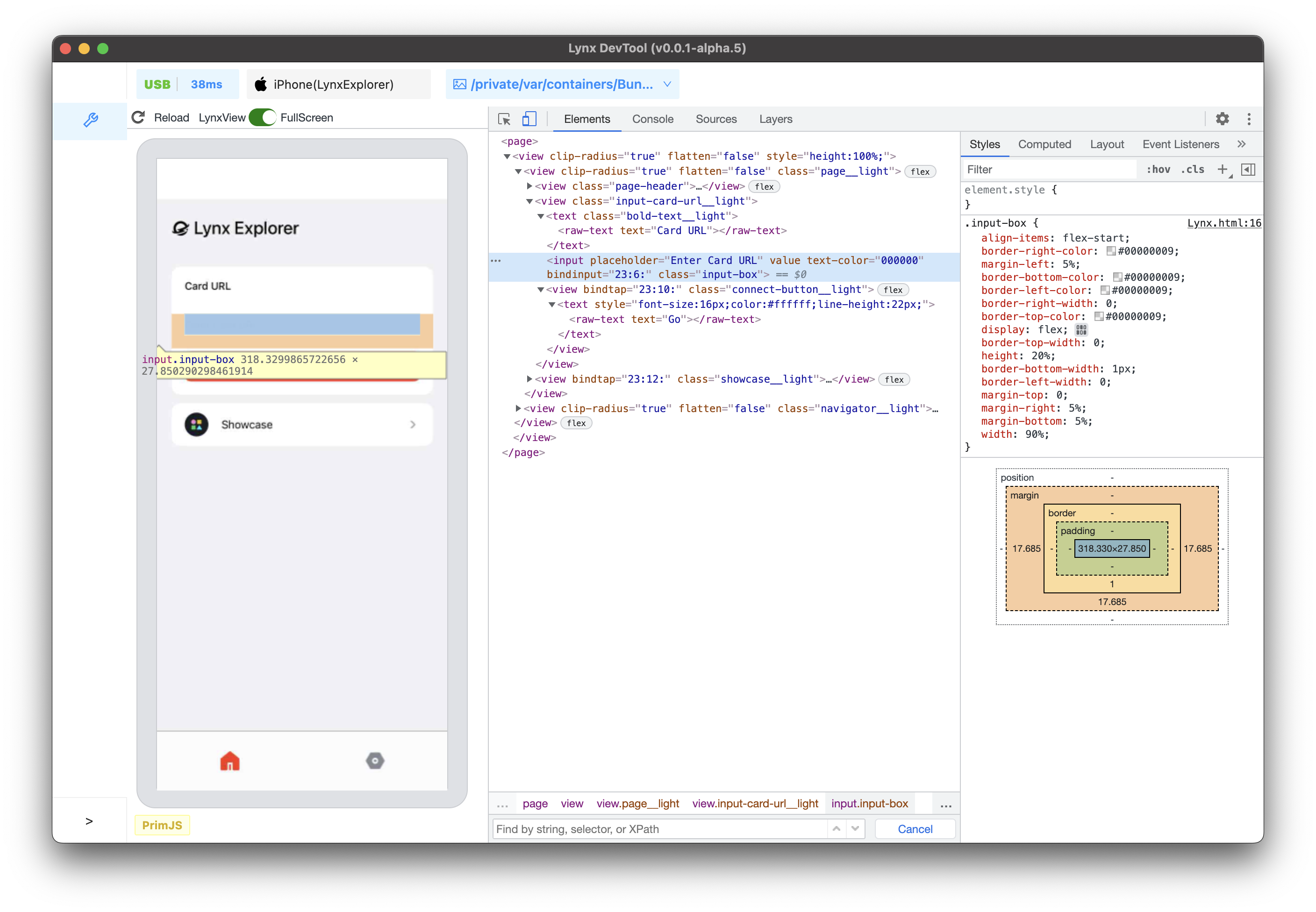
The **Elements** panel allows you to inspect and modify elements.
* [View Element Nodes](/guide/debugging/lynx-devtool/elements-panel.md#view-dom-nodes)
* [Edit the Element](/guide/debugging/lynx-devtool/elements-panel.md#edit-the-dom)
* [View and Change CSS](/guide/debugging/lynx-devtool/elements-panel.md#view-and-change-css)
* [Find Invalid, Overridden, and Other CSS](/guide/debugging/lynx-devtool/elements-panel.md#find-invalid-overridden-and-other-css)
### Console
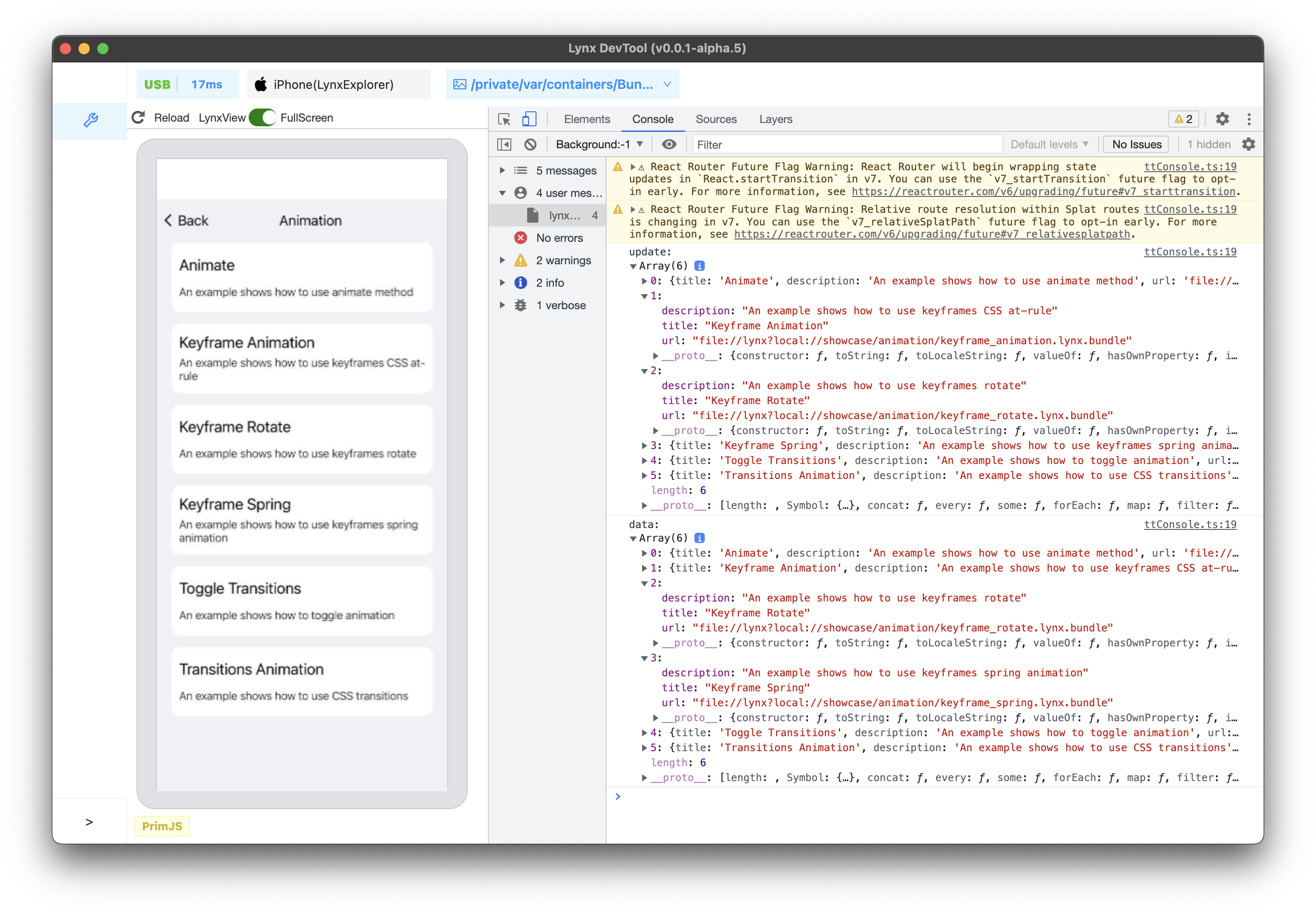
Use the **Console** panel to view logged messages and run JavaScript.
* [View Logged messages](/guide/debugging/lynx-devtool/console-panel.md#view-logged-messages)
* [Run JavaScript](/guide/debugging/lynx-devtool/console-panel.md#run-javascript)
* [Clear the Console](/guide/debugging/lynx-devtool/console-panel.md#clear-the-console)
### Sources
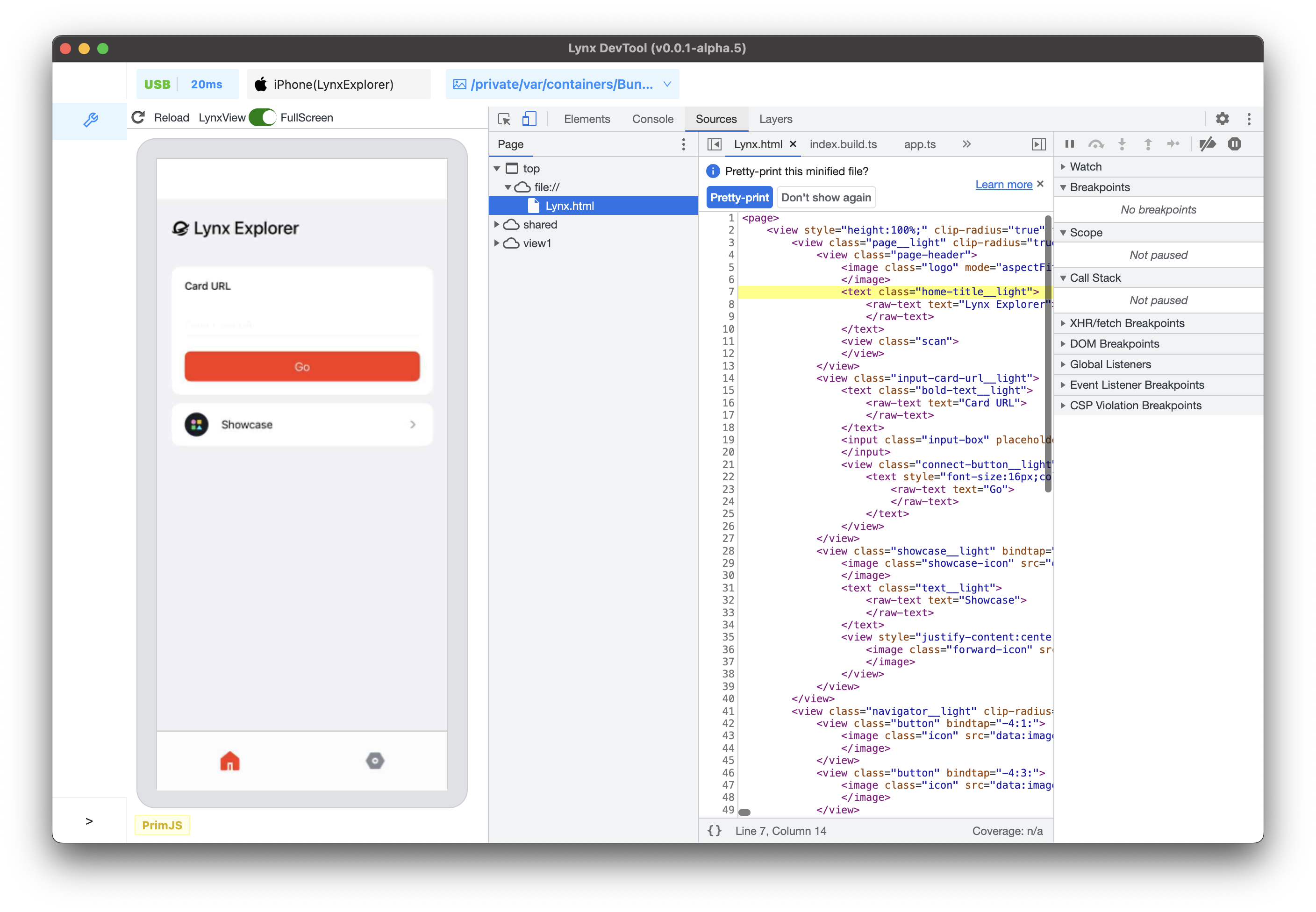
Use the **Sources** panel to debug JavaScript.
* [File Navigation](/guide/debugging/lynx-devtool/sources-panel.md#file-navigation)
* [Pause Code with Breakpoints](/guide/debugging/lynx-devtool/sources-panel.md#pause-code-with-breakpoints)
* [Debug JavaScript](/guide/debugging/lynx-devtool/sources-panel.md#debug-javascript)
* [Debug Original Code with Source Maps](/guide/debugging/lynx-devtool/sources-panel.md#debug-original-code-with-source-maps)
* [Debug the Main Thread](/guide/debugging/lynx-devtool/sources-panel.md#debug-the-main-thread)
### Layers
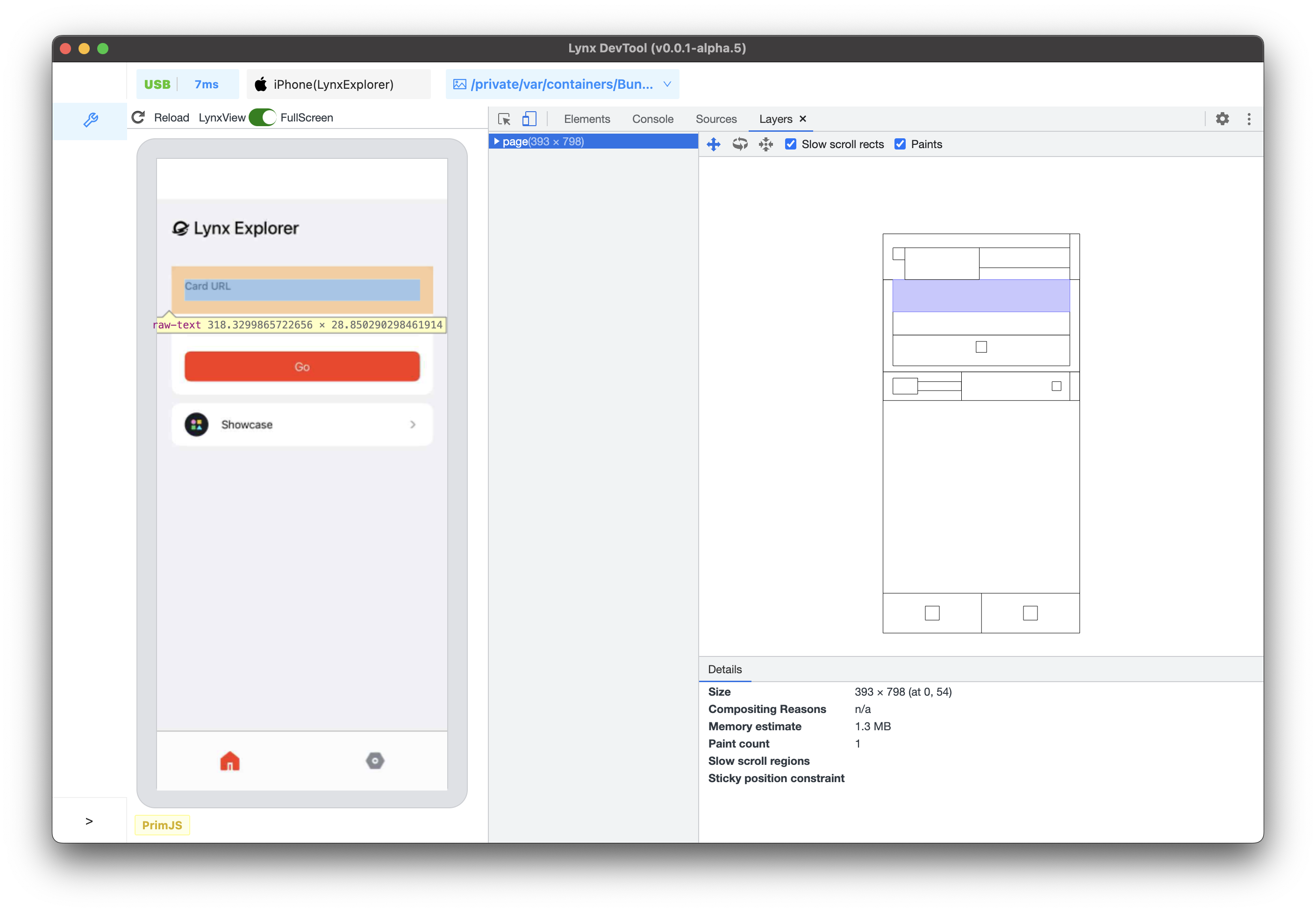
Helps you understand the composition of Lynx pages and how the framework presents content, analyzing its 3D layers to discover rendering issues.
* [View page Layers](/guide/debugging/lynx-devtool/layers-panel.md#view-page-layers)
* [Inspect page Layers](/guide/debugging/lynx-devtool/layers-panel.md#inspect-page-layers)
## Common Issues and Troubleshooting
**Question**: Why can't Lynx DevTool desktop application recognize my debugging device?
**Answer**: Make sure you have connected your development device (e.g., your MacBook) and the device running the Lynx application (e.g., your phone) using a data cable.
For iOS devices, ensure that you have installed Xcode and iOS SDK with matching versions on your development device.
For Android devices, in addition to ensuring a data cable connection, you also need to enable Developer Mode and USB debugging on your Android device:
1. Enable Developer Mode on your Android device - specific steps may vary between devices, please refer to the [Android Developer Documentation](https://developer.android.com/studio/debug/dev-options)
2. Enable "USB Debugging" in the developer options
3. When the device is connected to your computer, an authorization prompt will appear, click "Allow"
You can try launching Xcode or Android Studio to compile and run an application to verify that you can connect to the device properly.
## Provide Feedback
Welcome to experience Lynx DevTool. If you need a hand, please file an issue in [Lynx Issues](https://github.com/lynx-family/lynx-devtool/issues). Thank you!
---
url: /guide/debugging/lynx-devtool/elements-panel.md
---
{`
.full_image {
width: 800px;
margin: 20px;
}
`}
# Elements Panel
The **Elements** panel allows you to inspect and modify element and element tree.
## Overview
The **Elements** panel provides a powerful interface for inspecting and manipulating the element and the element tree. You can select specific element using the element tree and use other tools to make modifications.
The **Elements** panel also includes tabs for the following related tools:
* **Styles**:
* [View and debug](#viewing-and-changing-css) CSS rules applied to an element from all stylesheets.
* Find any [invalid, overridden, or otherwise not working CSS](#invalid-and-declarations-with-invalid-values).
* Modify elements by [adding declarations](#adding-css-declarations-to-an-element), and [interacting with the Box model](#interacting-with-elements-in-the-lynx-page-preview-window-via-the-box-model).
* **Computed**: Lists the resolved properties applied to an element.
### Open the Elements Panel
By default, when you open the Lynx DevTool desktop application and connect to a device to debug Lynx pages, the **Elements** panel will open.
To manually open or switch back to the **Elements** panel from another panel, click on the **Elements** tab in the main panel of the DevTool window.
### Preview Panel
The left side of the **Elements** panel is the Lynx Page Preview Window, showing the Lynx page content for mobile devices in real-time.
#### Introduction to the Preview Panel
As shown in the above figure:
1. Click the reload icon in the upper left corner to refresh the Lynx page.
2. SD/HD toggle switch, adjust current debugging screen mirroring clarity.
3. Switch current screen mirroring mode, there are two modes: LynxView and FullScreen.
* When there are multiple Lynx pages on the current screen, it is recommended to use the LynxView screen mirroring mode, so that you can focus on the currently selected debugging page.
* If the Lynx page has an overlay component (this component is in a separate window and may be outside the LynxView display area), it is recommended to use the FullScreen mode, and the entire screen content of the mobile phone will be captured at this time.
4. The border that separates the Elements panel and the preview window can be dragged to adjust their size.
5. Displays the JS engine used by the current page.
#### Open/Close the Preview Panel
Click on this icon to open/close the preview window.
After closing, it will be displayed as follows:
At this time, if an element that can generate UI is selected in the Elements panel (not all nodes on the element tree will eventually generate platform UI), the Lynx page on the mobile phone will highlight the corresponding element.
## View Element Nodes
### Inspect Nodes
1. Click on the **Inspect** icon in the upper left corner of the developer tools.
2. Click on the logo in the upper left corner of the preview window.
3. Now, the corresponding `` node is highlighted in the element tree.
### Navigate the Element Tree with a keyboard
After selecting a node in the element tree, you can use the keyboard to browse the element tree.
1. After clicking on the **Inspect** icon in the upper left corner of the developer tools, click on the input box in the middle of the Lynx page preview window.
Now, the `` node is selected in the element tree.
2. Press the Up arrow key twice. `` has been selected.
3. Press the left arrow key. All child nodes of `` will be collapsed.
4. Press the left arrow key again, and the parent `` of `` will be selected.
5. Press the Down arrow key twice to reselect the `` node that you just collapsed. The displayed content should be as follows: `...`.
6. Press the right arrow key. At this time, the `` node will be expanded.
## Edit the Element
You can dynamically modify the element and see how these changes affect the Lynx page.
### Edit Content
To modify the content of a node, double-click on the corresponding content in the element tree.
As shown above:
1. After clicking on the **Inspect** icon, click on the text **Lynx Explorer** in the Lynx page preview window. Now the `...` node is selected in the element tree.
2. Press the right arrow key on the keyboard to expand the `...` node.
3. Press the down arrow key on the keyboard, and the `` node is selected in the element tree.
4. Double-click on the **Lynx Explorer** on ``.
5. Modify the content to **Hello world**.
6. Press the Enter key, and you can see that the text change has taken effect both in the element tree and on the left preview window.
### Edit Attributes
To modify attributes, double-click on the attribute name or value. Follow the instructions below to learn how to modify the style attribute of a node.
1. Select the `` node in the element tree that you want to modify.
2. Double-click on the part that displays `style="height:100px;"`, and the text will be highlighted.
3. Modify the **style** content to `style="width:70%;height:100px;"`.
4. Press the Enter key, and you can see that the width change of the view has taken effect both in the element tree and on the left preview window.
## View and Change CSS
### View CSS for an Element
1. Click on the **Inspect** icon, and click on the text **Lynx Explorer** in the preview window.
2. The `...` node is selected in the element tree.
3. At this time, you can see that the **Styles** tab shows all the styles applied to the currently selected node.
4. Switch to the **Computed** tab in the upper tab bar, and you can see the box model of the selected node, as well as all the resolved styles finally applied to the node.
### Add CSS Declarations to an Element
If you want to change or add CSS declarations to an element, use the **Styles** tab.
1. Selected `...` in the element tree.
2. On the right side of the **Styles** tab, click on the top `element.style`.
3. After clicking, enter the property name `border` and press the Enter key. A second input box will pop up, enter `black 20px`.
4. Press the Enter key again. At this time, whether it is the UI effect on the preview window or the element tree, the style change has taken effect.
{' '}
### Interact with Elements in the Lynx Page preview window via the Box Model
1. Click on the **Inspect** icon, and hover over the Go button in the preview window.
2. At this time, you can see that all the box models are highlighted in the left preview window, from the inside to the outside are **content-box**/ **padding-box** / **border-box** / **margin-box**.
3. Click Go button, then corresponding `...` node is selected in the element tree.
4. Click on the box model in the **Styles** tab on the right side, and click one by one from the inside to the outside, you can see that the left preview window is highlighted one by one in turn. Using content-box as an example, as shown in the image below:
## Find Invalid, Overridden, and Other CSS
### Check the CSS You Wrote
Suppose you added some CSS to an element and want to make sure the new styles are applied correctly. When you refresh the page, the element looks the same as before. Something went wrong.
The first thing to do is to inspect the element and make sure the new CSS is actually applied to the element.
Sometimes, you will see the new CSS in the **Elements** > **Styles** pane, but the new CSS appears as faded text, cannot be modified, is crossed out, or a warning or hint icon is displayed next to it.
### Understand CSS in the **Styles** Pane
The Styles pane can identify various CSS issues and highlight them in different ways.
#### Invalid and Declarations with Invalid Values
The **Styles** pane will cross out the following and display a warning icon next to the following:
* When the CSS property is invalid or unknown, the entire CSS declaration (property and value).
* When the CSS property is valid but the value is invalid, the entire CSS declaration (property and value).
#### Overridden
The **Styles** pane will cross out properties that are overridden by other properties according to the cascade order.
In this example, the `color:red;` style property on the element will override the `color:linear-gradient(120deg,#0095ff 30%,#42d392 100%);` on the `.banner.title` class.
#### Inherited and Non-Inherited
The **Styles** pane will list properties in the `Inherited from ` section based on the default inheritance relationship of the property:
* Inherited content will be shown in regular text by default.
* Non-inherited content will be shown in light text by default.
---
url: /guide/debugging/lynx-devtool/console-panel.md
---
{`
.inline-content {
display: flex;
align-items: center;
flex-wrap: wrap;
}
.inline-content img {
margin: 0 5px;
height: 2rem;
}
.margin {
margin-top: 1rem;
margin-bottom: 1rem;
}
.margin2 {
margin-top: 0.5rem;
}
`}
# Console Panel
## Overview
Use the **Console** panel to [view logged messages](#view-logged-messages) and [run JavaScript](#run-javascript). Before you start debugging, please take some time to familiarize yourself with the [Lynx JavaScript Runtime](/guide/scripting-runtime/index.md#javascript-runtime).
### Open the Console Panel
The Console can be opened as a panel or as a tab in the Drawer.
#### Open in the Drawer
If you want to view the Console panel while using other panels, you can open the Console in the Drawer.
Please refer to [Open the Console in the Drawer | Chrome DevTools](https://developer.chrome.com/docs/devtools/console/reference#drawer).
### Console Settings
Click **Console Settings**
in the top-right corner of the **Console** panel.
The following links explain each setting:
* [Selected context only](#filter-messages-from-different-contexts)
* [Group similar messages in console](#disable-message-grouping)
* [Eager evaluation](#disable-eager-evaluation)
* [Autocomplete from history](#disable-autocomplete-from-history)
### Console Sidebar
Please refer to [Open the Console Sidebar | Chrome DevTools](https://developer.chrome.com/docs/devtools/console/reference#sidebar).
## View Logged messages
The types of logs currently can be viewed include:
1. **JavaScript logs**. Including the main thread and the background thread.
* By default, logs from the background thread are displayed in full format, while logs from the main thread are serialized as strings with the `[main-thread.js]` prefix.
* When [Main Thread Debugging](/en/guide/debugging/lynx-devtool/sources-panel.md#debug-the-main-thread) is enabled, logs from the main thread will also be displayed in full format.
2. **Some client logs**.
Currently, client runtime errors and some other client logs are serialized as strings and displayed in the Console panel.
### Log Sources
For JavaScript logs, the `App.tsx:11` on the right side of the log represents where it logged. Clicking it will open the [Sources](/en/guide/debugging/lynx-devtool/sources-panel.md) panel and highlight the line of code that caused the message to get logged to the Console.
### Disable Message Grouping
DevTool enables **Group similar messages in console** by default, which aggregates similar messages logged consecutively.
Open [Console Settings](#console-settings) and disable this option to expand the logs that were originally grouped.
### View Stack Traces
For JavaScript errors and warnings, click **Expand**
to view the stack trace.
### Filter messages
#### Filter by Log Level
Please refer to [Filter by log level | Chrome DevTools](https://developer.chrome.com/docs/devtools/console/reference#level).
:::tip
When the sidebar is open, you cannot click the log level drop-down.
:::
#### Filter by Text
Please refer to [Filter by text | Chrome DevTools](https://developer.chrome.com/docs/devtools/console/log#text).
#### Filter by Regular Expressions
Please refer to [Filter by regular expression | Chrome DevTools](https://developer.chrome.com/docs/devtools/console/log#regex).
#### Filter by URL
Please refer to [Filter messages by URL | Chrome DevTools](https://developer.chrome.com/docs/devtools/console/reference#url).
#### Filter Messages from Different [Contexts](/guide/spec.md#scripting-runtime-enviroment①)
By default, all logs are displayed within the context of the background thread. When [Main thread debugging](/en/guide/debugging/lynx-devtool/sources-panel.md#debug-the-main-thread) is enabled, an additional context of the main thread will be added.
As shown in the figure, `Background:-1` represents the background thread, and `Main` represents the main thread.
When you [run JavaScript in the Console](#run-javascript), it will execute only within the currently selected context.
Open [Console Settings](#console-settings) and enable **Selected context only** checkbox to display logs only from the currently selected context.
### Search for Text
Please refer to [Search for text in logs | Chrome DevTools](https://developer.chrome.com/docs/devtools/console/reference#search).
## Run JavaScript
The Console is a **REPL**, which stands for "Read, Evaluate, Print, and Loop." It reads the JavaScript you enter, evaluates your code, outputs the result of the expression, and then loops back to the first step.
You can enter expressions related to the current page in the Console, such as `this`.
You can also enter expressions unrelated to the current page, such as `1+2`.
Press Enter to get the result, and the Console will output the result of the expression below the code.
### String Copy Options
Please refer to [String copy options | Chrome DevTools](https://developer.chrome.com/docs/devtools/console/reference#string-copy-options).
For example, in this case, the results of copying are as follows:
```javascript
{"a":123,"b":"string"}
'{"a":123,"b":"string"}'
"{\"a\":123,\"b\":\"string\"}"
```
### Re-run Expressions from History
Please refer to [Re-run expressions from history | Chrome DevTools](https://developer.chrome.com/docs/devtools/console/reference#history).
### Watch Expression Values in Real-Time
Please refer to [Watch JavaScript values in real time with Live Expressions | Chrome DevTools](https://developer.chrome.com/docs/devtools/console/live-expressions).
### Disable Eager Evaluation
Please refer to [Disable Eager Evaluation | Chrome DevTools](https://developer.chrome.com/docs/devtools/console/reference#eagereval).
### Disable Autocomplete from History
Please refer to [Disable autocomplete from history | Chrome DevTools](https://developer.chrome.com/docs/devtools/console/reference#autocomplete).
## Clear the Console
You can use any of the following workflows to clear the Console:
*
Click **Clear Console**
.
* Right-click a log and select **Clear Console**.
* When the Console is in focus, press Control+L or Command+K.
---
url: /guide/debugging/lynx-devtool/sources-panel.md
---
{`
.inline-content {
display: flex;
align-items: center;
flex-wrap: wrap;
}
.inline-content img {
margin: 0 5px;
height: 2rem;
}
.margin {
margin-top: 1rem;
margin-bottom: 1rem;
}
.margin2 {
margin-top: 0.5rem;
}
`}
# Sources Panel
Use the **Sources** panel to debug JavaScript. Before you start debugging, please take some time to familiarize yourself with the [Lynx JavaScript Runtime](/guide/scripting-runtime/index.md#javascript-runtime).
After DevTool is enabled, the background thread uses the PrimJS engine for debugging by default. On Android, you can also switch to the V8 engine for a more comprehensive debugging experience.
To switch to the V8 engine, open the [DevTool Switch Page](/guide/start/integrate-lynx-devtool-advanced.md#debugging-devtool-switch), toggle the "**V8 Engine**" switch to "**On**" and restart the application. You can check the current engine type in the lower-left corner of the [Preview Window](/guide/debugging/lynx-devtool/elements-panel.md#introduction-to-the-preview-panel).
## Overview
The **Sources** panel has three sections:
1. **File Navigation Pane**. All JavaScript files of the page are listed here.
2. **Code Editor Pane**. After selecting a file in the **File Navigation Pane**, the contents of the file are displayed here.
3. **Debugger Pane**. Various tools for inspecting the page's JavaScript.
## File Navigation
### Open File
You can use the **File Navigation Pane** or the **Open file** feature to open the file of interest.
Click **More Options**
and select **Open file**. A dialog will display.
You can enter the file URL here or select a file from the drop-down list.
The bottom status bar of the **Code Editor Pane** will display the line and column number of the current mouse position.
Click **Show navigator**
button to collapse/expand the **File Navigation Pane**.
### Close File
You can close a file in the following ways:
* Hover the mouse over the file name tab at the top of the **Code Editor Pane** and click the **close** button.
* Right-click the file name tab at the top of the **Code Editor Pane**:
* Close: Close the current file.
* Close others: Close other files.
* Close all: Close all files.
### Locate File
To locate the file currently displayed in the **Code Editor Pane**:
1. Right-click anywhere in the **Code Editor Pane** or right-click the file name tab at the top of the **Code Editor Pane**.
2. Select **Reveal in sidebar**.
### Search Code
To search a code segment:
1. Click **Customize And Control DevTools**
\> **Search** to open the **Search** panel.
2. Enter text and press Enter to search.
3. Click search results to jump to the corresponding file and the code will be highlighted.
You can also:
* Click **Match Case**
to make the query case-sensitive.
* Click **Use Regular Expression**
to search using a RegEx.
* Click **Refresh**
to search again.
* Click **Clear**
to clear the input contents.
## Pause Code with Breakpoints
By adding breakpoints, you can pause the code execution and inspect all relevant values at that moment.
Currently supported breakpoint types are as follows:
| Type | Description |
| :---------------------------------------------------------------: | ----------------------------------------------------------------------------- |
| [Line-of-code](#line-of-code-breakpoints) | Pause on an exact region of code. |
| [Conditional line-of-code](#conditional-line-of-code-breakpoints) | Pause on an exact region of code, but only when some other condition is true. |
| [Logpoint](#log-line-of-code-breakpoints) | Log a message to the Console without pausing the execution. |
| [First line](#first-line-breakpoints) | Pause on the first line of every executed JavaScript file. |
| [Exception](#exception-breakpoints) | Pause on the line of code that is throwing a caught or uncaught exception. |
### Line-of-Code Breakpoints
Please refer to [Line-of-code breakpoints | Chrome DevTools](https://developer.chrome.com/docs/devtools/javascript/breakpoints#loc).
#### Line-of-Code Breakpoints in Code
Please refer to [Line-of-code breakpoints in your code | Chrome DevTools](https://developer.chrome.com/docs/devtools/javascript/breakpoints#debugger).
#### Conditional Line-of-Code Breakpoints
Please refer to [Conditional line-of-code breakpoints | Chrome DevTools](https://developer.chrome.com/docs/devtools/javascript/breakpoints#conditional-loc).
#### Log Line-of-Code breakpoints
Please refer to [Log line-of-code breakpoints | Chrome DevTools](https://developer.chrome.com/docs/devtools/javascript/breakpoints#log-loc).
#### Manage Line-of-Code Breakpoints
Right-click the breakpoint icon or use the **Breakpoints** pane to manage line-of-code breakpoints.
* Right-click the breakpoint icon and select **Edit breakpoint** to edit it. You can also change its type from the drop-down list in the inline editor.
* Click the breakpoint icon again to delete the breakpoint.
* In the **Breakpoints** pane, click the checkbox next to the breakpoint entry to enable or disable the breakpoint. When disabled, the marker next to the line number will become transparent.
* Right-click the breakpoint icon to see the options menu:
* Remove breakpoint.
* Edit breakpoint.
* Disable/Enable breakpoint.
* Right-click the breakpoint entry in the **Breakpoints** pane to see the options menu:
* Remove breakpoint.
* Reveal location.
* Deactivate/Activate breakpoints.
You can also use **Deactivate breakpoints**
button to deactivate breakpoints.
When breakpoints are deactivated, DevTool will ignore all line-of-code
breakpoints, and they will not be triggered. All breakpoints will remain in
the same state after being reactivated.
* Disable/Enable all breakpoints.
* Disable/Enable breakpoints in file.
* Remove all breakpoints.
* Remove other breakpoints.
#### Skip Breakpoints with 'Never Pause Here' Background V8 Only
Please refer to [Skip breakpoints with 'Never pause here' | Chrome DevTools](https://developer.chrome.com/docs/devtools/javascript/breakpoints#never-pause-here).
### First-Line Breakpoints Background Only
Use first-line breakpoints to pause at the entry of every executed JavaScript file.
Hover your mouse over the position shown in the image, then enable **First-Line Breakpoints**. This is a non-persistent global switch that takes effect for all pages during a single APP run. The switch state will be reset after closing and restarting the APP.
You can debug first-line breakpoints in two ways:
1. Turn on the switch, then open the page you want to debug.
2. Open the page you want to debug, turn on the switch, and then [reload](/en/guide/debugging/lynx-devtool/elements-panel.md#introduction-to-the-preview-panel) the page.
### Exception Breakpoints
Use exception breakpoints when you want to pause on the line of code that's throwing a caught or uncaught exception.
1. In the **Breakpoints** pane, click the **Pause on exceptions** button, which turns blue when enabled.
2. By default, it only pause on uncaught exceptions. If you also want to pause on caught exceptions, check the **Pause On Caught Exceptions** checkbox.
:::warning
Currently, the PrimJS engine does not distinguish between caught and uncaught
exceptions, and all exceptions will cause a pause. In contrast, the V8 engine
distinguishes between caught and uncaught exceptions.
:::
## Debug JavaScript
By default, you can only debug the background thread. If you need to debug the main thread, please refer to the section [Debug the Main Thread](#debug-the-main-thread).
### Step Through Code
Once your code is paused, step through it, one expression at a time, investigating control flow and property values along the way.
#### Step Over
Please refer to [Step over line of code | Chrome DevTools](https://developer.chrome.com/docs/devtools/javascript/reference#step-over).
#### Step Into
Please refer to [Step into line of code | Chrome DevTools](https://developer.chrome.com/docs/devtools/javascript/reference#step-into).
#### Step Out
Please refer to [Step out of line of code | Chrome DevTools](https://developer.chrome.com/docs/devtools/javascript/reference#step-out).
#### Run All Code Up to a Certain Line Background V8 Only
Please refer to [Run all code up to a certain line | Chrome DevTools](https://developer.chrome.com/docs/devtools/javascript/reference#continue-to-here).
#### Resume
Please refer to [Resume script execution | Chrome DevTools](https://developer.chrome.com/docs/devtools/javascript/reference#resume).
##### Terminate Execution Background V8 Only
To stop your script's execution after a pause, click and hold the **Resume** button and then select **Terminate script execution** button.
For example, in this case, select **Terminate script execution**, DevTool will
stop executing the script, the rest of the code in `add` will not be executed,
and you will see that the value of `count` will not change.
### View and Edit Properties
Please refer to [View and edit local, closure, and global properties | Chrome DevTools](https://developer.chrome.com/docs/devtools/javascript/reference#scope).
### View the Current Call Stack
When paused on a line of code, you can use the **Call Stack** pane to view the call stack that got you to this point.
Select an entry in the pane to jump to the line of code where the function was called. A blue arrow icon represents the currently highlighted code.
#### Copy Stack Trace
Right-click anywhere in the **Call Stack** pane and select **Copy stack trace** to copy the current call stack to the clipboard.
For example, in this case, the copied stack trace is as follows:
```
add (App.tsx:11)
publishEvent (tt.js:148)
```
### Ignore Scripts Background V8 Only
Ignore certain scripts during debugging to skip them. When ignored, scripts will be hidden in the **Call stack** pane, and you will never step into functions from ignored scripts while stepping through code.
#### Ignore a Script from the Editor Pane
Please refer to [Ignore a script from the Editor pane | Chrome DevTools](https://developer.chrome.com/docs/devtools/javascript/reference#editor-ignore-list).
#### Ignore a Script from the Call Stack Pane
Please refer to [Ignore a script from the Call Stack pane | Chrome DevTools](https://developer.chrome.com/docs/devtools/javascript/reference#call-stack-ignore-list).
#### Show ignore-listed frames
If you need to view the complete call stack, click **Show ignore-listed frames** in the **Call Stack** pane. The ignored frames will be expanded but displayed in gray.
#### Unignore Scripts
To unignore scripts, follow the same steps as above and select **Remove from ignore list**.
You can also unignore scripts through the prompt at the top of the **Code Editor Pane**.
### Watch the Values of Custom JavaScript Expressions
Please refer to [Watch the values of custom JavaScript expressions | Chrome DevTools](https://developer.chrome.com/docs/devtools/javascript/reference#watch).
### Inspect and Edit Scripts
In the **Code Editor Pane**, you can browse and edit code.
#### Make Minified Files Readable
Click the `{}` button in the bottom status bar of the editor, and the **Sources** panel will present the minified file in a more readable format to improve readability.
#### Edit Scripts Background V8 Only
Please refer to [Edit a script | Chrome DevTools](https://developer.chrome.com/docs/devtools/javascript/reference#edit).
:::warning
You can only modify compiled JavaScript files. The original files reversed through SourceMap cannot be modified, and changes will not be saved after reloading the page.
:::
#### Search and Replace Text in Scripts
Please refer to [Search and replace text in a script | Chrome DevTools](https://developer.chrome.com/docs/devtools/javascript/reference#search).
After replacing, you need to manually save the script, as referenced in [Edit Scripts](#edit-scripts).
## Debug Original Code with Source Maps Background Only
After [configuring SourceMap](/api/rspeedy/rspeedy.output.sourcemap.md), you can directly debug the original code you author in the Sources panel.
### Check If Source Maps Loaded Successfully
#### Check Load Status
When you open DevTool, it attempts to load source maps, if any.
After loading successfully, the files in the **File Navigator Pane** with orange folders are the original source files.
If loading fails, the **Console** logs an error similar to the following.
When you open any compiled file, DevTool will notify you if it found the source map.
#### Load a Source Map Manually
You can manually load a source map:
1. Open the compiled file, right-click anywhere in the **Code Editor Pane**, and select **Add source map**.
2. Enter the source map URL in the textbox, then click **Add**.
### Debug with Source Maps
1. In the original file, you can [set breakpoints](#pause-code-with-breakpoints) as you normally would, or you can set breakpoints in the compiled file, and DevTool will automatically jump to the original file.
2. After triggering a breakpoint and pausing, the **Call Stack** pane will display the name of the original file.
3. The bottom status bar of the **Code Editor Pane** will show a link to the compiled file it points to. Click it to jump to the corresponding file.
## Debug the Main Thread
Debugging the main thread is similar to debugging the background thread, but it requires some additional steps to enable.
### Preparation
To debug the main thread, you need to start the project in **dev** mode using rspeedy.
You can check the following two items to ensure preparation is done:
1. A `debug-info.json` file is generated in the [intermediate output directory](/api/rspeedy/rspeedy.distpath.intermediate.md).
2. In the `tasm.json` file of the [intermediate output directory](/api/rspeedy/rspeedy.distpath.intermediate.md), the `templateDebugUrl` field is a valid URL pointing to the `debug-info.json` file mentioned in step one. Refer to [rspeedy.dev.assetprefix](/api/rspeedy/rspeedy.dev.assetprefix.md).
### Enable Main Thread Debugging
Hover over the position shown in the image below, then enable **Main Thread Debugging**. This is a non-persistent global switch that takes effect for all pages during a single APP run. The switch state will be reset after closing and restarting the APP.
To enable main thread debugging:
1. Turn on the switch, then open the page you want to debug. Or open the page you want to debug, turn on the switch, and then [reload](/en/guide/debugging/lynx-devtool/elements-panel.md#introduction-to-the-preview-panel) the page.
2. The `main-thread.js` file of the main thread will be displayed in the **File Navigator Pane** (formerly known as `lepus.js`).
3. In the **Threads** pane, switch to **Main** to start debugging.
In the **Threads** pane, you can switch between debugging the main thread or the background thread. The blue arrow icon represents which context is selected. The currently paused thread will be marked as **paused**.
---
url: /guide/debugging/lynx-devtool/layers-panel.md
---
{`
.full_image {
width: 800px;
margin: 20px;
}
`}
# Layers Panel
The **Layers** panel helps you understand the composition of Lynx pages and how the framework presents content, analyzing its 3D layers to discover rendering issues.
## Overview
Use the **Layers** panel to perform the following operations:
* View page layers
* Inspect page layers
### Open the Layers Panel
To open the Layers panel, follow these steps:
1. Press **Command+Shift+P** to open the command menu.
2. Start typing **Layers**, select **Show Layers**, and then press **Enter**.
Or, select the More options in the upper right corner -> **More tools** -> **Layers**.
## View page Layers
The leftmost part of the **Layers** panel lists all the rendered layers of the Lynx page in an expandable tree. This tree structure is updated as the mobile **Lynx** page is updated. Layers are identified by their **CSS** selector or a number (followed by the layer size in pixels).
Hover the mouse over a layer to highlight it on the Lynx page preview window. A tooltip will be displayed on the page preview, which contains the following information:
* The selector of the layer
* The size of the layer (in pixels)
## Inspect page Layers
Click on a layer to view more information in the **Details** pane.
Depending on the layer, the following information will be displayed:
* Size
* Compositing reason
* Memory estimate
* Number of draws
The following figure shows the stacking and arrangement of the layers of this **Lynx** page.
To move the chart, do the following:
* Use **WASD** to move the chart. Press W to pan up, A to pan left, S to pan down, and D to pan right.
* Click the **Pan Mode** icon to move along the X and Y axes.
* Click the **Rotate Mode** icon to rotate along the Z axis.
* Click **Reset Transform** to reset the chart to its original position.
* Scroll the mouse wheel up to zoom in.
* Scroll the mouse wheel down to zoom out.
To view the element corresponding to the layer in the **Elements** panel, right-click on the corresponding layer in the chart or layer tree, and then click **Reveal in Elements panel**.
---
url: /guide/debugging/handle-errors.md
---
# Handle Errors in Lynx
## Recognize Errors in Tools
When you are developing Lynx apps, you may encounter various types of errors that are designed to notify you the unexpected situations that have just happened.
For example, if the bundle file is broken, you'll see:
Also, sometimes when your JavaScript code contains an TypeError:
Sometimes, a [native module](/guide/spec.md#nativemodules) is called with a wrong number of arguments:
With DevTool or LogBox, you shall easily recognize them.
## LogBox
You've already seen it above - the in-app tool that displays errors.
It's convenient for a quick overview and lets you know what's happening.
However, for development purposes, we recommend using DevTool Desktop Application with more features and a better interactive experience.
## Handle Errors in Code
Now let's try to do something with the errors.
You may want to have an overall understanding of the [errors](/api/errors/lynx-error.md) first if you want to handle them in your code.
And then, here is an example of handling error [301](/api/errors/error-code.md#eb_resource_image-301) in code:
```tsx
const ImageErrorExample = () => {
const [isImageError, setImageError] = useState(false);
const handleImageError = (event: ErrorEvent) => {
setImageError(true);
console.log('Image loaded error:', JSON.stringify(event));
};
if (isImageError) {
return ;
}
return (
);
};
```
In order for developers to quickly categorize an error and figure out how to deal with it, we have summed up all of them and made a [list](/api/errors/error-code.md), including the error code, description, level, fix suggestion, etc.
Just help yourself!
---
url: /guide/performance.md
---
# Performance
## What is Performance
The topic of performance aims to discuss the issue of how to make Lynx pages faster. Performance optimization focuses on improving Lynx page speed through two core
objectives: maximizing runtime efficiency and ensuring a fluid user experience. It revolves around two core dimensions: **User Perceived Performance** and
**Application Runtime Performance**.
### User Perceived Performance
User Perceived Performance (UPP) quantifies users’ subjective judgment of a page’s responsiveness, including loading speed and interaction latency. As the primary
driver of user retention, UPP directly reflects how users experience application performance.
When network latency or insufficient system resources delay page rendering, users may abandon the page if no feedback mechanism (e.g., loading indicators) confirms ongoing progress.
To address this, displaying loading animations, progress bars, or other visual components can maintain user engagement. These elements reassure users that the
application is still functioning smoothly during the wait, thereby reducing bounce rates.
Improving user-perceived performance is highly beneficial for increasing user retention. However, since user perceived performance is subjective, accurately measuring it
can be challenging and complex. The [Performance API](/api/lynx-api/performance-api.md) provides metrics to help evaluate user-perceived performance. For more details,
refer to the [Evaluating User Perceived Performance](/guide/performance/evaluating-performance.md#evaluating-user-perceived-performance).
### Application Runtime Performance
Application Runtime Performance (ARP) measures quantifiable metrics for page loading and rendering speeds, forming the technical basis for user experience. ARP tracks
time spent in critical stages (e.g., initialization, resource loading) and directly determines how quickly content becomes visible.
Suboptimal ARP manifests as prolonged resource loading or rendering delays, resulting in extended wait time before content becomes interactive. Pages that load slowly
or are unresponsive can lead users to abandon further browsing.
ARP Analysis identifies bottlenecks by profiling time spent in key stages (initialization, resource loading, rendering pipelines). Developers can then implement
optimizations such as resource preloading, incremental data streaming, or task scheduling logic refinements to enhance runtime efficiency. For more details, refer to the
[Evaluating Application Runtime Performance](/guide/performance/evaluating-performance.md#evaluating-application-runtime-performance).
---
url: /guide/performance/evaluating-performance.md
---
# Evaluating Performane
The performance of the Lynx page can determine users' perceptions of your application. Lynx provides the [Performance API](/api/lynx-api/performance-api.md)
to help you monitor the status of the page and accurately measure its performance during operation.
## Evaluating User Perceived Performance
It is critical to understand that **User Perceived Performance (UPP)** reflects users' subjective experience of page responsiveness. When opening a page, users typically expect
immediate content visibility rather than waiting through a blank screen. To enhance this perception, two fundamental principles apply: **Show Content Early** and **Quick Response**.
* Show Content Early: While loading a page, prioritize displaying partial content (e.g., skeleton screens, loading animations) instead of waiting for full data readiness.
This reduces perceived wait time by providing immediate visual feedback.
* Quick Response: When user actions trigger operations that take time (such as searching or image processing), display a loading animation immediately. Although
this doesn't change the actual completion time, it gives users the impression that the page responded timely to their actions.
These principles reduce user abandonment caused by perceived unresponsiveness. However, since UPP involves complex subjective experiences, it's challenging to rely on a single
metric for evaluation. Instead, a comprehensive assessment using multiple metrics provided by the [Performance API](/api/lynx-api/performance-api.md) is necessary:
* [First Contentful Paint (FCP)](/api/lynx-api/performance-api/performance-entry/metric-fcp-entry.md): Time to first content rendering completion.
* [Actual First Meaningful Paint (ActualFMP)](/api/lynx-api/performance-api/performance-entry/metric-actual-fmp-entry.md): Time to rendering of truly meaningful content.
Based on the aforementioned metrics, if a page can immediately display primary content after loading (LoadBundle) without requiring additional data fetches to render,
prioritize optimizing *FCP*.

Conversely, if page rendering depends on additional data — such as asynchronous fetches via network requests or local file reads — to achieve "actual" content display,
you can [mark the Lynx pipeline](/guide/performance/timing-flag.md) to track this critical data update. By annotating the [Lynx Pipeline](/guide/spec.md#lynx-pipeline), developers can track critical data
updates and measure the resulting *ActualFMP*. Unlike scenarios without data dependencies, FCP in such cases may only show non-meaningful UI states (e.g., loading animations or skeleton screens).

This highlights a conflict: rendering real data requires additional processing time, which contradicts the goal of improving UPP. To optimize perceived performance,
prioritize static or preloaded content for the initial screen, while deferring network-dependent content to subsequent updates. Although this approach may
increases total data transfer, it significantly enhances user perceived performance by rendering meaningful content earlier.
## Evaluating Application Runtime Performance
While perceived speed (UPP) drives user satisfaction, **Application Runtime Performance (ARP)** determines technical efficiency in resource preparation and rendering.
ARP evaluation focuses on two phases: **initialize** and **render**. Both phases dictate how quickly users can interact with the application. Poor performance may
cause users to abandon accessing the page content or even be unable to access the content at all.
### Initialize
From the moment a user clicks a link to the display of a new page, an application needs to complete preparatory tasks, including initializing the page container and
preparing the [TemplateBundle](/guide/spec.md#template-bundle).
The initialization phase includes three key steps: [Container](/guide/spec.md#container) setup, [LynxView](/guide/spec.md#lynxview①)
creation, and [Background Thread Runtime](/guide/spec.md#background-thread-runtime) preparation. The [Performance API](/api/lynx-api/performance-api.md) provides
[`InitContainerEntry`](/api/lynx-api/performance-api/performance-entry/init-container-entry.md), [`InitLynxviewEntry`](/api/lynx-api/performance-api/performance-entry/init-lynxview-entry.md),
and [`InitBackgroundRuntimeEntry`](/api/lynx-api/performance-api/performance-entry/init-background-runtime-entry.md) to describe these key moments. You can
combine these performance entries to analyze the entire initialization phase.

Although these preparations occur before the page rendering, their performance directly impacts the user experience. Slow initialization delays rendering, increasing user
wait time and negatively impacting perceived performance. To minimize loading time as much as possible, you can advance these initialization tasks by using local caching,
preloading TemplateBundle, and pre-creating LynxView, ensuring immediate response.
### Render
The rendering phase begins post-load and directly controls content visibility speed. To manage each step precisely, Lynx uses the Lynx pipeline to divide the rendering
process into several crucial stages. The [Performance API](/api/lynx-api/performance-api.md) provides the
[`PipelineEntry`](/api/lynx-api/performance-api/performance-entry/pipeline-entry.md) interface to record and analyze the specific timing of these stages.
With `PipelineEntry`, you can access detailed timing data during the page rendering process, such as main thread script execution time, style computation time, and layout
computation time. These detailed timing metrics help identify performance bottlenecks, enabling targeted optimization efforts.

Understanding and tracking the actual performance of a page is critical for improving the user experience. By utilizing specific performance metrics, you can identify which
stages are causing delays and implement optimization strategies to ensure users see a complete, interactive page as quickly as possible. This monitoring and optimization can
significantly reduce user waiting time and enhance the overall smoothness of an application.
## Building Custom Performance Metrics
Custom performance metrics align with specific business objectives. Usage of the [Performance API](/api/lynx-api/performance-api.md) is not restricted to analyzing
page performance using built-in metrics. You can flexibly combine key moments of different [`PerformanceEntry`](/api/lynx-api/performance-api/performance-entry.md) to build a set
of performance metrics tailored to your application.
For example, if you want to focus on the delay between the end of the first-frame rendering and the end of the first significant data updates. You can combine
[`LoadBundleEntry`](/api/lynx-api/performance-api/performance-entry/load-bundle-entry.md) and [`PipelineEntry`](/api/lynx-api/performance-api/performance-entry/pipeline-entry.md)
to calculate a new performance metric `waitingDuration` like the following code. This metric can help you monitor the speed of network requests, file reads, and other
behaviors, pinpointing the reasons for deteriorating page performance.
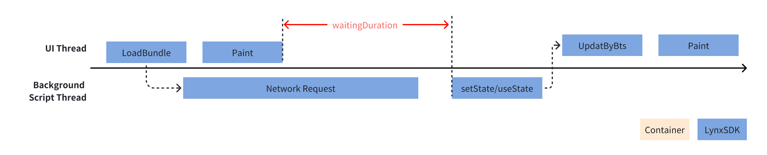
---
url: /guide/performance/timing-flag.md
---
# Marking Lynx Pipeline
The [Lynx Pipeline](/guide/spec.md#lynx-pipeline) defines the complete process from rendering trigger to display on the screen. If you are concerned about the performance of the rendering process for certain key components, you can mark the Lynx Pipeline that renders them by setting the `__lynx_timing_flag` attribute. This allows you to monitor the performance of that specific Lynx Pipeline.
When a marked Lynx Pipeline execution is completed and the screen display is refreshed, a [`PipelineEntry`](/api/lynx-api/performance-api/performance-entry/pipeline-entry.md) performance event is generated. You can retrieve this event using the [`PerformanceObserver`](/api/lynx-api/performance-api/performance-observer.md).
## Usage Rules
* The `__lynx_timing_flag` attribute must be a non-empty string; empty values or invalid types will not trigger the `PerformanceObserver` callback.
* When the value of the `__lynx_timing_flag` attribute is `__lynx_timing_actual_fmp`, an additional [`MetricActualFmpEntry`](/api/lynx-api/performance-api/performance-entry/metric-actual-fmp-entry.md) performance event will be generated.
## Usage Example
1. **Marking the Node**: Set the `__lynx_timing_flag` attribute on the target component. When the node finishes rendering, the framework will automatically collect performance data for its Lynx Pipeline.
2. **Getting Data**: Register an observer using [`lynx.performance.createObserver()`](/api/lynx-api/lynx/lynx-performance.md#createobserver) to obtain relevant performance data (`PipelineEntry`).
## Important Notes
### 1. Multiple Components with Same Timing Flag
```ts
export default function App() {
const [showImage, setShowImage] = useState(false);
useEffect(() => {
setTimeout(() => {
setShowImage(true);
}, 3000);
}, []);
return (
Hello World
{showImage && }
);
}
```
In this case, only the Lynx Pipeline data of the first displayed component will be counted:
1. Calculate the `ActualFMP` metric and send a [`MetricActualFmpEntry`](/api/lynx-api/performance-api/performance-entry/metric-actual-fmp-entry.md).
2. Send a [`PipelineEntry`](/api/lynx-api/performance-api/performance-entry/pipeline-entry.md).
If you want to track the timing of both components completing rendering, using different \_\_lynx\_timing\_flag values.
### 2. Re-rendering Same Component
```ts
export default function App() {
return (
{data.needShow &&
{data.msg}
}
);
}
```
In this case, only the Lynx Pipeline data of the first displayed instance of the component will be counted:
1. Calculate the `ActualFMP` metric and send a [`MetricActualFmpEntry`](/api/lynx-api/performance-api/performance-entry/metric-actual-fmp-entry.md).
2. Send a [`PipelineEntry`](/api/lynx-api/performance-api/performance-entry/pipeline-entry.md).
If you want to perceive the rendering performance of the component with each data update, you can use data-driven flags as follows:
```ts
let isFirst = true;
export default function App(this: any) {
return (
{
// needShow: true -> false -> true
data.needShow ? {data.msg} : null
}
);
}
```
## Compatibility
---
url: /guide/compatibility.md
---
# Compatibility
This article explains how to ensure version compatibility between [Bundle] and [Lynx Engine], and how to handle challenges that come with Lynx Engine version evolution.
## Build from Source
A simple way to ensure compatibility is to **always build the Bundle with the Host application from source**.
* Bundle can fully utilize all features of the current Lynx Engine version
* Compatibility can be fully verified during development, what you see is what you get
## Multi-version Compatibility
However, in a complex project, the relationship between Bundle and Lynx Engine is not one-to-one:
* A Bundle might run in applications with different Lynx Engine versions
* An application can run multiple Bundles maintained by different teams
In this case, you need to set the [`engineVersion`] to ensure compatibility.
:::info Engine Version
When the Bundle's [`engineVersion`] is greater than the Lynx Engine version, it will not be able to run.
:::
For example: a Bundle with [`engineVersion`] 3.3 can run on Lynx Engine 3.3 and later versions, but cannot run on 3.2.
{`
graph TB
subgraph Bundle["🎯 Bundle"]
B10["Engine Version 3.3"]
end
subgraph Engine["⚙️ Lynx Engine"]
E12["Version 3.5"]
E11["Version 3.4"]
E10["Version 3.3"]
E09["Version 3.2"]
end
B10 -.->|❌ Not Supported| E09
B10 ==>|✅ Can Run| E10
B10 ==>|✅ Can Run| E11
B10 ==>|✅ Can Run| E12
%% Node styles
style E12 fill:#2b5a83,stroke:#4a90e2,stroke-width:3px,rx:10px
style E11 fill:#2b5a83,stroke:#4a90e2,stroke-width:3px,rx:10px
style E10 fill:#2b5a83,stroke:#4a90e2,stroke-width:3px,rx:10px
style E09 fill:#2b5a83,stroke:#4a90e2,stroke-width:2px,rx:10px,stroke-dasharray:5,5
style B10 fill:#2d5a1e,stroke:#7ed321,stroke-width:3px,rx:10px
%% Subgraph styles
style Bundle fill:transparent,stroke:#7ed321,stroke-width:2px,rx:10px
style Engine fill:transparent,stroke:#4a90e2,stroke-width:2px,rx:10px
%% Default styles
classDef default fill:#23272f,color:#ccc,font-family:system-ui
%% Connection line label styles
linkStyle default stroke-width:2px
`}
When a Bundle needs to run on multiple Lynx Engine versions, its [`engineVersion`] must be lower than all Lynx Engine versions.
When running multiple Bundles on a single Lynx Engine version, each Bundle can set different [`engineVersion`]s, but none can be greater than the Lynx Engine version.
### Version Incompatibility Handling
If you try to run a Bundle on a lower version of the Lynx Engine, a Fatal level error with code [10204](/api/errors/error-code.md#subcode-10204) will occur, and the rendering process will stop. This mechanism prevents potential runtime issues caused by version incompatibility.
### Configuring Engine Version
The [`engineVersion`] is a string containing two version numbers, and you can specify it in your configuration file:
```js title="lynx.config.js"
import { defineConfig } from '@lynx-js/rspeedy';
import { pluginReactLynx } from '@lynx-js/react-rsbuild-plugin';
export default defineConfig({
plugins: [
pluginReactLynx({
engineVersion: '3.2',
}),
],
});
```
## Upgrading Lynx Engine
As Lynx Engine evolves, new features are added and some features may be deprecated. Their compatibility is also managed by [`engineVersion`].
### New Features
Some new features ***will not*** affect existing Bundles, but if [`engineVersion`] is lower than the version where they were introduced, runtime detection is needed, for example:
```js
// Detect if `lynx.newlyAddedMethod` can be called
if (lynx.newlyAddedMethod) {
lynx.newlyAddedMethod();
}
```
While some new features cannot run on lower versions of the Lynx Engine at all, so they will only be enabled when [`engineVersion`] is greater than or equal to the corresponding version.
### Deprecated Features
Some features may be deprecated during iteration, and their behavior may change when a higher [`engineVersion`] is set.
* If only the Lynx Engine version is upgraded without upgrading the Bundle's [`engineVersion`], there will be no compatibility issues
* If both Lynx Engine and Bundle's [`engineVersion`] are upgraded, you need to read the CHANGELOG to ensure there are no unexpected behavior changes
## Compatibility Table
Lynx provides compatibility tables for each API, built-in component, and CSS property. Here's an example for the [`gap`](/api/css/properties/gap.md) property:
[Bundle]: /guide/spec.md#app-bundle-aka-template-bundle
[Lynx Engine]: /guide/spec.md#engine
[`engineVersion`]: /api/rspeedy/react-rsbuild-plugin.pluginreactlynxoptions.targetsdkversion.md
---
url: /guide/scripting-runtime/index.md
---
# JavaScript Runtime
## JavaScript Runtime
One of biggest features of Lynx is [Dual-Thread Architecture](/guide/spec.md#scripting-facing-threading-abstraction)(read [Thinking in ReactLynx](/react/thinking-in-reactlynx.md) for more information), JavaScript code runs on two threads: the [main thread](/guide/spec.md#main-thread-or-lynx-main-thread) and the [background thread](/guide/spec.md#background-thread-aka-off-main-thread). The two threads use different JavaScript engines as their runtime.
### [Main Thread](/guide/spec.md#main-thread-or-lynx-main-thread)
The Lynx main thread is responsible for handling tasks that directly affect the screen [pixel-pipeline](/guide/spec.md#enginepixeling-the-pixel-pipeline), including executing [main thread scripts](/react/main-thread-script.md), handling layout, and rendering graphics.
The main thread uses [PrimJS](/guide/scripting-runtime/main-thread-runtime.md#primjs), maintained by the Lynx team, as its runtime. PrimJS is a lightweight, high-performance JavaScript engine based on QuickJS, providing excellent runtime performance for the main thread.
### [Background Thread](/guide/spec.md#background-thread-aka-off-main-thread)
As opposed to the main thread, Lynx's background threads handle tasks that do not directly affect the display of screen pixels. This includes scripts and tasks that run in the background, separate from the main thread. This allows the main thread to focus on handling user interaction and rendering, which improves overall performance.
* Android: for a combination of package size and performance considerations, we use [PrimJS](/guide/scripting-runtime/main-thread-runtime.md#primjs) by default
* iOS: we use [JavaScriptCore](https://trac.webkit.org/wiki/JavaScriptCore) by default, unless you need to use the [PrimJS](/guide/scripting-runtime/main-thread-runtime.md#primjs) for debugging
While these environments are very similar, you may end up hitting some inconsistencies. It is best to avoid relying on specifics of any runtime.
## JavaScript Syntax Transformers
The Lynx dual-thread runtime supports the following maximum ECMAScript versions:
* Main thread: [ECMAScript 2019 (ES10)](https://tc39.es/ecma262/2019/)
* Background thread: [ECMAScript 2015 (ES6)](https://262.ecma-international.org/6.0/)
Of course, you can use new JavaScript syntax to write your code. During the build process, [SWC](https://swc.rs/) will be used as Syntax Transformer to transform your code, so you don't have to wait for JavaScript runtime support.
## JavaScript Polyfills
:::info
Only injects polyfills on iOS.
A full list of Lynx's polyfills can be found in [Lynx repository](https://github.com/lynx-family/lynx/blob/develop/js_libraries/lynx-polyfill/src/index.js)
:::
Besides syntax transformers, many built-in objects and standard functions are also available. Including:
### Built-in Objects
* [Map](https://tc39.es/ecma262/#sec-map-constructor)
* [Set](https://tc39.es/ecma262/#sec-set-constructor)
* [WeakMap](https://tc39.es/ecma262/#sec-weakmap-constructor)
* [WeakSet](https://tc39.es/ecma262/#sec-weakset-constructor)
### Array
* [Array.prototype.concat](https://tc39.es/ecma262/#sec-array.prototype.concat)
* [Array.prototype.filter](https://tc39.es/ecma262/#sec-array.prototype.filter)
* [Array.prototype.flat](https://tc39.es/ecma262/#sec-array.prototype.flat)
* [Array.prototype.flatMap](https://tc39.es/ecma262/#sec-array.prototype.flatmap)
* [Array.prototype.includes](https://tc39.es/ecma262/#sec-array.prototype.includes)
* [Array.prototype\[@@iterator\]](https://ts39.es/ecma262/#sec-array.prototype-@@iterator)
* [Array.prototype.map](https://tc39.es/ecma262/#sec-array.prototype.map)
* [Array.prototype.reverse](https://tc39.es/ecma262/#sec-array.prototype.reverse)
* [Array.prototype.slice](https://tc39.es/ecma262/#sec-array.prototype.slice)
* [Array.prototype.sort](https://tc39.es/ecma262/#sec-array.prototype.sort)
* [Array.prototype.species](https://tc39.es/ecma262/#sec-array.prototype.species)
* [Array.prototype.splice](https://tc39.es/ecma262/#sec-array.prototype.splice)
* [Array.prototype\[@@unscopables\].flat](https://ts39.es/ecma262/#sec-array.prototype-@@unscopables)
* [Array.prototype\[@@unscopables\].flatMap](https://ts39.es/ecma262/#sec-array.prototype-@@unscopables)
### ArrayBuffer
* [ArrayBuffer](https://tc39.es/ecma262/#sec-arraybuffer-objects)
* [ArrayBuffer.prototype.slice](https://tc39.es/ecma262/#sec-arraybuffer.prototype.slice)
### Date
* [Date.prototype.toJSON](https://tc39.es/ecma262/#sec-date.prototype.tojson)
* [Date.prototype\[@@toPrimitive\]](https://tc39.es/ecma262/#sec-date.prototype-@@toprimitive)
### Number
* [Number.parseFloat](https://ts39.es/ecma262/#sec-number.parseFloat)
### Object
* [Object.entries](https://tc39.es/ecma262/#sec-object.entries)
* [Object.fromEntries](https://tc39.es/ecma262/#sec-object.fromentries)
* [Object.getOwnPropertyDescriptors](https://tc39.es/ecma262/#sec-object.getownpropertydescriptors)
* [Object.toString](https://tc39.es/ecma262/#sec-object.tostring)
* [Object.values](https://tc39.es/ecma262/#sec-object.values)
### Promise
* [Promise](https://tc39.es/ecma262/#sec-promise-constructor)
* [Promise.all](https://tc39.es/ecma262/#sec-promise.all)
* [Promise.race](https://tc39.es/ecma262/#sec-promise.race)
* [Promise.reject](https://tc39.es/ecma262/#sec-promise.reject)
* [Promise.resolve](https://tc39.es/ecma262/#sec-promise.resolve)
* [Promise.prototype.catch](https://tc39.es/ecma262/#sec-promise.prototype.catch)
* [Promise.prototype.finally](https://tc39.es/ecma262/#sec-promise.prototype.finally)
* [Promise.prototype.then](https://tc39.es/ecma262/#sec-promise.prototype.then)
### Reflect
* [Reflect.apply](https://tc39.es/ecma262/#sec-reflect.apply)
* [Reflect.construct](https://tc39.es/ecma262/#sec-reflect.construct)
* [Reflect.defineProperty](https://tc39.es/ecma262/#sec-reflect.defineproperty)
* [Reflect.deleteProperty](https://tc39.es/ecma262/#sec-reflect.deleteproperty)
* [Reflect.get](https://tc39.es/ecma262/#sec-reflect.get)
* [Reflect.getOwnPropertyDescriptors](https://tc39.es/ecma262/#sec-reflect.getownpropertydescriptor)
* [Reflect.getPrototypeOf](https://tc39.es/ecma262/#sec-reflect.getprototypeof)
* [Reflect.has](https://tc39.es/ecma262/#sec-reflect.has)
* [Reflect.isExtensible](https://tc39.es/ecma262/#sec-reflect.isextensible)
* [Reflect.ownKeys](https://tc39.es/ecma262/#sec-reflect.ownkeys)
* [Reflect.preventExtensions](https://tc39.es/ecma262/#sec-reflect.preventextensions)
* [Reflect.set](https://tc39.es/ecma262/#sec-reflect.set)
* [Reflect.setPrototypeOf](https://tc39.es/ecma262/#sec-reflect.setprototypeof)
### RegExp
* [RegExp](https://ts39.es/ecma262/#sec-regexp-constructor)
* [RegExp.prototype.exec](https://tc39.es/ecma262/#sec-regexp.prototype.exec)
* [RegExp.prototype.sticky](https://tc39.es/ecma262/#sec-regexp.prototype.sticky)
* [RegExp.prototype.test](https://tc39.es/ecma262/#sec-regexp.prototype.test)
* [RegExp.prototype.toString](https://tc39.es/ecma262/#sec-regexp.prototype.tostring)
### String
* [String.prototype.endsWith](https://tc39.es/ecma262/#sec-string.prototype.endswith)
* [String.prototype.includes](https://tc39.es/ecma262/#sec-string.prototype.includes)
* [String.prototype.match](https://tc39.es/ecma262/#sec-string.prototype.match)
* [String.prototype.matchAll](https://tc39.es/ecma262/#sec-string.prototype.matchall)
* [String.prototype.padEnd](https://tc39.es/ecma262/#sec-string.prototype.padend)
* [String.prototype.padStart](https://tc39.es/ecma262/#sec-string.prototype.padstart)
* [String.prototype.replace](https://tc39.es/ecma262/#sec-string.prototype.replace)
* [String.prototype.search](https://tc39.es/ecma262/#sec-string.prototype.search)
* [String.prototype.split](https://tc39.es/ecma262/#sec-string.prototype.split)
* [String.prototype.startsWith](https://tc39.es/ecma262/#sec-string.prototype.startswith)
* [String.prototype.trim](https://tc39.es/ecma262/#sec-string.prototype.trim)
* [String.prototype.trimEnd](https://tc39.es/ecma262/#sec-string.prototype.trimend)
* [String.prototype.trimStart](https://tc39.es/ecma262/#sec-string.prototype.trimstart)
### Symbol
* [Symbol](https://tc39.es/ecma262/#sec-symbol-constructor)
* [Symbol.prototype.description](https://tc39.es/ecma262/#sec-symbol-prototype.description)
* [Symbol.asyncIterator](https://tc39.es/ecma262/#sec-symbol.asynciterator)
* [Symbol.hasInstance](https://tc39.es/ecma262/#sec-symbol.hasinstance)
* [Symbol.isConcatSpreadable](https://tc39.es/ecma262/#sec-symbol.isconcatspreadable)
* [Symbol.match](https://tc39.es/ecma262/#sec-symbol.match)
* [Symbol.matchAll](https://tc39.es/ecma262/#sec-symbol.matchall)
* [Symbol.replace](https://tc39.es/ecma262/#sec-symbol.replace)
* [Symbol.search](https://tc39.es/ecma262/#sec-symbol.search)
* [Symbol.species](https://tc39.es/ecma262/#sec-symbol.species)
* [Symbol.split](https://tc39.es/ecma262/#sec-symbol.split)
* [Symbol.toPrimitive](https://tc39.es/ecma262/#sec-symbol.toprimitive)
* [Symbol.toStringTag](https://tc39.es/ecma262/#sec-symbol-prototype.tostringtag)
## Module
You can use JavaScript module when developing Lynx project.
Lynx currently supports [ESModule](https://developer.mozilla.org/en-US/docs/Web/JavaScript/Guide/Modules) and [CommonJS](https://en.wikipedia.org/wiki/CommonJS). The usage of ESModule and CommonJS can be mixed.
It is recommended to use ESModule, which allows for better [Tree Shaking](https://webpack.js.org/guides/tree-shaking/).
### Module Names
Both ESModule and CommonJS, a module name needs to be specified. It can be one of:
* Relative path: `./common.js`
* Name of a npm package: `lodash` (C++ addon and NodeJS builtin packages are not supported)
* Path with [alias](/api/rspeedy/rspeedy.source.alias.md): `@common/foo.js`
### CommonJS
CommonJS uses `require(path)` to import a module. Uses `module.exports` or `exports` to export a module.
```js title="common.js" {1,10-11}
const lodash = require('lodash'); // can require npm packages
function hello(name) {
console.log(`Hello ${lodash.capitalize(name)} !`);
}
function goodbye(name) {
console.log(`Goodbye ${name} !`);
}
module.exports.hello = hello;
exports.goodbye = goodbye;
```
```jsx {1,6,10}
const { Component } = require('@lynx-js/react'); // can require npm packages
export default App extends Component {
constructor(props) {
super(props);
const common = require('./common.js'); // can require relative path
common.hello('world');
}
componentDidMount() {
const common = require('./common.js'); // can require relative path
common.goodbye('world');
}
render() {
return Hello, world!;
}
}
```
:::tip
* `require` can be anywhere in your code, not required to be at top.
* `require` will **synchronously** execute the target module.
* `require` will cache the returned object. Multiple `require` to the same path will return the **same** value. e.g:
```js
require('foo') === require('foo'); // true
```
:::
### ESModule
ESModule uses `import` to import a module. Uses `export` to export a module.
`import` and `export` must be placed at the top level of source file.
ESModule can also use `import()` to dynamically import a module.
```js title="utils.js"
export function getAge() {
return 11;
}
export default function (add1, add2) {
return add1 + add2;
}
```
```jsx {1-2,8,13}
import { Component } from '@lynx-js/react'; // can import npm packages
import { capitalize } from 'lodash';
export default App extends Component {
constructor(props) {
super(props);
// can dynamic import relative path
import('./utils.js').then(utils => {
capitalize(utils.getSum());
});
}
async componentDidMount() {
const utils = await import('./utils.js'); // can dynamic import relative path
utils.getAge();
}
render() {
return Hello, world!;
}
}
```
---
url: /guide/scripting-runtime/main-thread-runtime.md
---
# Main Thread Runtime
## [PrimJS](https://github.com/lynx-family/primjs)
The main thread uses PrimJS as the runtime engine. PrimJS is a lightweight, high-performance JavaScript engine designed specifically for Lynx. PrimJS is built on top of [QuickJS](https://bellard.org/quickjs/) and offers a much better performance and development experience than QuickJS.
Meanwhile, PrimJS provides a high-performance FFI capability, which can encapsulate the Lynx object as a JS object and return it to the FFI caller at low cost, which has obvious performance advantage over the traditional FFI. However, this type of JS object is not an Object Model, Lynx engine can not bind setter getter methods to this object, it can only provide FFI to pass it as a parameter to realize similar functions.
## [Element PAPI](/api/engine/element-api.md) Bindings
In order to achieve high performance, the Element PAPI provided in the main thread runtime is based on the above approach. Since ReactLynx developers don't need to manipulate Element directly in most scenarios, this limitation of high-performance FFI doesn't degrade the experience.
If developers need to operate Element directly, we provide the [main-thread-element](/api/lynx-api/main-thread/main-thread-element.md) based on the Element PAPI to improve the development experience.
## [Lynx API](/api/lynx-api/main-thread.md) Bindings
Because of the special nature of the main thread, we only provide Lynx APIs in the main thread that do not affect rendering, which are a subset of the background thread APIs.
## Runtime Script Format
For performance optimization, the main thread scripts use the bytecode format compiled by PrimJS. This format avoids the parsing of scripts at runtime, and the bytecode format can be loaded about four times faster than normal text format scripts.
---
url: /guide/use-native-modules.md
---
# Native Modules
When developing Lynx applications, you may encounter scenarios where you need to interact with native platform APIs not covered by Lynx. Or, you might want to reuse existing native platform code in your Lynx application. Regardless of the reason, you can use [**Native Modules**](/guide/spec.md#nativemodules) to seamlessly connect your JavaScript code with native code, allowing you to call native platform functions and APIs from your JavaScript code. The following will detail how to write a native module.
The basic steps for writing a native module are as follows:
1. Use TypeScript to **declare your typed interface specification**.
2. Use your interface specification to **write your Lynx application code**.
3. Follow your interface specification to **write your native platform code** and connect your native code to the Lynx runtime environment.
Next, this guide will demonstrate these steps through an example of building a native module.
:::info
Currently, native modules can only be used in [Background Thread Scripting](/guide/spec.md#background-thread-scripting).
:::
## Local Persistent Storage Module
This guide aims to show you how to write a local persistent storage module that enables your Lynx application to use JavaScript code to store data persistently locally.
To implement local persistent storage on mobile devices, you need to use the native APIs of Android and iOS:
* Android: [SharedPreferences](https://developer.android.com/reference/android/content/SharedPreferences)
* iOS: [NSUserDefaults](https://developer.apple.com/documentation/foundation/nsuserdefaults)
### Declare a Typed Interface Specification
The interface specification of a native module serves as a bridge between the native code and the Lynx JavaScript runtime, defining the methods and data types passed between them.
The steps to declare an interface specification are as follows:
1. **Create a Lynx project**: Refer to the [Create a Lynx Project](/guide/start/quick-start.md#Installation) guide to create your Lynx project.
2. **Create a new type declaration file**: Create a new file named `src/typing.d.ts` in your Lynx project.
3. **Implement the interface specification**: Implement the interface specification of the native module in the `typing.d.ts` file.
:::info
You can view the types available in the specification and their corresponding native types in the [Type Mapping Table](#type-mapping-table).
:::
The following is the implementation of the interface specification for the local persistent storage module:
```typescript title="typing.d.ts"
declare let NativeModules: {
NativeLocalStorageModule: {
setStorageItem(key: string, value: string): void;
getStorageItem(key: string): string | null;
clearStorage(): void;
};
};
```
`NativeModules` is a global built-in object provided by Lynx in the JavaScript runtime. It serves as the access point for all native modules, and all native module declarations must be defined within it.
### Write Your Lynx Application Code
Next, write your application code in `src/App.tsx` within your Lynx project.
The following is the `App.tsx` for the local persistent storage module. It includes an area to display the content read from local storage and three buttons for reading, writing, and clearing local storage.
### Write Your Native Platform Code
Now, you can start writing the native platform code.
import { Steps, Tabs, Tab, PackageManagerTabs } from '@theme'
import { CodeFold } from '@lynx'
#### Prepare Your Xcode Project
First, follow the [Build Lynx Explorer for iOS](https://github.com/lynx-family/lynx/tree/develop/explorer/darwin/ios) guide to create a Lynx Explorer project locally and open it with Xcode.
Next, right-click on the `modules` folder in the Lynx Explorer project and select `New File...` to create the header and source files for the native module.
Then, use the `Cocoa Touch Class` template.

Name the class `NativeLocalStorageModule`. You can choose to create it in either `Objective-C` or `Swift`. Then click `Next` to complete the file creation.
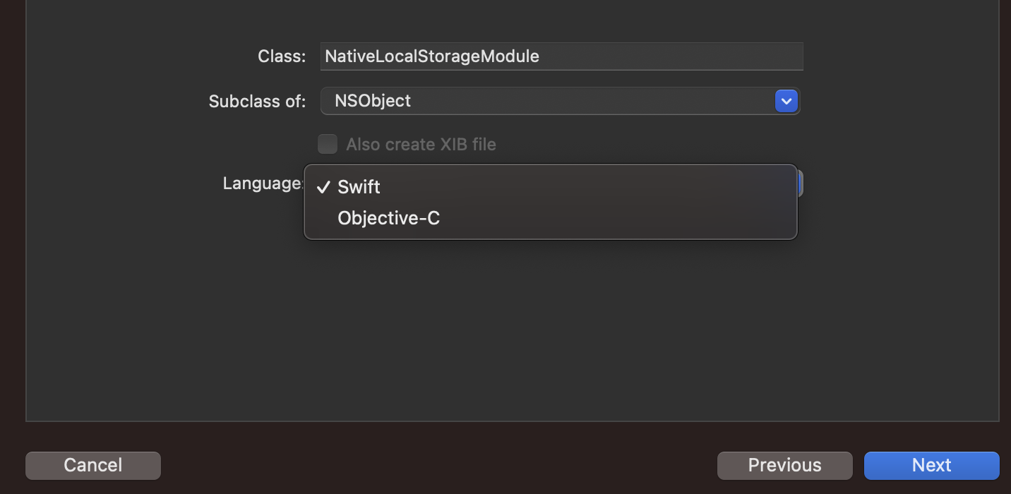
#### Implement Your Native Module
:::info
You need to implement an additional static method `name` in the native module to return the exported name of your native module. Also, implement an additional static method `methodLookup` in the native module to map the names of the methods to be exported to their corresponding selectors.
:::
```objective-c {6} title="explorer/darwin/ios/lynx_explorer/LynxExplorer/modules/NativeLocalStorageModule.h"
#import
#import
NS_ASSUME_NONNULL_BEGIN
@interface NativeLocalStorageModule : NSObject
@end
NS_ASSUME_NONNULL_END
```
```objective-c {18-20,22-27} title="explorer/darwin/ios/lynx_explorer/LynxExplorer/modules/NativeLocalStorageModule.m"
#import "NativeLocalStorageModule.h"
@interface NativeLocalStorageModule()
@property (strong, nonatomic) NSUserDefaults *localStorage;
@end
@implementation NativeLocalStorageModule
static NSString *const NativeLocalStorageKey = @"MyLocalStorage";
- (instancetype)init {
if (self = [super init]) {
_localStorage = [[NSUserDefaults alloc] initWithSuiteName:NativeLocalStorageKey];
}
return self;
}
+ (NSString *)name {
return @"NativeLocalStorageModule";
}
+ (NSDictionary *)methodLookup {
return @{
@"setStorageItem" : NSStringFromSelector(@selector(setStorageItem:value:)),
@"getStorageItem" : NSStringFromSelector(@selector(getStorageItem:)),
@"clearStorage" : NSStringFromSelector(@selector(clearStorage))
};
}
- (void)setStorageItem:(NSString *)key value:(NSString *)value {
[self.localStorage setObject:value forKey:key];
}
- (NSString*)getStorageItem:(NSString *)key {
NSString *value = [self.localStorage stringForKey:key];
return value;
}
- (void)clearStorage {
NSDictionary *keys = [self.localStorage dictionaryRepresentation];
for (NSString *key in keys) {
[self.localStorage removeObjectForKey:key];
}
}
@end
```
:::tip
Lynx Explorer is a project built with Objective-C. If you wish to implement a native module with Swift, please refer to [Importing Objective-C into Swift](https://developer.apple.com/documentation/swift/importing-objective-c-into-swift) to import the required Lynx header file `LynxModule.h`.
:::
```swift title="explorer/darwin/ios/lynx_explorer/LynxExplorer/modules/LynxExplorer-Bridging-Header.h"
//
// Use this file to import your target's public headers that you would like to expose to Swift.
//
#import
```
```swift {6-8,10-16} title="explorer/darwin/ios/lynx_explorer/LynxExplorer/modules/NativeLocalStorageModule.swift"
import Foundation
@objcMembers
public final class NativeLocalStorageModule: NSObject, LynxModule {
@objc public static var name: String {
return "NativeLocalStorageModule"
}
@objc public static var methodLookup: [String : String] {
return [
"setStorageItem": NSStringFromSelector(#selector(setStorageItem(_:value:))),
"getStorageItem": NSStringFromSelector(#selector(getStorageItem(_:))),
"clearStorage": NSStringFromSelector(#selector(clearStorage))
]
}
private let localStorage: UserDefaults
private static let storageKey = "MyLocalStorage"
@objc public init(param: Any) {
guard let suite = UserDefaults(suiteName: NativeLocalStorageModule.storageKey) else {
fatalError("Failed to initialize UserDefaults with suiteName: \(NativeLocalStorageModule.storageKey)")
}
localStorage = suite
super.init()
}
@objc public override init() {
guard let suite = UserDefaults(suiteName: NativeLocalStorageModule.storageKey) else {
fatalError("Failed to initialize UserDefaults with suiteName: \(NativeLocalStorageModule.storageKey)")
}
localStorage = suite
super.init()
}
@objc func setStorageItem(_ key: String, value: String) {
localStorage.set(value, forKey: key)
}
@objc func getStorageItem(_ key: String) -> String? {
return localStorage.string(forKey: key)
}
@objc func clearStorage() {
localStorage.dictionaryRepresentation().keys.forEach {
localStorage.removeObject(forKey: $0)
}
}
}
```
Next, you need to register your native module into the Lynx runtime environment.
Add the following registration code to the `setupLynxEnv` method in the `explorer/darwin/ios/lynx_explorer/LynxExplorer/LynxInitProcessor.m` file of the Lynx Explorer project to register your native module with the global configuration of the Lynx runtime environment.
```objective-c {7} title="explorer/darwin/ios/lynx_explorer/LynxExplorer/LynxInitProcessor.m"
#import "NativeLocalStorageModule.h"
- (void)setupLynxEnv {
// ...
// register global JS module
[globalConfig registerModule:NativeLocalStorageModule.class];
// ...
}
NS_ASSUME_NONNULL_END
```
:::tip
Lynx Explorer is a project built with Objective-C. If you want to use Swift native modules in Objective-C files, please refer to [Importing Swift into Objective-C](https://developer.apple.com/documentation/swift/importing-swift-into-objective-c) to generate and import the `LynxExplorer-Swift.h` header file.
:::
```objective-c {7} title="explorer/darwin/ios/lynx_explorer/LynxExplorer/LynxInitProcessor.m"
#import "LynxExplorer-Swift.h"
- (void)setupLynxEnv {
// ...
// register global JS module
[globalConfig registerModule:NativeLocalStorageModule.class];
// ...
}
NS_ASSUME_NONNULL_END
```
#### Run Your Code
Once you've prepared everything, you can now build and run your code.
First, follow the [Build and Run iOS Lynx Explorer](https://github.com/lynx-family/lynx/tree/develop/explorer/darwin/ios#build-ios-app) guide to build Lynx Explorer and install it on your phone.
Next, refer to the [Install Dependencies & Start the Development Server](/en/start/quick-start.md#Installation) guide to install dependencies and start the development server in the root directory of your Lynx project.
Install dependencies:
Start the development server:
You'll see a QR code and an artifact link in the console. Use Lynx Explorer to scan the QR code or enter the artifact link to open your Lynx page.
import { Steps, Tabs, Tab, PackageManagerTabs } from '@theme'
import { CodeFold } from '@lynx'
First, follow the [Build Lynx Explorer for Android](https://github.com/lynx-family/lynx/tree/develop/explorer/android) guide to create a Lynx Explorer project locally.
Next, create a new `NativeLocalStorageModule.java` or `NativeLocalStorageModule.kt` file in the `explorer/android/lynx_explorer/src/main/java/com/lynx/explorer/modules/` path of the Lynx Explorer project. Then, inherit from `LynxModule` to implement the `NativeLocalStorageModule` native module.
:::info
You need to add the `@LynxMethod` annotation to the methods that need to be exported in the native module.
:::
```java {21,29,36} title="explorer/android/lynx_explorer/src/main/java/com/lynx/explorer/modules/NativeLocalStorageModule.java"
package com.lynx.explorer.modules;
import android.content.Context;
import android.content.SharedPreferences;
import com.lynx.jsbridge.LynxMethod;
import com.lynx.jsbridge.LynxModule;
import com.lynx.tasm.behavior.LynxContext;
public class NativeLocalStorageModule extends LynxModule {
private static final String PREF_NAME = "MyLocalStorage";
public NativeLocalStorageModule(Context context) {
super(context);
}
Context getContext() {
LynxContext lynxContext = (LynxContext) mContext;
return lynxContext.getContext();
}
@LynxMethod
public void setStorageItem(String key, String value) {
SharedPreferences sharedPreferences = getContext().getSharedPreferences(PREF_NAME, Context.MODE_PRIVATE);
SharedPreferences.Editor editor = sharedPreferences.edit();
editor.putString(key, value);
editor.apply();
}
@LynxMethod
public String getStorageItem(String key) {
SharedPreferences sharedPreferences = getContext().getSharedPreferences(PREF_NAME, Context.MODE_PRIVATE);
String value = sharedPreferences.getString(key, null);
return value;
}
@LynxMethod
public void clearStorage() {
SharedPreferences sharedPreferences = getContext().getSharedPreferences(PREF_NAME, Context.MODE_PRIVATE);
SharedPreferences.Editor editor = sharedPreferences.edit();
editor.clear();
editor.apply();
}
}
```
```kotlin {16,24,30} title="explorer/android/lynx_explorer/src/main/java/com/lynx/explorer/modules/NativeLocalStorageModule.kt"
package com.lynx.explorer.modules
import android.content.Context
import com.lynx.jsbridge.LynxMethod
import com.lynx.jsbridge.LynxModule
import com.lynx.tasm.behavior.LynxContext
class NativeLocalStorageModule(context: Context) : LynxModule(context) {
private val PREF_NAME = "MyLocalStorage"
private fun getContext(): Context {
val lynxContext = mContext as LynxContext
return lynxContext.getContext()
}
@LynxMethod
fun setStorageItem(key: String, value: String) {
val sharedPreferences = getContext().getSharedPreferences(PREF_NAME, Context.MODE_PRIVATE)
val editor = sharedPreferences.edit()
editor.putString(key, value)
editor.apply()
}
@LynxMethod
fun getStorageItem(key: String): String? {
val sharedPreferences = getContext().getSharedPreferences(PREF_NAME, Context.MODE_PRIVATE)
return sharedPreferences.getString(key, null)
}
@LynxMethod
fun clearStorage() {
val sharedPreferences = getContext().getSharedPreferences(PREF_NAME, Context.MODE_PRIVATE)
val editor = sharedPreferences.edit()
editor.clear()
editor.apply()
}
}
```
Next, you need to register your native module with the Lynx runtime environment.
Add the following registration code to the `Init` method in the `explorer/android/lynx_explorer/src/main/java/com/lynx/explorer/modules/LynxModuleAdapter.java` file of the Lynx Explorer project to register your native module with the Lynx runtime environment. Here, you need to specify the name of the native module you are exporting, which must be consistent with your interface specification.
```java {4} title="explorer/android/lynx_explorer/src/main/java/com/lynx/explorer/modules/LynxModuleAdapter.java"
public void Init(Context context) {
// ......
LynxEnv.inst().registerModule("NativeLocalStorageModule", NativeLocalStorageModule.class);
// ......
}
```
After preparing everything, you can now build and run your code.
First, follow the [Compile and Run Android Lynx Explorer](https://github.com/lynx-family/lynx/tree/develop/explorer/android#compile-and-run) guide to build Lynx Explorer from source code and install it on your phone.
Then, refer to the [Install Dependencies & Start the Development Server](/en/start/quick-start.md#Installation) guide to install dependencies and start the development server in the root directory of your Lynx project.
Install dependencies:
Start the development server:
You will see a QR code in the console. Use Lynx Explorer to scan the QR code to open the page.
Congratulations! You have successfully created a native module in Lynx Explorer! If you want to create a native module in your application, you first need to integrate Lynx by referring to the [Integrate with Existing Apps](/guide/start/integrate-with-existing-apps.md) guide, and then follow the steps above to create the native module.
## Type Mapping Table
| TypeScript | iOS(Objective-C) | Android(Java) |
| --------------- | ------------------------------------------------- | ------------------------------------------------- |
| `null` | `nil` | `null` |
| `undefined` | `nil` | `null` |
| `boolean` | `BOOL` (or `NSNumber` when used inside objects) | `boolean` (or `Boolean` when used inside objects) |
| `number` | `double` (or `NSNumber` when used inside objects) | `double` (or `Number` when used inside objects) |
| `string` | `NSString` | `String` |
| `BigInt` | `NSString` | `long` (or `Number` when used inside objects) |
| `ArrayBuffer` | `NSData` | `byte[]` |
| `object` | `NSDictionary` | `com.lynx.react.bridge.ReadableMap` |
| `array` | `NSArray` | `com.lynx.react.bridge.ReadableArray` |
| Callback `()=>` | block `void (^)(id)` | `com.lynx.react.bridge.Callback` |
---
url: /guide/custom-native-component.md
---
# Custom Element
If the built-in elements do not meet your requirements, you can extend Lynx's capabilities by creating custom native elements. This section will guide you through creating and registering custom elements on Android and iOS platforms.
:::info Prerequisites
✅ Completed [Quick Start](/guide/start/quick-start.md)
✅ Completed [Lynx Integration](/guide/start/integrate-with-existing-apps.md)
✅ Familiar with [element Basics](/guide/ui/elements-components.md)
:::
## Building your Native Code
The implementation of custom native elements can be broken down into several steps, including: declaring and registering elements, creating native views, handling styles and properties, event binding, etc. Let's take a simple custom input element `` as an example to briefly introduce the implementation process of custom elements.
The complete implementation can be found in the [LynxExplorer/input module](https://github.com/lynx-family/lynx/tree/develop/explorer/darwin/ios/lynx_explorer/LynxExplorer/input). You can compile and run the [LynxExplorer sample project](https://github.com/lynx-family/lynx/tree/develop/explorer/darwin/ios) to preview element behavior in real-time.
### Declare and Register Elements
#### Declare Custom Elements
A declared custom element needs to inherit from `LynxUI`. Below is the implementation of the `` element:
```objc title="LynxExplorerInput.h" {1,11}
#import
NS_ASSUME_NONNULL_BEGIN
@interface LynxTextField : UITextField
@property(nonatomic, assign) UIEdgeInsets padding;
@end
@interface LynxExplorerInput : LynxUI
@end
NS_ASSUME_NONNULL_END
```
```objc title="LynxExplorerInput.m"
#import "LynxExplorerInput.h"
@implementation LynxExplorerInput
//...
@end
@implementation LynxTextField
- (UIEditingInteractionConfiguration)editingInteractionConfiguration API_AVAILABLE(ios(13.0)) {
return UIEditingInteractionConfigurationNone;
}
- (void)setPadding:(UIEdgeInsets)padding {
_padding = padding;
[self setNeedsLayout];
}
- (CGRect)textRectForBounds:(CGRect)bounds {
CGFloat x = self.padding.left;
CGFloat y = self.padding.top;
CGFloat width = bounds.size.width - self.padding.left - self.padding.right;
CGFloat height = bounds.size.height - self.padding.top - self.padding.bottom;
return CGRectMake(x, y, width, height);
}
- (CGRect)editingRectForBounds:(CGRect)bounds {
return [self textRectForBounds:bounds];
}
@end
```
#### Register Custom Element
Elements can be registered in two ways: globally and locally.
##### Global Registration
Globally registered elements can be shared across multiple `LynxView` instances.
```objc title="LynxExplorerInput.m" {2,6}
#import "LynxExplorerInput.h"
#import
@implementation LynxExplorerInput
LYNX_LAZY_REGISTER_UI("input")
@end
@implementation LynxTextField
- (UIEditingInteractionConfiguration)editingInteractionConfiguration API_AVAILABLE(ios(13.0)) {
return UIEditingInteractionConfigurationNone;
}
- (void)setPadding:(UIEdgeInsets)padding {
_padding = padding;
[self setNeedsLayout];
}
- (CGRect)textRectForBounds:(CGRect)bounds {
CGFloat x = self.padding.left;
CGFloat y = self.padding.top;
CGFloat width = bounds.size.width - self.padding.left - self.padding.right;
CGFloat height = bounds.size.height - self.padding.top - self.padding.bottom;
return CGRectMake(x, y, width, height);
}
- (CGRect)editingRectForBounds:(CGRect)bounds {
return [self textRectForBounds:bounds];
}
@end
```
##### Local Registration
Locally registered elements are only applicable to the current `LynxView` instance.
```objc {7}
#import
#import
LynxView *lynxView = [[LynxView alloc] initWithBuilderBlock:^(LynxViewBuilder *builder) {
builder.config =
[[LynxConfig alloc] initWithProvider:[LynxEnv sharedInstance].config.templateProvider];
[builder.config registerUI:[LynxExplorerInput class] withName:@"input"];
}];
```
Where `"input"` corresponds to the tag name in the front-end DSL. When Lynx Engine parses this tag, it will look for the registered native element and create an instance.
### Create Native `View` Instance
Each custom element needs to implement the `createView` method, which returns a corresponding native `View` instance.
Here is the implementation for the `` element:
```objc title="LynxExplorerInput.m" {8-13}
#import "LynxExplorerInput.h"
#import
@implementation LynxExplorerInput
LYNX_LAZY_REGISTER_UI("input")
- (UITextField *)createView {
UITextField *textField = [[LynxTextField alloc] init];
//...
textField.delegate = self;
return textField;
}
@end
@implementation LynxTextField
- (UIEditingInteractionConfiguration)editingInteractionConfiguration API_AVAILABLE(ios(13.0)) {
return UIEditingInteractionConfigurationNone;
}
- (void)setPadding:(UIEdgeInsets)padding {
_padding = padding;
[self setNeedsLayout];
}
- (CGRect)textRectForBounds:(CGRect)bounds {
CGFloat x = self.padding.left;
CGFloat y = self.padding.top;
CGFloat width = bounds.size.width - self.padding.left - self.padding.right;
CGFloat height = bounds.size.height - self.padding.top - self.padding.bottom;
return CGRectMake(x, y, width, height);
}
- (CGRect)editingRectForBounds:(CGRect)bounds {
return [self textRectForBounds:bounds];
}
@end
```
### Handle Front-End Style and Property Updates
You can use the `LYNX_PROP_SETTER` macro to listen for property changes passed from the front end and update the native view. For example, handling the `value` property of the `` element:
```objc title="LynxExplorerInput.m" {3,9-11}
#import "LynxExplorerInput.h"
#import
#import
@implementation LynxExplorerInput
LYNX_LAZY_REGISTER_UI("input")
LYNX_PROP_SETTER("value", setValue, NSString *) {
self.view.text = value;
}
- (UITextField *)createView {
UITextField *textField = [[LynxTextField alloc] init];
//...
textField.delegate = self;
return textField;
}
@end
@implementation LynxTextField
- (UIEditingInteractionConfiguration)editingInteractionConfiguration API_AVAILABLE(ios(13.0)) {
return UIEditingInteractionConfigurationNone;
}
- (void)setPadding:(UIEdgeInsets)padding {
_padding = padding;
[self setNeedsLayout];
}
- (CGRect)textRectForBounds:(CGRect)bounds {
CGFloat x = self.padding.left;
CGFloat y = self.padding.top;
CGFloat width = bounds.size.width - self.padding.left - self.padding.right;
CGFloat height = bounds.size.height - self.padding.top - self.padding.bottom;
return CGRectMake(x, y, width, height);
}
- (CGRect)editingRectForBounds:(CGRect)bounds {
return [self textRectForBounds:bounds];
}
@end
```
### Handle Layout Information (Optional)
#### Handle Lynx Engine Layout Results
Typically, Lynx Engine automatically calculates and updates the `View` layout information, so developers do not need to manually handle this. However, in some special cases, such as when additional adjustments to the `View` are required, you can obtain the latest layout information in the `layoutDidFinished` callback and apply custom logic.
```objc title="LynxExplorerInput.m" {9-11}
#import "LynxExplorerInput.h"
#import
#import
@implementation LynxExplorerInput
LYNX_LAZY_REGISTER_UI("input")
- (void)layoutDidFinished {
self.view.padding = self.padding;
}
LYNX_PROP_SETTER("value", setValue, NSString \*) {
self.view.text = value;
}
- (UITextField *)createView {
UITextField *textField = [[LynxTextField alloc] init];
//...
textField.delegate = self;
return textField;
}
@end
@implementation LynxTextField
- (UIEditingInteractionConfiguration)editingInteractionConfiguration API_AVAILABLE(ios(13.0)) {
return UIEditingInteractionConfigurationNone;
}
- (void)setPadding:(UIEdgeInsets)padding {
\_padding = padding;
[self setNeedsLayout];
}
- (CGRect)textRectForBounds:(CGRect)bounds {
CGFloat x = self.padding.left;
CGFloat y = self.padding.top;
CGFloat width = bounds.size.width - self.padding.left - self.padding.right;
CGFloat height = bounds.size.height - self.padding.top - self.padding.bottom;
return CGRectMake(x, y, width, height);
}
- (CGRect)editingRectForBounds:(CGRect)bounds {
return [self textRectForBounds:bounds];
}
@end
```
### Handle Event Binding (Optional)
In some scenarios, the front-end may need to respond to events from custom elements. For example, when the user types in the input box, the front-end might
need to capture and process the input data.
Here is an example of how to send a text input event from the `` element to the front-end and how the front-end listens for the event.
#### Client-Side Event Sending
The client listens to text input callbacks from the native view, and when the text changes, it uses `[self.context.eventEmitter dispatchCustomEvent:eventInfo]` to send the event to the front-end for handling.
```objc title="LynxExplorerInput.m" {13-16,20-25,27-32}
#import "LynxExplorerInput.h"
#import
#import
@implementation LynxExplorerInput
LYNX_LAZY_REGISTER_UI("input")
- (UITextField *)createView {
UITextField *textField = [[LynxTextField alloc] init];
//...
textField.delegate = self;
[[NSNotificationCenter defaultCenter] addObserver:self
selector:@selector(textFieldDidChange:)
name:UITextFieldTextDidChangeNotification
object:textField];
return textField;
}
- (void)emitEvent:(NSString *)name detail:(NSDictionary *)detail {
LynxCustomEvent *eventInfo = [[LynxDetailEvent alloc] initWithName:name
targetSign:[self sign]
detail:detail];
[self.context.eventEmitter dispatchCustomEvent:eventInfo];
}
- (void)textFieldDidChange:(NSNotification *)notification {
[self emitEvent:@"input"
detail:@{
@"value": [self.view text] ?: @"",
}];
}
- (void)layoutDidFinished {
self.view.padding = self.padding;
}
LYNX_PROP_SETTER("value", setValue, NSString *) {
self.view.text = value;
}
@end
@implementation LynxTextField
- (UIEditingInteractionConfiguration)editingInteractionConfiguration API_AVAILABLE(ios(13.0)) {
return UIEditingInteractionConfigurationNone;
}
- (void)setPadding:(UIEdgeInsets)padding {
_padding = padding;
[self setNeedsLayout];
}
- (CGRect)textRectForBounds:(CGRect)bounds {
CGFloat x = self.padding.left;
CGFloat y = self.padding.top;
CGFloat width = bounds.size.width - self.padding.left - self.padding.right;
CGFloat height = bounds.size.height - self.padding.top - self.padding.bottom;
return CGRectMake(x, y, width, height);
}
- (CGRect)editingRectForBounds:(CGRect)bounds {
return [self textRectForBounds:bounds];
}
@end
```
#### Front-End DSL Event Binding
On the front-end, bind the corresponding input event to listen for and handle the text input data sent by the client.
```jsx title="App.tsx"
const handleInput = (e) => {
const currentValue = e.detail.value.trim();
setInputValue(currentValue);
};
;
```
> **Note**: The front-end DSL uses `bindxxx` for event binding, such as `bindinput` to bind the `input` event.
### Support Direct Element Manipulation (Optional)
In some cases, the front-end may need to directly manipulate custom elements via imperative APIs. You can make elements support such operations with `LYNX_UI_METHOD`.
#### Front-End Call Example
The following code shows how to use [SelectorQuery](/api/lynx-api/selector-query.md) to call the `focus` method and focus the `` element:
```jsx title="App.tsx"
lynx
.createSelectorQuery()
.select('#input-id')
.invoke({
method: 'focus',
params: {},
success: function (res) {
console.log('lynx', 'request focus success');
},
fail: function (res) {
console.log('lynx', 'request focus fail');
},
})
.exec();
```
#### Client-Side Implementation
On the client side, use `LYNX_UI_METHOD` to add a `focus` method to the custom element to handle the front-end call.
```objc title="LynxExplorerInput.m" {4,10-16}
#import "LynxExplorerInput.h"
#import
#import
#import
@implementation LynxExplorerInput
LYNX_LAZY_REGISTER_UI("input")
LYNX_UI_METHOD(focus) {
if ([self.view becomeFirstResponder]) {
callback(kUIMethodSuccess, nil);
} else {
callback(kUIMethodUnknown, @"fail to focus");
}
}
- (UITextField *)createView {
UITextField *textField = [[LynxTextField alloc] init];
//...
textField.delegate = self;
[[NSNotificationCenter defaultCenter] addObserver:self
selector:@selector(textFieldDidChange:)
name:UITextFieldTextDidChangeNotification
object:textField];
return textField;
}
- (void)emitEvent:(NSString *)name detail:(NSDictionary *)detail {
LynxCustomEvent *eventInfo = [[LynxDetailEvent alloc] initWithName:name
targetSign:[self sign]
detail:detail];
[self.context.eventEmitter dispatchCustomEvent:eventInfo];
}
- (void)textFieldDidChange:(NSNotification *)notification {
[self emitEvent:@"input"
detail:@{
@"value": [self.view text] ?: @"",
}];
}
- (void)layoutDidFinished {
self.view.padding = self.padding;
}
LYNX_PROP_SETTER("value", setValue, NSString *) {
self.view.text = value;
}
@end
@implementation LynxTextField
- (UIEditingInteractionConfiguration)editingInteractionConfiguration API_AVAILABLE(ios(13.0)) {
return UIEditingInteractionConfigurationNone;
}
- (void)setPadding:(UIEdgeInsets)padding {
_padding = padding;
[self setNeedsLayout];
}
- (CGRect)textRectForBounds:(CGRect)bounds {
CGFloat x = self.padding.left;
CGFloat y = self.padding.top;
CGFloat width = bounds.size.width - self.padding.left - self.padding.right;
CGFloat height = bounds.size.height - self.padding.top - self.padding.bottom;
return CGRectMake(x, y, width, height);
}
- (CGRect)editingRectForBounds:(CGRect)bounds {
return [self textRectForBounds:bounds];
}
@end
```
#### Method Callback Return Values
When implementing the focus method, component developers need to return a status code to the frontend to indicate whether the operation was successful. For instance, the frontend call might fail, in which case an appropriate error status should be returned so that the frontend can handle it in the `fail` callback.
Lynx Engine defines several common error codes, and developers can return the appropriate status code in the method callback:
```objc
enum LynxUIMethodErrorCode {
kUIMethodSuccess = 0, // Succeeded
kUIMethodUnknown, // Unknown error
kUIMethodNodeNotFound, // Cannot find corresponding element
kUIMethodMethodNotFound, // No corresponding method on this element
kUIMethodParamInvalid, // Invalid method parameters
kUIMethodSelectorNotSupported, // Selector not supported
};
```
import { Steps, Tabs, Tab } from '@theme';
import { CodeFold } from '@lynx';
### Custom Native element Implementation Process
The implementation of custom native elements involves several steps, including: declaring and registering the element, creating native views, handling styles and properties, event binding, etc. Let's take a simple custom input element `` as an example to briefly introduce the implementation process of a custom element. The complete code can be viewed in [LynxExplorer](https://github.com/lynx-family/lynx/tree/develop/explorer/android/lynx_explorer/src/main/java/com/lynx/explorer/input).
The complete implementation can be found in the [LynxExplorer/input module](https://github.com/lynx-family/lynx/tree/develop/explorer/android/lynx_explorer/src/main/java/com/lynx/explorer/input). You can compile and run the [LynxExplorer sample project](https://github.com/lynx-family/lynx/tree/develop/explorer/android) to preview element behavior in real-time.
### Declaring and Registering the Element
#### Declare the Custom Element
The declared custom element needs to inherit from `LynxUI`.
```java title="LynxExplorerInput.java"
import com.lynx.tasm.behavior.LynxContext;
import com.lynx.tasm.behavior.ui.LynxUI;
import androidx.appcompat.widget.AppCompatEditText;
public class LynxExplorerInput extends LynxUI {
public LynxExplorerInput(LynxContext context) {
super(context);
}
//...
}
```
```kotlin title="LynxExplorerInput.kt"
import com.lynx.tasm.behavior.LynxContext
import com.lynx.tasm.behavior.ui.LynxUI
import androidx.appcompat.widget.AppCompatEditText
class LynxExplorerInput(context: LynxContext) : LynxUI(context) {
//...
}
```
#### Register the Custom Element
There are two ways to register elements: global registration and local registration.
##### Global Registration
Globally registered elements can be shared among multiple `LynxView` instances.
```java
import com.lynx.tasm.LynxEnv;
import com.lynx.tasm.behavior.Behavior;
LynxEnv.inst().addBehavior(new Behavior("input"){
@Override
public LynxExplorerInput createUI(LynxContext context) {
return new LynxExplorerInput(context);
}
});
```
```kotlin
import com.lynx.tasm.LynxEnv
import com.lynx.tasm.behavior.Behavior
LynxEnv.inst().addBehavior(object : Behavior("input") {
override fun createUI(context: LynxContext): LynxExplorerInput {
return LynxExplorerInput(context)
}
})
```
##### Local Registration
Locally registered elements are only available for the current `LynxView` instance.
```java
LynxViewBuilder lynxViewBuilder = new LynxViewBuilder();
lynxViewBuilder.addBehavior(new Behavior("input") {
@Override
public LynxExplorerInput createUI(LynxContext context) {
return new LynxExplorerInput(context);
}
});
```
```kotlin
val lynxViewBuilder = LynxViewBuilder()
lynxViewBuilder.addBehavior(object : Behavior("input") {
override fun createUI(context: LynxContext): LynxExplorerInput {
return LynxExplorerInput(context)
}
})
```
Where `"input"` corresponds to the tag name in the front-end DSL. When the Lynx Engine encounters this tag, it will look for the registered native element and create an instance.
### Create the Native `View` Instance
Each custom element needs to implement the `createView` method, which returns the corresponding native `View` instance.
Here’s the implementation for the `` element:
```java title="LynxExplorerInput.java" {12-17}
import android.content.Context;
import androidx.appcompat.widget.AppCompatEditText;
import com.lynx.tasm.behavior.LynxContext;
import com.lynx.tasm.behavior.ui.LynxUI;
public class LynxExplorerInput extends LynxUI {
public LynxExplorerInput(LynxContext context) {
super(context);
}
@Override
protected AppCompatEditText createView(Context context) {
AppCompatEditText view = new AppCompatEditText(context);
//...
return view;
}
}
```
```kotlin title="LynxExplorerInput.kt" {9-13}
import android.content.Context
import androidx.appcompat.widget.AppCompatEditText
import com.lynx.tasm.behavior.LynxContext
import com.lynx.tasm.behavior.ui.LynxUI
class LynxExplorerInput(context: LynxContext) : LynxUI(context) {
override fun createView(context: Context): AppCompatEditText {
return AppCompatEditText(context).apply {
//...
}
}
}
```
### Handle Front-End Style and Property Updates
You can use the `@LynxProp` annotation to listen for property changes passed from the front-end and update the native view accordingly. For example, handling the `value` property of the `` element:
```java {4,13-18} title="LynxExplorerInput.java"
import android.content.Context;
import androidx.appcompat.widget.AppCompatEditText;
import com.lynx.tasm.behavior.LynxContext;
import com.lynx.tasm.behavior.LynxProp;
import com.lynx.tasm.behavior.ui.LynxUI;
public class LynxExplorerInput extends LynxUI {
public LynxExplorerInput(LynxContext context) {
super(context);
}
@LynxProp(name = "value")
public void setValue(String value) {
if (!value.equals(mView.getText().toString())) {
mView.setText(value);
}
}
@Override
protected AppCompatEditText createView(Context context) {
AppCompatEditText view = new AppCompatEditText(context);
//...
return view;
}
}
```
```kotlin {4,15-20} title="LynxExplorerInput.kt"
import android.content.Context
import androidx.appcompat.widget.AppCompatEditText
import com.lynx.tasm.behavior.LynxContext
import com.lynx.tasm.behavior.LynxProp
import com.lynx.tasm.behavior.ui.LynxUI
class LynxExplorerInput(context: LynxContext) : LynxUI(context) {
override fun createView(context: Context): AppCompatEditText {
return AppCompatEditText(context).apply {
//...
}
}
@LynxProp(name = "value")
fun setValue(value: String) {
if (value != mView.text.toString()) {
mView.setText(value)
}
}
}
```
### Handle Layout Information (Optional)
#### Handle the Layout Result from the Lynx Engine
Usually, the Lynx Engine will automatically calculate and update the `View` layout information, so developers don’t need to handle this manually. However, in some special cases, such as when extra adjustments are needed for the `View`, you can retrieve the latest layout information in the `onLayoutUpdated` callback and apply custom logic.
```java title="LynxExplorerInput.java" {13-21}
import android.content.Context;
import androidx.appcompat.widget.AppCompatEditText;
import com.lynx.tasm.behavior.LynxContext;
import com.lynx.tasm.behavior.LynxProp;
import com.lynx.tasm.behavior.ui.LynxUI;
public class LynxExplorerInput extends LynxUI {
public LynxExplorerInput(LynxContext context) {
super(context);
}
@Override
public void onLayoutUpdated() {
super.onLayoutUpdated();
int paddingTop = mPaddingTop + mBorderTopWidth;
int paddingBottom = mPaddingBottom + mBorderBottomWidth;
int paddingLeft = mPaddingLeft + mBorderLeftWidth;
int paddingRight = mPaddingRight + mBorderRightWidth;
mView.setPadding(paddingLeft, paddingTop, paddingRight, paddingBottom);
}
@Override
protected AppCompatEditText createView(Context context) {
AppCompatEditText view = new AppCompatEditText(context);
//...
return view;
}
@LynxProp(name = "value")
public void setValue(String value) {
if (!value.equals(mView.getText().toString())) {
mView.setText(value);
}
}
}
```
```kotlin title="LynxExplorerInput.kt" {10-17}
import android.content.Context
import androidx.appcompat.widget.AppCompatEditText
import com.lynx.tasm.behavior.LynxContext
import com.lynx.tasm.behavior.LynxProp
import com.lynx.tasm.behavior.ui.LynxUI
class LynxExplorerInput(context: LynxContext) : LynxUI(context) {
override fun onLayoutUpdated() {
super.onLayoutUpdated()
val paddingTop = mPaddingTop + mBorderTopWidth
val paddingBottom = mPaddingBottom + mBorderBottomWidth
val paddingLeft = mPaddingLeft + mBorderLeftWidth
val paddingRight = mPaddingRight + mBorderRightWidth
mView.setPadding(paddingLeft, paddingTop, paddingRight, paddingBottom)
}
override fun createView(context: Context): AppCompatEditText {
return AppCompatEditText(context).apply {
//...
}
}
@LynxProp(name = "value")
fun setValue(value: String) {
if (value != mView.text.toString()) {
mView.setText(value)
}
}
}
```
### Event Binding
Event handling in native elements is usually done using the `@LynxEvent` annotation, which binds events between the front-end and native elements. For example, let’s implement a custom `onChange` event for the `` element:
```java title="LynxExplorerInput.java" {2-3,8-10,14-22,27-43}
import android.content.Context;
import android.text.Editable;
import android.text.TextWatcher;
import androidx.appcompat.widget.AppCompatEditText;
import com.lynx.tasm.behavior.LynxContext;
import com.lynx.tasm.behavior.LynxProp;
import com.lynx.tasm.behavior.ui.LynxUI;
import com.lynx.tasm.event.LynxCustomEvent;
import java.util.HashMap;
import java.util.Map;
public class LynxExplorerInput extends LynxUI {
private void emitEvent(String name, Map value) {
LynxCustomEvent detail = new LynxCustomEvent(getSign(), name);
if (value != null) {
for (Map.Entry entry : value.entrySet()) {
detail.addDetail(entry.getKey(), entry.getValue());
}
}
getLynxContext().getEventEmitter().sendCustomEvent(detail);
}
@Override
protected AppCompatEditText createView(Context context) {
AppCompatEditText view = new AppCompatEditText(context);
view.addTextChangedListener(new TextWatcher() {
@Override
public void afterTextChanged(Editable s) {
emitEvent("input", new HashMap() {
{
put("value", s.toString());
}
});
}
@Override
public void beforeTextChanged(CharSequence s, int start, int count, int after) {}
@Override
public void onTextChanged(CharSequence s, int start, int before, int count) {
}
});
return view;
}
public LynxExplorerInput(LynxContext context) {
super(context);
}
@Override
public void onLayoutUpdated() {
super.onLayoutUpdated();
int paddingTop = mPaddingTop + mBorderTopWidth;
int paddingBottom = mPaddingBottom + mBorderBottomWidth;
int paddingLeft = mPaddingLeft + mBorderLeftWidth;
int paddingRight = mPaddingRight + mBorderRightWidth;
mView.setPadding(paddingLeft, paddingTop, paddingRight, paddingBottom);
}
@LynxProp(name = "value")
public void setValue(String value) {
if (!value.equals(mView.getText().toString())) {
mView.setText(value);
}
}
}
```
```kotlin title="LynxExplorerInput.kt" {2-3,8,15-23,27-33}
import android.content.Context
import android.text.Editable
import android.text.TextWatcher
import androidx.appcompat.widget.AppCompatEditText
import com.lynx.tasm.behavior.LynxContext
import com.lynx.tasm.behavior.LynxProp
import com.lynx.tasm.behavior.ui.LynxUI
import com.lynx.tasm.event.LynxCustomEvent
class LynxExplorerInput(context: LynxContext) : LynxUI(context) {
override fun createView(context: Context): AppCompatEditText {
return AppCompatEditText(context).apply {
addTextChangedListener(object : TextWatcher {
override fun beforeTextChanged(s: CharSequence?, start: Int, count: Int, after: Int) {}
override fun onTextChanged(s: CharSequence?, start: Int, before: Int, count: Int) {}
override fun afterTextChanged(s: Editable?) {
emitEvent("input", mapOf("value" to (s?.toString() ?: "")))
}
})
}
}
private fun emitEvent(name: String, value: Map?) {
val detail = LynxCustomEvent(sign, name)
value?.forEach { (key, v) ->
detail.addDetail(key, v)
}
lynxContext.eventEmitter.sendCustomEvent(detail)
}
override fun onLayoutUpdated() {
super.onLayoutUpdated()
val paddingTop = mPaddingTop + mBorderTopWidth
val paddingBottom = mPaddingBottom + mBorderBottomWidth
val paddingLeft = mPaddingLeft + mBorderLeftWidth
val paddingRight = mPaddingRight + mBorderRightWidth
mView.setPadding(paddingLeft, paddingTop, paddingRight, paddingBottom)
}
@LynxProp(name = "value")
fun setValue(value: String) {
if (value != mView.text.toString()) {
mView.setText(value)
}
}
}
```
### Front-End DSL Event Binding
On the front-end, you need to bind the relevant input events for the text box. With the following code, the front-end will listen for events sent by the client and process the input data as needed.
```jsx title="App.tsx"
const handleInput = (e) => {
const currentValue = e.detail.value.trim();
setInputValue(currentValue);
};
;
```
> **Note**: Front-end DSL uses `bindxxx` for event binding, such as `bindinput` for binding the `input` event.
### Supporting Direct Element Manipulation (Optional)
In some cases, the front-end may need to directly manipulate custom elements using imperative APIs. You can enable such operations on elements by using `@LynxUIMethod`.
#### Front-End Example Call
The following code demonstrates how to use the [SelectorQuery](/api/lynx-api/selector-query.md) API to call the `focus` method and make the `` element gain focus:
```jsx title="App.tsx"
lynx
.createSelectorQuery()
.select('#input-id')
.invoke({
method: 'focus',
params: {},
success: function (res) {
console.log('lynx', 'request focus success');
},
fail: function (res) {
console.log('lynx', 'request focus fail');
},
})
.exec();
```
#### Client-Side Implementation
On the client side, you need to add the `focus` method to your custom element using `@LynxUIMethod`, ensuring it can correctly handle the front-end call.
```java title="LynxExplorerInput.java" {4,6-7,10-11,20-24,26-37}
import android.content.Context;
import android.text.Editable;
import android.text.TextWatcher;
import android.view.inputmethod.InputMethodManager;
import androidx.appcompat.widget.AppCompatEditText;
import com.lynx.react.bridge.Callback;
import com.lynx.react.bridge.ReadableMap;
import com.lynx.tasm.behavior.LynxContext;
import com.lynx.tasm.behavior.LynxProp;
import com.lynx.tasm.behavior.LynxUIMethod;
import com.lynx.tasm.behavior.LynxUIMethodConstants;
import com.lynx.tasm.behavior.ui.LynxUI;
import com.lynx.tasm.event.LynxCustomEvent;
import java.util.HashMap;
import java.util.Map;
public class LynxExplorerInput extends LynxUI {
private boolean showSoftInput() {
InputMethodManager imm = (InputMethodManager) getLynxContext().getSystemService(Context.INPUT_METHOD_SERVICE);
return imm.showSoftInput(mView,
InputMethodManager.SHOW_IMPLICIT, null);
}
@LynxUIMethod
public void focus(ReadableMap params, Callback callback) {
if (mView.requestFocus()) {
if (showSoftInput()) {
callback.invoke(LynxUIMethodConstants.SUCCESS);
} else {
callback.invoke(LynxUIMethodConstants.UNKNOWN, "fail to show keyboard");
}
} else {
callback.invoke(LynxUIMethodConstants.UNKNOWN, "fail to focus");
}
}
private void emitEvent(String name, Map value) {
LynxCustomEvent detail = new LynxCustomEvent(getSign(), name);
if (value != null) {
for (Map.Entry entry : value.entrySet()) {
detail.addDetail(entry.getKey(), entry.getValue());
}
}
getLynxContext().getEventEmitter().sendCustomEvent(detail);
}
@Override
protected AppCompatEditText createView(Context context) {
AppCompatEditText view = new AppCompatEditText(context);
view.addTextChangedListener(new TextWatcher() {
@Override
public void afterTextChanged(Editable s) {
emitEvent("input", new HashMap() {
{
put("value", s.toString());
}
});
}
@Override
public void beforeTextChanged(CharSequence s, int start, int count, int after) {
}
@Override
public void onTextChanged(CharSequence s, int start, int before, int count) {
}
});
return view;
}
public LynxExplorerInput(LynxContext context) {
super(context);
}
@Override
public void onLayoutUpdated() {
super.onLayoutUpdated();
int paddingTop = mPaddingTop + mBorderTopWidth;
int paddingBottom = mPaddingBottom + mBorderBottomWidth;
int paddingLeft = mPaddingLeft + mBorderLeftWidth;
int paddingRight = mPaddingRight + mBorderRightWidth;
mView.setPadding(paddingLeft, paddingTop, paddingRight, paddingBottom);
}
@LynxProp(name = "value")
public void setValue(String value) {
if (!value.equals(mView.getText().toString())) {
mView.setText(value);
}
}
}
```
```kotlin title="LynxExplorerInput.kt" {4,6-7,18-21,23-34}
import android.content.Context
import android.text.Editable
import android.text.TextWatcher
import android.view.inputmethod.InputMethodManager
import androidx.appcompat.widget.AppCompatEditText
import com.lynx.react.bridge.Callback
import com.lynx.react.bridge.ReadableMap
import com.lynx.tasm.behavior.LynxContext
import com.lynx.tasm.behavior.LynxProp
import com.lynx.tasm.behavior.LynxUIMethod
import com.lynx.tasm.behavior.LynxUIMethodConstants
import com.lynx.tasm.behavior.ui.LynxUI
import com.lynx.tasm.event.LynxCustomEvent
class LynxExplorerInput(context: LynxContext) : LynxUI(context) {
private fun showSoftInput(): Boolean {
val imm = lynxContext.getSystemService(Context.INPUT_METHOD_SERVICE) as InputMethodManager
return imm.showSoftInput(mView, InputMethodManager.SHOW_IMPLICIT, null)
}
@LynxUIMethod
fun focus(params: ReadableMap, callback: Callback) {
if (mView.requestFocus()) {
if (showSoftInput()) {
callback.invoke(LynxUIMethodConstants.SUCCESS)
} else {
callback.invoke(LynxUIMethodConstants.UNKNOWN, "fail to show keyboard")
}
} else {
callback.invoke(LynxUIMethodConstants.UNKNOWN, "fail to focus")
}
}
override fun createView(context: Context): AppCompatEditText {
return AppCompatEditText(context).apply {
addTextChangedListener(object : TextWatcher {
override fun beforeTextChanged(s: CharSequence?, start: Int, count: Int, after: Int) {}
override fun onTextChanged(s: CharSequence?, start: Int, before: Int, count: Int) {}
override fun afterTextChanged(s: Editable?) {
emitEvent("input", mapOf("value" to (s?.toString() ?: "")))
}
})
}
}
private fun emitEvent(name: String, value: Map?) {
val detail = LynxCustomEvent(sign, name)
value?.forEach { (key, v) ->
detail.addDetail(key, v)
}
lynxContext.eventEmitter.sendCustomEvent(detail)
}
override fun onLayoutUpdated() {
super.onLayoutUpdated()
val paddingTop = mPaddingTop + mBorderTopWidth
val paddingBottom = mPaddingBottom + mBorderBottomWidth
val paddingLeft = mPaddingLeft + mBorderLeftWidth
val paddingRight = mPaddingRight + mBorderRightWidth
mView.setPadding(paddingLeft, paddingTop, paddingRight, paddingBottom)
}
@LynxProp(name = "value")
fun setValue(value: String) {
if (value != mView.text.toString()) {
mView.setText(value)
}
}
}
```
#### Method Callback Return Values
When implementing the focus method, component developers need to return a status code to the frontend to indicate whether the operation was successful. For instance, the frontend call might fail, in which case an appropriate error status should be returned so that the frontend can handle it in the `fail` callback.
Lynx Engine predefines some common error codes, and the element developer can return the appropriate status code in the method callback:
```java
enum LynxUIMethodErrorCode {
kUIMethodSuccess, // Succeeded
kUIMethodUnknown, // Unknown error
kUIMethodNodeNotFound, // Cannot find corresponding element
kUIMethodMethodNotFound, // No corresponding method on this element
kUIMethodParamInvalid, // Invalid method parameters
kUIMethodSelectorNotSupported, // Selector not supported
}
```
The way to customize elements in the web can directly refer to [Web Components](https://developer.mozilla.org/en-US/docs/Web/API/Web_components)
## Use your Native Element
Once you have completed the development of a custom element, you can use it just like a built-in element. Below is a simple example of using an `` element:
---
url: /guide/embed-lynx-to-native.md
---
# Embedding LynxView into Native View
[LynxView](/guide/spec.md#lynxview) itself is a native view that can easily be used as a full-screen view, or be [embedded](/guide/spec.md#embedded) within a non-full-screen native view.
LynxView corresponds to the [Page](/api/elements/built-in/page.md) element. It only allows the client to set size constraints on LynxView, and you generally cannot directly modify the Page's style to set its size.
The client sets different size constraints on LynxView, which translates to setting size constraints on the Page.
The Lynx [layout engine](/guide/spec.md#starlight) uses these constraints to calculate the size of the Page node and all its child nodes.
## Constrain the size of LynxView \{#Constraining-LynxView}
### Constraint mode
You should proactively set its size constraints, when creating a LynxView on iOS.
There are two ways to set size constraints for LynxView.
* Using `updateViewportWithPreferredLayoutWidth` and `setLayoutWidthMode、setLayoutHeightMode` to set fixed or flexible sizes.
* Using `lynxviewbuilder#frame` to set fixed size.
Supported constraint modes:
```objective-c
typedef NS_ENUM(NSInteger, LynxViewSizeMode) {
LynxViewSizeModeUndefined = 0,
LynxViewSizeModeExact,
LynxViewSizeModeMax
};
```
* `LynxViewSizeModeUndefined`
LynxView's size is determined by Page content, with no parent constraints.
* `LynxViewSizeModeExact`
LynxView's size is fixed, same as the Page element's size.
* `LynxViewSizeModeMax`
LynxView's maximum width or height.
### Get size constraints in the `onMeasure` method.
Android system provides an [onMeasure](https://developer.android.com/reference/android/view/View#onMeasure\(int,%20int\)) for views, during which LynxView receives size constraints from its parent view.
Lynx will complete the layout of all elements and calculate the size of LynxView within the system's `onMeasure` function, and then set the correct value using [setMeasuredDimension](https://developer.android.com/reference/android/view/View#setMeasuredDimension\(int,%20int\)).
[View.MeasureSpec](https://developer.android.com/reference/android/view/View.MeasureSpec) values:
* `UNSPECIFIED`
LynxView's size is determined by Page content, with no parent constraints.
* `EXACTLY`
LynxView's size is fixed, same as the Page element's size.
* `AT_MOST`
LynxView's maximum width or height.
When the content of the page needs to be re-layout, Lynx will call the system's [requestLayout](https://developer.android.com/reference/android/view/View#requestLayout\(\)), which triggers `onMeasure` to execute again.
### Preset Width and Height, Trigger Layout Early
When creating LynxView, you can preset its size constraints using `LynxViewBuilder#setPresetMeasuredSpec`, with parameters identical to`onMeasure`. This triggers layout during the [rendering pipeline](/guide/spec.md#pipeline) instead of waiting for `onMeasure`.
If a change in `measureSpec` is detected, the layout will re-trigger to ensure LynxView's size is correct.
For example, you can preset a fixed size of 400x200 with the following code:
```java
LynxViewBuilder viewBuilder = new LynxViewBuilder();
viewBuilder = viewBuilder.setPresetMeasuredSpec(View.MeasureSpec.makeMeasureSpec(400, View.MeasureSpec.EXACTLY),
View.MeasureSpec.makeMeasureSpec(200, View.MeasureSpec.EXACTLY));
LynxView lynxview = viewBuilder.build(this);;
```
### LynxView with fixed size
### Use the `LynxViewBuilder#frame`
You can set the `frame` property size when creating LynxView, so the size of LynxView is fixed.
For example, if you want to fix the size of LynxView to 400x200, you can do it as follows:
```objective-c
LynxView *lynxView = [[LynxView alloc] initWithBuilderBlock:^(LynxViewBuilder *builder) {
builder.frame = CGRectMake(0, 0, 400, 200);
...
}];
```
### Use `preferredLayoutWidth/preferredLayoutHeight` and `layoutWidthMode/layoutHeightMode`
For example:
```objective-c
_lynxView.layoutWidthMode = LynxViewSizeModeExact;
_lynxView.layoutHeightMode = LynxViewSizeModeExact;
_lynxView.preferredLayoutWidth = 400;
_lynxView.preferredLayoutHeight = 200;
```
As long as the outer container constraint for LynxView is `EXACTLY`, the size of LynxView will be fixed.
For example, if you want to set a 400x200 sized LynxView:
```java
//You can directly specify the size of LynxView
parentView.addView(lynxview, new ViewGroup.LayoutParams(400, 200));
//You can also fix the parent node's size and set it to MATCH_PARENT
parentView.addView(lynxview,
new ViewGroup.LayoutParams(ViewGroup.LayoutParams.MATCH_PARENT,ViewGroup.LayoutParams.MATCH_PARENT));
```
### LynxView with flexible size
If you want LynxView to adapt its size based on its content, you can either avoid setting `LynxViewBuilder#frame`, or set `setLayoutWidth/HeightMode` to `LynxViewSizeModeUndefined` or `LynxViewSizeModeMax`.
```objective-c
_lynxView.layoutWidthMode = LynxViewSizeModeUndefined;
_lynxView.layoutHeightMode = LynxViewSizeModeUndefined;
//Alternatively, limit the width to 400 and the height to 750.
_lynxView.preferredLayoutWidth = 400;
_lynxView.preferredLayoutHeight = 750;
_lynxView.layoutWidthMode = LynxViewSizeModeMax;
_lynxView.layoutHeightMode = LynxViewSizeModeMax;
```
The layout constraints here are consistent with the Android views.
For example, setting the layout parameters for LynxView to [WRAP\_CONTENT](https://developer.android.com/reference/android/view/ViewGroup.LayoutParams#WRAP_CONTENT) will make LynxView size adapt to its content.
```java
parentView.addView(lynxview,
new ViewGroup.LayoutParams(ViewGroup.LayoutParams.WRAP_CONTENT,ViewGroup.LayoutParams.WRAP_CONTENT));
```
---
url: /guide/use-data-from-host-platform.md
---
# Using Data from Host Platform
Lynx allows the client to provide an initial set of data when the page loads, and then update this data at any time afterward.
This initial data is called `initData`.
## Provide and Update Data
:::note Prerequisites
You need to complete the instructions in [Integrate with existing applications](/en/guide/start/integrate-with-existing-apps.md) to ensure that your application has integrated Lynx and have a basic understanding of Lynx's Native API.
:::
When using [`LynxView.loadTemplate()`] to load a Bundle, you have the opportunity to pass in some data:
```objective-c {5}
LynxLoadMeta* meta = [LynxLoadMeta init];
// meta.url = @"";
// meta.binaryData = nil;
// meta.templateBundle = nil;
meta.initialData = __YOUR_DATA__;
// meta.loadOption = LynxLoadOptionDumpElement | LynxLoadOptionRecycleTemplateBundle;
[lynxView loadTemplate:meta];
```
```java {5}
LynxLoadMeta.Builder builder = new LynxLoadMeta.Builder();
// builder.setUrl();
// builder.setBinaryData();
// builder.setTemplateBundle();
builder.setInitialData(__YOUR_DATA__);
// builder.addLoadOption();
LynxLoadMeta meta = builder.build();
lynxView.loadTemplate(meta);
```
You can update this data later through [`LynxView.updateData()`] when needed:
```objc {2}
LynxUpdateMeta* meta = [LynxUpdateMeta init];
meta.data = __YOUR_DATA__;
[lynxView updateData:meta];
```
```java {2}
LynxUpdateMeta.Builder builder = new LynxUpdateMeta.Builder();
builder.setUpdatedData(__YOUR_DATA__);
LynxUpdateMeta meta = builder.build();
lynxView.updateMetaData(meta);
```
The data you pass in when loading and the data you pass in when updating can be used on the frontend. Below is how to use this data on the front end.
## Consuming the Data
On the frontend, you can retrieve `initData` by using [`useInitData()`].
When the client updates the data, these components will automatically re-render.
```tsx title="src/App.jsx"
import { useInitData } from '@lynx-js/react';
export function App() {
const initData = useInitData();
return (
{initData.greeting}
);
}
```
If you are using class components, you can use [`InitDataConsumer`].
```tsx
import { Component, InitDataProvider, InitDataConsumer } from '@lynx-js/react';
class C extends Component {
render() {
return (
{(initData) => (
{initData.greeting}
)}
);
}
}
```
[`InitDataConsumer`] must be used as a child node of [`InitDataProvider`].
```tsx
```
## Process Data Before Using It
While [`useInitData()`] gives you the `initData` from the client, it may not be in the format you expect.
Image you have the following disorganized `initData`:
* On Android:
```json
{
"pageTitle": "Hello Lynx"
}
```
* But, on iOS:
```json
{
"page_title": "Hello Lynx"
}
```
Your code may become less cleaner if you want to be compatible with both platforms:
```tsx {7}
import { useInitData } from '@lynx-js/react';
export function App() {
const initData = useInitData();
return (
{initData.pageTitle || initData.page_title}
);
}
```
The above scenarios are just examples, but Lynx do provide a way to process the `initData` before it is used, it is called `dataProcessor`.
### Using default `dataProcessor`
If you (or the client developer) did not specify a `processorName`, Lynx will use the `defaultDataProcessor` to process the `initData`.
:::info
See [`lynx.registerDataProcessors`] for more examples.
:::
```tsx title="src/index.tsx" {4-12}
import { root } from '@lynx-js/react';
import { App } from './App.js';
lynx.registerDataProcessors({
defaultDataProcessor: function (rawInitData) {
const { pageTitle, page_title, ...rest } = rawInitData;
return {
...rest,
pageTitle: pageTitle || page_title,
};
},
});
root.render();
if (import.meta.webpackHot) {
import.meta.webpackHot.accept();
}
```
Then, in your component, you can use the `initData` directly:
```tsx title="src/App.jsx" {7}
import { useInitData } from '@lynx-js/react';
export function App() {
const initData = useInitData();
return (
{initData.pageTitle}
);
}
```
### Using named `dataProcessor`
You (or the client developer) can also specify a `processorName` when calling [`LynxView.updateData()`]:
```objc
LynxUpdateMeta *meta = [[LynxUpdateMeta alloc] init];
// TODO: set data and processorName
[lynxView updateData:meta];
```
```java
LynxUpdateMeta meta = new LynxUpdateMeta();
// TODO: set data and processorName
lynxView.updateMetaData(meta);
```
Accordingly, a named `dataProcessor` you defined will be called to process the `initData`, you can define multiple `dataProcessor`s with syntax below:
```tsx title="src/index.tsx" {5-14}
import { root } from '@lynx-js/react';
import { App } from './App.js';
lynx.registerDataProcessors({
dataProcessors: {
someDataProcessor: function (rawInitData) {
// process rawInitData
return processedInitData;
},
anotherDataProcessor: function (rawInitData) {
// process rawInitData
return processedInitData;
},
},
});
root.render();
if (import.meta.webpackHot) {
import.meta.webpackHot.accept();
}
```
This allows you (or the client developer) to decide on the client which `dataProcessor` to use if the business logic requires it.
[`LynxView.loadTemplate()`]: /api/lynx-native-api/lynx-view/load-template.md
[`LynxView.updateData()`]: /api/lynx-native-api/lynx-view/update-data.md
[`useInitData()`]: /api/react/Function.useInitData.md
[`InitDataConsumer`]: /api/react/Function.InitDataConsumer.md
[`InitDataProvider`]: /api/react/Function.InitDataProvider.md
[`lynx.registerdataprocessors`]: /api/react/Interface.Lynx.md#registerdataprocessors
---
url: /guide/spec.md
---
{/* # Living Specification */}
---
url: /api/index.md
---
---
url: /api/rspeedy/qrcode-rsbuild-plugin.md
---
[Home](./index.md) > [@lynx-js/qrcode-rsbuild-plugin](./qrcode-rsbuild-plugin.md)
## qrcode-rsbuild-plugin package
A rsbuild plugin that print the template.js url using QRCode.
## Functions
| Function | Description |
| --- | --- |
| [pluginQRCode(options)](./qrcode-rsbuild-plugin.pluginqrcode.md) | Create a rsbuild plugin for printing QRCode. |
## Interfaces
| Interface | Description |
| --- | --- |
| [PluginQRCodeOptions](./qrcode-rsbuild-plugin.pluginqrcodeoptions.md) | The options for [pluginQRCode()](./qrcode-rsbuild-plugin.pluginqrcode.md). |
## Type Aliases
| Type Alias | Description |
| --- | --- |
| [CustomizedSchemaFn](./qrcode-rsbuild-plugin.customizedschemafn.md) | Customize the generated schema. |
---
url: /api/rspeedy/qrcode-rsbuild-plugin.pluginqrcodeoptions.md
---
[Home](./index.md) > [@lynx-js/qrcode-rsbuild-plugin](./qrcode-rsbuild-plugin.md) > [PluginQRCodeOptions](./qrcode-rsbuild-plugin.pluginqrcodeoptions.md)
## PluginQRCodeOptions interface
The options for [pluginQRCode()](./qrcode-rsbuild-plugin.pluginqrcode.md).
**Signature:**
```typescript
export interface PluginQRCodeOptions
```
## Properties
| Property | Modifiers | Type | Description |
| --- | --- | --- | --- |
| [schema?](./qrcode-rsbuild-plugin.pluginqrcodeoptions.schema.md) | | [CustomizedSchemaFn](./qrcode-rsbuild-plugin.customizedschemafn.md) \| undefined | _(Optional)_ Customize the generated schema. |
---
url: /api/rspeedy/react-rsbuild-plugin.addcomponentelementconfig.md
---
[Home](./index.md) > [@lynx-js/react-rsbuild-plugin](./react-rsbuild-plugin.md) > [AddComponentElementConfig](./react-rsbuild-plugin.addcomponentelementconfig.md)
## AddComponentElementConfig interface
Controls whether to add wrapper elements for components
**Signature:**
```typescript
export interface AddComponentElementConfig
```
## Remarks
Default value: `false`
## Properties
| Property | Modifiers | Type | Description |
| --- | --- | --- | --- |
| [compilerOnly](./react-rsbuild-plugin.addcomponentelementconfig.compileronly.md) | | boolean | Whether to only add component element during compilation |
---
url: /api/rspeedy/react-rsbuild-plugin.compatvisitorconfig.md
---
[Home](./index.md) > [@lynx-js/react-rsbuild-plugin](./react-rsbuild-plugin.md) > [CompatVisitorConfig](./react-rsbuild-plugin.compatvisitorconfig.md)
## CompatVisitorConfig interface
The `compat` option controls compatibilities with ReactLynx2.0.
**Signature:**
```typescript
export interface CompatVisitorConfig
```
## Remarks
These options should only be used for migrating from ReactLynx2.0.
## Properties
| Property | Modifiers | Type | Description |
| --- | --- | --- | --- |
| [addComponentElement](./react-rsbuild-plugin.compatvisitorconfig.addcomponentelement.md) | | boolean \| [AddComponentElementConfig](./react-rsbuild-plugin.addcomponentelementconfig.md) | Controls whether to add wrapper elements for components |
| [additionalComponentAttributes](./react-rsbuild-plugin.compatvisitorconfig.additionalcomponentattributes.md) | | Array<string> | Specifies additional component attributes list, these attributes will be passed to the wrapped <view> instead of the component. |
| [componentsPkg](./react-rsbuild-plugin.compatvisitorconfig.componentspkg.md) | | Array<string> | Specifies the list of component package names that need compatibility processing |
| [darkMode?](./react-rsbuild-plugin.compatvisitorconfig.darkmode.md) | | boolean \| DarkModeConfig | _(Optional)_ |
| [disableDeprecatedWarning](./react-rsbuild-plugin.compatvisitorconfig.disabledeprecatedwarning.md) | | boolean | Whether to disable deprecated warnings |
| [newRuntimePkg](./react-rsbuild-plugin.compatvisitorconfig.newruntimepkg.md) | | string | Specifies the new runtime package name |
| [oldRuntimePkg](./react-rsbuild-plugin.compatvisitorconfig.oldruntimepkg.md) | | Array<string> | Specifies the list of old runtime package names that need compatibility processing |
| [removeComponentAttrRegex?](./react-rsbuild-plugin.compatvisitorconfig.removecomponentattrregex.md) | | string | _(Optional)_ Regular expression used to remove component attributes |
| [simplifyCtorLikeReactLynx2](./react-rsbuild-plugin.compatvisitorconfig.simplifyctorlikereactlynx2.md) | | boolean | Whether to simplify constructor calls like ReactLynx 2 |
---
url: /api/rspeedy/react-rsbuild-plugin.definedcevisitorconfig.md
---
[Home](./index.md) > [@lynx-js/react-rsbuild-plugin](./react-rsbuild-plugin.md) > [DefineDceVisitorConfig](./react-rsbuild-plugin.definedcevisitorconfig.md)
## DefineDceVisitorConfig interface
Like `define` in various bundlers, but this one happens at transform time, and a DCE pass will be performed.
**Signature:**
```typescript
export interface DefineDceVisitorConfig
```
## Properties
| Property | Modifiers | Type | Description |
| --- | --- | --- | --- |
| [define](./react-rsbuild-plugin.definedcevisitorconfig.define.md) | | Record<string, string> | Replaces variables in your code with other values or expressions at compile time. |
---
url: /api/rspeedy/react-rsbuild-plugin.extractstrconfig.md
---
[Home](./index.md) > [@lynx-js/react-rsbuild-plugin](./react-rsbuild-plugin.md) > [ExtractStrConfig](./react-rsbuild-plugin.extractstrconfig.md)
## ExtractStrConfig interface
Merge same string literals in JS and Lepus to reduce output bundle size. Set to `false` to disable.
**Signature:**
```typescript
export interface ExtractStrConfig
```
## Properties
| Property | Modifiers | Type | Description |
| --- | --- | --- | --- |
| [strLength](./react-rsbuild-plugin.extractstrconfig.strlength.md) | | number | The minimum length of string literals to be extracted. |
---
url: /api/rspeedy/react-rsbuild-plugin.md
---
[Home](./index.md) > [@lynx-js/react-rsbuild-plugin](./react-rsbuild-plugin.md)
## react-rsbuild-plugin package
A rsbuild plugin that integrates with ReactLynx.
## Functions
| Function | Description |
| --- | --- |
| [pluginReactLynx(userOptions)](./react-rsbuild-plugin.pluginreactlynx.md) | Create a rsbuild plugin for ReactLynx. |
## Interfaces
| Interface | Description |
| --- | --- |
| [AddComponentElementConfig](./react-rsbuild-plugin.addcomponentelementconfig.md) | Controls whether to add wrapper elements for components |
| [CompatVisitorConfig](./react-rsbuild-plugin.compatvisitorconfig.md) | The compat option controls compatibilities with ReactLynx2.0. |
| [DefineDceVisitorConfig](./react-rsbuild-plugin.definedcevisitorconfig.md) | Like define in various bundlers, but this one happens at transform time, and a DCE pass will be performed. |
| [ExtractStrConfig](./react-rsbuild-plugin.extractstrconfig.md) | Merge same string literals in JS and Lepus to reduce output bundle size. Set to false to disable. |
| [PluginReactLynxOptions](./react-rsbuild-plugin.pluginreactlynxoptions.md) | Options of [pluginReactLynx()](./react-rsbuild-plugin.pluginreactlynx.md) |
| [ShakeVisitorConfig](./react-rsbuild-plugin.shakevisitorconfig.md) | How main-thread code will be shaken. |
---
url: /api/rspeedy/react-rsbuild-plugin.pluginreactlynxoptions.jsx.md
---
[Home](./index.md) > [@lynx-js/react-rsbuild-plugin](./react-rsbuild-plugin.md) > [PluginReactLynxOptions](./react-rsbuild-plugin.pluginreactlynxoptions.md) > [jsx](./react-rsbuild-plugin.pluginreactlynxoptions.jsx.md)
## PluginReactLynxOptions.jsx property
The `jsx` option controls how JSX is transformed.
**Signature:**
```typescript
jsx?: Partial | undefined;
```
---
url: /api/rspeedy/react-rsbuild-plugin.pluginreactlynxoptions.md
---
[Home](./index.md) > [@lynx-js/react-rsbuild-plugin](./react-rsbuild-plugin.md) > [PluginReactLynxOptions](./react-rsbuild-plugin.pluginreactlynxoptions.md)
## PluginReactLynxOptions interface
Options of [pluginReactLynx()](./react-rsbuild-plugin.pluginreactlynx.md)
**Signature:**
```typescript
export interface PluginReactLynxOptions
```
## Properties
| Property | Modifiers | Type | Description |
| --- | --- | --- | --- |
| [compat?](./react-rsbuild-plugin.pluginreactlynxoptions.compat.md) | | Partial<[CompatVisitorConfig](./react-rsbuild-plugin.compatvisitorconfig.md)> & { disableCreateSelectorQueryIncompatibleWarning?: boolean; } \| undefined | _(Optional)_ The compat option controls compatibilities with ReactLynx2.0. |
| [customCSSInheritanceList?](./react-rsbuild-plugin.pluginreactlynxoptions.customcssinheritancelist.md) | | string\[\] \| undefined | _(Optional)_ When [PluginReactLynxOptions.enableCSSInheritance](./react-rsbuild-plugin.pluginreactlynxoptions.enablecssinheritance.md) is enabled, customCSSInheritanceList can control which properties are inheritable, not just the default ones. |
| [debugInfoOutside?](./react-rsbuild-plugin.pluginreactlynxoptions.debuginfooutside.md) | | boolean | _(Optional)_ debugInfoOutside controls whether the debug info is placed outside the template. |
| [defaultDisplayLinear?](./react-rsbuild-plugin.pluginreactlynxoptions.defaultdisplaylinear.md) | | boolean | _(Optional)_ defaultDisplayLinear controls whether the default value of display in CSS is linear. |
| [defineDCE?](./react-rsbuild-plugin.pluginreactlynxoptions.definedce.md) | | Partial<[DefineDceVisitorConfig](./react-rsbuild-plugin.definedcevisitorconfig.md)> \| undefined | _(Optional)_ Like define in various bundlers, but this one happens at transform time, and a DCE pass will be performed. |
| [enableAccessibilityElement?](./react-rsbuild-plugin.pluginreactlynxoptions.enableaccessibilityelement.md) | | boolean | _(Optional)_ enableAccessibilityElement set the default value of accessibility-element for all <view /> elements. |
| [enableCSSInheritance?](./react-rsbuild-plugin.pluginreactlynxoptions.enablecssinheritance.md) | | boolean | _(Optional)_ enableCSSInheritance enables the default inheritance properties. |
| [enableCSSInvalidation?](./react-rsbuild-plugin.pluginreactlynxoptions.enablecssinvalidation.md) | | boolean | _(Optional)_ CSS Invalidation refers to the process of determining which elements need to have their styles recalculated when the DOM is updated. |
| [enableCSSSelector?](./react-rsbuild-plugin.pluginreactlynxoptions.enablecssselector.md) | | boolean | _(Optional)_ enableCSSSelector controls whether enabling the new CSS implementation. |
| [enableICU?](./react-rsbuild-plugin.pluginreactlynxoptions.enableicu.md) | | boolean |
_(Optional)_ enableICU enables the Intl API to be enabled globally.
If enabled, please double check the compatibility with Lynx Share Context feature to avoid using shared Intl API from other destroyed card.
_(Optional)_ enableRemoveCSSScope controls whether CSS is restrict to use in the component scope.
true: All CSS files are treated as global CSS.
false: All CSS files are treated as scoped CSS, and only take effect in the component that explicitly imports it.
undefined: Only use scoped CSS for CSS Modules, and treat other CSS files as global CSS. Scoped CSS is faster than global CSS, thus you can use CSS Modules to speedy up your CSS if there are performance issues.
|
| [enableSSR?](./react-rsbuild-plugin.pluginreactlynxoptions.enablessr.md) | | boolean | _(Optional)_ enableSSR enable Lynx SSR feature for this build. |
| [engineVersion?](./react-rsbuild-plugin.pluginreactlynxoptions.engineversion.md) | | string | _(Optional)_ engineVersion specifies the minimum Lynx Engine version required for an App bundle to function properly. |
| [experimental\_isLazyBundle?](./react-rsbuild-plugin.pluginreactlynxoptions.experimental_islazybundle.md) | | boolean | **_(ALPHA)_** _(Optional)_ Generate standalone lazy bundle. |
| [extractStr?](./react-rsbuild-plugin.pluginreactlynxoptions.extractstr.md) | | Partial<[ExtractStrConfig](./react-rsbuild-plugin.extractstrconfig.md)> \| boolean | _(Optional)_ Merge same string literals in JS and Lepus to reduce output bundle size. Set to false to disable. |
| [firstScreenSyncTiming?](./react-rsbuild-plugin.pluginreactlynxoptions.firstscreensynctiming.md) | | 'immediately' \| 'jsReady' |
_(Optional)_ This flag controls when MainThread (Lepus) transfers control to Background after the first screen
This flag has two options:
"immediately": Transfer immediately
"jsReady": Transfer when background (JS Runtime) is ready
After handing over control, MainThread (Lepus) runtime can no longer respond to data updates, and data updates will be forwarded to background (JS Runtime) and processed \_\_asynchronously\_\_
|
| [pipelineSchedulerConfig?](./react-rsbuild-plugin.pluginreactlynxoptions.pipelineschedulerconfig.md) | | number | _(Optional)_ Composite configuration representing pipeline scheduling strategies, including [PluginReactLynxOptions.enableParallelElement](./react-rsbuild-plugin.pluginreactlynxoptions.enableparallelelement.md) and list batch-rendering. All newly introduced scheduling strategies will be managed by this uint64 configuration. |
| [removeDescendantSelectorScope?](./react-rsbuild-plugin.pluginreactlynxoptions.removedescendantselectorscope.md) | | boolean | _(Optional)_ removeDescendantSelectorScope is used to remove the scope of descendant selectors. |
| [shake?](./react-rsbuild-plugin.pluginreactlynxoptions.shake.md) | | Partial<[ShakeVisitorConfig](./react-rsbuild-plugin.shakevisitorconfig.md)> \| undefined | _(Optional)_ How main-thread code will be shaken. |
| [targetSdkVersion?](./react-rsbuild-plugin.pluginreactlynxoptions.targetsdkversion.md) | | string | _(Optional)_ targetSdkVersion is used to specify the minimal Lynx Engine version that a App bundle can run on. |
---
url: /api/rspeedy/react-rsbuild-plugin.shakevisitorconfig.md
---
[Home](./index.md) > [@lynx-js/react-rsbuild-plugin](./react-rsbuild-plugin.md) > [ShakeVisitorConfig](./react-rsbuild-plugin.shakevisitorconfig.md)
## ShakeVisitorConfig interface
How main-thread code will be shaken.
**Signature:**
```typescript
export interface ShakeVisitorConfig
```
## Properties
| Property | Modifiers | Type | Description |
| --- | --- | --- | --- |
| [pkgName](./react-rsbuild-plugin.shakevisitorconfig.pkgname.md) | | Array<string> | Package names to identify runtime imports that need to be processed |
| [removeCallParams](./react-rsbuild-plugin.shakevisitorconfig.removecallparams.md) | | Array<string> | Function names whose parameters should be removed during transformation |
| [retainProp](./react-rsbuild-plugin.shakevisitorconfig.retainprop.md) | | Array<string> | Properties that should be retained in the component class |
---
url: /api/rspeedy/rspeedy.buildcache.md
---
[Home](./index.md) > [@lynx-js/rspeedy](./rspeedy.md) > [BuildCache](./rspeedy.buildcache.md)
## BuildCache interface
> This API is provided as a beta preview for developers and may change based on feedback that we receive. Do not use this API in a production environment.
>
Enable or configure persistent build cache.
This feature is experimental and may be changed in the future.
**Signature:**
```typescript
export interface BuildCache
```
## Properties
| Property | Modifiers | Type | Description |
| --- | --- | --- | --- |
| [buildDependencies?](./rspeedy.buildcache.builddependencies.md) | | string\[\] \| undefined | **_(BETA)_** _(Optional)_ An array of files containing build dependencies. Rspack will use the hash of each of these files to invalidate the persistent cache. |
| [cacheDigest?](./rspeedy.buildcache.cachedigest.md) | | Array<string \| undefined> \| undefined | **_(BETA)_** _(Optional)_ Add additional cache digests, the previous build cache will be invalidated when any value in the array changes. |
| [cacheDirectory?](./rspeedy.buildcache.cachedirectory.md) | | string \| undefined | **_(BETA)_** _(Optional)_ The output directory of the cache files. |
---
url: /api/rspeedy/rspeedy.chunksplit.md
---
[Home](./index.md) > [@lynx-js/rspeedy](./rspeedy.md) > [ChunkSplit](./rspeedy.chunksplit.md)
## ChunkSplit interface
[Performance.chunkSplit](./rspeedy.performance.chunksplit.md) is used to configure the chunk splitting strategy.
**Signature:**
```typescript
export interface ChunkSplit
```
## Properties
| Property | Modifiers | Type | Description |
| --- | --- | --- | --- |
| [override?](./rspeedy.chunksplit.override.md) | | Rspack.Configuration extends { optimization?: { splitChunks?: infer P; } \| undefined; } ? P : never | _(Optional)_ Custom Rspack chunk splitting config can be specified. |
| [strategy?](./rspeedy.chunksplit.strategy.md) | | 'all-in-one' \| 'split-by-module' \| 'split-by-experience' \| 'single-vendor' \| undefined | _(Optional)_ The ChunkSplitting strategy. |
---
url: /api/rspeedy/rspeedy.chunksplitbysize.md
---
[Home](./index.md) > [@lynx-js/rspeedy](./rspeedy.md) > [ChunkSplitBySize](./rspeedy.chunksplitbysize.md)
## ChunkSplitBySize interface
[Performance.chunkSplit](./rspeedy.performance.chunksplit.md) is used to configure the chunk splitting strategy.
**Signature:**
```typescript
export interface ChunkSplitBySize
```
## Properties
| Property | Modifiers | Type | Description |
| --- | --- | --- | --- |
| [maxSize?](./rspeedy.chunksplitbysize.maxsize.md) | | number \| undefined | _(Optional)_ The maximum size of a chunk, unit in bytes. Defaults to Number.POSITIVE_INFINITY. |
| [minSize?](./rspeedy.chunksplitbysize.minsize.md) | | number \| undefined | _(Optional)_ The minimum size of a chunk, unit in bytes. Defaults to 10000. |
| [override?](./rspeedy.chunksplitbysize.override.md) | | Rspack.Configuration extends { optimization?: { splitChunks?: infer P; } \| undefined; } ? P : never | _(Optional)_ Custom Rspack chunk splitting config can be specified. |
| [strategy](./rspeedy.chunksplitbysize.strategy.md) | | 'split-by-size' | The ChunkSplitting strategy. |
---
url: /api/rspeedy/rspeedy.chunksplitbysize.override.md
---
[Home](./index.md) > [@lynx-js/rspeedy](./rspeedy.md) > [ChunkSplitBySize](./rspeedy.chunksplitbysize.md) > [override](./rspeedy.chunksplitbysize.override.md)
## ChunkSplitBySize.override property
Custom Rspack chunk splitting config can be specified.
**Signature:**
```typescript
override?: Rspack.Configuration extends {
optimization?: {
splitChunks?: infer P;
} | undefined;
} ? P : never;
```
---
url: /api/rspeedy/rspeedy.chunksplitbysize.strategy.md
---
[Home](./index.md) > [@lynx-js/rspeedy](./rspeedy.md) > [ChunkSplitBySize](./rspeedy.chunksplitbysize.md) > [strategy](./rspeedy.chunksplitbysize.strategy.md)
## ChunkSplitBySize.strategy property
The ChunkSplitting strategy.
**Signature:**
```typescript
strategy: 'split-by-size';
```
## Remarks
- `split-by-experience`(default): an empirical splitting strategy, automatically splits some commonly used npm packages into chunks of moderate size.
- `split-by-module`: split by NPM package granularity, each NPM package corresponds to a chunk.
- `split-by-size`: automatically split according to module size.
- `all-in-one`: bundle all codes into one chunk.
- `single-vendor`: bundle all NPM packages into a single chunk.
- `custom`: custom chunk splitting strategy.
---
url: /api/rspeedy/rspeedy.chunksplitcustom.md
---
[Home](./index.md) > [@lynx-js/rspeedy](./rspeedy.md) > [ChunkSplitCustom](./rspeedy.chunksplitcustom.md)
## ChunkSplitCustom interface
[Performance.chunkSplit](./rspeedy.performance.chunksplit.md) is used to configure the chunk splitting strategy.
**Signature:**
```typescript
export interface ChunkSplitCustom
```
## Properties
| Property | Modifiers | Type | Description |
| --- | --- | --- | --- |
| [splitChunks?](./rspeedy.chunksplitcustom.splitchunks.md) | | Rspack.Configuration extends { optimization?: { splitChunks?: infer P; } \| undefined; } ? P : never | _(Optional)_ Custom Rspack chunk splitting config can be specified. |
| [strategy](./rspeedy.chunksplitcustom.strategy.md) | | 'custom' | The ChunkSplitting strategy. |
---
url: /api/rspeedy/rspeedy.chunksplitcustom.strategy.md
---
[Home](./index.md) > [@lynx-js/rspeedy](./rspeedy.md) > [ChunkSplitCustom](./rspeedy.chunksplitcustom.md) > [strategy](./rspeedy.chunksplitcustom.strategy.md)
## ChunkSplitCustom.strategy property
The ChunkSplitting strategy.
**Signature:**
```typescript
strategy: 'custom';
```
## Remarks
- `split-by-experience`(default): an empirical splitting strategy, automatically splits some commonly used npm packages into chunks of moderate size.
- `split-by-module`: split by NPM package granularity, each NPM package corresponds to a chunk.
- `split-by-size`: automatically split according to module size.
- `all-in-one`: bundle all codes into one chunk.
- `single-vendor`: bundle all NPM packages into a single chunk.
- `custom`: custom chunk splitting strategy.
---
url: /api/rspeedy/rspeedy.config.dev.md
---
[Home](./index.md) > [@lynx-js/rspeedy](./rspeedy.md) > [Config](./rspeedy.config.md) > [dev](./rspeedy.config.dev.md)
## Config.dev property
The [Dev](./rspeedy.dev.md) option is used to control the behavior related with development. Including: HMR, DevServer, etc.
**Signature:**
```typescript
dev?: Dev | undefined;
```
---
url: /api/rspeedy/rspeedy.config.md
---
[Home](./index.md) > [@lynx-js/rspeedy](./rspeedy.md) > [Config](./rspeedy.config.md)
## Config interface
The `Config` is the configuration that `rspeedy` uses.
**Signature:**
```typescript
export interface Config
```
## Properties
| Property | Modifiers | Type | Description |
| --- | --- | --- | --- |
| [dev?](./rspeedy.config.dev.md) | | [Dev](./rspeedy.dev.md) \| undefined | _(Optional)_ The [Dev](./rspeedy.dev.md) option is used to control the behavior related with development. Including: HMR, DevServer, etc. |
| [environments?](./rspeedy.config.environments.md) | | RsbuildConfig\['environments'\] \| undefined | _(Optional)_ The [Config.environments](./rspeedy.config.environments.md) option is used to set the output environment. |
| [mode?](./rspeedy.config.mode.md) | | 'development' \| 'production' \| 'none' \| undefined | _(Optional)_ Specify the build mode for Rsbuild and Rspack, as each mode has different default behavior and optimizations. |
| [output?](./rspeedy.config.output.md) | | [Output](./rspeedy.output.md) \| undefined | _(Optional)_ The [Output](./rspeedy.output.md) option is used to set how and where should the bundles and assets output. |
| [performance?](./rspeedy.config.performance.md) | | [Performance](./rspeedy.performance.md) \| undefined | _(Optional)_ The [Performance](./rspeedy.performance.md) option is used to |
| [plugins?](./rspeedy.config.plugins.md) | | RsbuildPlugins \| undefined | _(Optional)_ The plugins option is used to customize the build process in a variety of ways. |
| [provider?](./rspeedy.config.provider.md) | | RsbuildConfig\['provider'\] | **_(ALPHA)_** _(Optional)_ The Rsbuild provider. |
| [server?](./rspeedy.config.server.md) | | [Server](./rspeedy.server.md) \| undefined | _(Optional)_ The [Server](./rspeedy.server.md) option changes the behavior of dev-server. |
| [source?](./rspeedy.config.source.md) | | [Source](./rspeedy.source.md) \| undefined | _(Optional)_ The [Source](./rspeedy.source.md) option changes the behavior of source files. |
| [tools?](./rspeedy.config.tools.md) | | [Tools](./rspeedy.tools.md) \| undefined | _(Optional)_ The [Tools](./rspeedy.tools.md) options changes the behavior of various building tools. |
---
url: /api/rspeedy/rspeedy.config.output.md
---
[Home](./index.md) > [@lynx-js/rspeedy](./rspeedy.md) > [Config](./rspeedy.config.md) > [output](./rspeedy.config.output.md)
## Config.output property
The [Output](./rspeedy.output.md) option is used to set how and where should the bundles and assets output.
**Signature:**
```typescript
output?: Output | undefined;
```
---
url: /api/rspeedy/rspeedy.config.performance.md
---
[Home](./index.md) > [@lynx-js/rspeedy](./rspeedy.md) > [Config](./rspeedy.config.md) > [performance](./rspeedy.config.performance.md)
## Config.performance property
The [Performance](./rspeedy.performance.md) option is used to
**Signature:**
```typescript
performance?: Performance | undefined;
```
---
url: /api/rspeedy/rspeedy.config.plugins.md
---
[Home](./index.md) > [@lynx-js/rspeedy](./rspeedy.md) > [Config](./rspeedy.config.md) > [plugins](./rspeedy.config.plugins.md)
## Config.plugins property
The `plugins` option is used to customize the build process in a variety of ways.
**Signature:**
```typescript
plugins?: RsbuildPlugins | undefined;
```
## Remarks
Rspeedy use the plugin APIs from [Rsbuild](https://rsbuild.dev/plugins/dev/index). See the corresponding document for developing a plugin.
---
url: /api/rspeedy/rspeedy.config.provider.md
---
[Home](./index.md) > [@lynx-js/rspeedy](./rspeedy.md) > [Config](./rspeedy.config.md) > [provider](./rspeedy.config.provider.md)
## Config.provider property
> This API is provided as an alpha preview for developers and may change based on feedback that we receive. Do not use this API in a production environment.
>
The Rsbuild provider.
**Signature:**
```typescript
provider?: RsbuildConfig['provider'];
```
## Example
You can switch from Rspack to Webpack by:
- Use `webpackProvider` from `@rsbuild/webpack` - Add `pluginSwc` from `@rsbuild/plugin-webpack-swc` for TypeScript transpilation
```ts
import { defineConfig } from '@lynx-js/rspeedy'
import { webpackProvider } from '@rsbuild/webpack'
import { pluginSwc } from '@rsbuild/plugin-webpack-swc'
export default defineConfig({
provider: webpackProvider,
plugins: [
pluginSwc(),
],
})
```
---
url: /api/rspeedy/rspeedy.config.server.md
---
[Home](./index.md) > [@lynx-js/rspeedy](./rspeedy.md) > [Config](./rspeedy.config.md) > [server](./rspeedy.config.server.md)
## Config.server property
The [Server](./rspeedy.server.md) option changes the behavior of dev-server.
**Signature:**
```typescript
server?: Server | undefined;
```
---
url: /api/rspeedy/rspeedy.config.source.md
---
[Home](./index.md) > [@lynx-js/rspeedy](./rspeedy.md) > [Config](./rspeedy.config.md) > [source](./rspeedy.config.source.md)
## Config.source property
The [Source](./rspeedy.source.md) option changes the behavior of source files.
**Signature:**
```typescript
source?: Source | undefined;
```
---
url: /api/rspeedy/rspeedy.config.tools.md
---
[Home](./index.md) > [@lynx-js/rspeedy](./rspeedy.md) > [Config](./rspeedy.config.md) > [tools](./rspeedy.config.tools.md)
## Config.tools property
The [Tools](./rspeedy.tools.md) options changes the behavior of various building tools.
**Signature:**
```typescript
tools?: Tools | undefined;
```
---
url: /api/rspeedy/rspeedy.consoletype.md
---
[Home](./index.md) > [@lynx-js/rspeedy](./rspeedy.md) > [ConsoleType](./rspeedy.consoletype.md)
## ConsoleType type
The type of the console method.
**Signature:**
```typescript
export type ConsoleType = 'log' | 'warn' | 'error' | 'info' | 'debug' | 'profile' | 'profileEnd' | (string & Record);
```
---
url: /api/rspeedy/rspeedy.createrspeedy.md
---
[Home](./index.md) > [@lynx-js/rspeedy](./rspeedy.md) > [createRspeedy](./rspeedy.createrspeedy.md)
## createRspeedy() function
The `createRspeedy` method can let you create a Rspeedy instance and you can customize the build or development process in Node.js Runtime.
**Signature:**
```typescript
export declare function createRspeedy({ cwd, rspeedyConfig, loadEnv, environment, callerName, }: CreateRspeedyOptions): Promise;
```
## Parameters
| Parameter | Type | Description |
| --- | --- | --- |
| { cwd, rspeedyConfig, loadEnv, environment, callerName, } | [CreateRspeedyOptions](./rspeedy.createrspeedyoptions.md) | |
**Returns:**
Promise<[RspeedyInstance](./rspeedy.rspeedyinstance.md)>
- Rspeedy instance.
## Example
```ts
import { createRspeedy } from '@lynx-js/rspeedy'
void async function () {
const rspeedy = await createRspeedy({})
await rspeedy.build()
}()
```
---
url: /api/rspeedy/rspeedy.createrspeedyoptions.callername.md
---
[Home](./index.md) > [@lynx-js/rspeedy](./rspeedy.md) > [CreateRspeedyOptions](./rspeedy.createrspeedyoptions.md) > [callerName](./rspeedy.createrspeedyoptions.callername.md)
## CreateRspeedyOptions.callerName property
The name of the framework or tool that is currently invoking Rsbuild. This allows plugins to tailor their behavior based on the calling context.
**Signature:**
```typescript
callerName?: string;
```
## Example
Rsbuild plugins can access this value via `api.context.callerName`.
```js
export function myPlugin() {
return {
name: 'my-plugin',
setup(api) {
// Log the name of the tool invoking Rsbuild
console.log(`Called by: ${api.context.callerName}`);
// Conditionally apply plugin logic based on caller
if (api.context.callerName === 'rspeedy') {
api.modifyRsbuildConfig((config) => {
// Apply rspeedy-specific config changes
return config;
});
} else if (api.context.callerName === 'rslib') {
api.modifyRsbuildConfig((config) => {
// Apply rslib-specific config changes
return config;
});
}
}
};
}
```
---
url: /api/rspeedy/rspeedy.createrspeedyoptions.cwd.md
---
[Home](./index.md) > [@lynx-js/rspeedy](./rspeedy.md) > [CreateRspeedyOptions](./rspeedy.createrspeedyoptions.md) > [cwd](./rspeedy.createrspeedyoptions.cwd.md)
## CreateRspeedyOptions.cwd property
The root path of the current build.
**Signature:**
```typescript
cwd?: string;
```
---
url: /api/rspeedy/rspeedy.createrspeedyoptions.environment.md
---
[Home](./index.md) > [@lynx-js/rspeedy](./rspeedy.md) > [CreateRspeedyOptions](./rspeedy.createrspeedyoptions.md) > [environment](./rspeedy.createrspeedyoptions.environment.md)
## CreateRspeedyOptions.environment property
Only build specified environments. For example, passing `['lynx']` will only build the `lynx` environment. If not specified or passing an empty array, all environments will be built.
**Signature:**
```typescript
environment?: CreateRsbuildOptions['environment'];
```
---
url: /api/rspeedy/rspeedy.createrspeedyoptions.loadenv.md
---
[Home](./index.md) > [@lynx-js/rspeedy](./rspeedy.md) > [CreateRspeedyOptions](./rspeedy.createrspeedyoptions.md) > [loadEnv](./rspeedy.createrspeedyoptions.loadenv.md)
## CreateRspeedyOptions.loadEnv property
Rspeedy automatically loads the .env file by default, utilizing the \[Rsbuild API\](https://rsbuild.dev/api/javascript-api/core\#load-env-variables). You can use the environment variables defined in the .env file within your code by accessing them via `import.meta.env.FOO` or `process.env.Foo`.
**Signature:**
```typescript
loadEnv?: CreateRsbuildOptions['loadEnv'];
```
---
url: /api/rspeedy/rspeedy.createrspeedyoptions.md
---
[Home](./index.md) > [@lynx-js/rspeedy](./rspeedy.md) > [CreateRspeedyOptions](./rspeedy.createrspeedyoptions.md)
## CreateRspeedyOptions interface
The options of `createRspeedy` method.
**Signature:**
```typescript
export interface CreateRspeedyOptions
```
## Properties
| Property | Modifiers | Type | Description |
| --- | --- | --- | --- |
| [callerName?](./rspeedy.createrspeedyoptions.callername.md) | | string | _(Optional)_ The name of the framework or tool that is currently invoking Rsbuild. This allows plugins to tailor their behavior based on the calling context. |
| [cwd?](./rspeedy.createrspeedyoptions.cwd.md) | | string | _(Optional)_ The root path of the current build. |
| [environment?](./rspeedy.createrspeedyoptions.environment.md) | | CreateRsbuildOptions\['environment'\] | _(Optional)_ Only build specified environments. For example, passing ['lynx'] will only build the lynx environment. If not specified or passing an empty array, all environments will be built. |
| [loadEnv?](./rspeedy.createrspeedyoptions.loadenv.md) | | CreateRsbuildOptions\['loadEnv'\] | _(Optional)_ Rspeedy automatically loads the .env file by default, utilizing the \[Rsbuild API\](https://rsbuild.dev/api/javascript-api/core\#load-env-variables). You can use the environment variables defined in the .env file within your code by accessing them via import.meta.env.FOO or process.env.Foo. |
| [rspeedyConfig?](./rspeedy.createrspeedyoptions.rspeedyconfig.md) | | [Config](./rspeedy.config.md) | _(Optional)_ The config of Rspeedy. |
---
url: /api/rspeedy/rspeedy.createrspeedyoptions.rspeedyconfig.md
---
[Home](./index.md) > [@lynx-js/rspeedy](./rspeedy.md) > [CreateRspeedyOptions](./rspeedy.createrspeedyoptions.md) > [rspeedyConfig](./rspeedy.createrspeedyoptions.rspeedyconfig.md)
## CreateRspeedyOptions.rspeedyConfig property
The config of Rspeedy.
**Signature:**
```typescript
rspeedyConfig?: Config;
```
---
url: /api/rspeedy/rspeedy.cssextract.md
---
[Home](./index.md) > [@lynx-js/rspeedy](./rspeedy.md) > [CssExtract](./rspeedy.cssextract.md)
## CssExtract interface
The [CssExtract](./rspeedy.cssextract.md) controls the options of [CssExtractRspackPlugin](https://www.rspack.dev/plugins/rspack/css-extract-rspack-plugin)
**Signature:**
```typescript
export interface CssExtract
```
## Properties
| Property | Modifiers | Type | Description |
| --- | --- | --- | --- |
| [loaderOptions?](./rspeedy.cssextract.loaderoptions.md) | | [CssExtractRspackLoaderOptions](./rspeedy.cssextractrspackloaderoptions.md) \| undefined | _(Optional)_ The options of CSS extract loader. |
| [pluginOptions?](./rspeedy.cssextract.pluginoptions.md) | | [CssExtractRspackPluginOptions](./rspeedy.cssextractrspackpluginoptions.md) \| undefined | _(Optional)_ The options for [CssExtractRspackPlugin](https://rspack.dev/plugins/rspack/css-extract-rspack-plugin) |
---
url: /api/rspeedy/rspeedy.cssextractrspackloaderoptions.md
---
[Home](./index.md) > [@lynx-js/rspeedy](./rspeedy.md) > [CssExtractRspackLoaderOptions](./rspeedy.cssextractrspackloaderoptions.md)
## CssExtractRspackLoaderOptions interface
The options of CSS extract loader.
**Signature:**
```typescript
export interface CssExtractRspackLoaderOptions
```
## Properties
| Property | Modifiers | Type | Description |
| --- | --- | --- | --- |
| [esModule?](./rspeedy.cssextractrspackloaderoptions.esmodule.md) | | boolean \| undefined | _(Optional)_ The same as [https://github.com/webpack-contrib/mini-css-extract-plugin\#esModule](https://github.com/webpack-contrib/mini-css-extract-plugin#esModule). By default, @lynx-js/css-extract-webpack-plugin generates JS modules that use the ES modules syntax. There are some cases in which using ES modules is beneficial, like in the case of module concatenation and tree shaking. |
---
url: /api/rspeedy/rspeedy.cssextractrspackpluginoptions.md
---
[Home](./index.md) > [@lynx-js/rspeedy](./rspeedy.md) > [CssExtractRspackPluginOptions](./rspeedy.cssextractrspackpluginoptions.md)
## CssExtractRspackPluginOptions interface
The options for [CssExtractRspackPlugin](https://rspack.dev/plugins/rspack/css-extract-rspack-plugin)
**Signature:**
```typescript
export interface CssExtractRspackPluginOptions
```
## Properties
| Property | Modifiers | Type | Description |
| --- | --- | --- | --- |
| [ignoreOrder?](./rspeedy.cssextractrspackpluginoptions.ignoreorder.md) | | boolean \| undefined | _(Optional)_ |
| [pathinfo?](./rspeedy.cssextractrspackpluginoptions.pathinfo.md) | | boolean \| undefined | _(Optional)_ |
---
url: /api/rspeedy/rspeedy.cssloader.md
---
[Home](./index.md) > [@lynx-js/rspeedy](./rspeedy.md) > [CssLoader](./rspeedy.cssloader.md)
## CssLoader interface
The [CssLoader](./rspeedy.cssloader.md) controls the options of [css-loader](https://github.com/webpack-contrib/css-loader).
**Signature:**
```typescript
export interface CssLoader
```
## Remarks
The default option is as follow:
```js
const defaultOptions = {
modules: {
auto: true,
namedExport: false,
exportLocalsConvention: 'camelCase',
localIdentName: output.cssModules.localIdentName,
},
sourceMap: output.sourceMap,
// importLoaders is `1` when compiling css files, and is `2` when compiling sass/less files
importLoaders: 1 || 2,
};
```
## Properties
| Property | Modifiers | Type | Description |
| --- | --- | --- | --- |
| [importLoaders?](./rspeedy.cssloader.importloaders.md) | | 0 \| 1 \| 2 \| undefined | _(Optional)_ The option importLoaders allows you to configure how many loaders before css-loader should be applied to @imported resources and CSS modules imports. |
| [modules?](./rspeedy.cssloader.modules.md) | | boolean \| [CssLoaderModules](./rspeedy.cssloadermodules.md) \| undefined | _(Optional)_ The [cssLoader.modules](./rspeedy.cssloadermodules.md) option enables/disables the CSS Modules specification and setup basic behavior. |
---
url: /api/rspeedy/rspeedy.cssloadermodules.md
---
[Home](./index.md) > [@lynx-js/rspeedy](./rspeedy.md) > [CssLoaderModules](./rspeedy.cssloadermodules.md)
## CssLoaderModules interface
The [cssLoader.modules](./rspeedy.cssloadermodules.md) option enables/disables the CSS Modules specification and setup basic behavior.
**Signature:**
```typescript
export interface CssLoaderModules
```
## Properties
| Property | Modifiers | Type | Description |
| --- | --- | --- | --- |
| [auto?](./rspeedy.cssloadermodules.auto.md) | | boolean \| RegExp \| ((filename: string) => boolean) \| undefined | _(Optional)_ The auto option allows CSS modules to be automatically enabled based on their filenames. |
| [exportLocalsConvention?](./rspeedy.cssloadermodules.exportlocalsconvention.md) | | [CssModuleLocalsConvention](./rspeedy.cssmodulelocalsconvention.md) \| undefined | _(Optional)_ The style of exported class names. |
| [localIdentName?](./rspeedy.cssloadermodules.localidentname.md) | | string \| undefined | _(Optional)_ Sets the format of the className generated by CSS Modules after compilation. |
| [namedExport?](./rspeedy.cssloadermodules.namedexport.md) | | boolean \| undefined | _(Optional)_ Enables/disables ES modules named export for locals. |
---
url: /api/rspeedy/rspeedy.cssmodulelocalsconvention.md
---
[Home](./index.md) > [@lynx-js/rspeedy](./rspeedy.md) > [CssModuleLocalsConvention](./rspeedy.cssmodulelocalsconvention.md)
## CssModuleLocalsConvention type
The style of exported class names.
**Signature:**
```typescript
export type CssModuleLocalsConvention = 'asIs' | 'camelCase' | 'camelCaseOnly' | 'dashes' | 'dashesOnly';
```
## Remarks
Given the various `exportLocalsConvention` values, the behavior is described as follows:
- `'asIs'`: Class names will be exported as is.
- `'camelCase'`: Class names will be camelized, the original class name will not to be removed from the locals
- `'camelCaseOnly'`: Class names will be camelized, the original class name will be removed from the locals
- `'dashes'`: Only dashes in class names will be camelized
- `'dashesOnly'`: Dashes in class names will be camelized, the original class name will be removed from the locals
See [css-loader\#exportLocalsConvention](https://github.com/webpack-contrib/css-loader?tab=readme-ov-file#exportlocalsconvention) for details.
---
url: /api/rspeedy/rspeedy.cssmodules.md
---
[Home](./index.md) > [@lynx-js/rspeedy](./rspeedy.md) > [CssModules](./rspeedy.cssmodules.md)
## CssModules interface
The [CssModules](./rspeedy.cssmodules.md) option is used for the customization of CSS Modules configurations.
**Signature:**
```typescript
export interface CssModules
```
## Remarks
The CSS module is enabled for `*.module.css`, `*.module.scss` and `*.module.less`. Use [CssModules.auto](./rspeedy.cssmodules.auto.md) to customize the filtering behavior.
## Properties
| Property | Modifiers | Type | Description |
| --- | --- | --- | --- |
| [auto?](./rspeedy.cssmodules.auto.md) | | boolean \| RegExp \| ((filename: string) => boolean) \| undefined | _(Optional)_ The auto option allows CSS modules to be automatically enabled based on their filenames. |
| [exportGlobals?](./rspeedy.cssmodules.exportglobals.md) | | boolean \| undefined | _(Optional)_ Allows exporting names from global class names, so you can use them via import. |
| [exportLocalsConvention?](./rspeedy.cssmodules.exportlocalsconvention.md) | | [CssModuleLocalsConvention](./rspeedy.cssmodulelocalsconvention.md) \| undefined | _(Optional)_ The style of exported class names. |
| [localIdentName?](./rspeedy.cssmodules.localidentname.md) | | string \| undefined | _(Optional)_ Sets the format of the className generated by CSS Modules after compilation. |
---
url: /api/rspeedy/rspeedy.decorators.md
---
[Home](./index.md) > [@lynx-js/rspeedy](./rspeedy.md) > [Decorators](./rspeedy.decorators.md)
## Decorators interface
Used to configure the decorators syntax.
**Signature:**
```typescript
export interface Decorators
```
## Remarks
See [Decorators.version](./rspeedy.decorators.version.md) for more information.
## Properties
| Property | Modifiers | Type | Description |
| --- | --- | --- | --- |
| [version?](./rspeedy.decorators.version.md) | | 'legacy' \| '2022-03' | _(Optional)_ Specify the decorator syntax version to be used. |
---
url: /api/rspeedy/rspeedy.defineconfig.md
---
[Home](./index.md) > [@lynx-js/rspeedy](./rspeedy.md) > [defineConfig](./rspeedy.defineconfig.md)
## defineConfig() function
The `defineConfig` method is a helper function used to get TypeScript intellisense.
**Signature:**
```typescript
export declare function defineConfig(config: Config): Config;
```
## Parameters
| Parameter | Type | Description |
| --- | --- | --- |
| config | [Config](./rspeedy.config.md) | The config of Rspeedy. |
**Returns:**
[Config](./rspeedy.config.md)
- The identical config as the input config.
## Example
Use `defineConfig` in `lynx.config.ts`:
```ts
//@ts-check
import { defineConfig } from '@lynx-js/rspeedy'
export default defineConfig({
// autocompletion works here!
})
```
---
url: /api/rspeedy/rspeedy.devclient.md
---
[Home](./index.md) > [@lynx-js/rspeedy](./rspeedy.md) > [DevClient](./rspeedy.devclient.md)
## DevClient interface
Configuration of the development client.
**Signature:**
```typescript
export interface Client
```
## Properties
| Property | Modifiers | Type | Description |
| --- | --- | --- | --- |
| [websocketTransport?](./rspeedy.devclient.websockettransport.md) | | string \| undefined | _(Optional)_ The path to websocket. |
---
url: /api/rspeedy/rspeedy.distpath.css.md
---
[Home](./index.md) > [@lynx-js/rspeedy](./rspeedy.md) > [DistPath](./rspeedy.distpath.md) > [css](./rspeedy.distpath.css.md)
## DistPath.css property
The output directory of CSS style files.
**Signature:**
```typescript
css?: string | undefined;
```
## Remarks
Default value:
- The same as [DistPath.intermediate](./rspeedy.distpath.intermediate.md)
---
url: /api/rspeedy/rspeedy.distpath.cssasync.md
---
[Home](./index.md) > [@lynx-js/rspeedy](./rspeedy.md) > [DistPath](./rspeedy.distpath.md) > [cssAsync](./rspeedy.distpath.cssasync.md)
## DistPath.cssAsync property
The output directory of async JavaScript files.
**Signature:**
```typescript
cssAsync?: string | undefined;
```
## Remarks
Default value:
- The `async` subdirectory of [DistPath.css](./rspeedy.distpath.css.md).
---
url: /api/rspeedy/rspeedy.distpath.js.md
---
[Home](./index.md) > [@lynx-js/rspeedy](./rspeedy.md) > [DistPath](./rspeedy.distpath.md) > [js](./rspeedy.distpath.js.md)
## DistPath.js property
The output directory of JavaScript files.
**Signature:**
```typescript
js?: string | undefined;
```
## Remarks
Default value:
- `'static/js'`
---
url: /api/rspeedy/rspeedy.distpath.jsasync.md
---
[Home](./index.md) > [@lynx-js/rspeedy](./rspeedy.md) > [DistPath](./rspeedy.distpath.md) > [jsAsync](./rspeedy.distpath.jsasync.md)
## DistPath.jsAsync property
The output directory of async JavaScript files.
**Signature:**
```typescript
jsAsync?: string | undefined;
```
## Remarks
Default value:
- The `async` subdirectory of [DistPath.js](./rspeedy.distpath.js.md).
---
url: /api/rspeedy/rspeedy.distpath.md
---
[Home](./index.md) > [@lynx-js/rspeedy](./rspeedy.md) > [DistPath](./rspeedy.distpath.md)
## DistPath interface
Set the directory of the dist files.
**Signature:**
```typescript
export interface DistPath extends DistPathConfig
```
**Extends:** DistPathConfig
## Remarks
More options can be found at [Rsbuild - distPath](https://rsbuild.dev/config/output/dist-path).
## Properties
| Property | Modifiers | Type | Description |
| --- | --- | --- | --- |
| [intermediate?](./rspeedy.distpath.intermediate.md) | | string \| undefined | _(Optional)_ The output directory of the intermediate files. |
---
url: /api/rspeedy/rspeedy.distpath.root.md
---
[Home](./index.md) > [@lynx-js/rspeedy](./rspeedy.md) > [DistPath](./rspeedy.distpath.md) > [root](./rspeedy.distpath.root.md)
## DistPath.root property
The root directory of all output files.
**Signature:**
```typescript
root?: string | undefined;
```
## Remarks
Default value:
- `'dist'`
---
url: /api/rspeedy/rspeedy.entry.md
---
[Home](./index.md) > [@lynx-js/rspeedy](./rspeedy.md) > [Entry](./rspeedy.entry.md)
## Entry type
The [Entry](./rspeedy.entry.md) option is used to set the entry module.
**Signature:**
```typescript
export type Entry = string | string[] | Record;
```
**References:** [EntryDescription](./rspeedy.entrydescription.md)
## Remarks
If no value is provided, the default value `'./src/index.js'` will be used.
## Example 1
- Use a single entry:
```js
import { defineConfig } from '@lynx-js/rspeedy'
export default defineConfig({
source: {
entry: './src/pages/main/index.js',
}
})
```
## Example 2
- Use a single entry with multiple entry modules:
```js
import { defineConfig } from '@lynx-js/rspeedy'
export default defineConfig({
source: {
entry: ['./src/prefetch.js', './src/pages/main/index.js'],
}
})
```
## Example 3
- Use multiple entries(with multiple entry modules):
```js
import { defineConfig } from '@lynx-js/rspeedy'
export default defineConfig({
source: {
entry: {
foo: './src/pages/foo/index.js',
bar: ['./src/pages/bar/index.js', './src/post.js'], // multiple entry modules is allowed
}
}
})
```
## Example 4
- Use multiple entries with [EntryDescription](./rspeedy.entrydescription.md):
```js
import { defineConfig } from '@lynx-js/rspeedy'
export default defineConfig({
source: {
entry: {
foo: './src/pages/foo/index.js',
bar: {
import: ['./src/prefetch.js', './src/pages/bar'],
}
}
}
})
```
---
url: /api/rspeedy/rspeedy.entrydescription.import.md
---
[Home](./index.md) > [@lynx-js/rspeedy](./rspeedy.md) > [EntryDescription](./rspeedy.entrydescription.md) > [import](./rspeedy.entrydescription.import.md)
## EntryDescription.import property
The path to the entry module(s).
**Signature:**
```typescript
import?: string | string[] | undefined;
```
## Remarks
If no value is provided, the default value `src/index.js` will be used.
---
url: /api/rspeedy/rspeedy.entrydescription.md
---
[Home](./index.md) > [@lynx-js/rspeedy](./rspeedy.md) > [EntryDescription](./rspeedy.entrydescription.md)
## EntryDescription interface
The `EntryDescription` describes a entry. It is useful when the project has multiple entries with different configuration.
**Signature:**
```typescript
export interface EntryDescription
```
## Remarks
It is similar with the [Entry Description Object](https://www.rspack.dev/config/entry#entry-description-object) of Rspack. But only a few properties that Lynx supports is allowed.
## Properties
| Property | Modifiers | Type | Description |
| --- | --- | --- | --- |
| [import?](./rspeedy.entrydescription.import.md) | | string \| string\[\] \| undefined | _(Optional)_ The path to the entry module(s). |
| [publicPath?](./rspeedy.entrydescription.publicpath.md) | | string \| undefined | _(Optional)_ This is an important option when using on-demand-loading or loading external resources like images, files, etc. If an incorrect value is specified you'll receive 404 errors while loading these resources. |
---
url: /api/rspeedy/rspeedy.entrydescription.publicpath.md
---
[Home](./index.md) > [@lynx-js/rspeedy](./rspeedy.md) > [EntryDescription](./rspeedy.entrydescription.md) > [publicPath](./rspeedy.entrydescription.publicpath.md)
## EntryDescription.publicPath property
This is an important option when using on-demand-loading or loading external resources like images, files, etc. If an incorrect value is specified you'll receive 404 errors while loading these resources.
**Signature:**
```typescript
publicPath?: string | undefined;
```
---
url: /api/rspeedy/rspeedy.exposedapi.config.md
---
[Home](./index.md) > [@lynx-js/rspeedy](./rspeedy.md) > [ExposedAPI](./rspeedy.exposedapi.md) > [config](./rspeedy.exposedapi.config.md)
## ExposedAPI.config property
The user config.
**Signature:**
```typescript
config: Config;
```
---
url: /api/rspeedy/rspeedy.exposedapi.debug.md
---
[Home](./index.md) > [@lynx-js/rspeedy](./rspeedy.md) > [ExposedAPI](./rspeedy.exposedapi.md) > [debug](./rspeedy.exposedapi.debug.md)
## ExposedAPI.debug property
Print debug logs.
**Signature:**
```typescript
debug: (message: string | (() => string)) => void;
```
---
url: /api/rspeedy/rspeedy.exposedapi.exit.md
---
[Home](./index.md) > [@lynx-js/rspeedy](./rspeedy.md) > [ExposedAPI](./rspeedy.exposedapi.md) > [exit](./rspeedy.exposedapi.exit.md)
## ExposedAPI.exit property
Exit the process.
**Signature:**
```typescript
exit: (code?: number) => Promise | void;
```
---
url: /api/rspeedy/rspeedy.exposedapi.logger.md
---
[Home](./index.md) > [@lynx-js/rspeedy](./rspeedy.md) > [ExposedAPI](./rspeedy.exposedapi.md) > [logger](./rspeedy.exposedapi.logger.md)
## ExposedAPI.logger property
Get the Rspeedy logger.
**Signature:**
```typescript
logger: typeof logger;
```
---
url: /api/rspeedy/rspeedy.exposedapi.md
---
[Home](./index.md) > [@lynx-js/rspeedy](./rspeedy.md) > [ExposedAPI](./rspeedy.exposedapi.md)
## ExposedAPI interface
The exposed API of Rspeedy. Can be used in Rsbuild plugin with [api.useExposed](https://rsbuild.dev/plugins/dev/core#apiuseexposed).
**Signature:**
```typescript
export interface ExposedAPI
```
## Example
```ts
import type { ExposedAPI } from '@lynx-js/rspeedy'
const RsbuildPlugin = {
name: 'my-rsbuild-plugin',
pre: ['lynx:rsbuild:plugin-api'],
setup(api) {
const rspeedyAPI = api.useExposed(Symbol.for('rspeedy.api'))
},
}
```
## Properties
| Property | Modifiers | Type | Description |
| --- | --- | --- | --- |
| [config](./rspeedy.exposedapi.config.md) | | [Config](./rspeedy.config.md) | The user config. |
| [debug](./rspeedy.exposedapi.debug.md) | | (message: string \| (() => string)) => void | Print debug logs. |
| [exit](./rspeedy.exposedapi.exit.md) | | (code?: number) => Promise<void> \| void | Exit the process. |
| [logger](./rspeedy.exposedapi.logger.md) | | typeof logger | Get the Rspeedy logger. |
| [version](./rspeedy.exposedapi.version.md) | | string | The version of Rspeedy. |
---
url: /api/rspeedy/rspeedy.exposedapi.version.md
---
[Home](./index.md) > [@lynx-js/rspeedy](./rspeedy.md) > [ExposedAPI](./rspeedy.exposedapi.md) > [version](./rspeedy.exposedapi.version.md)
## ExposedAPI.version property
The version of Rspeedy.
**Signature:**
```typescript
version: string;
```
---
url: /api/rspeedy/rspeedy.filename.md
---
[Home](./index.md) > [@lynx-js/rspeedy](./rspeedy.md) > [Filename](./rspeedy.filename.md)
## Filename interface
The [Filename](./rspeedy.filename.md) determines the name of the JavaScript bundle file to be output. These bundles will be written to the directory specified by output.path.
**Signature:**
```typescript
export interface Filename
```
## Remarks
If a string is provided, it will be used as [Filename.bundle](./rspeedy.filename.bundle.md).
## Properties
| Property | Modifiers | Type | Description |
| --- | --- | --- | --- |
| [bundle?](./rspeedy.filename.bundle.md) | | string \| undefined | _(Optional)_ The name of the bundle files. |
| [css?](./rspeedy.filename.css.md) | | string \| undefined | _(Optional)_ The name of the CSS files. |
| [font?](./rspeedy.filename.font.md) | | string \| undefined | _(Optional)_ The name of the font files. |
| [image?](./rspeedy.filename.image.md) | | string \| undefined | _(Optional)_ The name of non-SVG images. |
| [js?](./rspeedy.filename.js.md) | | string \| undefined | _(Optional)_ The name of the JavaScript files. |
| [media?](./rspeedy.filename.media.md) | | string \| undefined | _(Optional)_ The name of media assets, such as video. |
| [svg?](./rspeedy.filename.svg.md) | | string \| undefined | _(Optional)_ The name of the SVG images. |
| [template?](./rspeedy.filename.template.md) | | string \| undefined | _(Optional)_ The name of the template files. |
---
url: /api/rspeedy/rspeedy.loadconfig.md
---
[Home](./index.md) > [@lynx-js/rspeedy](./rspeedy.md) > [loadConfig](./rspeedy.loadconfig.md)
## loadConfig() function
Load the build config by the config path.
**Signature:**
```typescript
export declare function loadConfig(loadConfigOptions: LoadConfigOptions): Promise;
```
## Parameters
| Parameter | Type | Description |
| --- | --- | --- |
| loadConfigOptions | [LoadConfigOptions](./rspeedy.loadconfigoptions.md) | the options of loadConfig method. |
**Returns:**
Promise<[LoadConfigResult](./rspeedy.loadconfigresult.md)>
Build config.
## Example
```ts
import { loadConfig } from '@lynx-js/rspeedy'
void async function () {
const config = await loadConfig({ configPath: './lynx.config.js' })
console.log(config);
}()
```
---
url: /api/rspeedy/rspeedy.loadconfigoptions.configpath.md
---
[Home](./index.md) > [@lynx-js/rspeedy](./rspeedy.md) > [LoadConfigOptions](./rspeedy.loadconfigoptions.md) > [configPath](./rspeedy.loadconfigoptions.configpath.md)
## LoadConfigOptions.configPath property
**Signature:**
```typescript
configPath?: string | undefined;
```
---
url: /api/rspeedy/rspeedy.loadconfigoptions.cwd.md
---
[Home](./index.md) > [@lynx-js/rspeedy](./rspeedy.md) > [LoadConfigOptions](./rspeedy.loadconfigoptions.md) > [cwd](./rspeedy.loadconfigoptions.cwd.md)
## LoadConfigOptions.cwd property
**Signature:**
```typescript
cwd?: string | undefined;
```
---
url: /api/rspeedy/rspeedy.loadconfigoptions.md
---
[Home](./index.md) > [@lynx-js/rspeedy](./rspeedy.md) > [LoadConfigOptions](./rspeedy.loadconfigoptions.md)
## LoadConfigOptions interface
The options of loadConfig.
**Signature:**
```typescript
export interface LoadConfigOptions
```
## Properties
| Property | Modifiers | Type | Description |
| --- | --- | --- | --- |
| [configPath?](./rspeedy.loadconfigoptions.configpath.md) | | string \| undefined | _(Optional)_ |
| [cwd?](./rspeedy.loadconfigoptions.cwd.md) | | string \| undefined | _(Optional)_ |
---
url: /api/rspeedy/rspeedy.loadconfigresult.configpath.md
---
[Home](./index.md) > [@lynx-js/rspeedy](./rspeedy.md) > [LoadConfigResult](./rspeedy.loadconfigresult.md) > [configPath](./rspeedy.loadconfigresult.configpath.md)
## LoadConfigResult.configPath property
The configuration path that has been loaded.
**Signature:**
```typescript
configPath: string;
```
---
url: /api/rspeedy/rspeedy.loadconfigresult.content.md
---
[Home](./index.md) > [@lynx-js/rspeedy](./rspeedy.md) > [LoadConfigResult](./rspeedy.loadconfigresult.md) > [content](./rspeedy.loadconfigresult.content.md)
## LoadConfigResult.content property
The configuration object that exported from the configuration file.
**Signature:**
```typescript
content: Config;
```
## Remarks
The returned object has already been validated.
---
url: /api/rspeedy/rspeedy.loadconfigresult.md
---
[Home](./index.md) > [@lynx-js/rspeedy](./rspeedy.md) > [LoadConfigResult](./rspeedy.loadconfigresult.md)
## LoadConfigResult interface
The result of [loadConfig()](./rspeedy.loadconfig.md).
**Signature:**
```typescript
export interface LoadConfigResult
```
## Properties
| Property | Modifiers | Type | Description |
| --- | --- | --- | --- |
| [configPath](./rspeedy.loadconfigresult.configpath.md) | | string | The configuration path that has been loaded. |
| [content](./rspeedy.loadconfigresult.content.md) | | [Config](./rspeedy.config.md) | The configuration object that exported from the configuration file. |
---
url: /api/rspeedy/rspeedy.md
---
[Home](./index.md) > [@lynx-js/rspeedy](./rspeedy.md)
## rspeedy package
The document contains all the configurations of the `@lynx-js/rspeedy` package.
## Example
Use `lynx.config.ts` with [defineConfig()](./rspeedy.defineconfig.md) to get better TypeScript intellisense.
```ts
import { defineConfig } from '@lynx-js/rspeedy'
export default defineConfig({
entry: './src/index.tsx',
})
```
## Functions
| Function | Description |
| --- | --- |
| [createRspeedy({ cwd, rspeedyConfig, loadEnv, environment, callerName, })](./rspeedy.createrspeedy.md) | The createRspeedy method can let you create a Rspeedy instance and you can customize the build or development process in Node.js Runtime. |
| [defineConfig(config)](./rspeedy.defineconfig.md) | The defineConfig method is a helper function used to get TypeScript intellisense. |
| [loadConfig(loadConfigOptions)](./rspeedy.loadconfig.md) | Load the build config by the config path. |
| [mergeRspeedyConfig(configs)](./rspeedy.mergerspeedyconfig.md) | Merge multiple Rspeedy configuration objects. |
## Interfaces
| Interface | Description |
| --- | --- |
| [BuildCache](./rspeedy.buildcache.md) |
**_(BETA)_** Enable or configure persistent build cache.
This feature is experimental and may be changed in the future.
|
| [ChunkSplit](./rspeedy.chunksplit.md) | [Performance.chunkSplit](./rspeedy.performance.chunksplit.md) is used to configure the chunk splitting strategy. |
| [ChunkSplitBySize](./rspeedy.chunksplitbysize.md) | [Performance.chunkSplit](./rspeedy.performance.chunksplit.md) is used to configure the chunk splitting strategy. |
| [ChunkSplitCustom](./rspeedy.chunksplitcustom.md) | [Performance.chunkSplit](./rspeedy.performance.chunksplit.md) is used to configure the chunk splitting strategy. |
| [Config](./rspeedy.config.md) | The Config is the configuration that rspeedy uses. |
| [CreateRspeedyOptions](./rspeedy.createrspeedyoptions.md) | The options of createRspeedy method. |
| [CssExtract](./rspeedy.cssextract.md) | The [CssExtract](./rspeedy.cssextract.md) controls the options of [CssExtractRspackPlugin](https://www.rspack.dev/plugins/rspack/css-extract-rspack-plugin) |
| [CssExtractRspackLoaderOptions](./rspeedy.cssextractrspackloaderoptions.md) | The options of CSS extract loader. |
| [CssExtractRspackPluginOptions](./rspeedy.cssextractrspackpluginoptions.md) | The options for [CssExtractRspackPlugin](https://rspack.dev/plugins/rspack/css-extract-rspack-plugin) |
| [CssLoader](./rspeedy.cssloader.md) | The [CssLoader](./rspeedy.cssloader.md) controls the options of [css-loader](https://github.com/webpack-contrib/css-loader). |
| [CssLoaderModules](./rspeedy.cssloadermodules.md) | The [cssLoader.modules](./rspeedy.cssloadermodules.md) option enables/disables the CSS Modules specification and setup basic behavior. |
| [CssModules](./rspeedy.cssmodules.md) | The [CssModules](./rspeedy.cssmodules.md) option is used for the customization of CSS Modules configurations. |
| [Decorators](./rspeedy.decorators.md) | Used to configure the decorators syntax. |
| [Dev](./rspeedy.dev.md) | The [Dev](./rspeedy.dev.md) option is used to control the behavior related with development. Including: HMR, DevServer, etc. |
| [DevClient](./rspeedy.devclient.md) | Configuration of the development client. |
| [DistPath](./rspeedy.distpath.md) | Set the directory of the dist files. |
| [EntryDescription](./rspeedy.entrydescription.md) | The EntryDescription describes a entry. It is useful when the project has multiple entries with different configuration. |
| [ExposedAPI](./rspeedy.exposedapi.md) | The exposed API of Rspeedy. Can be used in Rsbuild plugin with [api.useExposed](https://rsbuild.dev/plugins/dev/core#apiuseexposed). |
| [Filename](./rspeedy.filename.md) | The [Filename](./rspeedy.filename.md) determines the name of the JavaScript bundle file to be output. These bundles will be written to the directory specified by output.path. |
| [LoadConfigOptions](./rspeedy.loadconfigoptions.md) | The options of loadConfig. |
| [LoadConfigResult](./rspeedy.loadconfigresult.md) | The result of [loadConfig()](./rspeedy.loadconfig.md). |
| [Minify](./rspeedy.minify.md) | The [Minify](./rspeedy.minify.md) configures whether to enable code minification in the production build, or to configure minimizer options. |
| [Output](./rspeedy.output.md) | The [Output](./rspeedy.output.md) option is used to set how and where should the bundles and assets output. |
| [Performance](./rspeedy.performance.md) | The [Performance](./rspeedy.performance.md) option is used to |
| [Server](./rspeedy.server.md) | The [Server](./rspeedy.server.md) option changes the behavior of dev-server. |
| [Source](./rspeedy.source.md) | The [Source](./rspeedy.source.md) option changes the behavior of source files. |
| [SourceMap](./rspeedy.sourcemap.md) | The [SourceMap](./rspeedy.sourcemap.md) configures whether and how to generate source-map for outputs. |
| [Tools](./rspeedy.tools.md) | The [Tools](./rspeedy.tools.md) options changes the behavior of various building tools. |
| [TransformImport](./rspeedy.transformimport.md) | The [TransformImport](./rspeedy.transformimport.md) option transforms the import paths to enable modular imports from subpaths of third-party packages, similar to the functionality provided by [babel-plugin-import](https://npmjs.com/package/babel-plugin-import). |
## Variables
| Variable | Description |
| --- | --- |
| [rspackVersion](./rspeedy.rspackversion.md) | |
| [version](./rspeedy.version.md) | |
## Type Aliases
| Type Alias | Description |
| --- | --- |
| [ConsoleType](./rspeedy.consoletype.md) | The type of the console method. |
| [CssModuleLocalsConvention](./rspeedy.cssmodulelocalsconvention.md) | The style of exported class names. |
| [Entry](./rspeedy.entry.md) | The [Entry](./rspeedy.entry.md) option is used to set the entry module. |
| [RsdoctorRspackPluginOptions](./rspeedy.rsdoctorrspackpluginoptions.md) | |
| [RspeedyInstance](./rspeedy.rspeedyinstance.md) | The instance of Rspeedy. |
---
url: /api/rspeedy/rspeedy.mergerspeedyconfig.md
---
[Home](./index.md) > [@lynx-js/rspeedy](./rspeedy.md) > [mergeRspeedyConfig](./rspeedy.mergerspeedyconfig.md)
## mergeRspeedyConfig() function
Merge multiple Rspeedy configuration objects.
**Signature:**
```typescript
export declare function mergeRspeedyConfig(...configs: Config[]): Config;
```
## Parameters
| Parameter | Type | Description |
| --- | --- | --- |
| configs | [Config](./rspeedy.config.md)\[\] | The Rspeedy configuration objects to merge. |
**Returns:**
[Config](./rspeedy.config.md)
The merged Rspeedy configuration object.
## Remarks
This is actually an alias of [mergeRsbuildConfig](https://rsbuild.dev/api/javascript-api/core#mergersbuildconfig).
## Example
```ts
import { mergeRspeedyConfig } from '@lynx-js/rspeedy';
const config1 = {
dev: {
writeToDisk: false,
},
};
const config2 = {
dev: {
writeToDisk: true,
},
};
const mergedConfig = mergeRspeedyConfig(config1, config2);
console.log(mergedConfig); // { dev: { writeToDisk: true } }
```
---
url: /api/rspeedy/rspeedy.minify.cssoptions.md
---
[Home](./index.md) > [@lynx-js/rspeedy](./rspeedy.md) > [Minify](./rspeedy.minify.md) > [cssOptions](./rspeedy.minify.cssoptions.md)
## Minify.cssOptions property
[Minify.cssOptions](./rspeedy.minify.cssoptions.md) is used to configure CSS minimizer options.
**Signature:**
```typescript
cssOptions?: Rspack.LightningCssMinimizerRspackPluginOptions | undefined;
```
## Remarks
For detailed configurations, please refer to [LightningCssMinimizerRspackPlugin](https://rspack.dev/plugins/rspack/lightning-css-minimizer-rspack-plugin).
## Example
- For example, disable error recovery:
```js
import { defineConfig } from '@lynx-js/rspeedy'
export default defineConfig({
output: {
minify: {
cssOptions: {
minimizerOptions: {
errorRecovery: false,
},
},
},
},
})
```
---
url: /api/rspeedy/rspeedy.minify.md
---
[Home](./index.md) > [@lynx-js/rspeedy](./rspeedy.md) > [Minify](./rspeedy.minify.md)
## Minify interface
The [Minify](./rspeedy.minify.md) configures whether to enable code minification in the production build, or to configure minimizer options.
**Signature:**
```typescript
export interface Minify
```
## Properties
| Property | Modifiers | Type | Description |
| --- | --- | --- | --- |
| [css?](./rspeedy.minify.css.md) | | boolean \| undefined | _(Optional)_ Whether enable the CSS minification. |
| [js?](./rspeedy.minify.js.md) | | boolean \| undefined | _(Optional)_ Whether enable the JavaScript minification. |
| [jsOptions?](./rspeedy.minify.jsoptions.md) | | Rspack.SwcJsMinimizerRspackPluginOptions \| undefined | _(Optional)_ [Minify.jsOptions](./rspeedy.minify.jsoptions.md) is used to configure SWC minification options. |
---
url: /api/rspeedy/rspeedy.rsdoctorrspackpluginoptions.md
---
[Home](./index.md) > [@lynx-js/rspeedy](./rspeedy.md) > [RsdoctorRspackPluginOptions](./rspeedy.rsdoctorrspackpluginoptions.md)
## RsdoctorRspackPluginOptions type
**Signature:**
```typescript
export type RsdoctorRspackPluginOptions = ConstructorParameters>[0];
```
---
url: /api/rspeedy/rspeedy.rspackversion.md
---
[Home](./index.md) > [@lynx-js/rspeedy](./rspeedy.md) > [rspackVersion](./rspeedy.rspackversion.md)
## rspackVersion variable
**Signature:**
```typescript
rspackVersion: string
```
---
url: /api/rspeedy/rspeedy.rspeedyinstance.md
---
[Home](./index.md) > [@lynx-js/rspeedy](./rspeedy.md) > [RspeedyInstance](./rspeedy.rspeedyinstance.md)
## RspeedyInstance type
The instance of Rspeedy.
**Signature:**
```typescript
export type RspeedyInstance = RsbuildInstance & {
getRspeedyConfig(): Config;
};
```
**References:** [Config](./rspeedy.config.md)
---
url: /api/rspeedy/rspeedy.sourcemap.md
---
[Home](./index.md) > [@lynx-js/rspeedy](./rspeedy.md) > [SourceMap](./rspeedy.sourcemap.md)
## SourceMap interface
The [SourceMap](./rspeedy.sourcemap.md) configures whether and how to generate source-map for outputs.
**Signature:**
```typescript
export interface SourceMap
```
## Properties
| Property | Modifiers | Type | Description |
| --- | --- | --- | --- |
| [js?](./rspeedy.sourcemap.js.md) | | Rspack.DevTool \| undefined \| \`${Exclude<Rspack.DevTool, false \| 'eval'>}-debugids\` | _(Optional)_ How the source map should be generated. Setting it to false will disable the source map. |
---
url: /api/rspeedy/rspeedy.transformimport.md
---
[Home](./index.md) > [@lynx-js/rspeedy](./rspeedy.md) > [TransformImport](./rspeedy.transformimport.md)
## TransformImport interface
The [TransformImport](./rspeedy.transformimport.md) option transforms the import paths to enable modular imports from subpaths of third-party packages, similar to the functionality provided by [babel-plugin-import](https://npmjs.com/package/babel-plugin-import).
**Signature:**
```typescript
export interface TransformImport
```
## Properties
| Property | Modifiers | Type | Description |
| --- | --- | --- | --- |
| [camelToDashComponentName?](./rspeedy.transformimport.cameltodashcomponentname.md) | | boolean \| undefined | _(Optional)_ Whether to convert camelCase imports to kebab-case. |
| [customName?](./rspeedy.transformimport.customname.md) | | string \| undefined | _(Optional)_ Customize the transformed path. |
| [libraryDirectory?](./rspeedy.transformimport.librarydirectory.md) | | string \| undefined | _(Optional)_ Used to splice the transformed path, the splicing rule is ${libraryName}/${libraryDirectory}/${member}, where member is the imported member. |
| [libraryName](./rspeedy.transformimport.libraryname.md) | | string | The original import path that needs to be transformed. |
| [transformToDefaultImport?](./rspeedy.transformimport.transformtodefaultimport.md) | | boolean \| undefined | _(Optional)_ Whether to convert import statements to default imports. |
---
url: /api/rspeedy/rspeedy.version.md
---
[Home](./index.md) > [@lynx-js/rspeedy](./rspeedy.md) > [version](./rspeedy.version.md)
## version variable
**Signature:**
```typescript
version: string
```
---
url: /api/react/index.md
---
{/*
* This file is generated by @lynx-js/tool-typedoc.
* Do not edit this file directly.
* @generated
*/}
{/* Import all components as Lynx to allow dynamic lookup in TSDoc writings. */}
# @lynx-js/react
Welcome to the API reference for `@lynx-js/react`, the package that provides the ReactLynx framework. For an introduction to ReactLynx, please visit the [ReactLynx Guides](/en/react/index.md).
## React APIs
ReactLynx is based on the React 17 API. You can expect the React APIs provided by `@lynx-js/react` to be fully compatible with React 17 or [Preact](https://preactjs.com/guide/v10/switching-to-preact/).
Here is an overview of the APIs provided by ReactLynx. These APIs will behave consistently with those described in the [official React reference](https://react.dev/reference/react) unless otherwise specified. We will also highlight any special considerations for using them on the Lynx platform.
:::details Why is it based on compatibility with React 17?
React officially entered the "concurrent" era starting with [React 18](https://react.dev/blog/2022/03/29/react-v18). Concurrent React features, represented by APIs such as `useTransition` and `useDeferredValue`, have very strict requirements for the scheduling method and concurrency model of the execution environment—including dependencies on or overwriting of browser Web APIs, dependencies on the new architecture of React Native, and more. Lynx has its own characteristics and considerations in architectural evolution, so we chose React 17 as the foundation for ReactLynx, evolving into the Lynx system while retaining the React programming model.
At the same time, we will continue to pay attention to subsequent React advancements, such as [React 19](https://react.dev/blog/2024/04/25/react-19) and [React Compiler](https://react.dev/learn/react-compiler), and attempt to integrate the parts that do not depend on the concurrent architecture into the ReactLynx system.
:::
## Documents
| Document | Description |
| ------ | ------ |
| [built-in-macros](/api/react/Document.built-in-macros.md) | - |
| [directives](/api/react/Document.directives.md) | - |
## Classes
| Class | Description |
| ------ | ------ |
| [Component](/api/react/Class.Component.md) | - |
| [MainThreadRef](/api/react/Class.MainThreadRef.md) | A `MainThreadRef` is a ref that can only be accessed on the main thread. It is used to preserve states between main thread function calls. The data saved in `current` property of the `MainThreadRef` can be read and written in multiple main thread functions. |
| [PureComponent](/api/react/Class.PureComponent.md) | - |
## Interfaces
| Interface | Description |
| ------ | ------ |
| [DataProcessorDefinition](/api/react/Interface.DataProcessorDefinition.md) | Definition of DataProcessor(s) |
| [InitData](/api/react/Interface.InitData.md) | The interface you can extends so that the `defaultDataProcessor` returning value can be customized |
| [InitDataRaw](/api/react/Interface.InitDataRaw.md) | The interface you can extends so that the `defaultDataProcessor` parameter can be customized |
| [Lynx](/api/react/Interface.Lynx.md) | APIs under `lynx` global variable that added by ReactLynx. |
| [Root](/api/react/Interface.Root.md) | The default root exported by `@lynx-js/react` for you to render a JSX |
## Variables
| Variable | Description |
| ------ | ------ |
| [root](/api/react/Variable.root.md) | The default and only root of ReactLynx for you to render JSX |
## Functions
| Function | Description |
| ------ | ------ |
| [createContext](/api/react/Function.createContext.md) | Lets you create a Context that components can provide or read. |
| [createElement](/api/react/Function.createElement.md) | - |
| [createRef](/api/react/Function.createRef.md) | - |
| [createRoot](/api/react/Function.createRoot.md) | The default and only root of ReactLynx for you to render JSX |
| [forwardRef](/api/react/Function.forwardRef.md) | Lets your component expose an element node to a parent component using a ref. |
| [Fragment](/api/react/Function.Fragment.md) | Lets you group elements without a wrapper node. |
| [isValidElement](/api/react/Function.isValidElement.md) | - |
| [lazy](/api/react/Function.lazy.md) | Lets you defer loading a component’s code until it is rendered for the first time. |
| [memo](/api/react/Function.memo.md) | Lets you skip re-rendering a component when its props are unchanged. |
| [runOnBackground](/api/react/Function.runOnBackground.md) | `runOnBackground` allows triggering js functions on the js context asynchronously. |
| [runOnMainThread](/api/react/Function.runOnMainThread.md) | `runOnMainThread` allows triggering main thread functions on the main thread asynchronously. |
| [Suspense](/api/react/Function.Suspense.md) | Lets you display a fallback until its children have finished loading. |
| [useCallback](/api/react/Function.useCallback.md) | `useCallback` will return a memoized version of the callback that only changes if one of the `inputs` has changed. |
| [useContext](/api/react/Function.useContext.md) | Accepts a context object (the value returned from `React.createContext`) and returns the current context value, as given by the nearest context provider for the given context. |
| [useDebugValue](/api/react/Function.useDebugValue.md) | `useDebugValue` can be used to display a label for custom hooks in React DevTools. |
| [useEffect](/api/react/Function.useEffect.md) | Accepts a function that contains imperative, possibly effectful code. |
| [useImperativeHandle](/api/react/Function.useImperativeHandle.md) | `useImperativeHandle` customizes the instance value that is exposed to parent components when using `ref`. As always, imperative code using refs should be avoided in most cases. |
| [useInitData](/api/react/Function.useInitData.md) | A React Hooks for you to get `initData`. If `initData` is changed, a re-render will be triggered automatically. |
| [useInitDataChanged](/api/react/Function.useInitDataChanged.md) | A React Hooks for you to get notified when `initData` changed. |
| [~~useLayoutEffect~~](/api/react/Function.useLayoutEffect.md) | `useLayoutEffect` is now an alias of `useEffect`. Use `useEffect` instead. |
| [useLynxGlobalEventListener](/api/react/Function.useLynxGlobalEventListener.md) | `useLynxGlobalEventListener` help you `addListener` as early as possible. || [useMainThreadRef](/api/react/Function.useMainThreadRef.md) | Create A `MainThreadRef`. |
| [useMemo](/api/react/Function.useMemo.md) | `useMemo` will only recompute the memoized value when one of the `deps` has changed. |
| [useReducer](/api/react/Function.useReducer.md) | An alternative to `useState`. |
| [useRef](/api/react/Function.useRef.md) | `useRef` returns a mutable ref object whose `.current` property is initialized to the passed argument (`initialValue`). The returned object will persist for the full lifetime of the component. |
| [useState](/api/react/Function.useState.md) | Returns a stateful value, and a function to update it. |
| [useSyncExternalStore](/api/react/Function.useSyncExternalStore.md) | - |
| [withInitDataInState](/api/react/Function.withInitDataInState.md) | Higher-Order Component (HOC) that injects `initData` into the state of the given class component. |
## Components
| Function | Description |
| ------ | ------ |
| [InitDataConsumer](/api/react/Function.InitDataConsumer.md) | The [Consumer](https://react.dev/reference/react/createContext#consumer) Component that provide `initData`. This should be used with [InitDataProvider](/api/react/Function.InitDataProvider.md) |
| [InitDataProvider](/api/react/Function.InitDataProvider.md) | The [Provider](https://react.dev/reference/react/createContext#provider) Component that provide `initData`, you must wrap your JSX inside it |
## Directives
| Document | Description |
| ------ | ------ |
| [directives](/api/react/Document.directives.md) | - |
## Globals
| Document | Description |
| ------ | ------ |
| [built-in-macros](/api/react/Document.built-in-macros.md) | - |
---
url: /api/react/Document.built-in-macros.md
---
{/*
* This file is generated by @lynx-js/tool-typedoc.
* Do not edit this file directly.
* @generated
*/}
{/* Import all components as Lynx to allow dynamic lookup in TSDoc writings. */}
[react](/api/react/index.md) / built-in-macros
# Built-in Macros
The `@lynx-js/react` package processes built-in macro definitions such as `__BACKGROUND__` and `__MAIN_THREAD__`. During compilation, code blocks with `false` conditions are automatically removed.
## `__BACKGROUND__`
* Type: `boolean`
* Purpose: Controls code execution in background thread environment. Used to determine which code segments should be preserved in background thread code after compilation.
### Usage Examples
#### In Function Components
Here's an example using the `App` component:
```tsx
import { noop } from 'lodash-es';
import { useEffect } from '@lynx-js/react';
function App() {
const showToast = __BACKGROUND__
? () => {
bridge.call('showToast', {
message: t('toast'),
icon: 'success',
});
}
: noop;
useEffect(showToast, []);
return ;
}
```
After compilation, this code is transformed into:
* Background thread code (`background.js` in the compilation intermediate directory):
```tsx
function App() {
const showToast = () => {
bridge.call('showToast', {
message: t('toast'),
icon: 'success',
});
};
useEffect(showToast, []);
return createSnapshotInstance(__snapshot_5ab440, null, []);
}
```
* Main thread code (`main-thread.js` in the compilation intermediate directory):
```tsx
function App() {
const showToast = noop_default;
useEffect();
return createSnapshotInstance(__snapshot_5ab440, null, []);
}
```
#### In Class Components
Here's an example using the `Conversations` component:
```tsx
import { AppLoggerFactory } from '../utils/appLoggerFactory';
class Conversations extends Component {
appLogger: AppLogger;
constructor(props: Props) {
super(props);
this.state = {
showConversationItemAction: false,
loading: true,
};
if (__BACKGROUND__) {
this.appLogger = AppLoggerFactory();
}
}
}
```
After compilation, this code is transformed into:
* Background thread code (`background.js` in the compilation intermediate directory):
```tsx
class Conversations extends Component {
appLogger: AppLogger;
constructor(props: Props) {
super(props);
this.state = {
showConversationItemAction: false,
loading: true,
};
this.appLogger = AppLoggerFactory();
}
}
```
* Main thread code (`main-thread.js` in the compilation intermediate directory):
```tsx
class Conversations extends Component {
appLogger: AppLogger;
constructor(props: Props) {
super(props);
this.state = {
showConversationItemAction: false,
loading: true,
};
}
}
```
## `__MAIN_THREAD__`
* Type: `boolean`
* Purpose: Controls code execution in main thread environment. Used to determine which code segments should be preserved in main thread code during compilation.
### Usage Examples
#### In Function Components
Here's an example using the `App` component:
```tsx
import { noop } from 'lodash-es';
import { useEffect } from '@lynx-js/react';
function App() {
const showToast = !__MAIN_THREAD__
? () => {
bridge.call('showToast', {
message: t('toast'),
icon: 'success',
});
}
: noop;
useEffect(showToast, []);
return ;
}
```
After compilation, this code is transformed into:
* Background thread code (`background.js` in the compilation intermediate directory):
```tsx
function App() {
const showToast = () => {
bridge.call('showToast', {
message: t('toast'),
icon: 'success',
});
};
useEffect(showToast, []);
return createSnapshotInstance(__snapshot_5ab440, null, []);
}
```
* Main thread code (`main-thread.js` in the compilation intermediate directory):
```tsx
function App() {
const showToast = noop_default;
useEffect();
return createSnapshotInstance(__snapshot_5ab440, null, []);
}
```
#### In Class Components
Here's an example using the `Conversations` component:
```tsx
import { AppLoggerFactory } from '../utils/appLoggerFactory';
class Conversations extends Component {
appLogger: AppLogger;
constructor(props: Props) {
super(props);
this.state = {
showConversationItemAction: false,
loading: true,
};
if (!__MAIN_THREAD__) {
this.appLogger = AppLoggerFactory();
}
}
}
```
After compilation, this code is transformed into:
* Background thread code (`background.js` in the compilation intermediate directory):
```tsx
class Conversations extends Component {
appLogger: AppLogger;
constructor(props: Props) {
super(props);
this.state = {
showConversationItemAction: false,
loading: true,
};
this.appLogger = AppLoggerFactory();
}
}
```
* Main thread code (`main-thread.js` in the compilation intermediate directory):
```tsx
class Conversations extends Component {
appLogger: AppLogger;
constructor(props: Props) {
super(props);
this.state = {
showConversationItemAction: false,
loading: true,
};
}
}
```
---
url: /api/react/Document.directives.md
---
{/*
* This file is generated by @lynx-js/tool-typedoc.
* Do not edit this file directly.
* @generated
*/}
{/* Import all components as Lynx to allow dynamic lookup in TSDoc writings. */}
[react](/api/react/index.md) / directives
# Directives
## `'background only'`
The `'background only'` directive allows you to mark functions that will only be executed on the background thread. In other threads, the function body of the marked function will be removed.
To mark a function as background only, simply add the `'background only'` directive at the first line of the function body:
```ts
function bgOnlyAction(pureCallback) {
'background only';
lynx.getJSModule('GlobalEventEmitter').addListener('eventName', pureCallback);
}
```
In the main thread portion of the generated output, this function will be replaced as follows:
```ts
function bgOnlyAction(pureCallback) {}
```
Typically, code with side effects should only be executed in the background thread, such as event listeners, JSB calls, etc. Marking such functions as `'background only'` can significantly reduce the bundle size.
One way to use `'background only'` is in conjunction with custom hooks. For example, `useFirstRender` is a user-defined hook used to execute some logic when a component is first rendered. We want to use it to listen for events. The event listening logic should not and cannot be executed on the main thread. In this case, we can use the `'background only'` directive to mark this function, removing the event listening logic from the main thread.
```ts
import {useFirstRender} from './useFirstRender';
function bgOnlyAction(pureCallback) {
'background only';
lynx.getJSModule('GlobalEventEmitter').addListener('eventName', pureCallback);
}
function Foo({ prop } ){
const ref = useRef(null);
useFirstRender(() => {
bgOnlyAction(() => {
// ...
});
});
return ;
}
```
It is not only the code marked as `'background only'` that will be removed in other threads; ReactLynx will by default remove certain parts of the code, including the parameters of `useEffect`, `useLayoutEffect`, and some event handlers, among others. For these parts, you do not need to mark the corresponding functions as `'background only'`. For more details, refer to [Dual Runtime Code Splitting](/react/thinking-in-reactlynx.md).
## `'main thread'`
The `'main thread'` directive allows you to mark main thread functions. Main thread functions are part of the [Main Thread Script](/react/main-thread-script.md) system and can only be executed on the main thread. They are primarily used for smooth animations and gesture handling.
To convert a background thread function into a main thread function, simply add the `'main thread'` directive at the first line of the function:
```tsx {7}
import {MainThread} from "@lynx-js/types";
export default function App() {
const red = 'red';
function handleTap(event: MainThread.TouchEvent) {
'main thread';
event.currentTarget.setStyleProperty('background-color', red);
}
return (
Hello World!
);
}
```
A main thread function will automatically capture external variables from the background thread when defined, such as `red` in the example above.
When using a main thread function as an event handler, the main thread function accepts an `event` parameter that contains basic information about the event. The `event.target` and `event.currentTarget` parameters differ from those in regular event handlers; they are [`MainThread.Element`](/api/lynx-api/main-thread/main-thread-element.md) objects. This object allows you to conveniently synchronize the retrieval and setting of node properties, such as using [`setStyleProperty()`] in the example.
Some important notes:
* Main thread functions can and must only run on the main thread. Main thread functions can call each other.
* Captured variables need to be passed between threads using `JSON.stringify()`, so they must be serializable to JSON.
* Main thread functions can only execute after TTI (Time to Interactive). This means they cannot execute during the initial screen load.
* Main thread functions do not support nested definitions.
* The constructor, getter, and setter of class components do not support being specified as main thread functions.
* You cannot modify variables captured from the external scope within a main thread function.
[`setStyleProperty()`]: /api/lynx-api/main-thread/main-thread-element.md#elementsetstyleproperty
---
url: /api/react/Class.Component.md
---
{/*
* This file is generated by @lynx-js/tool-typedoc.
* Do not edit this file directly.
* @generated
*/}
{/* Import all components as Lynx to allow dynamic lookup in TSDoc writings. */}
[react](/api/react/index.md) / Component
# Class: Component\
## Extends
* `ComponentLifecycle`\<`P`, `S`, `SS`>
## Extended by
* [`PureComponent`](/api/react/Class.PureComponent.md)
## Type Parameters
| Type Parameter | Default type |
| ------ | ------ |
| `P` | `object` |
| `S` | `object` |
| `SS` | `any` |
## Constructors
### new Component()
```ts
new Component(props: P): Component
```
#### Parameters
| Parameter | Type |
| ------ | ------ |
| `props` | `P` |
#### Returns
[`Component`](/api/react/Class.Component.md)\<`P`, `S`, `SS`>
#### Inherited from
`ComponentLifecycle.constructor`
#### Defined in
.pnpm/@types+react@18.3.11/node\_modules/@types/react/ts5.0/index.d.ts:1009
### new Component()
```ts
new Component(props: P, context: any): Component
```
#### Parameters
| Parameter | Type |
| ------ | ------ |
| `props` | `P` |
| `context` | `any` |
#### Returns
[`Component`](/api/react/Class.Component.md)\<`P`, `S`, `SS`>
#### Deprecated
#### See
[React Docs](https://legacy.reactjs.org/docs/legacy-context.html)
#### Inherited from
`ComponentLifecycle.constructor`
#### Defined in
.pnpm/@types+react@18.3.11/node\_modules/@types/react/ts5.0/index.d.ts:1014
## Properties
### context
```ts
context: unknown;
```
If using the new style context, re-declare this in your class to be the
`React.ContextType` of your `static contextType`.
Should be used with type annotation or static contextType.
#### Example
```ts
static contextType = MyContext
// For TS pre-3.7:
context!: React.ContextType
// For TS 3.7 and above:
declare context: React.ContextType
```
#### See
[React Docs](https://react.dev/reference/react/Component#context)
#### Defined in
.pnpm/@types+react@18.3.11/node\_modules/@types/react/ts5.0/index.d.ts:1007
***
### props
```ts
readonly props: Readonly
;
```
#### Defined in
.pnpm/@types+react@18.3.11/node\_modules/@types/react/ts5.0/index.d.ts:1027
***
### ~~refs~~
```ts
refs: object;
```
#### Index Signature
\[`key`: `string`]: `ReactInstance`
#### Deprecated
#### See
[Legacy React Docs](https://legacy.reactjs.org/docs/refs-and-the-dom.html#legacy-api-string-refs)
#### Defined in
.pnpm/@types+react@18.3.11/node\_modules/@types/react/ts5.0/index.d.ts:1034
***
### state
```ts
state: Readonly;
```
#### Defined in
.pnpm/@types+react@18.3.11/node\_modules/@types/react/ts5.0/index.d.ts:1028
***
### contextType?
```ts
static optional contextType: Context;
```
If set, `this.context` will be set at runtime to the current value of the given Context.
#### Example
```ts
type MyContext = number
const Ctx = React.createContext(0)
class Foo extends React.Component {
static contextType = Ctx
context!: React.ContextType
render () {
return <>My context's value: {this.context};
}
}
```
#### See
[https://react.dev/reference/react/Component#static-contexttype](https://react.dev/reference/react/Component#static-contexttype)
#### Defined in
.pnpm/@types+react@18.3.11/node\_modules/@types/react/ts5.0/index.d.ts:989
## Methods
### componentDidCatch()?
```ts
optional componentDidCatch(error: Error, errorInfo: ErrorInfo): void
```
Catches exceptions generated in descendant components. Unhandled exceptions will cause
the entire component tree to unmount.
#### Parameters
| Parameter | Type |
| ------ | ------ |
| `error` | `Error` |
| `errorInfo` | `ErrorInfo` |
#### Returns
`void`
#### Inherited from
`ComponentLifecycle.componentDidCatch`
#### Defined in
.pnpm/@types+react@18.3.11/node\_modules/@types/react/ts5.0/index.d.ts:1391
***
### componentDidMount()?
```ts
optional componentDidMount(): void
```
Called immediately after a component is mounted. Setting state here will trigger re-rendering.
#### Returns
`void`
#### Inherited from
`ComponentLifecycle.componentDidMount`
#### Defined in
.pnpm/@types+react@18.3.11/node\_modules/@types/react/ts5.0/index.d.ts:1370
***
### componentDidUpdate()?
```ts
optional componentDidUpdate(
prevProps: Readonly
,
prevState: Readonly,
snapshot?: SS): void
```
Called immediately after updating occurs. Not called for the initial render.
The snapshot is only present if [getSnapshotBeforeUpdate](/api/react/Class.Component.md#getsnapshotbeforeupdate) is present and returns non-null.
#### Parameters
| Parameter | Type |
| ------ | ------ |
| `prevProps` | `Readonly`\<`P`> |
| `prevState` | `Readonly`\<`S`> |
| `snapshot`? | `SS` |
#### Returns
`void`
#### Inherited from
`ComponentLifecycle.componentDidUpdate`
#### Defined in
.pnpm/@types+react@18.3.11/node\_modules/@types/react/ts5.0/index.d.ts:1433
***
### ~~componentWillMount()?~~
```ts
optional componentWillMount(): void
```
Called immediately before mounting occurs, and before [Component.render](/api/react/Class.Component.md#render).
Avoid introducing any side-effects or subscriptions in this method.
Note: the presence of NewLifecycle.getSnapshotBeforeUpdate getSnapshotBeforeUpdate
or StaticLifecycle.getDerivedStateFromProps getDerivedStateFromProps prevents
this from being invoked.
#### Returns
`void`
#### Deprecated
16.3, use ComponentLifecycle.componentDidMount componentDidMount or the constructor instead; will stop working in React 17
#### See
* [https://legacy.reactjs.org/blog/2018/03/27/update-on-async-rendering.html#initializing-state](https://legacy.reactjs.org/blog/2018/03/27/update-on-async-rendering.html#initializing-state)
* [https://legacy.reactjs.org/blog/2018/03/27/update-on-async-rendering.html#gradual-migration-path](https://legacy.reactjs.org/blog/2018/03/27/update-on-async-rendering.html#gradual-migration-path)
#### Inherited from
`ComponentLifecycle.componentWillMount`
#### Defined in
.pnpm/@types+react@18.3.11/node\_modules/@types/react/ts5.0/index.d.ts:1449
***
### ~~componentWillReceiveProps()?~~
```ts
optional componentWillReceiveProps(nextProps: Readonly
, nextContext: any): void
```
Called when the component may be receiving new props.
React may call this even if props have not changed, so be sure to compare new and existing
props if you only want to handle changes.
Calling [Component.setState](/api/react/Class.Component.md#setstate) generally does not trigger this method.
Note: the presence of NewLifecycle.getSnapshotBeforeUpdate getSnapshotBeforeUpdate
or StaticLifecycle.getDerivedStateFromProps getDerivedStateFromProps prevents
this from being invoked.
#### Parameters
| Parameter | Type |
| ------ | ------ |
| `nextProps` | `Readonly`\<`P`> |
| `nextContext` | `any` |
#### Returns
`void`
#### Deprecated
16.3, use static StaticLifecycle.getDerivedStateFromProps getDerivedStateFromProps instead; will stop working in React 17
#### See
* [https://legacy.reactjs.org/blog/2018/03/27/update-on-async-rendering.html#updating-state-based-on-props](https://legacy.reactjs.org/blog/2018/03/27/update-on-async-rendering.html#updating-state-based-on-props)
* [https://legacy.reactjs.org/blog/2018/03/27/update-on-async-rendering.html#gradual-migration-path](https://legacy.reactjs.org/blog/2018/03/27/update-on-async-rendering.html#gradual-migration-path)
#### Inherited from
`ComponentLifecycle.componentWillReceiveProps`
#### Defined in
.pnpm/@types+react@18.3.11/node\_modules/@types/react/ts5.0/index.d.ts:1480
***
### componentWillUnmount()?
```ts
optional componentWillUnmount(): void
```
Called immediately before a component is destroyed. Perform any necessary cleanup in this method, such as
cancelled network requests, or cleaning up any elements created in `componentDidMount`.
#### Returns
`void`
#### Inherited from
`ComponentLifecycle.componentWillUnmount`
#### Defined in
.pnpm/@types+react@18.3.11/node\_modules/@types/react/ts5.0/index.d.ts:1386
***
### ~~componentWillUpdate()?~~
```ts
optional componentWillUpdate(
nextProps: Readonly
,
nextState: Readonly,
nextContext: any): void
```
Called immediately before rendering when new props or state is received. Not called for the initial render.
Note: You cannot call [Component.setState](/api/react/Class.Component.md#setstate) here.
Note: the presence of NewLifecycle.getSnapshotBeforeUpdate getSnapshotBeforeUpdate
or StaticLifecycle.getDerivedStateFromProps getDerivedStateFromProps prevents
this from being invoked.
#### Parameters
| Parameter | Type |
| ------ | ------ |
| `nextProps` | `Readonly`\<`P`> |
| `nextState` | `Readonly`\<`S`> |
| `nextContext` | `any` |
#### Returns
`void`
#### Deprecated
16.3, use getSnapshotBeforeUpdate instead; will stop working in React 17
#### See
* [https://legacy.reactjs.org/blog/2018/03/27/update-on-async-rendering.html#reading-dom-properties-before-an-update](https://legacy.reactjs.org/blog/2018/03/27/update-on-async-rendering.html#reading-dom-properties-before-an-update)
* [https://legacy.reactjs.org/blog/2018/03/27/update-on-async-rendering.html#gradual-migration-path](https://legacy.reactjs.org/blog/2018/03/27/update-on-async-rendering.html#gradual-migration-path)
#### Inherited from
`ComponentLifecycle.componentWillUpdate`
#### Defined in
.pnpm/@types+react@18.3.11/node\_modules/@types/react/ts5.0/index.d.ts:1512
***
### forceUpdate()
```ts
forceUpdate(callback?: () => void): void
```
#### Parameters
| Parameter | Type |
| ------ | ------ |
| `callback`? | () => `void` |
#### Returns
`void`
#### Defined in
.pnpm/@types+react@18.3.11/node\_modules/@types/react/ts5.0/index.d.ts:1024
***
### getSnapshotBeforeUpdate()?
```ts
optional getSnapshotBeforeUpdate(prevProps: Readonly
, prevState: Readonly): null | SS
```
Runs before React applies the result of [render](/api/react/Class.Component.md#render) to the document, and
returns an object to be given to [componentDidUpdate](/api/react/Class.Component.md#componentdidupdate). Useful for saving
things such as scroll position before [render](/api/react/Class.Component.md#render) causes changes to it.
Note: the presence of this method prevents any of the deprecated
lifecycle events from running.
#### Parameters
| Parameter | Type |
| ------ | ------ |
| `prevProps` | `Readonly`\<`P`> |
| `prevState` | `Readonly`\<`S`> |
#### Returns
`null` | `SS`
#### Inherited from
`ComponentLifecycle.getSnapshotBeforeUpdate`
#### Defined in
.pnpm/@types+react@18.3.11/node\_modules/@types/react/ts5.0/index.d.ts:1427
***
### render()
```ts
render(): ReactNode
```
#### Returns
`ReactNode`
#### Defined in
.pnpm/@types+react@18.3.11/node\_modules/@types/react/ts5.0/index.d.ts:1025
***
### setState()
```ts
setState(state: null | S | (prevState: Readonly, props: Readonly
,
nextState: Readonly,
nextContext: any): boolean
```
Called to determine whether the change in props and state should trigger a re-render.
`Component` always returns true.
`PureComponent` implements a shallow comparison on props and state and returns true if any
props or states have changed.
If false is returned, [Component.render](/api/react/Class.Component.md#render), `componentWillUpdate`
and `componentDidUpdate` will not be called.
#### Parameters
| Parameter | Type |
| ------ | ------ |
| `nextProps` | `Readonly`\<`P`> |
| `nextState` | `Readonly`\<`S`> |
| `nextContext` | `any` |
#### Returns
`boolean`
#### Inherited from
`ComponentLifecycle.shouldComponentUpdate`
#### Defined in
.pnpm/@types+react@18.3.11/node\_modules/@types/react/ts5.0/index.d.ts:1381
***
### ~~UNSAFE\_componentWillMount()?~~
```ts
optional UNSAFE_componentWillMount(): void
```
Called immediately before mounting occurs, and before [Component.render](/api/react/Class.Component.md#render).
Avoid introducing any side-effects or subscriptions in this method.
This method will not stop working in React 17.
Note: the presence of NewLifecycle.getSnapshotBeforeUpdate getSnapshotBeforeUpdate
or StaticLifecycle.getDerivedStateFromProps getDerivedStateFromProps prevents
this from being invoked.
#### Returns
`void`
#### Deprecated
16.3, use ComponentLifecycle.componentDidMount componentDidMount or the constructor instead
#### See
* [https://legacy.reactjs.org/blog/2018/03/27/update-on-async-rendering.html#initializing-state](https://legacy.reactjs.org/blog/2018/03/27/update-on-async-rendering.html#initializing-state)
* [https://legacy.reactjs.org/blog/2018/03/27/update-on-async-rendering.html#gradual-migration-path](https://legacy.reactjs.org/blog/2018/03/27/update-on-async-rendering.html#gradual-migration-path)
#### Inherited from
`ComponentLifecycle.UNSAFE_componentWillMount`
#### Defined in
.pnpm/@types+react@18.3.11/node\_modules/@types/react/ts5.0/index.d.ts:1464
***
### ~~UNSAFE\_componentWillReceiveProps()?~~
```ts
optional UNSAFE_componentWillReceiveProps(nextProps: Readonly
, nextContext: any): void
```
Called when the component may be receiving new props.
React may call this even if props have not changed, so be sure to compare new and existing
props if you only want to handle changes.
Calling [Component.setState](/api/react/Class.Component.md#setstate) generally does not trigger this method.
This method will not stop working in React 17.
Note: the presence of NewLifecycle.getSnapshotBeforeUpdate getSnapshotBeforeUpdate
or StaticLifecycle.getDerivedStateFromProps getDerivedStateFromProps prevents
this from being invoked.
#### Parameters
| Parameter | Type |
| ------ | ------ |
| `nextProps` | `Readonly`\<`P`> |
| `nextContext` | `any` |
#### Returns
`void`
#### Deprecated
16.3, use static StaticLifecycle.getDerivedStateFromProps getDerivedStateFromProps instead
#### See
* [https://legacy.reactjs.org/blog/2018/03/27/update-on-async-rendering.html#updating-state-based-on-props](https://legacy.reactjs.org/blog/2018/03/27/update-on-async-rendering.html#updating-state-based-on-props)
* [https://legacy.reactjs.org/blog/2018/03/27/update-on-async-rendering.html#gradual-migration-path](https://legacy.reactjs.org/blog/2018/03/27/update-on-async-rendering.html#gradual-migration-path)
#### Inherited from
`ComponentLifecycle.UNSAFE_componentWillReceiveProps`
#### Defined in
.pnpm/@types+react@18.3.11/node\_modules/@types/react/ts5.0/index.d.ts:1498
***
### ~~UNSAFE\_componentWillUpdate()?~~
```ts
optional UNSAFE_componentWillUpdate(
nextProps: Readonly
,
nextState: Readonly,
nextContext: any): void
```
Called immediately before rendering when new props or state is received. Not called for the initial render.
Note: You cannot call [Component.setState](/api/react/Class.Component.md#setstate) here.
This method will not stop working in React 17.
Note: the presence of NewLifecycle.getSnapshotBeforeUpdate getSnapshotBeforeUpdate
or StaticLifecycle.getDerivedStateFromProps getDerivedStateFromProps prevents
this from being invoked.
#### Parameters
| Parameter | Type |
| ------ | ------ |
| `nextProps` | `Readonly`\<`P`> |
| `nextState` | `Readonly`\<`S`> |
| `nextContext` | `any` |
#### Returns
`void`
#### Deprecated
16.3, use getSnapshotBeforeUpdate instead
#### See
* [https://legacy.reactjs.org/blog/2018/03/27/update-on-async-rendering.html#reading-dom-properties-before-an-update](https://legacy.reactjs.org/blog/2018/03/27/update-on-async-rendering.html#reading-dom-properties-before-an-update)
* [https://legacy.reactjs.org/blog/2018/03/27/update-on-async-rendering.html#gradual-migration-path](https://legacy.reactjs.org/blog/2018/03/27/update-on-async-rendering.html#gradual-migration-path)
#### Inherited from
`ComponentLifecycle.UNSAFE_componentWillUpdate`
#### Defined in
.pnpm/@types+react@18.3.11/node\_modules/@types/react/ts5.0/index.d.ts:1528
---
url: /api/react/Class.MainThreadRef.md
---
{/*
* This file is generated by @lynx-js/tool-typedoc.
* Do not edit this file directly.
* @generated
*/}
{/* Import all components as Lynx to allow dynamic lookup in TSDoc writings. */}
[react](/api/react/index.md) / MainThreadRef
# Class: MainThreadRef\
A `MainThreadRef` is a ref that can only be accessed on the main thread. It is used to preserve
states between main thread function calls.
The data saved in `current` property of the `MainThreadRef` can be read and written in
multiple main thread functions.
## Extends
* `WorkletRef`\<`T`>
## Type Parameters
| Type Parameter |
| ------ |
| `T` |
## Constructors
### new MainThreadRef()
```ts
new MainThreadRef(initValue: T): MainThreadRef
```
#### Parameters
| Parameter | Type |
| ------ | ------ |
| `initValue` | `T` |
#### Returns
[`MainThreadRef`](/api/react/Class.MainThreadRef.md)\<`T`>
#### Overrides
`WorkletRef.constructor`
#### Defined in
@lynx-js/react/runtime/lib/worklet/workletRef.d.ts:14
## Accessors
### current
#### Get Signature
```ts
get current(): T
```
##### Returns
`T`
#### Set Signature
```ts
set current(_: T): void
```
##### Parameters
| Parameter | Type |
| ------ | ------ |
| `_` | `T` |
##### Returns
`void`
#### Inherited from
`WorkletRef.current`
#### Defined in
@lynx-js/react/runtime/lib/worklet/workletRef.d.ts:3
---
url: /api/react/Class.PureComponent.md
---
{/*
* This file is generated by @lynx-js/tool-typedoc.
* Do not edit this file directly.
* @generated
*/}
{/* Import all components as Lynx to allow dynamic lookup in TSDoc writings. */}
[react](/api/react/index.md) / PureComponent
# Class: PureComponent\
## Extends
* [`Component`](/api/react/Class.Component.md)\<`P`, `S`, `SS`>
## Type Parameters
| Type Parameter | Default type |
| ------ | ------ |
| `P` | `object` |
| `S` | `object` |
| `SS` | `any` |
## Constructors
### new PureComponent()
```ts
new PureComponent(props: P): PureComponent
```
#### Parameters
| Parameter | Type |
| ------ | ------ |
| `props` | `P` |
#### Returns
[`PureComponent`](/api/react/Class.PureComponent.md)\<`P`, `S`, `SS`>
#### Inherited from
[`Component`](/api/react/Class.Component.md).[`constructor`](/api/react/Class.Component.md#constructors)
#### Defined in
.pnpm/@types+react@18.3.11/node\_modules/@types/react/ts5.0/index.d.ts:1009
### new PureComponent()
```ts
new PureComponent(props: P, context: any): PureComponent
```
#### Parameters
| Parameter | Type |
| ------ | ------ |
| `props` | `P` |
| `context` | `any` |
#### Returns
[`PureComponent`](/api/react/Class.PureComponent.md)\<`P`, `S`, `SS`>
#### Deprecated
#### See
[React Docs](https://legacy.reactjs.org/docs/legacy-context.html)
#### Inherited from
[`Component`](/api/react/Class.Component.md).[`constructor`](/api/react/Class.Component.md#constructors)
#### Defined in
.pnpm/@types+react@18.3.11/node\_modules/@types/react/ts5.0/index.d.ts:1014
## Properties
### context
```ts
context: unknown;
```
If using the new style context, re-declare this in your class to be the
`React.ContextType` of your `static contextType`.
Should be used with type annotation or static contextType.
#### Example
```ts
static contextType = MyContext
// For TS pre-3.7:
context!: React.ContextType
// For TS 3.7 and above:
declare context: React.ContextType
```
#### See
[React Docs](https://react.dev/reference/react/Component#context)
#### Inherited from
[`Component`](/api/react/Class.Component.md).[`context`](/api/react/Class.Component.md#context)
#### Defined in
.pnpm/@types+react@18.3.11/node\_modules/@types/react/ts5.0/index.d.ts:1007
***
### props
```ts
readonly props: Readonly
;
```
#### Inherited from
[`Component`](/api/react/Class.Component.md).[`props`](/api/react/Class.Component.md#props)
#### Defined in
.pnpm/@types+react@18.3.11/node\_modules/@types/react/ts5.0/index.d.ts:1027
***
### ~~refs~~
```ts
refs: object;
```
#### Index Signature
\[`key`: `string`]: `ReactInstance`
#### Deprecated
#### See
[Legacy React Docs](https://legacy.reactjs.org/docs/refs-and-the-dom.html#legacy-api-string-refs)
#### Inherited from
[`Component`](/api/react/Class.Component.md).[`refs`](/api/react/Class.Component.md#refs)
#### Defined in
.pnpm/@types+react@18.3.11/node\_modules/@types/react/ts5.0/index.d.ts:1034
***
### state
```ts
state: Readonly;
```
#### Inherited from
[`Component`](/api/react/Class.Component.md).[`state`](/api/react/Class.Component.md#state)
#### Defined in
.pnpm/@types+react@18.3.11/node\_modules/@types/react/ts5.0/index.d.ts:1028
***
### contextType?
```ts
static optional contextType: Context;
```
If set, `this.context` will be set at runtime to the current value of the given Context.
#### Example
```ts
type MyContext = number
const Ctx = React.createContext(0)
class Foo extends React.Component {
static contextType = Ctx
context!: React.ContextType
render () {
return <>My context's value: {this.context};
}
}
```
#### See
[https://react.dev/reference/react/Component#static-contexttype](https://react.dev/reference/react/Component#static-contexttype)
#### Inherited from
[`Component`](/api/react/Class.Component.md).[`contextType`](/api/react/Class.Component.md#contexttype)
#### Defined in
.pnpm/@types+react@18.3.11/node\_modules/@types/react/ts5.0/index.d.ts:989
## Methods
### componentDidCatch()?
```ts
optional componentDidCatch(error: Error, errorInfo: ErrorInfo): void
```
Catches exceptions generated in descendant components. Unhandled exceptions will cause
the entire component tree to unmount.
#### Parameters
| Parameter | Type |
| ------ | ------ |
| `error` | `Error` |
| `errorInfo` | `ErrorInfo` |
#### Returns
`void`
#### Inherited from
[`Component`](/api/react/Class.Component.md).[`componentDidCatch`](/api/react/Class.Component.md#componentdidcatch)
#### Defined in
.pnpm/@types+react@18.3.11/node\_modules/@types/react/ts5.0/index.d.ts:1391
***
### componentDidMount()?
```ts
optional componentDidMount(): void
```
Called immediately after a component is mounted. Setting state here will trigger re-rendering.
#### Returns
`void`
#### Inherited from
[`Component`](/api/react/Class.Component.md).[`componentDidMount`](/api/react/Class.Component.md#componentdidmount)
#### Defined in
.pnpm/@types+react@18.3.11/node\_modules/@types/react/ts5.0/index.d.ts:1370
***
### componentDidUpdate()?
```ts
optional componentDidUpdate(
prevProps: Readonly
,
prevState: Readonly,
snapshot?: SS): void
```
Called immediately after updating occurs. Not called for the initial render.
The snapshot is only present if [getSnapshotBeforeUpdate](/api/react/Class.PureComponent.md#getsnapshotbeforeupdate) is present and returns non-null.
#### Parameters
| Parameter | Type |
| ------ | ------ |
| `prevProps` | `Readonly`\<`P`> |
| `prevState` | `Readonly`\<`S`> |
| `snapshot`? | `SS` |
#### Returns
`void`
#### Inherited from
[`Component`](/api/react/Class.Component.md).[`componentDidUpdate`](/api/react/Class.Component.md#componentdidupdate)
#### Defined in
.pnpm/@types+react@18.3.11/node\_modules/@types/react/ts5.0/index.d.ts:1433
***
### ~~componentWillMount()?~~
```ts
optional componentWillMount(): void
```
Called immediately before mounting occurs, and before [Component.render](/api/react/Class.Component.md#render).
Avoid introducing any side-effects or subscriptions in this method.
Note: the presence of NewLifecycle.getSnapshotBeforeUpdate getSnapshotBeforeUpdate
or StaticLifecycle.getDerivedStateFromProps getDerivedStateFromProps prevents
this from being invoked.
#### Returns
`void`
#### Deprecated
16.3, use ComponentLifecycle.componentDidMount componentDidMount or the constructor instead; will stop working in React 17
#### See
* [https://legacy.reactjs.org/blog/2018/03/27/update-on-async-rendering.html#initializing-state](https://legacy.reactjs.org/blog/2018/03/27/update-on-async-rendering.html#initializing-state)
* [https://legacy.reactjs.org/blog/2018/03/27/update-on-async-rendering.html#gradual-migration-path](https://legacy.reactjs.org/blog/2018/03/27/update-on-async-rendering.html#gradual-migration-path)
#### Inherited from
[`Component`](/api/react/Class.Component.md).[`componentWillMount`](/api/react/Class.Component.md#componentwillmount)
#### Defined in
.pnpm/@types+react@18.3.11/node\_modules/@types/react/ts5.0/index.d.ts:1449
***
### ~~componentWillReceiveProps()?~~
```ts
optional componentWillReceiveProps(nextProps: Readonly
, nextContext: any): void
```
Called when the component may be receiving new props.
React may call this even if props have not changed, so be sure to compare new and existing
props if you only want to handle changes.
Calling [Component.setState](/api/react/Class.Component.md#setstate) generally does not trigger this method.
Note: the presence of NewLifecycle.getSnapshotBeforeUpdate getSnapshotBeforeUpdate
or StaticLifecycle.getDerivedStateFromProps getDerivedStateFromProps prevents
this from being invoked.
#### Parameters
| Parameter | Type |
| ------ | ------ |
| `nextProps` | `Readonly`\<`P`> |
| `nextContext` | `any` |
#### Returns
`void`
#### Deprecated
16.3, use static StaticLifecycle.getDerivedStateFromProps getDerivedStateFromProps instead; will stop working in React 17
#### See
* [https://legacy.reactjs.org/blog/2018/03/27/update-on-async-rendering.html#updating-state-based-on-props](https://legacy.reactjs.org/blog/2018/03/27/update-on-async-rendering.html#updating-state-based-on-props)
* [https://legacy.reactjs.org/blog/2018/03/27/update-on-async-rendering.html#gradual-migration-path](https://legacy.reactjs.org/blog/2018/03/27/update-on-async-rendering.html#gradual-migration-path)
#### Inherited from
[`Component`](/api/react/Class.Component.md).[`componentWillReceiveProps`](/api/react/Class.Component.md#componentwillreceiveprops)
#### Defined in
.pnpm/@types+react@18.3.11/node\_modules/@types/react/ts5.0/index.d.ts:1480
***
### componentWillUnmount()?
```ts
optional componentWillUnmount(): void
```
Called immediately before a component is destroyed. Perform any necessary cleanup in this method, such as
cancelled network requests, or cleaning up any elements created in `componentDidMount`.
#### Returns
`void`
#### Inherited from
[`Component`](/api/react/Class.Component.md).[`componentWillUnmount`](/api/react/Class.Component.md#componentwillunmount)
#### Defined in
.pnpm/@types+react@18.3.11/node\_modules/@types/react/ts5.0/index.d.ts:1386
***
### ~~componentWillUpdate()?~~
```ts
optional componentWillUpdate(
nextProps: Readonly
,
nextState: Readonly,
nextContext: any): void
```
Called immediately before rendering when new props or state is received. Not called for the initial render.
Note: You cannot call [Component.setState](/api/react/Class.Component.md#setstate) here.
Note: the presence of NewLifecycle.getSnapshotBeforeUpdate getSnapshotBeforeUpdate
or StaticLifecycle.getDerivedStateFromProps getDerivedStateFromProps prevents
this from being invoked.
#### Parameters
| Parameter | Type |
| ------ | ------ |
| `nextProps` | `Readonly`\<`P`> |
| `nextState` | `Readonly`\<`S`> |
| `nextContext` | `any` |
#### Returns
`void`
#### Deprecated
16.3, use getSnapshotBeforeUpdate instead; will stop working in React 17
#### See
* [https://legacy.reactjs.org/blog/2018/03/27/update-on-async-rendering.html#reading-dom-properties-before-an-update](https://legacy.reactjs.org/blog/2018/03/27/update-on-async-rendering.html#reading-dom-properties-before-an-update)
* [https://legacy.reactjs.org/blog/2018/03/27/update-on-async-rendering.html#gradual-migration-path](https://legacy.reactjs.org/blog/2018/03/27/update-on-async-rendering.html#gradual-migration-path)
#### Inherited from
[`Component`](/api/react/Class.Component.md).[`componentWillUpdate`](/api/react/Class.Component.md#componentwillupdate)
#### Defined in
.pnpm/@types+react@18.3.11/node\_modules/@types/react/ts5.0/index.d.ts:1512
***
### forceUpdate()
```ts
forceUpdate(callback?: () => void): void
```
#### Parameters
| Parameter | Type |
| ------ | ------ |
| `callback`? | () => `void` |
#### Returns
`void`
#### Inherited from
[`Component`](/api/react/Class.Component.md).[`forceUpdate`](/api/react/Class.Component.md#forceupdate)
#### Defined in
.pnpm/@types+react@18.3.11/node\_modules/@types/react/ts5.0/index.d.ts:1024
***
### getSnapshotBeforeUpdate()?
```ts
optional getSnapshotBeforeUpdate(prevProps: Readonly
, prevState: Readonly): null | SS
```
Runs before React applies the result of [render](/api/react/Class.Component.md#render) to the document, and
returns an object to be given to [componentDidUpdate](/api/react/Class.PureComponent.md#componentdidupdate). Useful for saving
things such as scroll position before [render](/api/react/Class.Component.md#render) causes changes to it.
Note: the presence of this method prevents any of the deprecated
lifecycle events from running.
#### Parameters
| Parameter | Type |
| ------ | ------ |
| `prevProps` | `Readonly`\<`P`> |
| `prevState` | `Readonly`\<`S`> |
#### Returns
`null` | `SS`
#### Inherited from
[`Component`](/api/react/Class.Component.md).[`getSnapshotBeforeUpdate`](/api/react/Class.Component.md#getsnapshotbeforeupdate)
#### Defined in
.pnpm/@types+react@18.3.11/node\_modules/@types/react/ts5.0/index.d.ts:1427
***
### render()
```ts
render(): ReactNode
```
#### Returns
`ReactNode`
#### Inherited from
[`Component`](/api/react/Class.Component.md).[`render`](/api/react/Class.Component.md#render)
#### Defined in
.pnpm/@types+react@18.3.11/node\_modules/@types/react/ts5.0/index.d.ts:1025
***
### setState()
```ts
setState(state: null | S | (prevState: Readonly, props: Readonly
,
nextState: Readonly,
nextContext: any): boolean
```
Called to determine whether the change in props and state should trigger a re-render.
`Component` always returns true.
`PureComponent` implements a shallow comparison on props and state and returns true if any
props or states have changed.
If false is returned, [Component.render](/api/react/Class.Component.md#render), `componentWillUpdate`
and `componentDidUpdate` will not be called.
#### Parameters
| Parameter | Type |
| ------ | ------ |
| `nextProps` | `Readonly`\<`P`> |
| `nextState` | `Readonly`\<`S`> |
| `nextContext` | `any` |
#### Returns
`boolean`
#### Inherited from
[`Component`](/api/react/Class.Component.md).[`shouldComponentUpdate`](/api/react/Class.Component.md#shouldcomponentupdate)
#### Defined in
.pnpm/@types+react@18.3.11/node\_modules/@types/react/ts5.0/index.d.ts:1381
***
### ~~UNSAFE\_componentWillMount()?~~
```ts
optional UNSAFE_componentWillMount(): void
```
Called immediately before mounting occurs, and before [Component.render](/api/react/Class.Component.md#render).
Avoid introducing any side-effects or subscriptions in this method.
This method will not stop working in React 17.
Note: the presence of NewLifecycle.getSnapshotBeforeUpdate getSnapshotBeforeUpdate
or StaticLifecycle.getDerivedStateFromProps getDerivedStateFromProps prevents
this from being invoked.
#### Returns
`void`
#### Deprecated
16.3, use ComponentLifecycle.componentDidMount componentDidMount or the constructor instead
#### See
* [https://legacy.reactjs.org/blog/2018/03/27/update-on-async-rendering.html#initializing-state](https://legacy.reactjs.org/blog/2018/03/27/update-on-async-rendering.html#initializing-state)
* [https://legacy.reactjs.org/blog/2018/03/27/update-on-async-rendering.html#gradual-migration-path](https://legacy.reactjs.org/blog/2018/03/27/update-on-async-rendering.html#gradual-migration-path)
#### Inherited from
[`Component`](/api/react/Class.Component.md).[`UNSAFE_componentWillMount`](/api/react/Class.Component.md#unsafe_componentwillmount)
#### Defined in
.pnpm/@types+react@18.3.11/node\_modules/@types/react/ts5.0/index.d.ts:1464
***
### ~~UNSAFE\_componentWillReceiveProps()?~~
```ts
optional UNSAFE_componentWillReceiveProps(nextProps: Readonly
, nextContext: any): void
```
Called when the component may be receiving new props.
React may call this even if props have not changed, so be sure to compare new and existing
props if you only want to handle changes.
Calling [Component.setState](/api/react/Class.Component.md#setstate) generally does not trigger this method.
This method will not stop working in React 17.
Note: the presence of NewLifecycle.getSnapshotBeforeUpdate getSnapshotBeforeUpdate
or StaticLifecycle.getDerivedStateFromProps getDerivedStateFromProps prevents
this from being invoked.
#### Parameters
| Parameter | Type |
| ------ | ------ |
| `nextProps` | `Readonly`\<`P`> |
| `nextContext` | `any` |
#### Returns
`void`
#### Deprecated
16.3, use static StaticLifecycle.getDerivedStateFromProps getDerivedStateFromProps instead
#### See
* [https://legacy.reactjs.org/blog/2018/03/27/update-on-async-rendering.html#updating-state-based-on-props](https://legacy.reactjs.org/blog/2018/03/27/update-on-async-rendering.html#updating-state-based-on-props)
* [https://legacy.reactjs.org/blog/2018/03/27/update-on-async-rendering.html#gradual-migration-path](https://legacy.reactjs.org/blog/2018/03/27/update-on-async-rendering.html#gradual-migration-path)
#### Inherited from
[`Component`](/api/react/Class.Component.md).[`UNSAFE_componentWillReceiveProps`](/api/react/Class.Component.md#unsafe_componentwillreceiveprops)
#### Defined in
.pnpm/@types+react@18.3.11/node\_modules/@types/react/ts5.0/index.d.ts:1498
***
### ~~UNSAFE\_componentWillUpdate()?~~
```ts
optional UNSAFE_componentWillUpdate(
nextProps: Readonly
,
nextState: Readonly,
nextContext: any): void
```
Called immediately before rendering when new props or state is received. Not called for the initial render.
Note: You cannot call [Component.setState](/api/react/Class.Component.md#setstate) here.
This method will not stop working in React 17.
Note: the presence of NewLifecycle.getSnapshotBeforeUpdate getSnapshotBeforeUpdate
or StaticLifecycle.getDerivedStateFromProps getDerivedStateFromProps prevents
this from being invoked.
#### Parameters
| Parameter | Type |
| ------ | ------ |
| `nextProps` | `Readonly`\<`P`> |
| `nextState` | `Readonly`\<`S`> |
| `nextContext` | `any` |
#### Returns
`void`
#### Deprecated
16.3, use getSnapshotBeforeUpdate instead
#### See
* [https://legacy.reactjs.org/blog/2018/03/27/update-on-async-rendering.html#reading-dom-properties-before-an-update](https://legacy.reactjs.org/blog/2018/03/27/update-on-async-rendering.html#reading-dom-properties-before-an-update)
* [https://legacy.reactjs.org/blog/2018/03/27/update-on-async-rendering.html#gradual-migration-path](https://legacy.reactjs.org/blog/2018/03/27/update-on-async-rendering.html#gradual-migration-path)
#### Inherited from
[`Component`](/api/react/Class.Component.md).[`UNSAFE_componentWillUpdate`](/api/react/Class.Component.md#unsafe_componentwillupdate)
#### Defined in
.pnpm/@types+react@18.3.11/node\_modules/@types/react/ts5.0/index.d.ts:1528
---
url: /api/react/Function.createContext.md
---
{/*
* This file is generated by @lynx-js/tool-typedoc.
* Do not edit this file directly.
* @generated
*/}
{/* Import all components as Lynx to allow dynamic lookup in TSDoc writings. */}
[react](/api/react/index.md) / createContext
# Function: createContext()
```ts
function createContext(defaultValue: T): Context
```
Lets you create a Context that components can provide or read.
## Type Parameters
| Type Parameter |
| ------ |
| `T` |
## Parameters
| Parameter | Type | Description |
| ------ | ------ | ------ |
| `defaultValue` | `T` | The value you want the context to have when there is no matching Provider in the tree above the component reading the context. This is meant as a "last resort" fallback. |
## Returns
`Context`\<`T`>
## See
* [React Docs](https://react.dev/reference/react/createContext#reference)
* [React TypeScript Cheatsheet](https://react-typescript-cheatsheet.netlify.app/docs/basic/getting-started/context/)
## Example
```tsx
import { createContext } from 'react';
const ThemeContext = createContext('light');
```
## Defined in
.pnpm/@types+react@18.3.11/node\_modules/@types/react/ts5.0/index.d.ts:775
---
url: /api/react/Function.createElement.md
---
{/*
* This file is generated by @lynx-js/tool-typedoc.
* Do not edit this file directly.
* @generated
*/}
{/* Import all components as Lynx to allow dynamic lookup in TSDoc writings. */}
[react](/api/react/index.md) / createElement
# Function: createElement()
## createElement(type, props, children)
```ts
function createElement(
type: "input",
props?: null | InputHTMLAttributes & ClassAttributes, ...
children?: ReactNode[]): DetailedReactHTMLElement, HTMLInputElement>
```
### Parameters
| Parameter | Type |
| ------ | ------ |
| `type` | `"input"` |
| `props`? | `null` | `InputHTMLAttributes`\<`HTMLInputElement`> & `ClassAttributes`\<`HTMLInputElement`> |
| ...`children`? | `ReactNode`\[] |
### Returns
`DetailedReactHTMLElement`\<`InputHTMLAttributes`\<`HTMLInputElement`>, `HTMLInputElement`>
### Defined in
.pnpm/@types+react@18.3.11/node\_modules/@types/react/ts5.0/index.d.ts:522
## createElement(type, props, children)
```ts
function createElement(
type: keyof ReactHTML,
props?: null | ClassAttributes & P, ...
children?: ReactNode[]): DetailedReactHTMLElement
```
### Type Parameters
| Type Parameter |
| ------ |
| `P` *extends* `HTMLAttributes`\<`T`, `P`> |
| `T` *extends* `HTMLElement` |
### Parameters
| Parameter | Type |
| ------ | ------ |
| `type` | keyof `ReactHTML` |
| `props`? | `null` | `ClassAttributes`\<`T`> & `P` |
| ...`children`? | `ReactNode`\[] |
### Returns
`DetailedReactHTMLElement`\<`P`, `T`>
### Defined in
.pnpm/@types+react@18.3.11/node\_modules/@types/react/ts5.0/index.d.ts:527
## createElement(type, props, children)
```ts
function createElement(
type: keyof ReactSVG,
props?: null | ClassAttributes & P, ...
children?: ReactNode[]): ReactSVGElement
```
### Type Parameters
| Type Parameter |
| ------ |
| `P` *extends* `SVGAttributes`\<`T`, `P`> |
| `T` *extends* `SVGElement` |
### Parameters
| Parameter | Type |
| ------ | ------ |
| `type` | keyof `ReactSVG` |
| `props`? | `null` | `ClassAttributes`\<`T`> & `P` |
| ...`children`? | `ReactNode`\[] |
### Returns
`ReactSVGElement`
### Defined in
.pnpm/@types+react@18.3.11/node\_modules/@types/react/ts5.0/index.d.ts:532
## createElement(type, props, children)
```ts
function createElement(
type: string,
props?: null | ClassAttributes & P, ...
children?: ReactNode[]): DOMElement
```
### Type Parameters
| Type Parameter |
| ------ |
| `P` *extends* `DOMAttributes`\<`T`, `P`> |
| `T` *extends* `Element` |
### Parameters
| Parameter | Type |
| ------ | ------ |
| `type` | `string` |
| `props`? | `null` | `ClassAttributes`\<`T`> & `P` |
| ...`children`? | `ReactNode`\[] |
### Returns
`DOMElement`\<`P`, `T`>
### Defined in
.pnpm/@types+react@18.3.11/node\_modules/@types/react/ts5.0/index.d.ts:537
## createElement(type, props, children)
```ts
function createElement
```
### Type Parameters
| Type Parameter |
| ------ |
| `P` *extends* `object` |
### Parameters
| Parameter | Type |
| ------ | ------ |
| `type` | `string` | `FunctionComponent`\<`P`> | `ComponentClass`\<`P`, `any`> |
| `props`? | `null` | `Attributes` & `P` |
| ...`children`? | `ReactNode`\[] |
### Returns
`ReactElement`\<`P`>
### Defined in
.pnpm/@types+react@18.3.11/node\_modules/@types/react/ts5.0/index.d.ts:555
---
url: /api/react/Function.createRef.md
---
{/*
* This file is generated by @lynx-js/tool-typedoc.
* Do not edit this file directly.
* @generated
*/}
{/* Import all components as Lynx to allow dynamic lookup in TSDoc writings. */}
[react](/api/react/index.md) / createRef
# Function: createRef()
```ts
function createRef(): RefObject
```
## Type Parameters
| Type Parameter |
| ------ |
| `T` |
## Returns
`RefObject`\<`T`>
## Defined in
.pnpm/@types+react@18.3.11/node\_modules/@types/react/ts5.0/index.d.ts:1562
---
url: /api/react/Function.createRoot.md
---
{/*
* This file is generated by @lynx-js/tool-typedoc.
* Do not edit this file directly.
* @generated
*/}
{/* Import all components as Lynx to allow dynamic lookup in TSDoc writings. */}
[react](/api/react/index.md) / createRoot
# Function: ~~createRoot()~~
```ts
function createRoot(): Root
```
The default and only root of ReactLynx for you to render JSX
## Returns
[`Root`](/api/react/Interface.Root.md)
Always return [root](/api/react/Variable.root.md).
## Deprecated
use [root](/api/react/Variable.root.md) instead
## Defined in
@lynx-js/react/runtime/lib/lynx-api.d.ts:78
---
url: /api/react/Function.forwardRef.md
---
{/*
* This file is generated by @lynx-js/tool-typedoc.
* Do not edit this file directly.
* @generated
*/}
{/* Import all components as Lynx to allow dynamic lookup in TSDoc writings. */}
[react](/api/react/index.md) / forwardRef
# Function: forwardRef()
```ts
function forwardRef(render: ForwardRefRenderFunction>): ForwardRefExoticComponent & RefAttributes>
```
Lets your component expose an element node to a parent component
using a ref.
## Type Parameters
| Type Parameter | Default type | Description |
| ------ | ------ | ------ |
| `T` | - | The type of the element node. |
| `P` | `object` | The props the component accepts, if any. |
## Parameters
| Parameter | Type | Description |
| ------ | ------ | ------ |
| `render` | `ForwardRefRenderFunction`\<`T`, `PropsWithoutRef`\<`P`>> | See the ForwardRefRenderFunction. |
## Returns
`ForwardRefExoticComponent`\<`PropsWithoutRef`\<`P`> & `RefAttributes`\<`T`>>
## See
* [React Docs](https://react.dev/reference/react/forwardRef)
* [React TypeScript Cheatsheet](https://react-typescript-cheatsheet.netlify.app/docs/basic/getting-started/forward_and_create_ref/)
## Example
```tsx
interface Props {
children?: ReactNode;
type: "submit" | "button";
}
export const FancyButton = forwardRef
 :::
:::
 ### Preview Panel
The left side of the **Elements** panel is the Lynx Page Preview Window, showing the Lynx page content for mobile devices in real-time.
#### Introduction to the Preview Panel
### Preview Panel
The left side of the **Elements** panel is the Lynx Page Preview Window, showing the Lynx page content for mobile devices in real-time.
#### Introduction to the Preview Panel
 As shown in the above figure:
1. Click the reload icon in the upper left corner to refresh the Lynx page.
2. SD/HD toggle switch, adjust current debugging screen mirroring clarity.
3. Switch current screen mirroring mode, there are two modes: LynxView and FullScreen.
* When there are multiple Lynx pages on the current screen, it is recommended to use the LynxView screen mirroring mode, so that you can focus on the currently selected debugging page.
* If the Lynx page has an overlay component (this component is in a separate window and may be outside the LynxView display area), it is recommended to use the FullScreen mode, and the entire screen content of the mobile phone will be captured at this time.
4. The border that separates the Elements panel and the preview window can be dragged to adjust their size.
5. Displays the JS engine used by the current page.
#### Open/Close the Preview Panel
Click on this icon to open/close the preview window.
As shown in the above figure:
1. Click the reload icon in the upper left corner to refresh the Lynx page.
2. SD/HD toggle switch, adjust current debugging screen mirroring clarity.
3. Switch current screen mirroring mode, there are two modes: LynxView and FullScreen.
* When there are multiple Lynx pages on the current screen, it is recommended to use the LynxView screen mirroring mode, so that you can focus on the currently selected debugging page.
* If the Lynx page has an overlay component (this component is in a separate window and may be outside the LynxView display area), it is recommended to use the FullScreen mode, and the entire screen content of the mobile phone will be captured at this time.
4. The border that separates the Elements panel and the preview window can be dragged to adjust their size.
5. Displays the JS engine used by the current page.
#### Open/Close the Preview Panel
Click on this icon to open/close the preview window.
 After closing, it will be displayed as follows:
 At this time, if an element that can generate UI is selected in the Elements panel (not all nodes on the element tree will eventually generate platform UI), the Lynx page on the mobile phone will highlight the corresponding element.
## View Element Nodes
### Inspect Nodes
1. Click on the **Inspect** icon in the upper left corner of the developer tools.
At this time, if an element that can generate UI is selected in the Elements panel (not all nodes on the element tree will eventually generate platform UI), the Lynx page on the mobile phone will highlight the corresponding element.
## View Element Nodes
### Inspect Nodes
1. Click on the **Inspect** icon in the upper left corner of the developer tools.
 2. Click on the logo in the upper left corner of the preview window.
 3. Now, the corresponding `
 ### Navigate the Element Tree with a keyboard
After selecting a node in the element tree, you can use the keyboard to browse the element tree.
1. After clicking on the **Inspect** icon in the upper left corner of the developer tools, click on the input box in the middle of the Lynx page preview window.
### Navigate the Element Tree with a keyboard
After selecting a node in the element tree, you can use the keyboard to browse the element tree.
1. After clicking on the **Inspect** icon in the upper left corner of the developer tools, click on the input box in the middle of the Lynx page preview window.
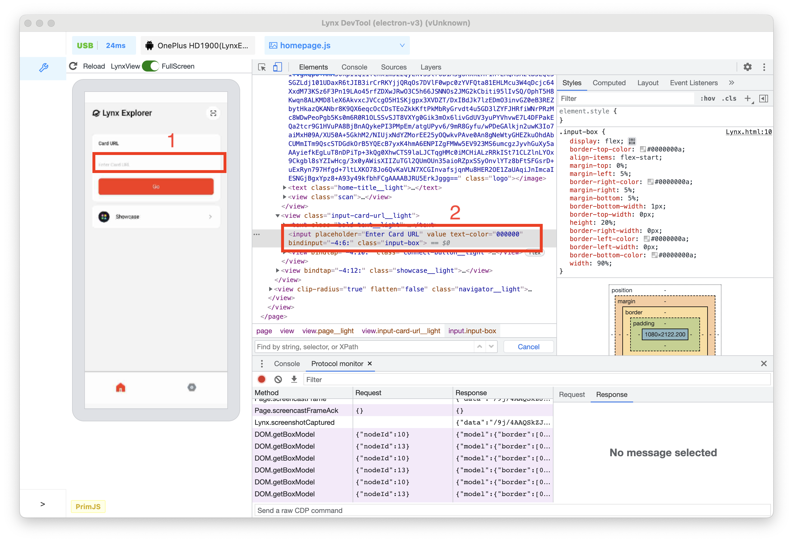 Now, the `` node is selected in the element tree.
2. Press the Up arrow key twice. `
Now, the `` node is selected in the element tree.
2. Press the Up arrow key twice. ` 3. Press the left arrow key. All child nodes of `
 2. Press the right arrow key on the keyboard to expand the `
 6. Press the Enter key, and you can see that the text change has taken effect both in the element tree and on the left preview window.
 ### Edit Attributes
To modify attributes, double-click on the attribute name or value. Follow the instructions below to learn how to modify the style attribute of a node.
1. Select the `
### Edit Attributes
To modify attributes, double-click on the attribute name or value. Follow the instructions below to learn how to modify the style attribute of a node.
1. Select the `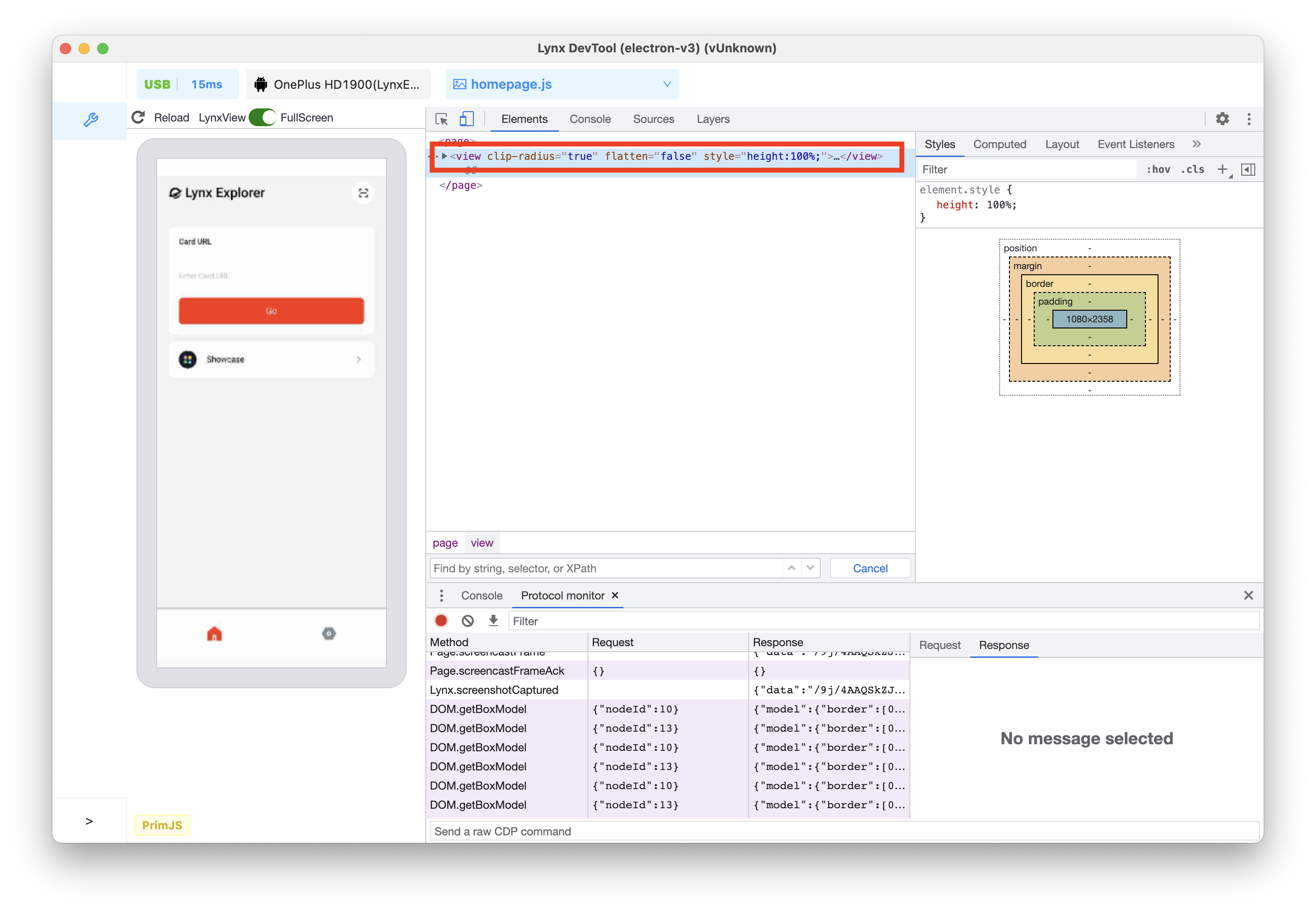 2. Double-click on the part that displays `style="height:100px;"`, and the text will be highlighted.
3. Modify the **style** content to `style="width:70%;height:100px;"`.
2. Double-click on the part that displays `style="height:100px;"`, and the text will be highlighted.
3. Modify the **style** content to `style="width:70%;height:100px;"`.
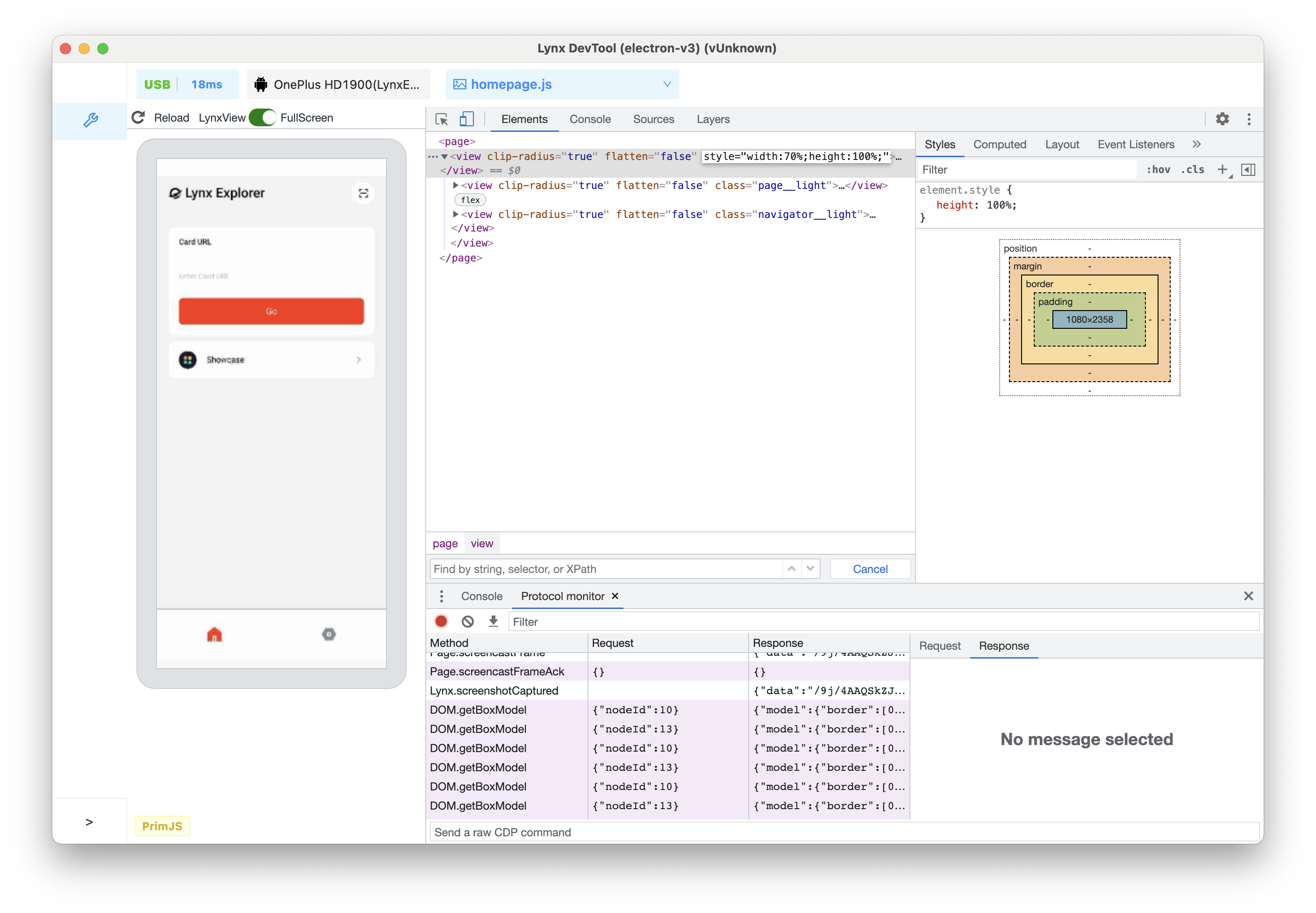 4. Press the Enter key, and you can see that the width change of the view has taken effect both in the element tree and on the left preview window.
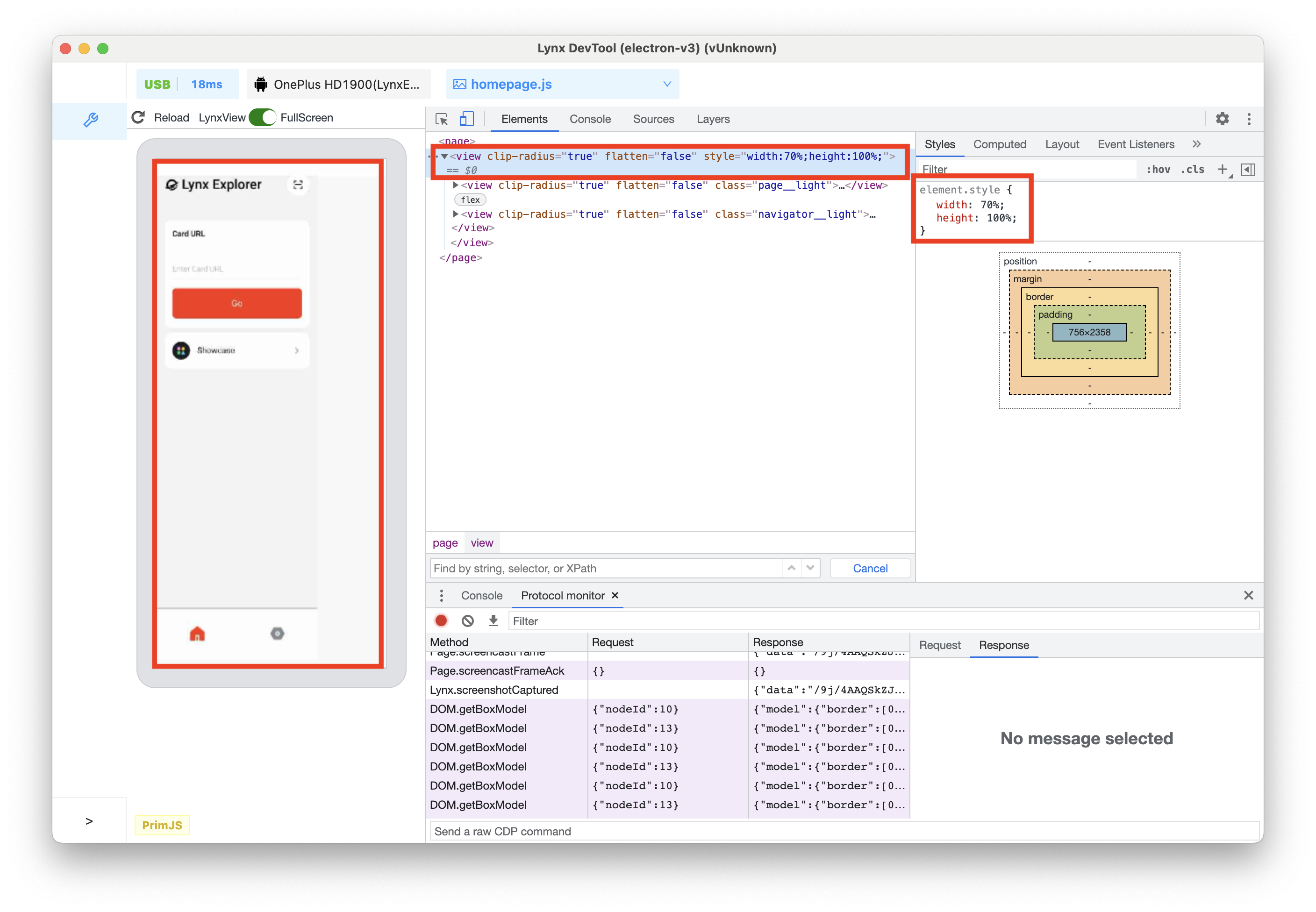 ## View and Change CSS
### View CSS for an Element
1. Click on the **Inspect** icon, and click on the text **Lynx Explorer** in the preview window.
2. The `
## View and Change CSS
### View CSS for an Element
1. Click on the **Inspect** icon, and click on the text **Lynx Explorer** in the preview window.
2. The `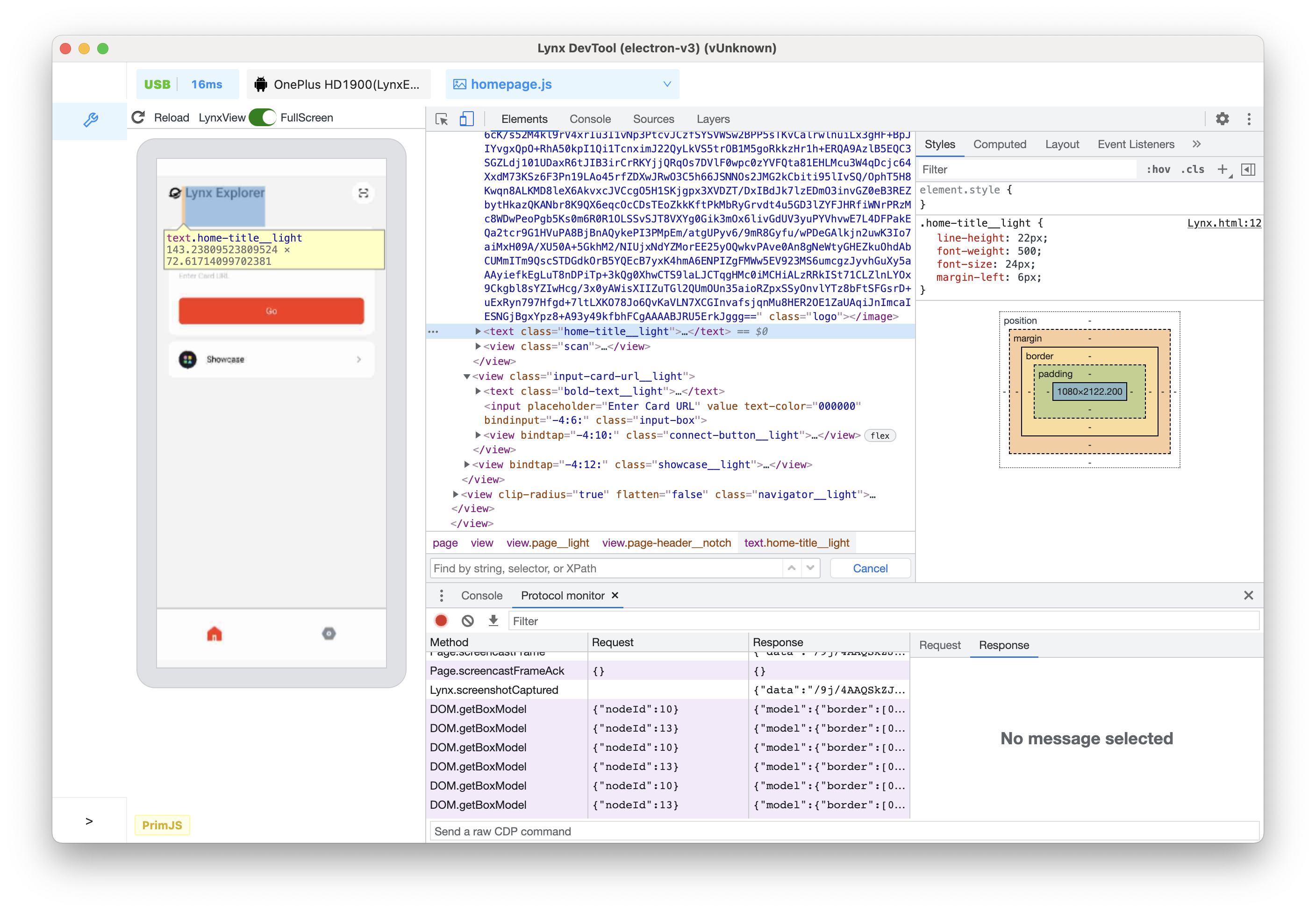 4. Switch to the **Computed** tab in the upper tab bar, and you can see the box model of the selected node, as well as all the resolved styles finally applied to the node.
### Add CSS Declarations to an Element
If you want to change or add CSS declarations to an element, use the **Styles** tab.
1. Selected `
4. Switch to the **Computed** tab in the upper tab bar, and you can see the box model of the selected node, as well as all the resolved styles finally applied to the node.
### Add CSS Declarations to an Element
If you want to change or add CSS declarations to an element, use the **Styles** tab.
1. Selected ` 4. Press the Enter key again. At this time, whether it is the UI effect on the preview window or the element tree, the style change has taken effect.
{' '}
4. Press the Enter key again. At this time, whether it is the UI effect on the preview window or the element tree, the style change has taken effect.
{' '}
 ### Interact with Elements in the Lynx Page preview window via the Box Model
1. Click on the **Inspect** icon, and hover over the Go button in the preview window.
2. At this time, you can see that all the box models are highlighted in the left preview window, from the inside to the outside are **content-box**/ **padding-box** / **border-box** / **margin-box**.
### Interact with Elements in the Lynx Page preview window via the Box Model
1. Click on the **Inspect** icon, and hover over the Go button in the preview window.
2. At this time, you can see that all the box models are highlighted in the left preview window, from the inside to the outside are **content-box**/ **padding-box** / **border-box** / **margin-box**.
 3. Click Go button, then corresponding `
 ## Find Invalid, Overridden, and Other CSS
### Check the CSS You Wrote
Suppose you added some CSS to an element and want to make sure the new styles are applied correctly. When you refresh the page, the element looks the same as before. Something went wrong.
The first thing to do is to inspect the element and make sure the new CSS is actually applied to the element.
Sometimes, you will see the new CSS in the **Elements** > **Styles** pane, but the new CSS appears as faded text, cannot be modified, is crossed out, or a warning or hint icon is displayed next to it.
### Understand CSS in the **Styles** Pane
The Styles pane can identify various CSS issues and highlight them in different ways.
#### Invalid and Declarations with Invalid Values
The **Styles** pane will cross out the following and display a warning icon next to the following:
* When the CSS property is invalid or unknown, the entire CSS declaration (property and value).
* When the CSS property is valid but the value is invalid, the entire CSS declaration (property and value).
## Find Invalid, Overridden, and Other CSS
### Check the CSS You Wrote
Suppose you added some CSS to an element and want to make sure the new styles are applied correctly. When you refresh the page, the element looks the same as before. Something went wrong.
The first thing to do is to inspect the element and make sure the new CSS is actually applied to the element.
Sometimes, you will see the new CSS in the **Elements** > **Styles** pane, but the new CSS appears as faded text, cannot be modified, is crossed out, or a warning or hint icon is displayed next to it.
### Understand CSS in the **Styles** Pane
The Styles pane can identify various CSS issues and highlight them in different ways.
#### Invalid and Declarations with Invalid Values
The **Styles** pane will cross out the following and display a warning icon next to the following:
* When the CSS property is invalid or unknown, the entire CSS declaration (property and value).
* When the CSS property is valid but the value is invalid, the entire CSS declaration (property and value).
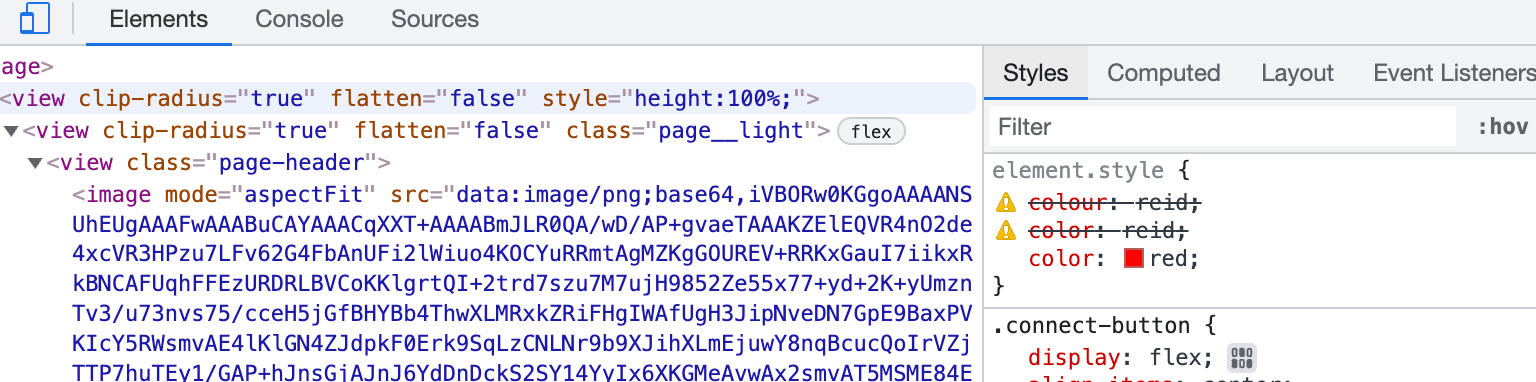 #### Overridden
The **Styles** pane will cross out properties that are overridden by other properties according to the cascade order.
#### Overridden
The **Styles** pane will cross out properties that are overridden by other properties according to the cascade order.
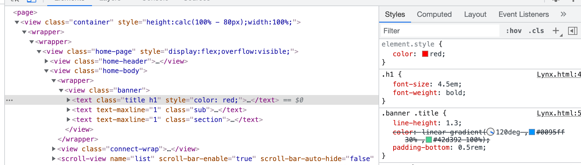 In this example, the `color:red;` style property on the element will override the `color:linear-gradient(120deg,#0095ff 30%,#42d392 100%);` on the `.banner.title` class.
#### Inherited and Non-Inherited
The **Styles** pane will list properties in the `Inherited from
In this example, the `color:red;` style property on the element will override the `color:linear-gradient(120deg,#0095ff 30%,#42d392 100%);` on the `.banner.title` class.
#### Inherited and Non-Inherited
The **Styles** pane will list properties in the `Inherited from 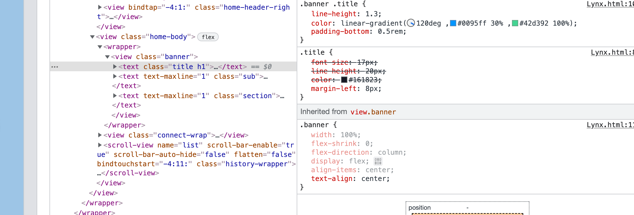 ---
url: /guide/debugging/lynx-devtool/console-panel.md
---
{`
.inline-content {
display: flex;
align-items: center;
flex-wrap: wrap;
}
.inline-content img {
margin: 0 5px;
height: 2rem;
}
.margin {
margin-top: 1rem;
margin-bottom: 1rem;
}
.margin2 {
margin-top: 0.5rem;
}
`}
# Console Panel
## Overview
Use the **Console** panel to [view logged messages](#view-logged-messages) and [run JavaScript](#run-javascript). Before you start debugging, please take some time to familiarize yourself with the [Lynx JavaScript Runtime](/guide/scripting-runtime/index.md#javascript-runtime).
---
url: /guide/debugging/lynx-devtool/console-panel.md
---
{`
.inline-content {
display: flex;
align-items: center;
flex-wrap: wrap;
}
.inline-content img {
margin: 0 5px;
height: 2rem;
}
.margin {
margin-top: 1rem;
margin-bottom: 1rem;
}
.margin2 {
margin-top: 0.5rem;
}
`}
# Console Panel
## Overview
Use the **Console** panel to [view logged messages](#view-logged-messages) and [run JavaScript](#run-javascript). Before you start debugging, please take some time to familiarize yourself with the [Lynx JavaScript Runtime](/guide/scripting-runtime/index.md#javascript-runtime).
 ### Open the Console Panel
The Console can be opened as a panel or as a tab in the Drawer.
#### Open in the Drawer
If you want to view the Console panel while using other panels, you can open the Console in the Drawer.
Please refer to [Open the Console in the Drawer | Chrome DevTools](https://developer.chrome.com/docs/devtools/console/reference#drawer).
### Console Settings
### Open the Console Panel
The Console can be opened as a panel or as a tab in the Drawer.
#### Open in the Drawer
If you want to view the Console panel while using other panels, you can open the Console in the Drawer.
Please refer to [Open the Console in the Drawer | Chrome DevTools](https://developer.chrome.com/docs/devtools/console/reference#drawer).
### Console Settings
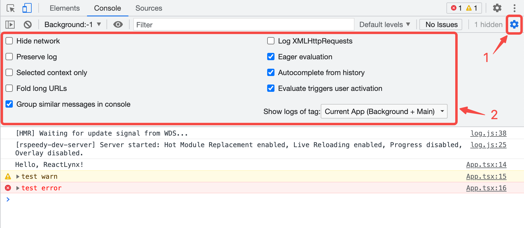 The following links explain each setting:
* [Selected context only](#filter-messages-from-different-contexts)
* [Group similar messages in console](#disable-message-grouping)
* [Eager evaluation](#disable-eager-evaluation)
* [Autocomplete from history](#disable-autocomplete-from-history)
### Console Sidebar
Please refer to [Open the Console Sidebar | Chrome DevTools](https://developer.chrome.com/docs/devtools/console/reference#sidebar).
## View Logged messages
The types of logs currently can be viewed include:
1. **JavaScript logs**. Including the main thread and the background thread.
* By default, logs from the background thread are displayed in full format, while logs from the main thread are serialized as strings with the `[main-thread.js]` prefix.
* When [Main Thread Debugging](/en/guide/debugging/lynx-devtool/sources-panel.md#debug-the-main-thread) is enabled, logs from the main thread will also be displayed in full format.
2. **Some client logs**.
Currently, client runtime errors and some other client logs are serialized as strings and displayed in the Console panel.
The following links explain each setting:
* [Selected context only](#filter-messages-from-different-contexts)
* [Group similar messages in console](#disable-message-grouping)
* [Eager evaluation](#disable-eager-evaluation)
* [Autocomplete from history](#disable-autocomplete-from-history)
### Console Sidebar
Please refer to [Open the Console Sidebar | Chrome DevTools](https://developer.chrome.com/docs/devtools/console/reference#sidebar).
## View Logged messages
The types of logs currently can be viewed include:
1. **JavaScript logs**. Including the main thread and the background thread.
* By default, logs from the background thread are displayed in full format, while logs from the main thread are serialized as strings with the `[main-thread.js]` prefix.
* When [Main Thread Debugging](/en/guide/debugging/lynx-devtool/sources-panel.md#debug-the-main-thread) is enabled, logs from the main thread will also be displayed in full format.
2. **Some client logs**.
Currently, client runtime errors and some other client logs are serialized as strings and displayed in the Console panel.
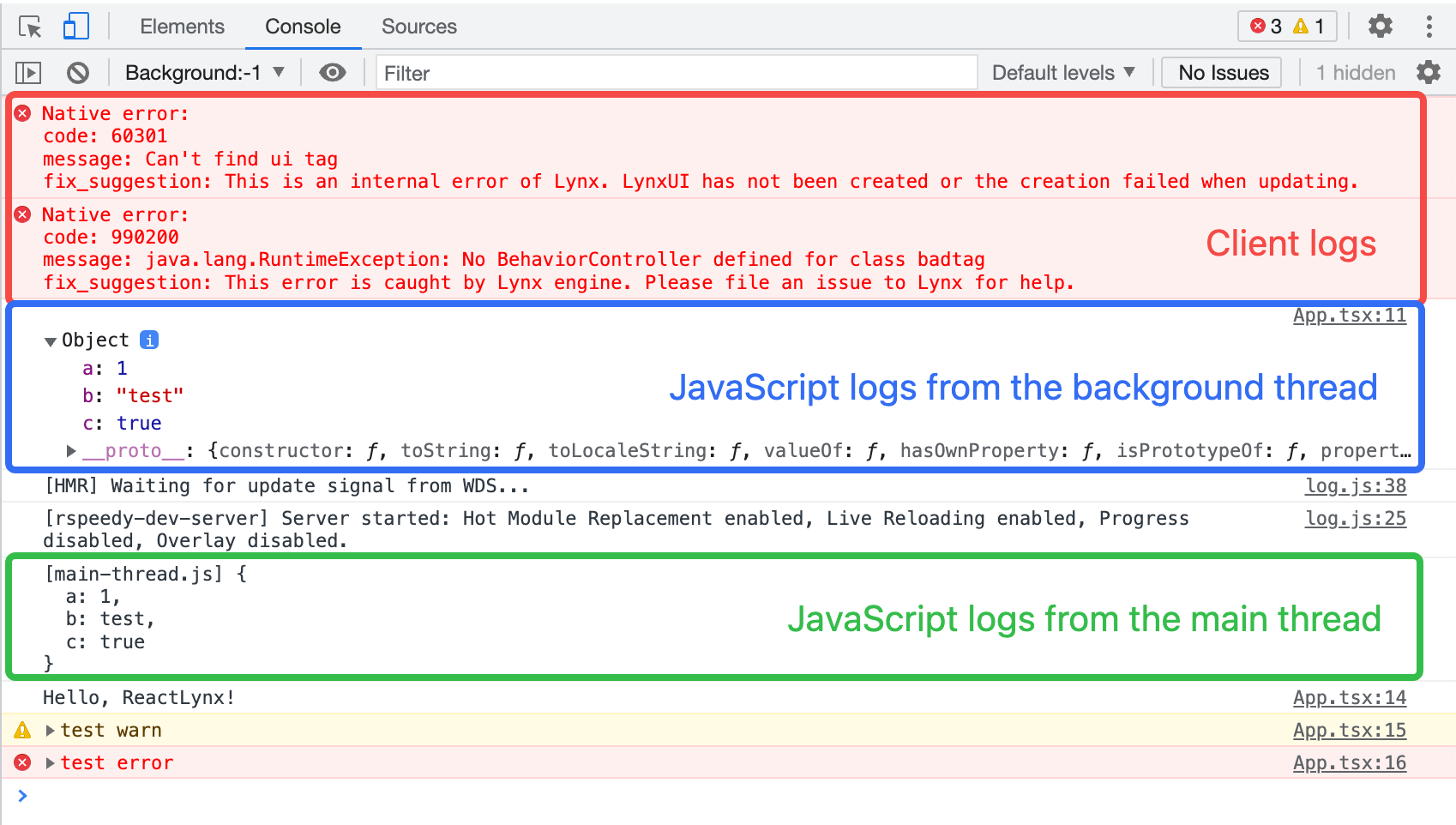 ### Log Sources
For JavaScript logs, the `App.tsx:11` on the right side of the log represents where it logged. Clicking it will open the [Sources](/en/guide/debugging/lynx-devtool/sources-panel.md) panel and highlight the line of code that caused the message to get logged to the Console.
### Log Sources
For JavaScript logs, the `App.tsx:11` on the right side of the log represents where it logged. Clicking it will open the [Sources](/en/guide/debugging/lynx-devtool/sources-panel.md) panel and highlight the line of code that caused the message to get logged to the Console.
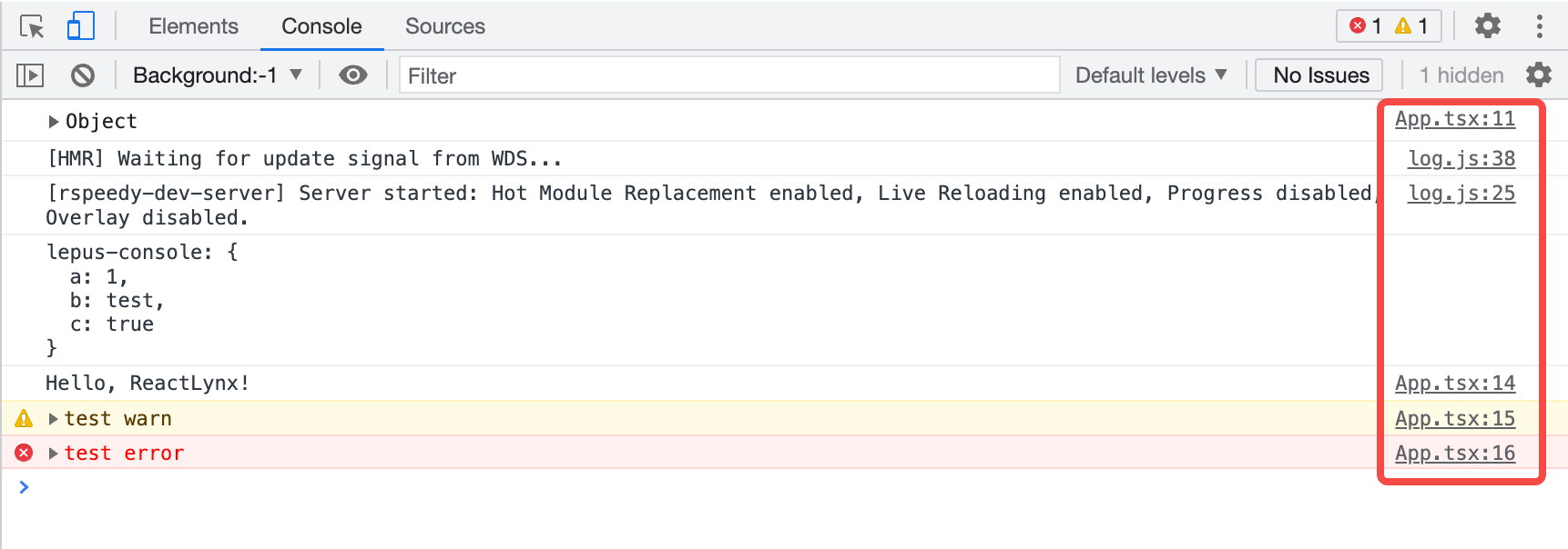 ### Disable Message Grouping
DevTool enables **Group similar messages in console** by default, which aggregates similar messages logged consecutively.
### Disable Message Grouping
DevTool enables **Group similar messages in console** by default, which aggregates similar messages logged consecutively.
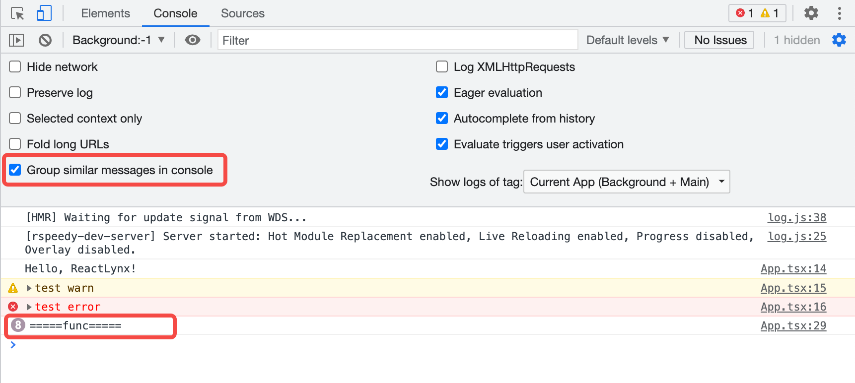 Open [Console Settings](#console-settings) and disable this option to expand the logs that were originally grouped.
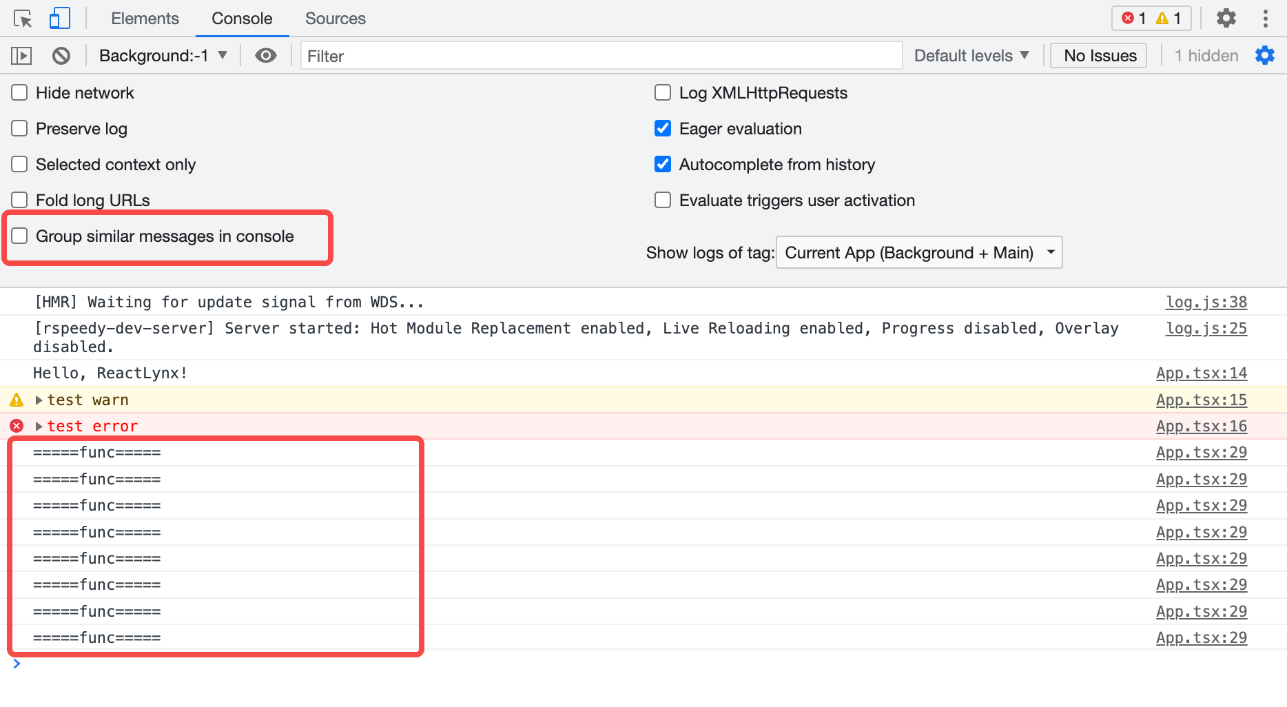 ### View Stack Traces
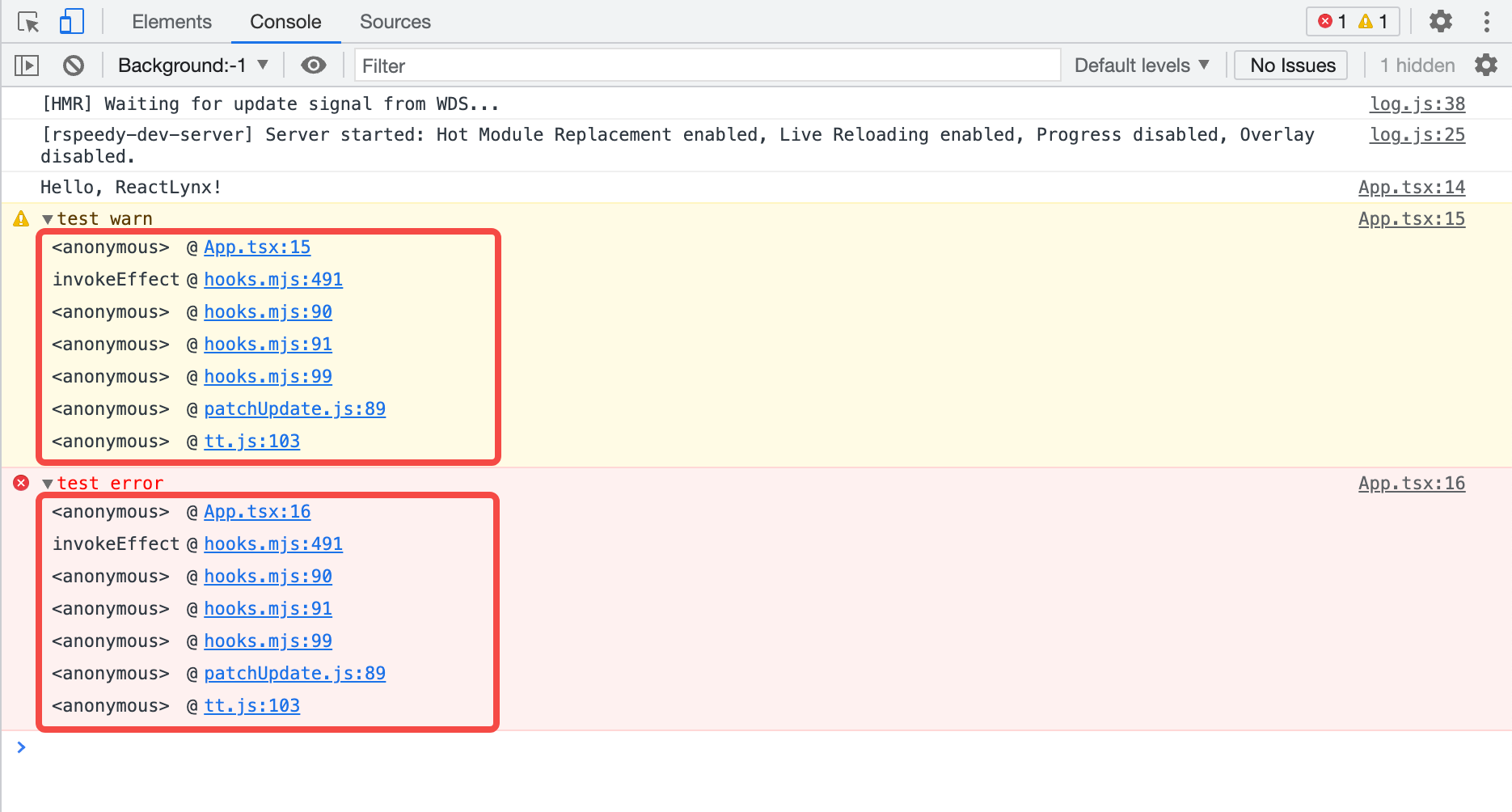 ### Filter messages
#### Filter by Log Level
Please refer to [Filter by log level | Chrome DevTools](https://developer.chrome.com/docs/devtools/console/reference#level).
:::tip
When the sidebar is open, you cannot click the log level drop-down.
:::
#### Filter by Text
Please refer to [Filter by text | Chrome DevTools](https://developer.chrome.com/docs/devtools/console/log#text).
#### Filter by Regular Expressions
Please refer to [Filter by regular expression | Chrome DevTools](https://developer.chrome.com/docs/devtools/console/log#regex).
#### Filter by URL
Please refer to [Filter messages by URL | Chrome DevTools](https://developer.chrome.com/docs/devtools/console/reference#url).
#### Filter Messages from Different [Contexts](/guide/spec.md#scripting-runtime-enviroment①)
By default, all logs are displayed within the context of the background thread. When [Main thread debugging](/en/guide/debugging/lynx-devtool/sources-panel.md#debug-the-main-thread) is enabled, an additional context of the main thread will be added.
As shown in the figure, `Background:-1` represents the background thread, and `Main` represents the main thread.
### Filter messages
#### Filter by Log Level
Please refer to [Filter by log level | Chrome DevTools](https://developer.chrome.com/docs/devtools/console/reference#level).
:::tip
When the sidebar is open, you cannot click the log level drop-down.
:::
#### Filter by Text
Please refer to [Filter by text | Chrome DevTools](https://developer.chrome.com/docs/devtools/console/log#text).
#### Filter by Regular Expressions
Please refer to [Filter by regular expression | Chrome DevTools](https://developer.chrome.com/docs/devtools/console/log#regex).
#### Filter by URL
Please refer to [Filter messages by URL | Chrome DevTools](https://developer.chrome.com/docs/devtools/console/reference#url).
#### Filter Messages from Different [Contexts](/guide/spec.md#scripting-runtime-enviroment①)
By default, all logs are displayed within the context of the background thread. When [Main thread debugging](/en/guide/debugging/lynx-devtool/sources-panel.md#debug-the-main-thread) is enabled, an additional context of the main thread will be added.
As shown in the figure, `Background:-1` represents the background thread, and `Main` represents the main thread.
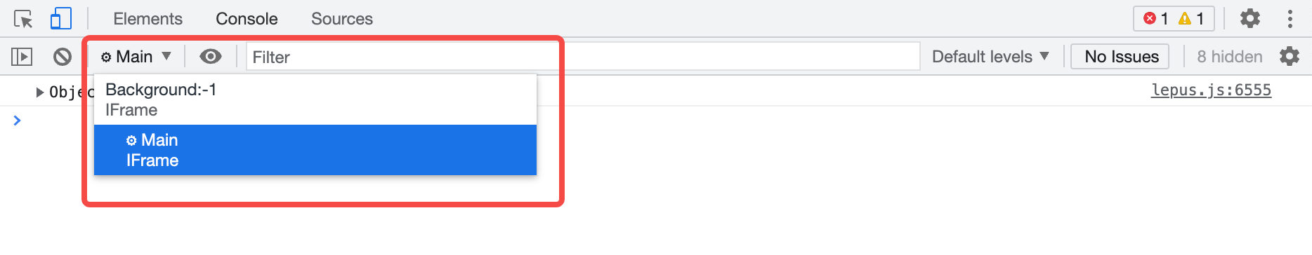 When you [run JavaScript in the Console](#run-javascript), it will execute only within the currently selected context.
Open [Console Settings](#console-settings) and enable **Selected context only** checkbox to display logs only from the currently selected context.
When you [run JavaScript in the Console](#run-javascript), it will execute only within the currently selected context.
Open [Console Settings](#console-settings) and enable **Selected context only** checkbox to display logs only from the currently selected context.
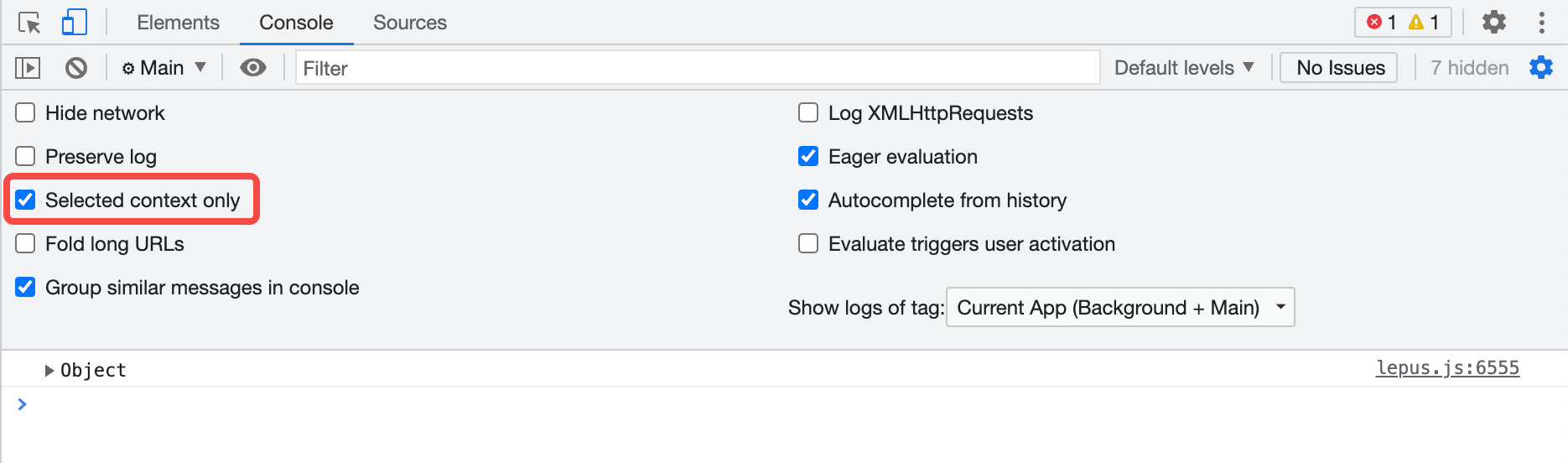 ### Search for Text
Please refer to [Search for text in logs | Chrome DevTools](https://developer.chrome.com/docs/devtools/console/reference#search).
## Run JavaScript
The Console is a **REPL**, which stands for "Read, Evaluate, Print, and Loop." It reads the JavaScript you enter, evaluates your code, outputs the result of the expression, and then loops back to the first step.
You can enter expressions related to the current page in the Console, such as `this`.
You can also enter expressions unrelated to the current page, such as `1+2`.
Press Enter to get the result, and the Console will output the result of the expression below the code.
### Search for Text
Please refer to [Search for text in logs | Chrome DevTools](https://developer.chrome.com/docs/devtools/console/reference#search).
## Run JavaScript
The Console is a **REPL**, which stands for "Read, Evaluate, Print, and Loop." It reads the JavaScript you enter, evaluates your code, outputs the result of the expression, and then loops back to the first step.
You can enter expressions related to the current page in the Console, such as `this`.
You can also enter expressions unrelated to the current page, such as `1+2`.
Press Enter to get the result, and the Console will output the result of the expression below the code.
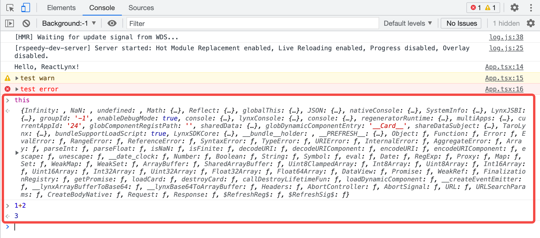 ### String Copy Options
Please refer to [String copy options | Chrome DevTools](https://developer.chrome.com/docs/devtools/console/reference#string-copy-options).
### String Copy Options
Please refer to [String copy options | Chrome DevTools](https://developer.chrome.com/docs/devtools/console/reference#string-copy-options).
 For example, in this case, the results of copying are as follows:
```javascript
{"a":123,"b":"string"}
'{"a":123,"b":"string"}'
"{\"a\":123,\"b\":\"string\"}"
```
### Re-run Expressions from History
Please refer to [Re-run expressions from history | Chrome DevTools](https://developer.chrome.com/docs/devtools/console/reference#history).
### Watch Expression Values in Real-Time
Please refer to [Watch JavaScript values in real time with Live Expressions | Chrome DevTools](https://developer.chrome.com/docs/devtools/console/live-expressions).
### Disable Eager Evaluation
Please refer to [Disable Eager Evaluation | Chrome DevTools](https://developer.chrome.com/docs/devtools/console/reference#eagereval).
### Disable Autocomplete from History
Please refer to [Disable autocomplete from history | Chrome DevTools](https://developer.chrome.com/docs/devtools/console/reference#autocomplete).
## Clear the Console
You can use any of the following workflows to clear the Console:
*
For example, in this case, the results of copying are as follows:
```javascript
{"a":123,"b":"string"}
'{"a":123,"b":"string"}'
"{\"a\":123,\"b\":\"string\"}"
```
### Re-run Expressions from History
Please refer to [Re-run expressions from history | Chrome DevTools](https://developer.chrome.com/docs/devtools/console/reference#history).
### Watch Expression Values in Real-Time
Please refer to [Watch JavaScript values in real time with Live Expressions | Chrome DevTools](https://developer.chrome.com/docs/devtools/console/live-expressions).
### Disable Eager Evaluation
Please refer to [Disable Eager Evaluation | Chrome DevTools](https://developer.chrome.com/docs/devtools/console/reference#eagereval).
### Disable Autocomplete from History
Please refer to [Disable autocomplete from history | Chrome DevTools](https://developer.chrome.com/docs/devtools/console/reference#autocomplete).
## Clear the Console
You can use any of the following workflows to clear the Console:
*  ---
url: /guide/debugging/lynx-devtool/sources-panel.md
---
{`
.inline-content {
display: flex;
align-items: center;
flex-wrap: wrap;
}
.inline-content img {
margin: 0 5px;
height: 2rem;
}
.margin {
margin-top: 1rem;
margin-bottom: 1rem;
}
.margin2 {
margin-top: 0.5rem;
}
`}
# Sources Panel
Use the **Sources** panel to debug JavaScript. Before you start debugging, please take some time to familiarize yourself with the [Lynx JavaScript Runtime](/guide/scripting-runtime/index.md#javascript-runtime).
After DevTool is enabled, the background thread uses the PrimJS engine for debugging by default. On Android, you can also switch to the V8 engine for a more comprehensive debugging experience.
To switch to the V8 engine, open the [DevTool Switch Page](/guide/start/integrate-lynx-devtool-advanced.md#debugging-devtool-switch), toggle the "**V8 Engine**" switch to "**On**" and restart the application. You can check the current engine type in the lower-left corner of the [Preview Window](/guide/debugging/lynx-devtool/elements-panel.md#introduction-to-the-preview-panel).
## Overview
The **Sources** panel has three sections:
1. **File Navigation Pane**. All JavaScript files of the page are listed here.
2. **Code Editor Pane**. After selecting a file in the **File Navigation Pane**, the contents of the file are displayed here.
3. **Debugger Pane**. Various tools for inspecting the page's JavaScript.
## File Navigation
### Open File
You can use the **File Navigation Pane** or the **Open file** feature to open the file of interest.
Click **More Options**
and select **Open file**. A dialog will display.
You can enter the file URL here or select a file from the drop-down list.
The bottom status bar of the **Code Editor Pane** will display the line and column number of the current mouse position.
Click **Show navigator**
button to collapse/expand the **File Navigation Pane**.
### Close File
You can close a file in the following ways:
* Hover the mouse over the file name tab at the top of the **Code Editor Pane** and click the **close** button.
* Right-click the file name tab at the top of the **Code Editor Pane**:
* Close: Close the current file.
* Close others: Close other files.
* Close all: Close all files.
### Locate File
To locate the file currently displayed in the **Code Editor Pane**:
1. Right-click anywhere in the **Code Editor Pane** or right-click the file name tab at the top of the **Code Editor Pane**.
2. Select **Reveal in sidebar**.
### Search Code
To search a code segment:
1. Click **Customize And Control DevTools**
---
url: /guide/debugging/lynx-devtool/sources-panel.md
---
{`
.inline-content {
display: flex;
align-items: center;
flex-wrap: wrap;
}
.inline-content img {
margin: 0 5px;
height: 2rem;
}
.margin {
margin-top: 1rem;
margin-bottom: 1rem;
}
.margin2 {
margin-top: 0.5rem;
}
`}
# Sources Panel
Use the **Sources** panel to debug JavaScript. Before you start debugging, please take some time to familiarize yourself with the [Lynx JavaScript Runtime](/guide/scripting-runtime/index.md#javascript-runtime).
After DevTool is enabled, the background thread uses the PrimJS engine for debugging by default. On Android, you can also switch to the V8 engine for a more comprehensive debugging experience.
To switch to the V8 engine, open the [DevTool Switch Page](/guide/start/integrate-lynx-devtool-advanced.md#debugging-devtool-switch), toggle the "**V8 Engine**" switch to "**On**" and restart the application. You can check the current engine type in the lower-left corner of the [Preview Window](/guide/debugging/lynx-devtool/elements-panel.md#introduction-to-the-preview-panel).
## Overview
The **Sources** panel has three sections:
1. **File Navigation Pane**. All JavaScript files of the page are listed here.
2. **Code Editor Pane**. After selecting a file in the **File Navigation Pane**, the contents of the file are displayed here.
3. **Debugger Pane**. Various tools for inspecting the page's JavaScript.
## File Navigation
### Open File
You can use the **File Navigation Pane** or the **Open file** feature to open the file of interest.
Click **More Options**
and select **Open file**. A dialog will display.
You can enter the file URL here or select a file from the drop-down list.
The bottom status bar of the **Code Editor Pane** will display the line and column number of the current mouse position.
Click **Show navigator**
button to collapse/expand the **File Navigation Pane**.
### Close File
You can close a file in the following ways:
* Hover the mouse over the file name tab at the top of the **Code Editor Pane** and click the **close** button.
* Right-click the file name tab at the top of the **Code Editor Pane**:
* Close: Close the current file.
* Close others: Close other files.
* Close all: Close all files.
### Locate File
To locate the file currently displayed in the **Code Editor Pane**:
1. Right-click anywhere in the **Code Editor Pane** or right-click the file name tab at the top of the **Code Editor Pane**.
2. Select **Reveal in sidebar**.
### Search Code
To search a code segment:
1. Click **Customize And Control DevTools**
 2. Enter text and press Enter to search.
3. Click search results to jump to the corresponding file and the code will be highlighted.
You can also:
* Click **Match Case**
2. Enter text and press Enter to search.
3. Click search results to jump to the corresponding file and the code will be highlighted.
You can also:
* Click **Match Case**
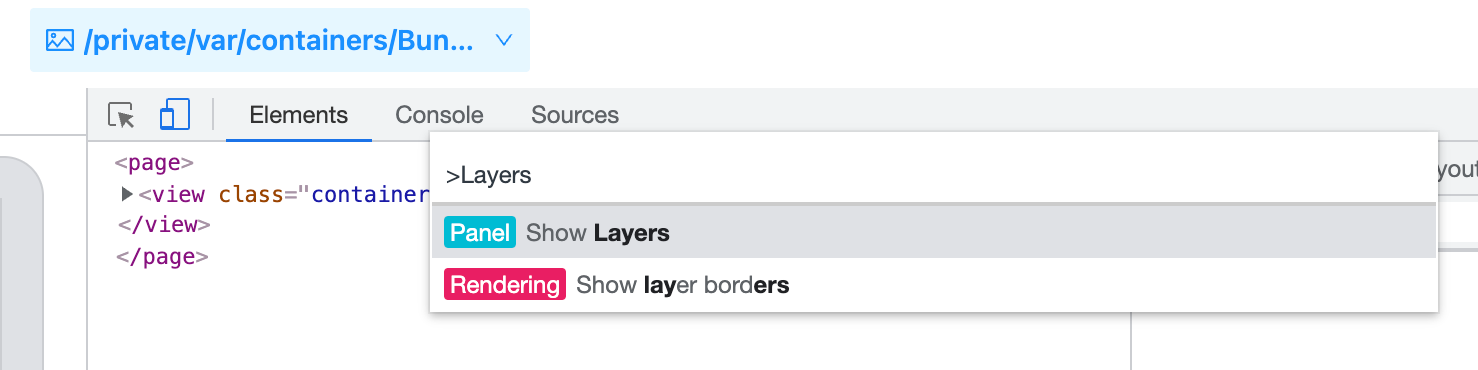 Or, select the More options in the upper right corner -> **More tools** -> **Layers**.
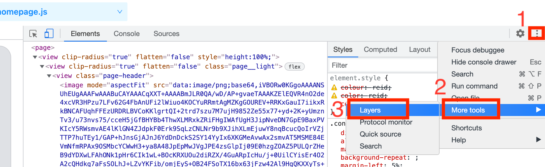 ## View page Layers
The leftmost part of the **Layers** panel lists all the rendered layers of the Lynx page in an expandable tree. This tree structure is updated as the mobile **Lynx** page is updated. Layers are identified by their **CSS** selector or a number (followed by the layer size in pixels).
## View page Layers
The leftmost part of the **Layers** panel lists all the rendered layers of the Lynx page in an expandable tree. This tree structure is updated as the mobile **Lynx** page is updated. Layers are identified by their **CSS** selector or a number (followed by the layer size in pixels).
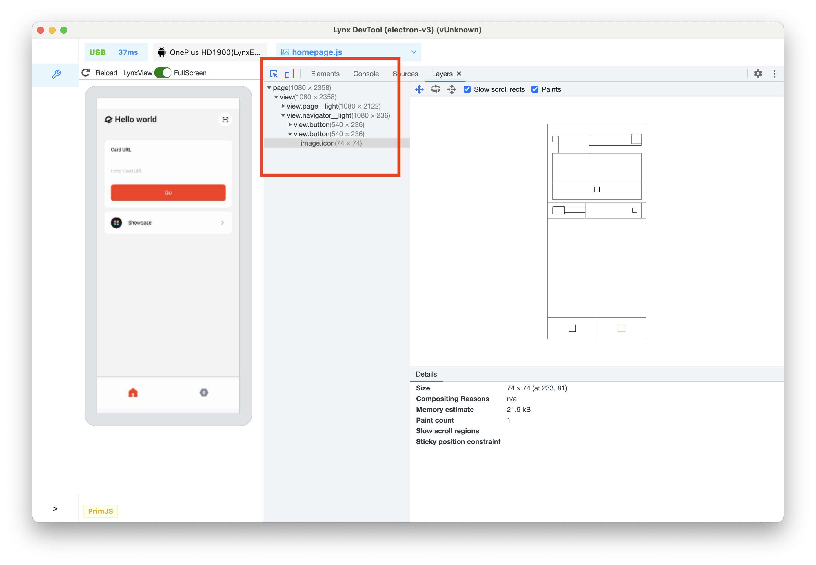 Hover the mouse over a layer to highlight it on the Lynx page preview window. A tooltip will be displayed on the page preview, which contains the following information:
* The selector of the layer
* The size of the layer (in pixels)
Hover the mouse over a layer to highlight it on the Lynx page preview window. A tooltip will be displayed on the page preview, which contains the following information:
* The selector of the layer
* The size of the layer (in pixels)
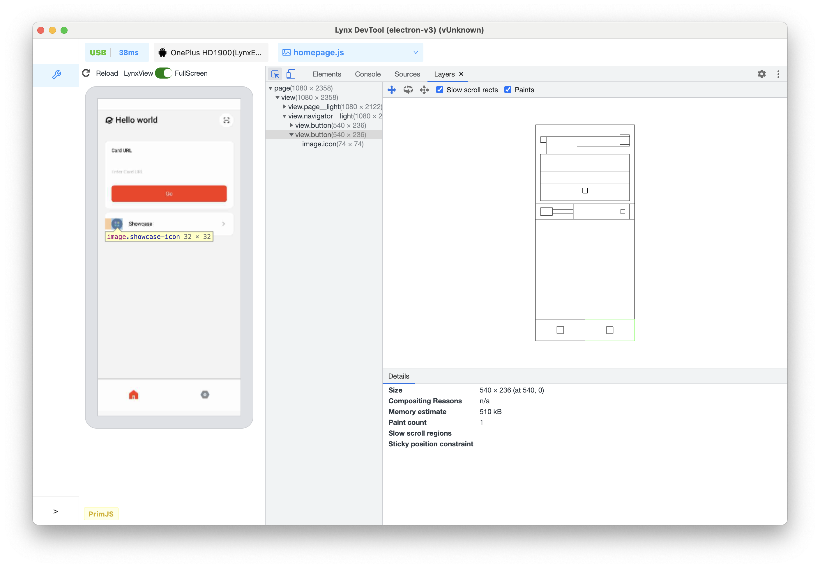 ## Inspect page Layers
Click on a layer to view more information in the **Details** pane.
## Inspect page Layers
Click on a layer to view more information in the **Details** pane.
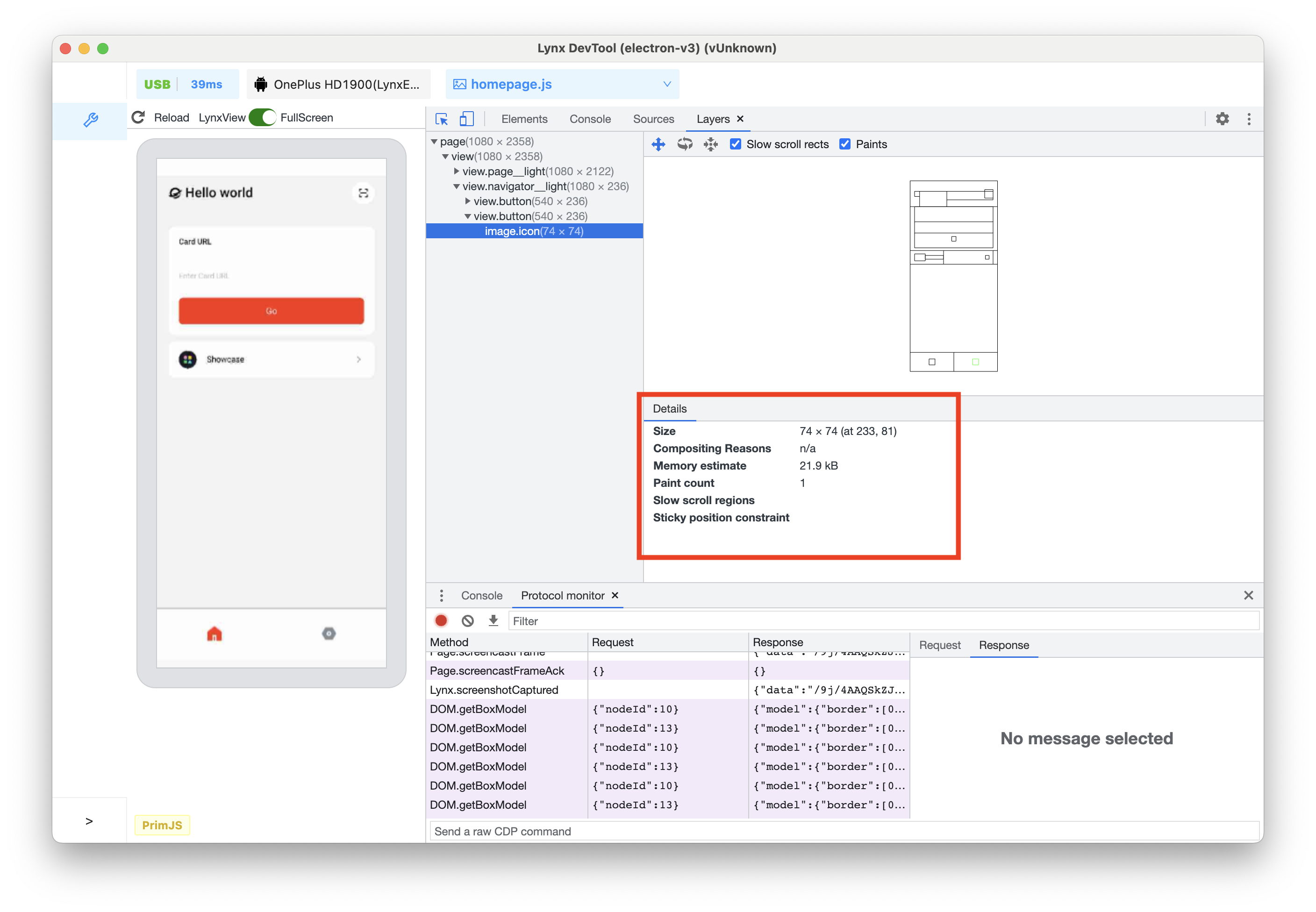 Depending on the layer, the following information will be displayed:
* Size
* Compositing reason
* Memory estimate
* Number of draws
The following figure shows the stacking and arrangement of the layers of this **Lynx** page.
Depending on the layer, the following information will be displayed:
* Size
* Compositing reason
* Memory estimate
* Number of draws
The following figure shows the stacking and arrangement of the layers of this **Lynx** page.
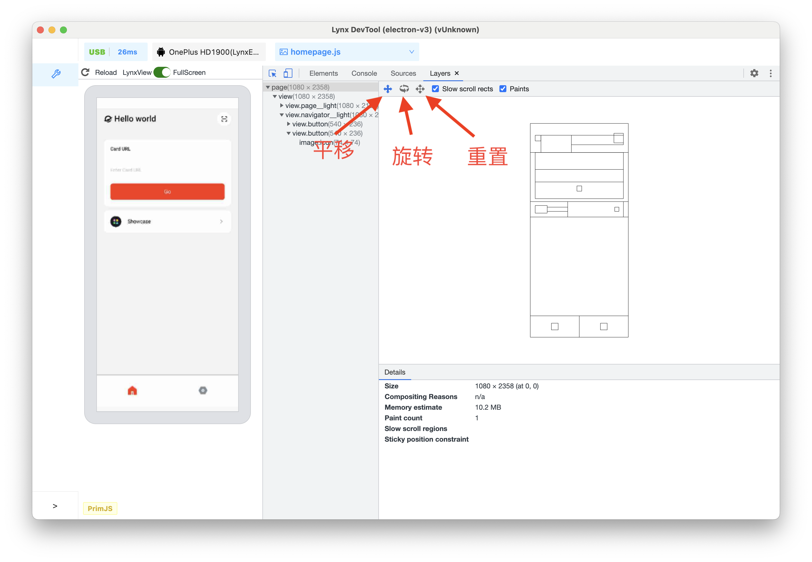 To move the chart, do the following:
* Use **WASD** to move the chart. Press W to pan up, A to pan left, S to pan down, and D to pan right.
* Click the **Pan Mode** icon to move along the X and Y axes.
* Click the **Rotate Mode** icon to rotate along the Z axis.
* Click **Reset Transform** to reset the chart to its original position.
* Scroll the mouse wheel up to zoom in.
* Scroll the mouse wheel down to zoom out.
To view the element corresponding to the layer in the **Elements** panel, right-click on the corresponding layer in the chart or layer tree, and then click **Reveal in Elements panel**.
To move the chart, do the following:
* Use **WASD** to move the chart. Press W to pan up, A to pan left, S to pan down, and D to pan right.
* Click the **Pan Mode** icon to move along the X and Y axes.
* Click the **Rotate Mode** icon to rotate along the Z axis.
* Click **Reset Transform** to reset the chart to its original position.
* Scroll the mouse wheel up to zoom in.
* Scroll the mouse wheel down to zoom out.
To view the element corresponding to the layer in the **Elements** panel, right-click on the corresponding layer in the chart or layer tree, and then click **Reveal in Elements panel**.
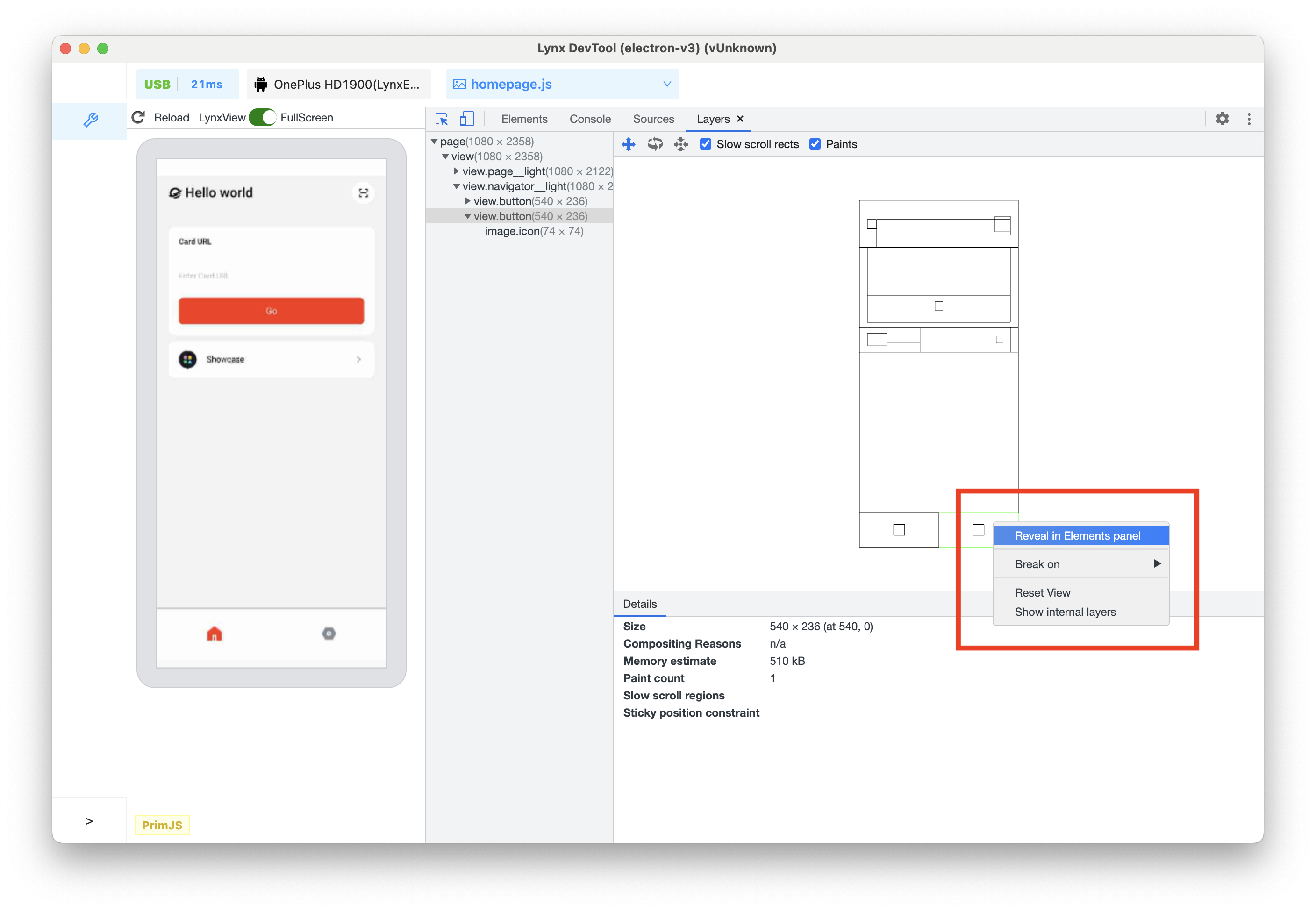 ---
url: /guide/debugging/handle-errors.md
---
# Handle Errors in Lynx
## Recognize Errors in Tools
When you are developing Lynx apps, you may encounter various types of errors that are designed to notify you the unexpected situations that have just happened.
For example, if the bundle file is broken, you'll see:
Also, sometimes when your JavaScript code contains an TypeError:
Sometimes, a [native module](/guide/spec.md#nativemodules) is called with a wrong number of arguments:
With DevTool or LogBox, you shall easily recognize them.
## LogBox
You've already seen it above - the in-app tool that displays errors.
It's convenient for a quick overview and lets you know what's happening.
However, for development purposes, we recommend using DevTool Desktop Application with more features and a better interactive experience.
## Handle Errors in Code
Now let's try to do something with the errors.
You may want to have an overall understanding of the [errors](/api/errors/lynx-error.md) first if you want to handle them in your code.
And then, here is an example of handling error [301](/api/errors/error-code.md#eb_resource_image-301) in code:
```tsx
const ImageErrorExample = () => {
const [isImageError, setImageError] = useState(false);
const handleImageError = (event: ErrorEvent) => {
setImageError(true);
console.log('Image loaded error:', JSON.stringify(event));
};
if (isImageError) {
return
---
url: /guide/debugging/handle-errors.md
---
# Handle Errors in Lynx
## Recognize Errors in Tools
When you are developing Lynx apps, you may encounter various types of errors that are designed to notify you the unexpected situations that have just happened.
For example, if the bundle file is broken, you'll see:
Also, sometimes when your JavaScript code contains an TypeError:
Sometimes, a [native module](/guide/spec.md#nativemodules) is called with a wrong number of arguments:
With DevTool or LogBox, you shall easily recognize them.
## LogBox
You've already seen it above - the in-app tool that displays errors.
It's convenient for a quick overview and lets you know what's happening.
However, for development purposes, we recommend using DevTool Desktop Application with more features and a better interactive experience.
## Handle Errors in Code
Now let's try to do something with the errors.
You may want to have an overall understanding of the [errors](/api/errors/lynx-error.md) first if you want to handle them in your code.
And then, here is an example of handling error [301](/api/errors/error-code.md#eb_resource_image-301) in code:
```tsx
const ImageErrorExample = () => {
const [isImageError, setImageError] = useState(false);
const handleImageError = (event: ErrorEvent) => {
setImageError(true);
console.log('Image loaded error:', JSON.stringify(event));
};
if (isImageError) {
return