


InputOTP
A headless, configurable-length OTP and PIN input for ReactLynx. InputOTP owns keyboard, focus, deletion, paste, filtering, and value state through one hidden native input. Consumers compose the visible field with InputOTPSlot.You can check the source code to understand how it works, and you're welcome to submit PRs to enhance its capabilities.
Basic Usage
Build a controlled six-character code field with autofocus and completion handling.
Examples
Capabilities
Explore input types, render props, states, masking, separators, and keyboard avoidance.
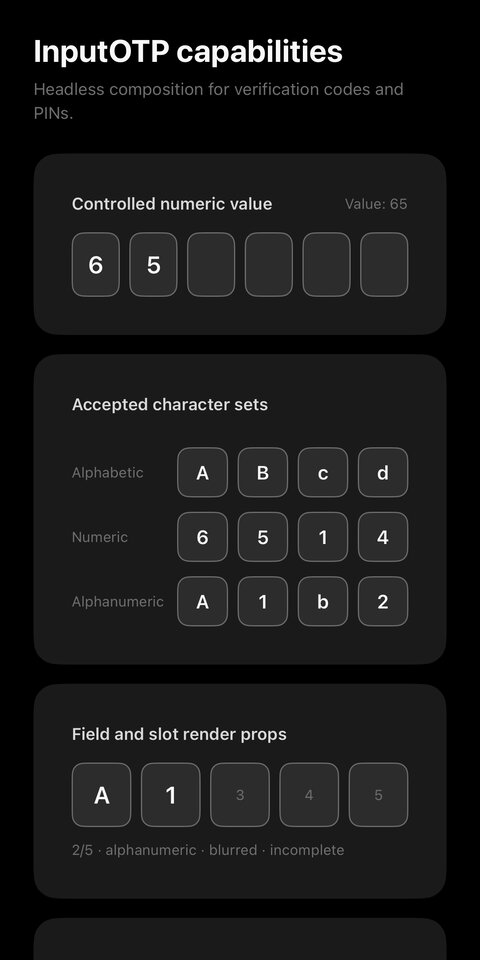
Keyboard Aware
Keep a code field near the bottom of the page visible above the software keyboard.
RTL
Let the code field inherit right-to-left direction from its surrounding layout.
Structure
Component API
InputOTP
Props for InputOTP.
ui-invalid UI variant.State-based styling & rendering
This component exposes runtime states through one or both of the following channels. The table lists only the channels available for each state:
- UI variant class — when supported, a class like
ui-<state>is toggled on the corresponding component node for selectors such as.ui-<state> { ... }. - Render-prop field — when supported and
childrenis a function, the state is passed in viachildren({ <state>: boolean, ... })for runtime-driven rendering.
UI variants applied by InputOTP based on its render state.
| Class Name | Render Prop | Type | Description |
|---|---|---|---|
| ui-complete | complete | boolean | Whether every slot is filled. Applied to the root when every slot is filled. |
| ui-disabled | disabled | boolean | Whether input is disabled. Applied to the root while input is disabled. |
| ui-focused | focused | boolean | Whether the hidden native input is focused. Applied to the root while the hidden input is focused. |
| ui-invalid | invalid | boolean | Whether the field is invalid. Applied to the root while the value is invalid. |
InputOTPSlot
Props for an individual InputOTP visual slot.
UI variants applied by InputOTPSlot based on its render state.
| Class Name | Render Prop | Type | Description |
|---|---|---|---|
| ui-complete | complete | boolean | Whether every slot in the field is filled. Applied to every slot when the field is complete. |
| ui-disabled | disabled | boolean | Whether input is disabled. Applied to the slot while input is disabled. |
| ui-filled | filled | boolean | Whether this slot contains a character. Applied to slots that contain a character. |
| ui-focused | focused | boolean | Whether this is the focused slot that contains the visual caret. Applied to the slot that contains the visual caret. |
| ui-invalid | invalid | boolean | Whether the field is invalid. Applied to the slot while the value is invalid. |
InputOTPRef
Imperative methods exposed by InputOTP.