动效
Lynx 提供了丰富的动效功能,使得开发者能够在 Lynx 中构建出更加现代、流畅且易于理解的用户界面。利用这些动效功能,可以打造出绚丽的过渡效果、自然的动效反馈,从而提升用户体验。
为布局和样式的变化添加过渡动画
如果你需要对布局或样式在发生变化时平滑地应用新的属性值,可以使用过渡动画。
过渡动画提供了一种在更改 CSS 属性时控制动画速度的方法。与属性更改立即生效不同,你可以让属性的更改在一段时间内逐渐发生。例如,当你将一个元件的颜色从白色变为黑色时,通常该更改是瞬间完成的。而启用过渡动画后,变化将在一个符合加速曲线的时间间隔内发生,这一切都可以进行自定义。
过渡动画具有自动触发、非重复播放、简单易用的特点,可以通过复合 transition 来定义动画属性和时长,也可以使用单条形式的 transition-property 和 transition-duration 等来指定。
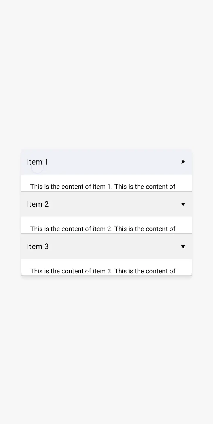
实现列表项收起展开效果
你可以使用过渡效果为列表中一个列表项添加从收起到展开的动画:
通过关键帧实现炫酷的效果
如果你需要多组样式配置按序列过渡的效果,可以使用关键帧动画。
关键帧动画通过 CSS 中的 @keyframes 规则定义,指定动画各个阶段的样式变化;并使用 animation 属性可以将定义好的动画应用到元件上,并设置动画名称、持续时间、延迟、播放次数等参数。
关键帧动画相较过渡动画更为灵活和可控,允许你指定过程以及更细粒度的时间曲线,可以在 CSS 中定义 @keyframes,然后通过复合 animation 属性来指定,也可以使用单条形式的 animation-name、animation-duration 等属性进行定义。
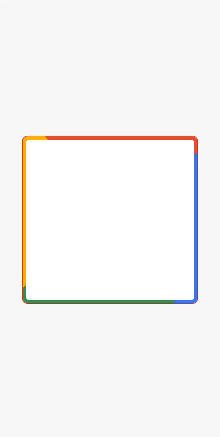
实现旋转特效
通过关键帧动画,我们可以实现一个边框旋转的效果。
实现弹簧效果
通过关键帧动画,我们可以为元件的运动添加符合弹簧物理效果的动画。

在 JS 中灵活创建关键帧动画
此外,我们提供的 animate api 扩展了 CSS 关键帧动画的应用范围,使你能够在 JavaScript 代码中更加灵活和动态地创建和控制动画。通过 animate 开发者能够在运行时根据交互或逻辑条件动态生成和修改动画,为用户提供更加生动和互动的体验。
实现变速运动
通过使用 animate api,为原件增加一个可以实时变化速率的动效。