Visual Appearance
Background and Borders
You can do a lot creative things with background and borders. Using background-image to
apply network image or gradient effects to the background area of an element, using border-radius to add a rounded corner, using box-shadow to create a shadow effect.
In the following example, we add a background with gradient effect, two styles of borders at top and left sides, a black shadow to an element with the top right corner rounded.
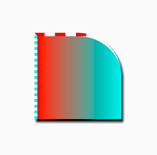
border-image and related properties are under development.
Colors
With Lynx CSS, you can apply color values to various properties to create the look you want.
Properties that can have color
Text
color: The color to use when drawing the text.-x-handle-color: The color of selection handlers (the cursor on the two ends of the selected text) when text is selected.text-shadow: The color of the shadow in the shape of text.text-decoration-color: The color to use when drawing the decoration line on the text.
Background and Border
background-color: The background color of the element.box-shadow: The color of shadow.border-color: The color to use when drawing the border. Can be set separately for the foursides viaborder-top-color,border-top-color,border-top-colororborder-top-coloras well.
Colors can be set to the property via selectors or the style property of the element directly.
The color value should be a hex number start with a '#', or a value calculated by function rgb(), rgba() or hsl(). View the specification for <color> value for more details.
Gradient
You can use <gradient> value to define a gradient effect and apply it to the following properties:
color: Drawing the text with a gradient effect.background-image: Fill the background area with a gradient effect.mask-image: Use the gradient effect to create a alpha mask.
 Text with a gradient color | 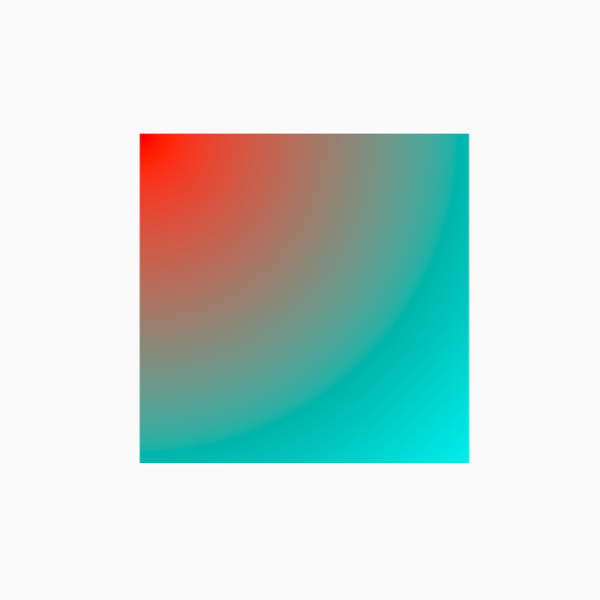 Filling background with radial-gradient | 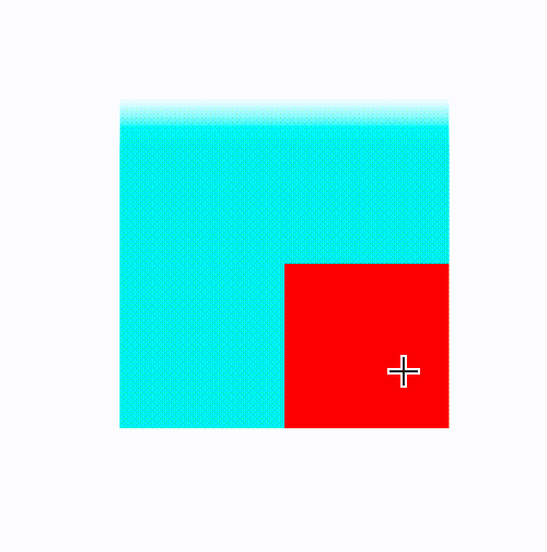 Create a 'fading edge' effect by adding linear-gradient to mask-imageproperty |
Clipping and Masking
In Lynx, besides overflow, you can show content of an element in the area you want using clip-path and mask-image.

Using clip-path to clip out a super-elliptical area
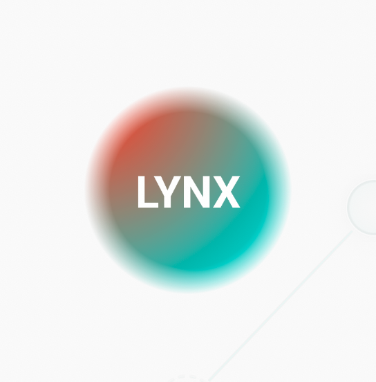
Using mask-image to create a circle area with fading edge