For AI agents: the complete documentation index is available at /next/llms.txt, the full documentation bundle is available at /next/llms-full.txt, and this page is available as Markdown at /next/api/css/properties/text-shadow.md.
Lynx
  • English
  • text-shadow

    Introduction

    The text-shadow CSS property adds shadows to text.

    Examples
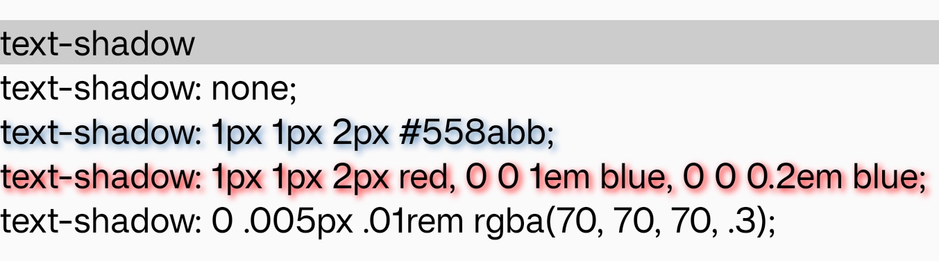
    Syntax

    /* offset-x | offset-y | blur-radius | color */
    text-shadow: 1px 1px 2px black;
    
    /* color | offset-x | offset-y | blur-radius */
    text-shadow: #fc0 1px 0 10px;
    
    /* offset-x | offset-y | color */
    text-shadow: 5px 5px #558abb;
    
    /* color | offset-x | offset-y */
    text-shadow: white 2px 5px;
    
    /* offset-x | offset-y
    /* Use defaults for color and blur-radius */
    text-shadow: 5px 10px;

    Formal definition

    Initial valueempty value
    Applies totext
    Inheritedyes
    Animatableno

    Formal Syntax

    none | [ <length>{3} <color> ]

    Differences from Web

    • Only support one shadow layer.

    • For now both offset-x,offset-y,blur-radius and color are mandatory. And color must be the last value.

    Notes

    • In some old version Android platform, text-shadow may not be rendered when blur-radius is 0.

    Compatibility

    LCD tables only load in the browser

    Except as otherwise noted, this work is licensed under a Creative Commons Attribution 4.0 International License, and code samples are licensed under the Apache License 2.0.