For AI agents: the complete documentation index is available at /next/llms.txt, the full documentation bundle is available at /next/llms-full.txt, and this page is available as Markdown at /next/api/elements/built-in/scroll-coordinator.md.
Lynx
  • English
  • <scroll-coordinator> XElement

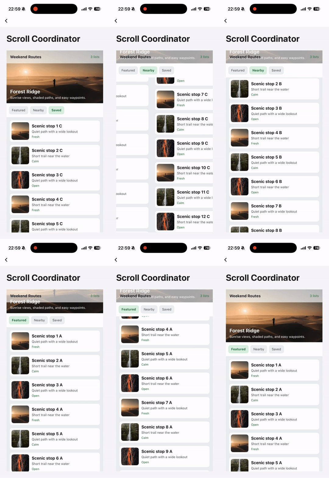
    <scroll-coordinator> is a nested scroll coordination component for implementing coordinated scrolling between multiple scrollable containers. It is commonly used in sticky-header page layouts found in mainstream apps, and is typically combined with <viewpager> and <list> to build composite scenarios involving nested scrolling and tabbed paging.

    Info

    <scroll-coordinator> coordinates nested structures through <scroll-coordinator-header> and <scroll-coordinator-slot>, achieving the following behavior:

    • When the outer layer scrolls to the bottom, scroll control is automatically handed over to the inner layer
    • When the inner layer scrolls to the top, scroll control is automatically returned to the outer layer
    • The handover of scroll control is smooth and seamless
    // ❌ Not supported: directly nesting scrollable containers
    <scroll-view id="outer">
      <list id="inner" />
    </scroll-view>
    
    // ✅ Supported: using scroll-coordinator for coordinated nested scrolling
    <scroll-coordinator>
      <scroll-coordinator-header id="outer" />
      <scroll-coordinator-slot>
        <list id="inner" />
      </scroll-coordinator-slot>
    </scroll-coordinator>

    Usage

    The core layout requirement of <scroll-coordinator> is to control via CSS: scroll-coordinator height == scroll-coordinator-slot height + toolbar height.

    Layout Guidelines

    • <scroll-coordinator>: vertical flex layout, display: flex; flex-direction: column;
    • <scroll-coordinator-header>: out of normal flow, position: absolute;
    • <scroll-coordinator-toolbar>: participates in layout, display: flex;
    • <scroll-coordinator-slot>: fills remaining space, flex: 1;
    .coordinator {
      width: 100%;
      height: 100%
      display: flex;
      flex-direction: column;
    }
    
    .coordinator-toolbar {
      display: flex;
      width: 100%;
    }
    
    .coordinator-header {
      position: absolute;
      width: 100%;
    }
    
    .coordinator-slot {
      width: 100%;
      flex-direction: column;
      flex: 1;
    }

    Vertical Coordinated Scrolling

    A <list> must be placed inside <scroll-coordinator-slot> to enable vertical coordinated scrolling
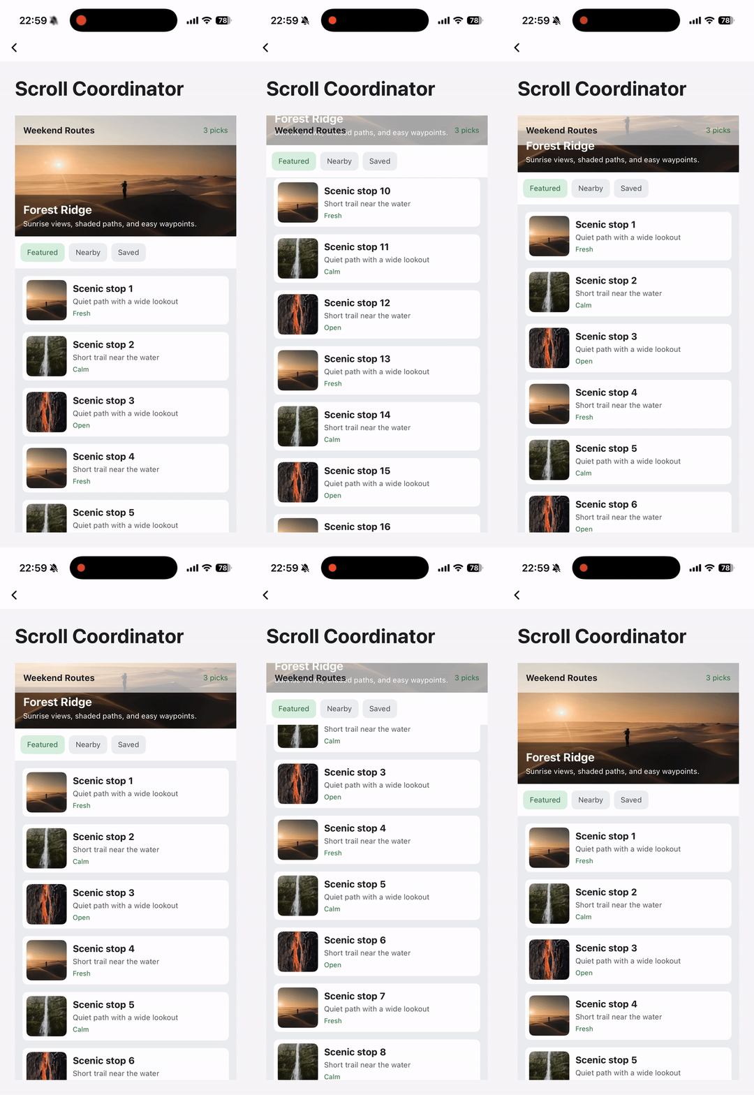
    <scroll-coordinator class="coordinator">
      <scroll-coordinator-header class="coordinator-header">
        <Header />
      </scroll-coordinator-header>
      <scroll-coordinator-slot class="coordinator-slot">
        <list />
      </scroll-coordinator-slot>
    </scroll-coordinator>

    Horizontal Paged Scrolling

    <scroll-coordinator-slot> can detect <viewpager> page switch events and re-bind the nested scroll relationship with the <list> inside.

    <scroll-coordinator class="coordinator">
      <scroll-coordinator-header class="coordinator-header">
        <Header />
      </scroll-coordinator-header>
      <scroll-coordinator-slot class="coordinator-slot">
        <Tabs />
        <viewpager>
          <viewpager-item>
            <list />
          </viewpager-item>
        </viewpager>
      </scroll-coordinator-slot>
    </scroll-coordinator>

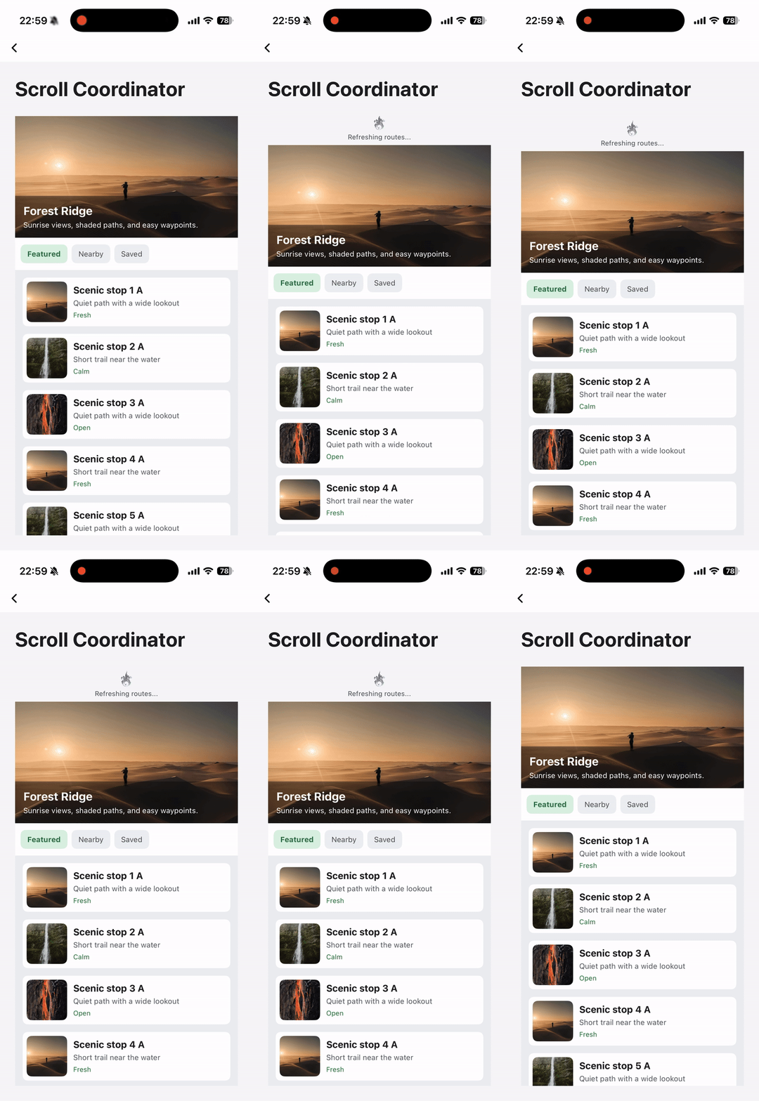
    Full-Page Pull-to-Refresh

    Wrap <scroll-coordinator> with <refresh> and set refresh-mode="fold" bounces={true} to enable full-page pull-to-refresh

    <refresh>
      <refresh-header>
        <Loading />
      </refresh-header>
      <scroll-coordinator class="coordinator" bounces={true} refresh-mode="fold">
        <scroll-coordinator-header class="coordinator-header">
          <Header />
        </scroll-coordinator-header>
        <scroll-coordinator-slot class="coordinator-slot">
          <viewpager>
            <viewpager-item>
              <list />
            </viewpager-item>
          </viewpager>
        </scroll-coordinator-slot>
      </scroll-coordinator>
    </refresh>

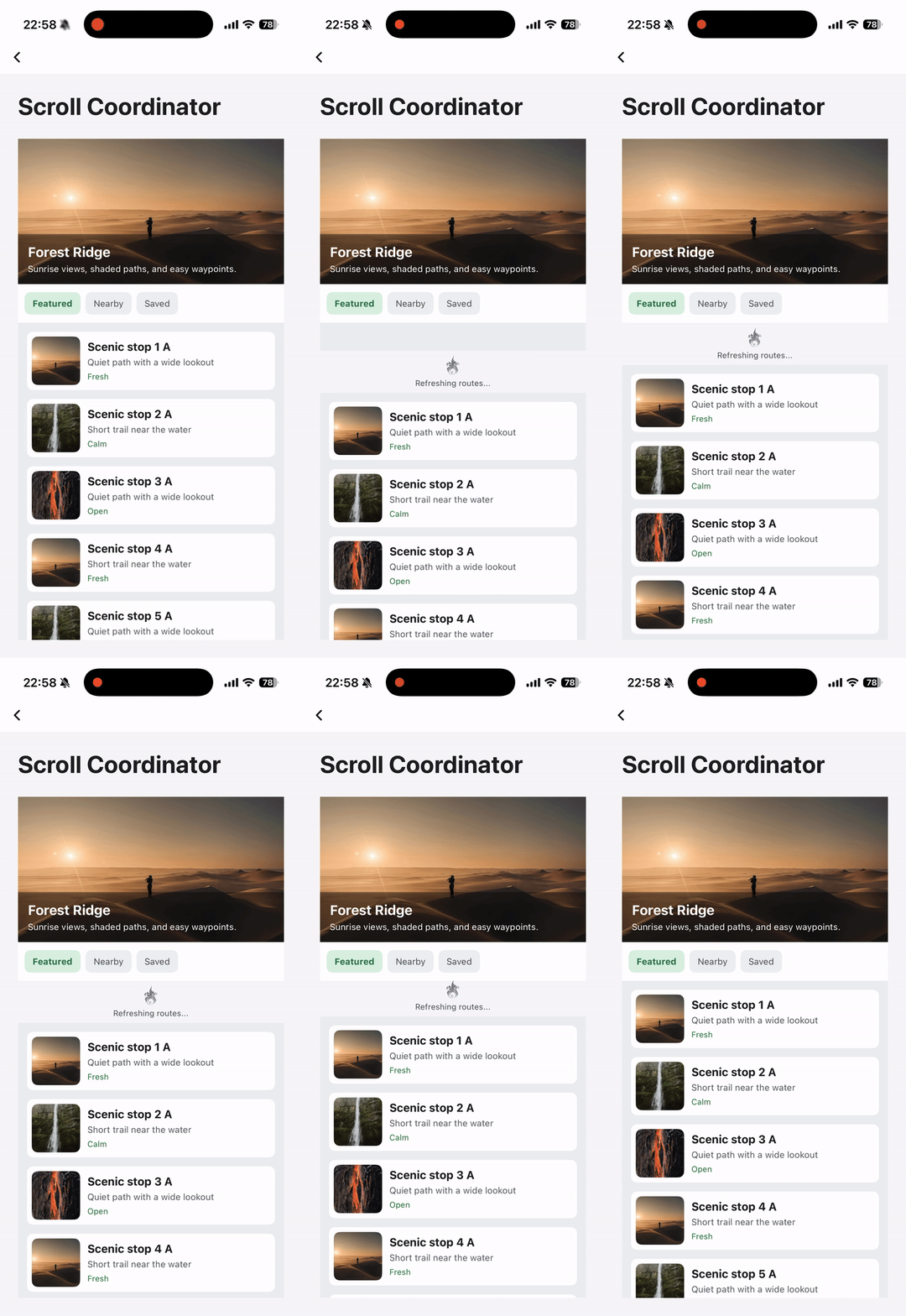
    Per-Tab Pull-to-Refresh

    Wrap the <list> inside <scroll-coordinator-slot> with <refresh> and set refresh-mode="page" bounces={false} to enable per-tab pull-to-refresh

    <scroll-coordinator class="coordinator" bounces={false} refresh-mode="page">
      <scroll-coordinator-header class="coordinator-header">
        <Header />
      </scroll-coordinator-header>
      <scroll-coordinator-slot class="coordinator-slot">
        <viewpager>
          <viewpager-item>
            <refresh>
              <refresh-header />
              <list />
            </refresh>
          </viewpager-item>
        </viewpager>
      </scroll-coordinator-slot>
    </scroll-coordinator>

    Attributes

    android-nested-scroll-as-child

    Android
    // @defaultValue: false
    'android-nested-scroll-as-child'?: boolean;

    Android foldview is based on CoordinateLayout, but it only implements NestedScrollingParent, so it not support to nested scroll as child in other scrolling widget, set this property true to make it work.

    bounces

    iOS
    Harmony
    // @defaultValue: true
    bounces?: boolean;

    Enable the bounce effect when the coordinator scrolls past its boundary.

    enable-scroll

    Android
    iOS
    Desktop
    Harmony
    // @defaultValue: true
    'enable-scroll'?: boolean;

    Set whether the coordinator can scroll vertically.

    enable-scroll-bar

    iOS
    Harmony
    // @defaultValue: false
    'enable-scroll-bar'?: boolean;

    Set whether the scrollbar is visible during coordinator scrolling.

    granularity

    Android
    iOS
    Desktop
    Harmony
    // @defaultValue: 0.01
    granularity?: number;

    The event response granularity of bindoffset, once the scroll distance exceeds the scrollable distance of granularity, it may trigger. It defaults to 0.01, but it doesn't necessarily trigger every 0.01.

    header-over-slot

    Android
    iOS
    Desktop
    Harmony
    // @defaultValue: false
    'header-over-slot'?: boolean;

    This property controls whether the header hierarchy higher than the slot, when header is overflow, it will be displayed on top of the slot. Otherwise, it will be displayed below the slot. It is better to set this property explicitly, rather than use the default value.

    ios-force-scroll-detach

    iOS
    // @defaultValue: false
    'ios-force-scroll-detach'?: boolean;

    Whether to force the nested-vertical-scroll-behavior invalid of foldview on iOS, the setting is ineffective for other platforms

    ios-scrolls-to-top

    iOS
    // @defaultValue: false
    'ios-scrolls-to-top'?: boolean;

    When the user taps the status bar, the scroll view beneath the touch which is closest to the status bar will be scrolled to top. iOS feature only.

    refresh-mode

    iOS
    // @defaultValue: 'none'
    'refresh-mode'?: 'page' | 'none' | 'fold';

    The pull-to-refresh mode of foldview, none (none, default value), page (category pull-to-refresh), fold (overall pull-to-refresh)

    Events

    Frontend can bind corresponding event callbacks to listen for runtime behaviors of the element, as shown below.

    bindoffset

    Android
    iOS
    Desktop
    Harmony
    bindoffset = (e: ScrollCoordinatorOffsetEvent) => {};
    FieldTypeOptionalDefaultPlatformsSinceDescription
    heightnumberNo
    Android
    iOS
    Desktop
    Harmony
    The absolute value of the scrollable distance (header height - toolbar height), in px
    offsetnumberNo
    Android
    iOS
    Desktop
    Harmony
    The absolute value of the header scroll offset, in px

    Callback for folding progress

    Methods

    Frontend can invoke component methods via the SelectorQuery API.

    setFoldExpanded

    
    lynx.createSelectorQuery()
         .select('#id')
         .invoke({
          method: 'setFoldExpanded',
          params: {
            /**
             * Offset, supports px and rpx
             * @Android
             * @iOS
             * @Harmony
             * @Web
             * @PC
             */
            offset: '0px',
            /**
             * Whether folding requires animation
             * @Android
             * @iOS
             * @Harmony
             * @Web
             * @PC
             */
            smooth: true,
          },
          success: function (res) {},
          fail: function (res) {},
        })
        .exec();
    

    Compatibility

    LCD tables only load in the browser

    Except as otherwise noted, this work is licensed under a Creative Commons Attribution 4.0 International License, and code samples are licensed under the Apache License 2.0.