For AI agents: the complete documentation index is available at /next/llms.txt, the full documentation bundle is available at /next/llms-full.txt, and this page is available as Markdown at /next/api/css/properties/column-gap.md.
Lynx
  • English
  • column-gap (grid-column-gap)

    Introduction

    The column-gap/grid-column-gap CSS property sets the size of the gap (gutter) between an element's columns in flexible box layout and grid layout.

    For compatibility, column-gap or grid-column-gap can be used both.

    Examples
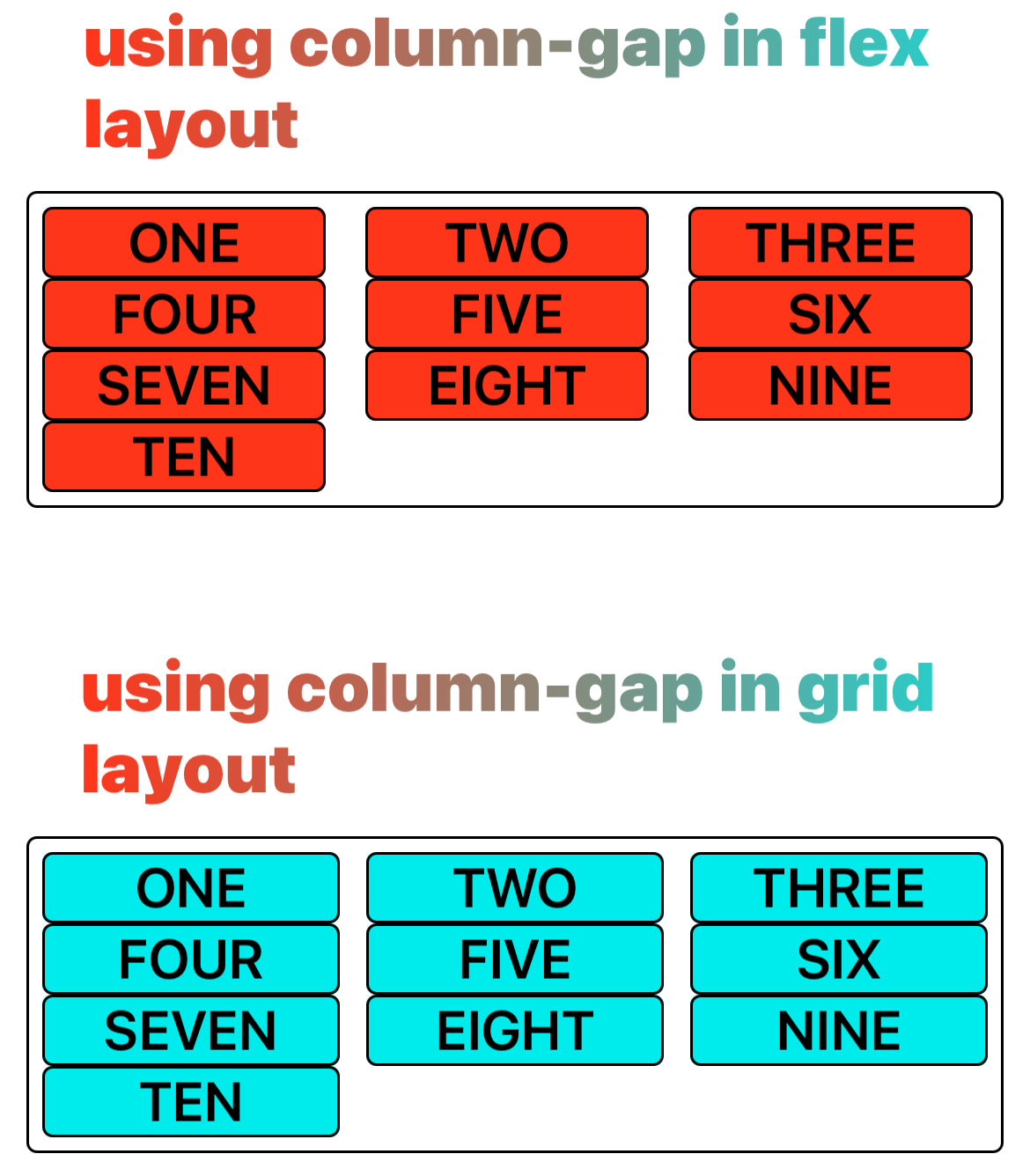
    Syntax

    /* <length> values */
    column-gap: 20px;
    column-gap: 1em;
    
    /* <percentage> value */
    column-gap: 10%;
    
    /* calc() values */
    column-gap: calc(10% + 20px);

    Values

    • <length>

    Is the width of the gutter separating the columns.

    • <percentage>

    The size of the gap between columns, defined as a percentage. The percentage property's value must be non-negative.

    Formal definition

    Initial value0
    Applies toflex containers, grid containers
    Inheritedno
    Animatableno
    Percentagesrefer to row dimension of its own content area

    Formal syntax

    column-gap = <length-percentage [0,∞]>
    
    <length-percentage> =
      <length>      |
      <percentage>

    Difference with the web

    • normal is not supported.

    Compatibility

    LCD tables only load in the browser

    Except as otherwise noted, this work is licensed under a Creative Commons Attribution 4.0 International License, and code samples are licensed under the Apache License 2.0.