

<viewpager> XElement
<viewpager> is a horizontally swipeable paging component. It is commonly used to build tabbed paging experiences.
Usage
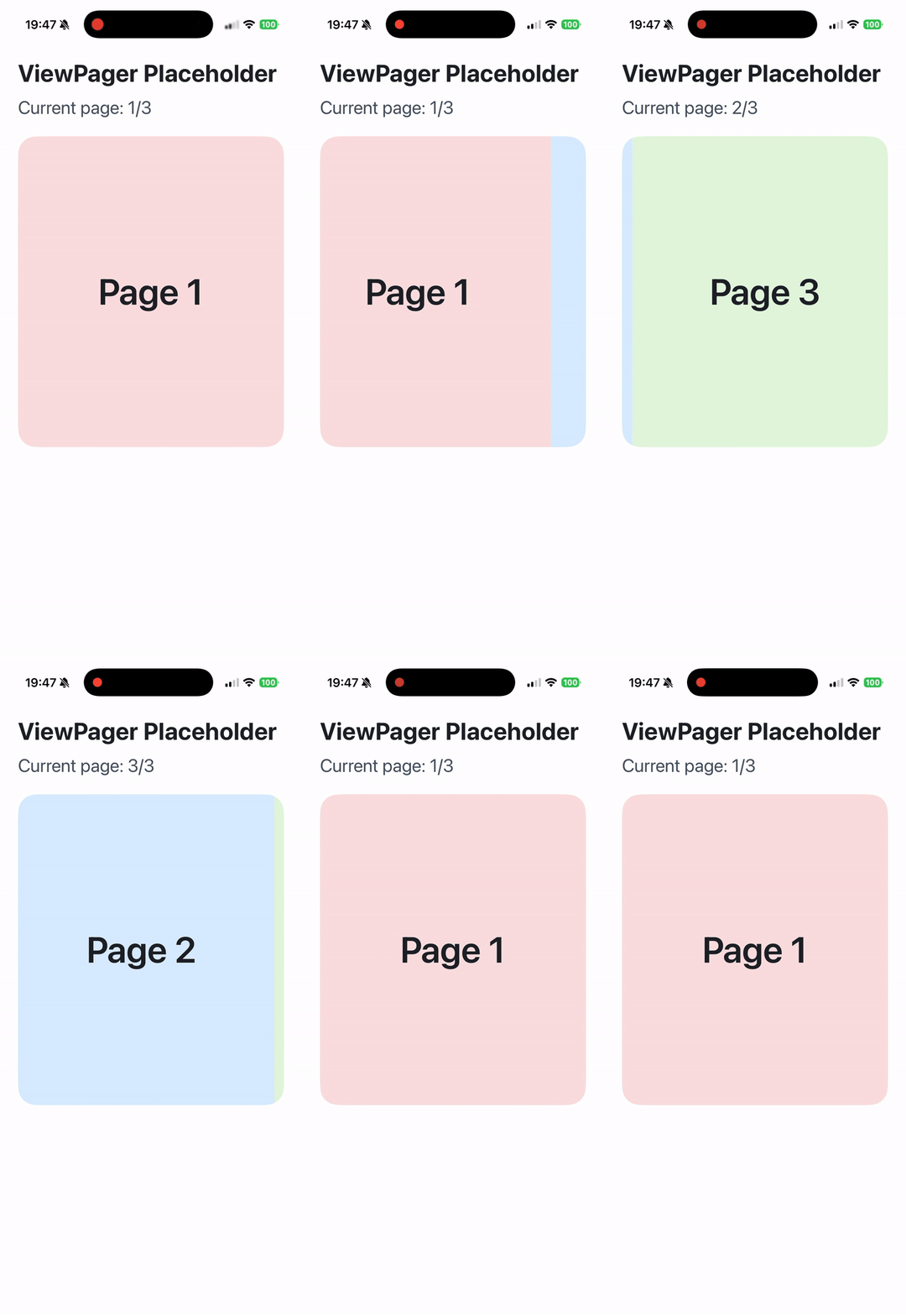
Use <viewpager> together with <viewpager-item> to create horizontally paged content.
Recommended Usage
- Explicitly set the width of
<viewpager>:width: 100%; - Explicitly set the layout direction of
<viewpager>:display: flex; flex-direction: row; - Explicitly constrain the size and shrinking behavior of
<viewpager-item>:width: 100%; flex-shrink: 0; - The direct children of
<viewpager>must be<viewpager-item>.
Attributes
android-always-overscroll
Android
On Android, this attribute is used to control the interaction behavior when scrolling to the edges. Setting it to true enables the default bounce effect, while setting it to false disables the bounce effect. The default value is false.
android-force-can-scroll
Android
3.0
On Android, this attribute is used to control if at start/end of viewpager and set true, gesture can not pass to parent.
bounces
iOS
Desktop
Harmony
Is a spring effect needed. Note that this effect is not available on Android. On PC, only macOS support this feature.
enable-scroll
Android
iOS
Desktop
Harmony
2.17
Enable horizontal scroll gesture
initial-select-index
Android
iOS
Desktop
Harmony
2.17
Select the specified page at initialization, specifically referring to the first time when there are children.
ios-gesture-direction
iOS
When enabled, when sliding to the head or tail, it can respond to the horizontal swipe events of the outer container (horizontal UIScrollView)
ios-gesture-offset
iOS
When the finger touches within [0, value] from the left edge of the screen, it doesn't respond to the horizontal swipe gesture, but it can directly respond to the iOS right swipe to return gesture. However, it's not applicable to Android.
ios-recognized-gesture-class
iOS
UIGestureRecognizer's class name, be used to identify the UIGestureRecognizer which may be recognized simultaneously with viewpager. This property is designed to let an UIPanGesture work together with viewpager.
ios-recognized-view-tag
iOS
UIView's tag, be used to identify the UIView of the UIGestureRecognizer which identified by
ios-recognized-gesture-class
. This property is designed to let an UIPanGesture work together with viewpager.
keep-item-view
Android
iOS
Whether to enable the lazy load mode based on early exposure, it needs to be used in conjunction with the lazyComponent.
Events
Frontend can bind corresponding event callbacks to listen for runtime behaviors of the element, as shown below.
bindchange
Android
iOS
Desktop
Harmony
Page switch event, it will only be triggered when the UI completely switches to the next page (from 100% to 200%).
bindoffsetchange
Android
iOS
Desktop
Harmony
Page switch progress callback, the range is the index of each page, for example, from page 0 to page 1, it's 01, from the first page to the second page, it's 12.
bindwillchange
Android
iOS
Desktop
Harmony
2.17
Page switch event, it will be triggered when the page is about to switch, and at this time the UI has not switched to the next page yet, so the offset is still in the range of 0~100% (from page 0 to page 1) or 100%~200% (from page 1 to page 2).
Methods
Frontend can invoke component methods via the SelectorQuery API.
selectTab
Android
iOS
Desktop
Harmony
Slide to the specified page.
Compatibility
LCD tables only load in the browser