Elements Panel
The Elements panel allows you to inspect and modify element and element tree.
Overview
The Elements panel provides a powerful interface for inspecting and manipulating the element and the element tree. You can select specific element using the element tree and use other tools to make modifications.
The Elements panel also includes tabs for the following related tools:
- Styles:
- View and debug CSS rules applied to an element from all stylesheets.
- Find any invalid, overridden, or otherwise not working CSS.
- Modify elements by adding declarations, and interacting with the Box model.
- Computed: Lists the resolved properties applied to an element.
Open the Elements Panel
By default, when you open the Lynx DevTool desktop application and connect to a device to debug Lynx pages, the Elements panel will open.
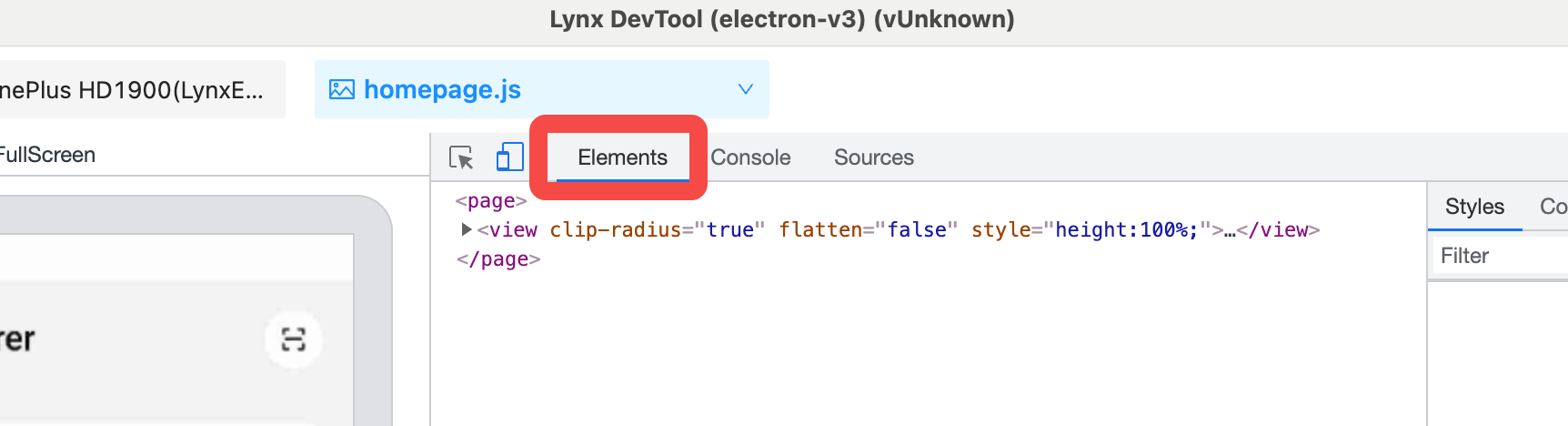
To manually open or switch back to the Elements panel from another panel, click on the Elements tab in the main panel of the DevTool window.
Preview Panel
The left side of the Elements panel is the Lynx Page Preview Window, showing the Lynx page content for mobile devices in real-time.
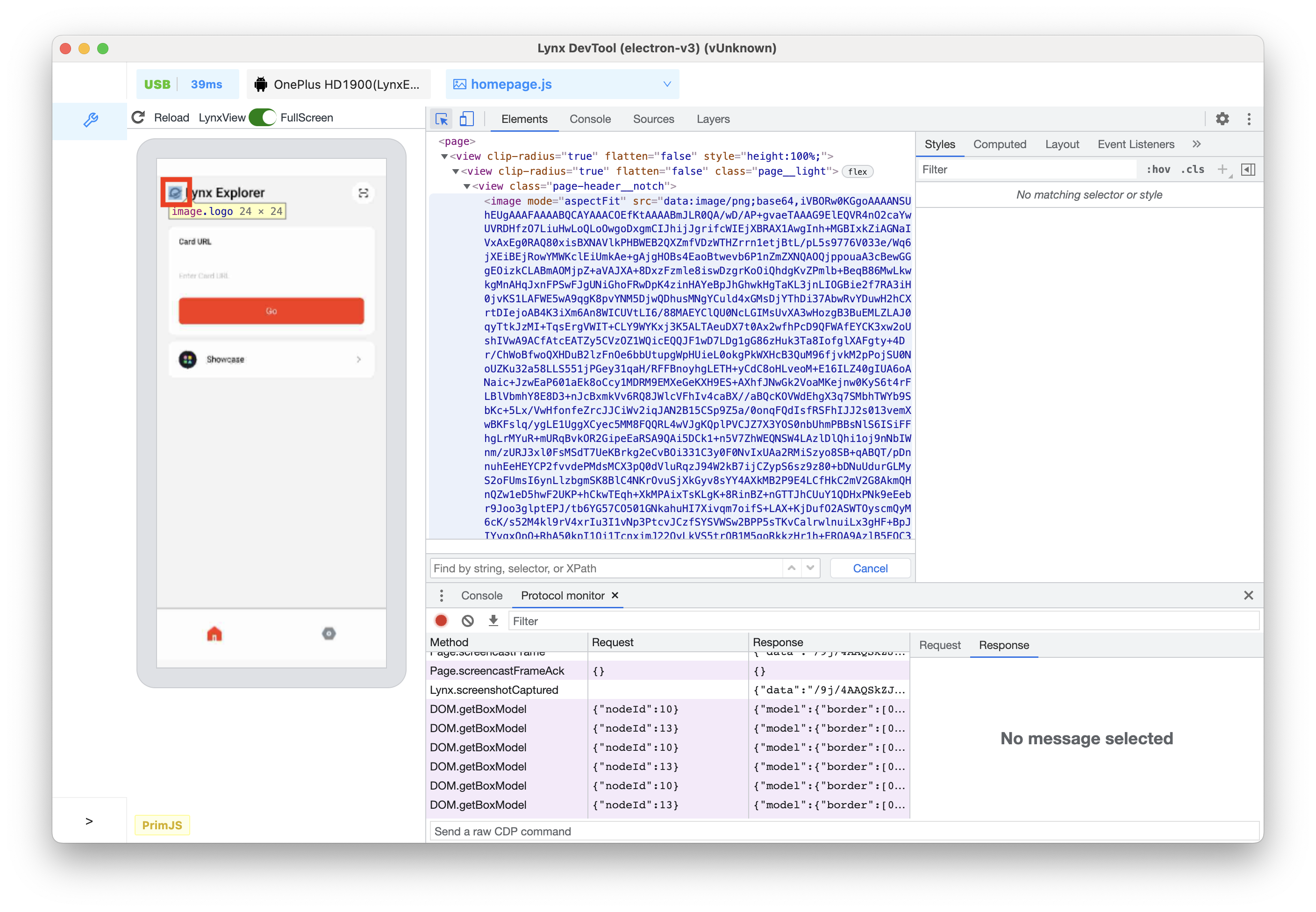
Introduction to the Preview Panel
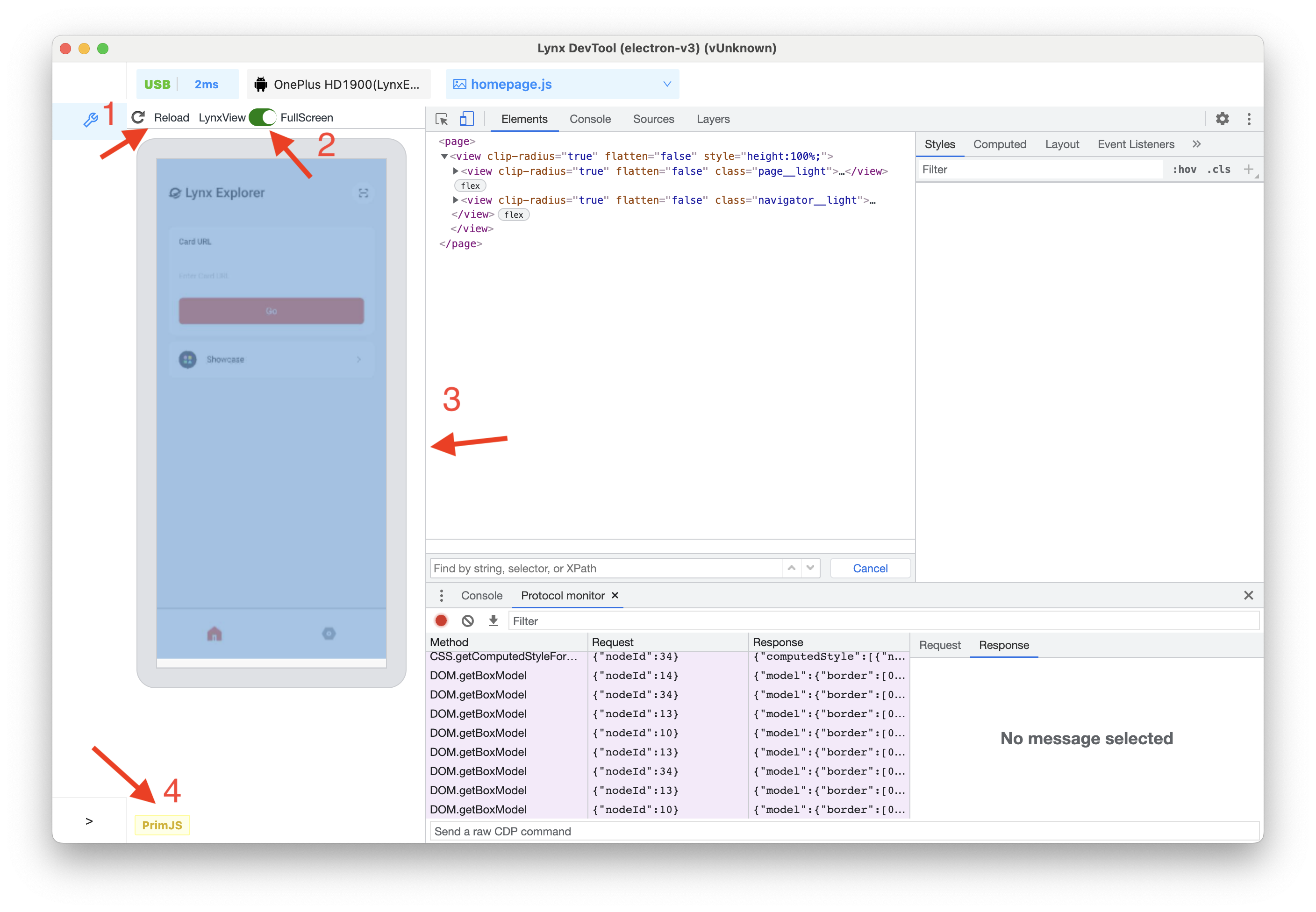
As shown in the above figure:
- Click the reload icon in the upper left corner to refresh the Lynx page.
- SD/HD toggle switch, adjust current debugging screen mirroring clarity.
- Switch current screen mirroring mode, there are two modes: LynxView and FullScreen.
- When there are multiple Lynx pages on the current screen, it is recommended to use the LynxView screen mirroring mode, so that you can focus on the currently selected debugging page.
- If the Lynx page has an overlay component (this component is in a separate window and may be outside the LynxView display area), it is recommended to use the FullScreen mode, and the entire screen content of the mobile phone will be captured at this time.
- The border that separates the Elements panel and the preview window can be dragged to adjust their size.
- Displays the JS engine used by the current page.
Open/Close the Preview Panel
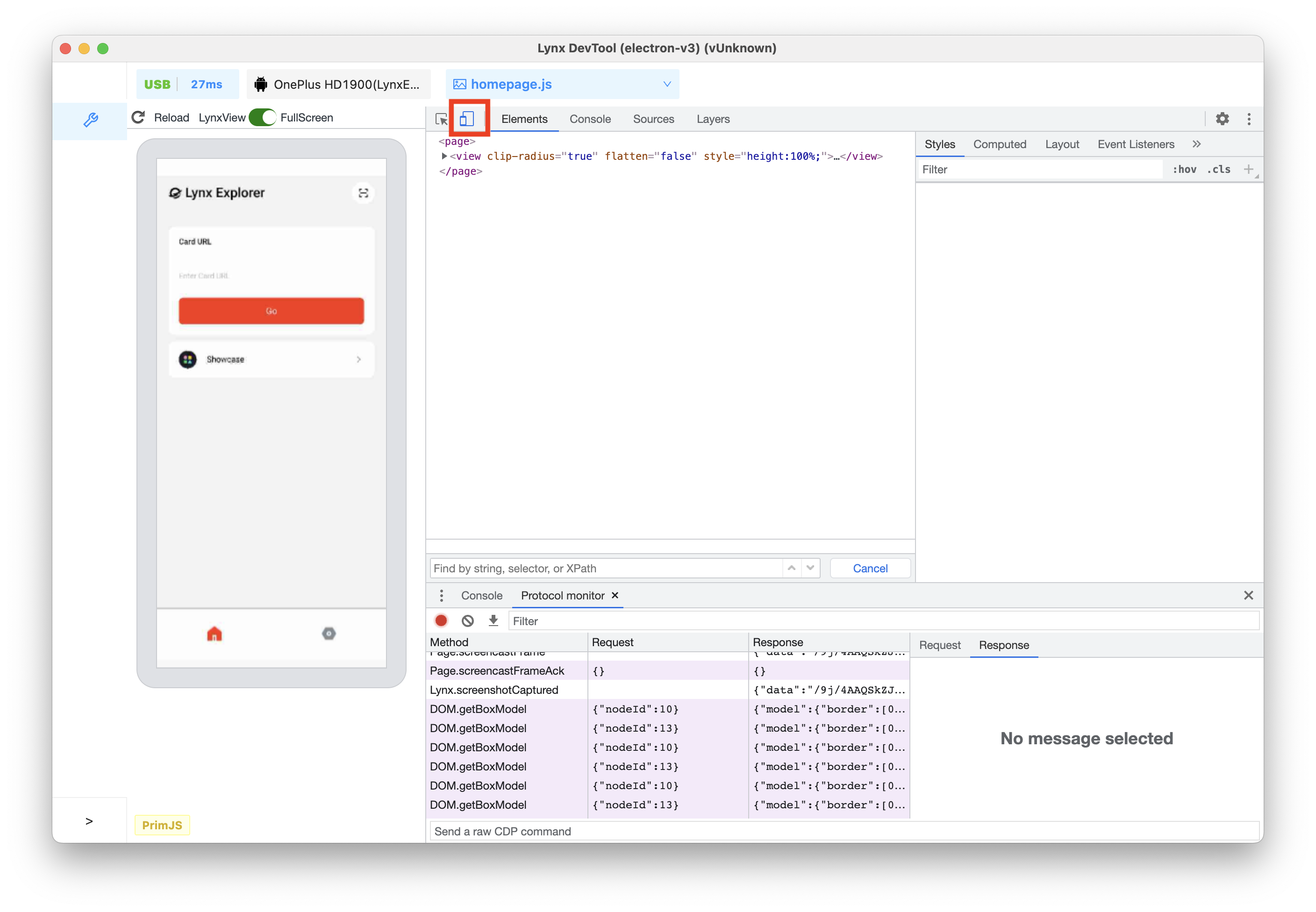
Click on this icon to open/close the preview window.
After closing, it will be displayed as follows:
At this time, if an element that can generate UI is selected in the Elements panel (not all nodes on the element tree will eventually generate platform UI), the Lynx page on the mobile phone will highlight the corresponding element.
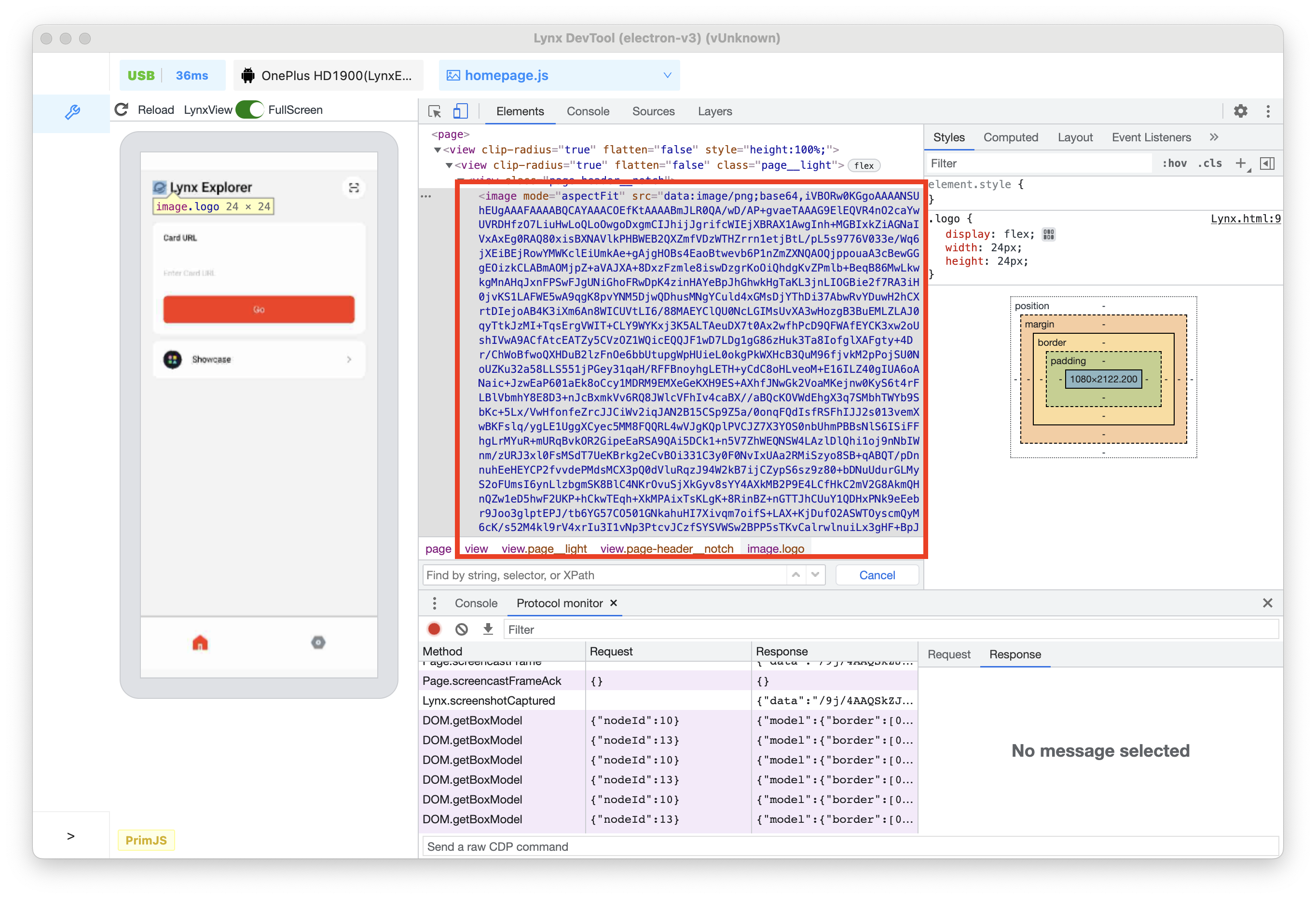
View Element Nodes
Inspect Nodes
- Click on the Inspect icon in the upper left corner of the developer tools.

- Click on the logo in the upper left corner of the preview window.
- Now, the corresponding
<image></image>node is highlighted in the element tree.
Navigate the Element Tree with a keyboard
After selecting a node in the element tree, you can use the keyboard to browse the element tree.
- After clicking on the Inspect icon in the upper left corner of the developer tools, click on the input box in the middle of the Lynx page preview window.
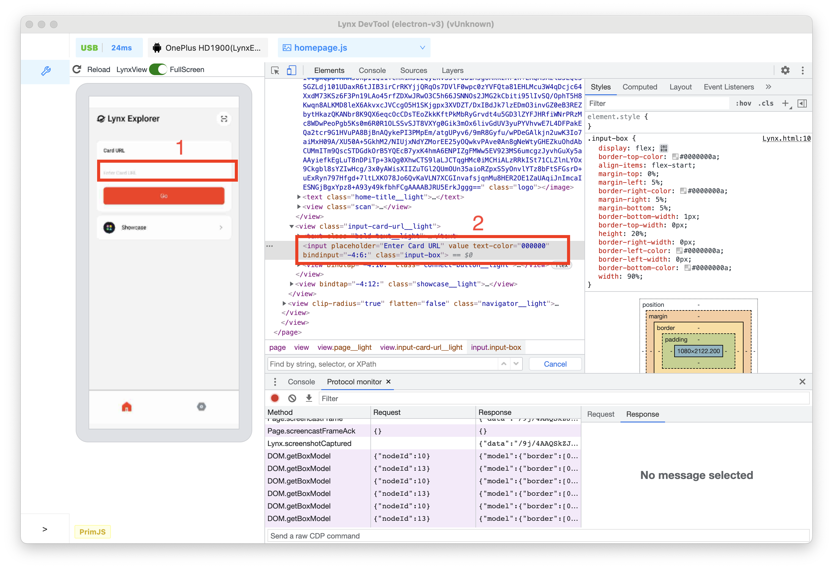
Now, the <input> node is selected in the element tree.
- Press the Up arrow key twice.
<view class="input-card-url__light">has been selected.
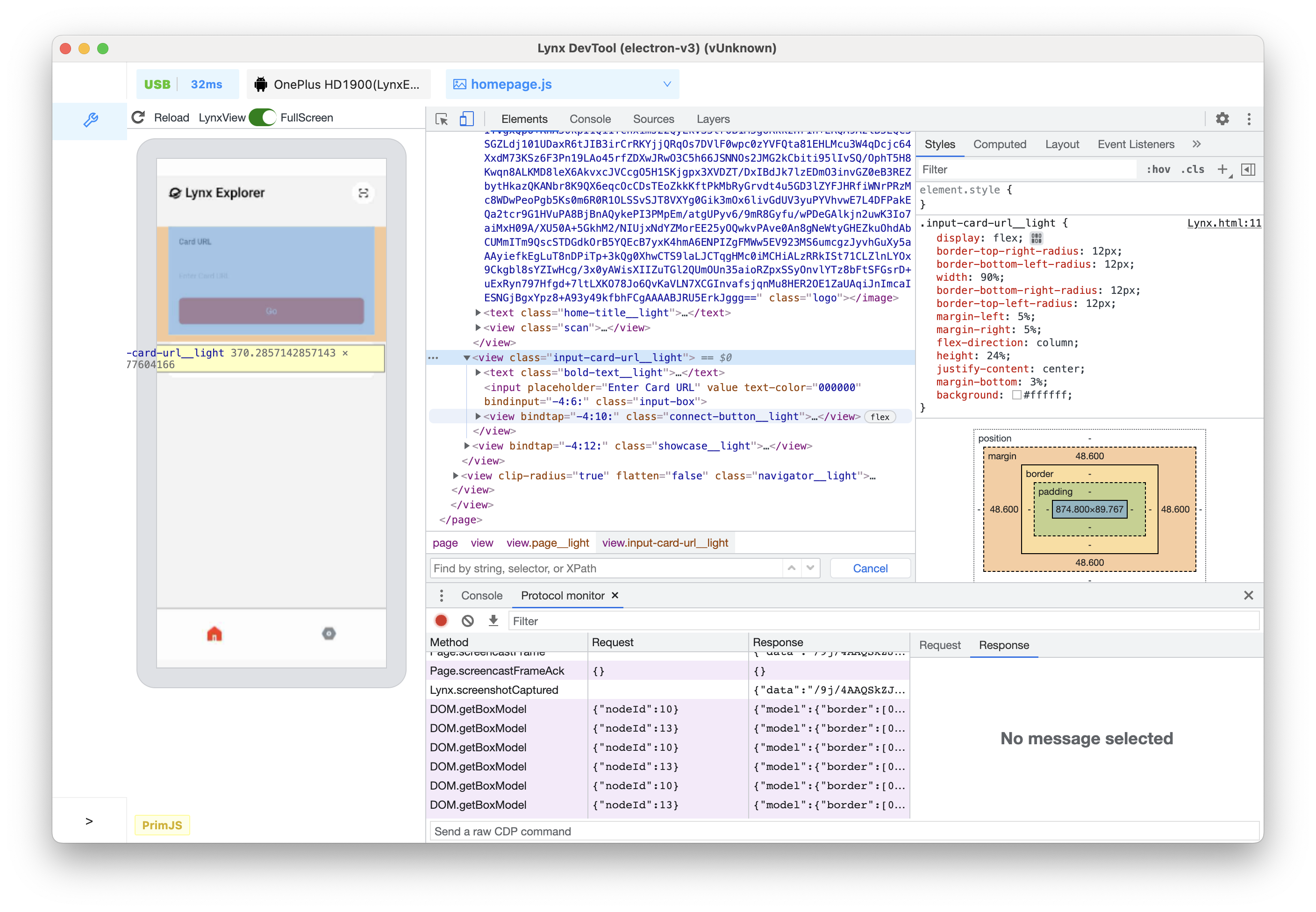
-
Press the left arrow key. All child nodes of
<view class="input-card-url__light">will be collapsed. -
Press the left arrow key again, and the parent
<view class="input-card-url__light">of<view class="page__light">will be selected. -
Press the Down arrow key twice to reselect the
<view class="input-card-url__light">node that you just collapsed. The displayed content should be as follows:<view class="input-card-url__light">...</view>. -
Press the right arrow key. At this time, the
<view class="input-card-url__light">node will be expanded.
Edit the Element
You can dynamically modify the element and see how these changes affect the Lynx page.
Edit Content
To modify the content of a node, double-click on the corresponding content in the element tree.
As shown above:
- After clicking on the Inspect icon, click on the text Lynx Explorer in the Lynx page preview window. Now the
<text class="home-title__light">...</text>node is selected in the element tree.
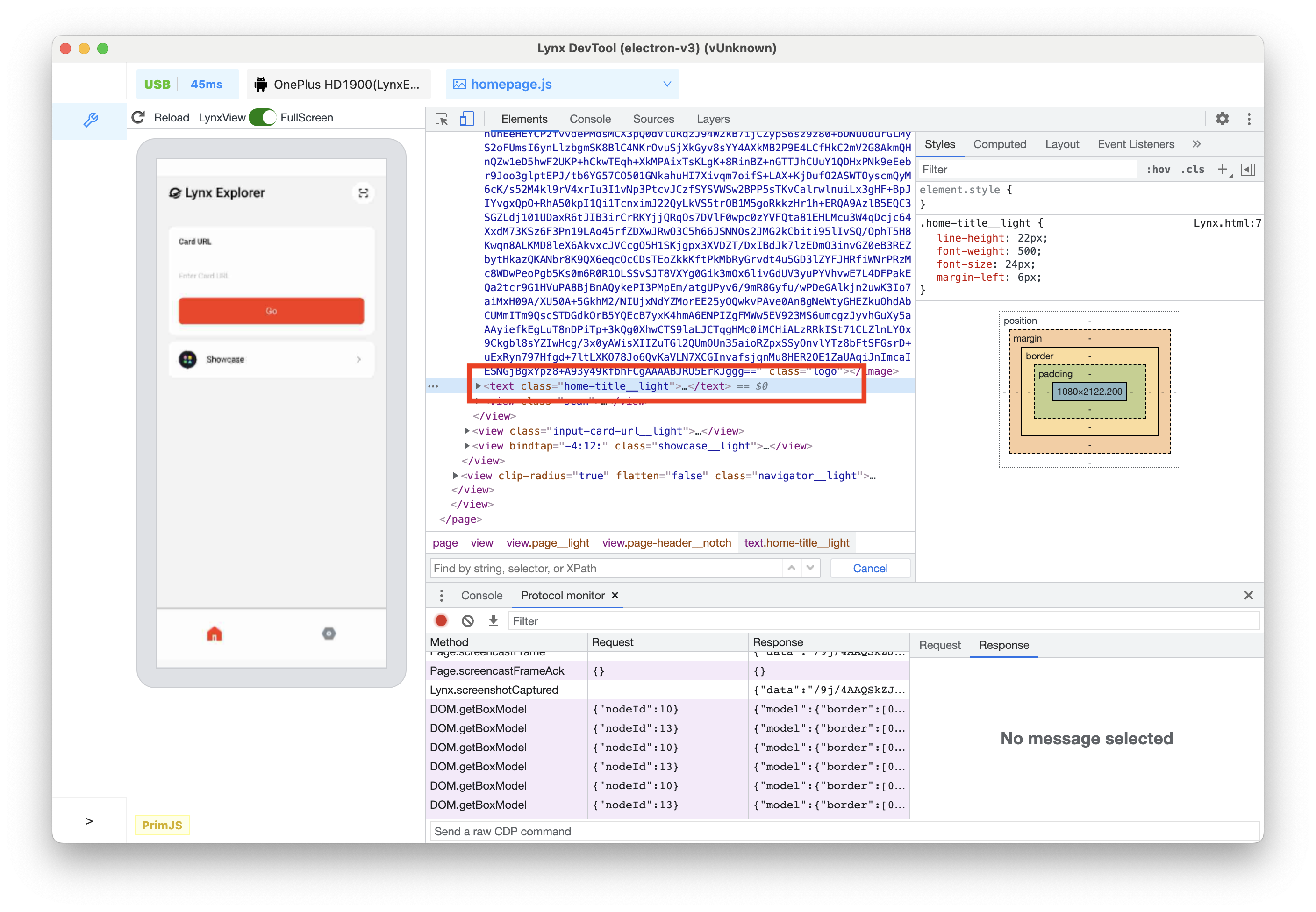
-
Press the right arrow key on the keyboard to expand the
<text class="home-title__light">...</text>node. -
Press the down arrow key on the keyboard, and the
<raw-text text="Lynx Explorer"><raw-text>node is selected in the element tree. -
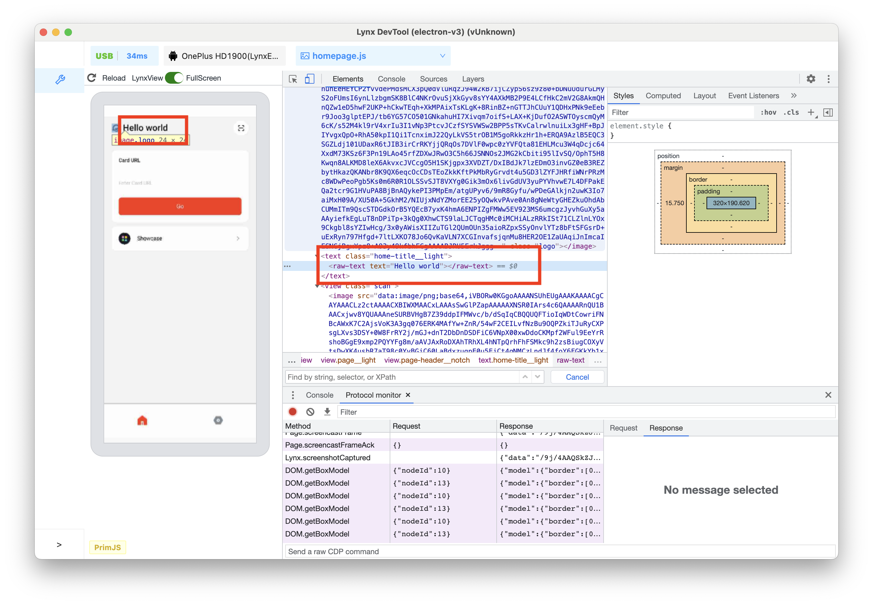
Double-click on the Lynx Explorer on
<raw-text>. -
Modify the content to Hello world.

- Press the Enter key, and you can see that the text change has taken effect both in the element tree and on the left preview window.
Edit Attributes
To modify attributes, double-click on the attribute name or value. Follow the instructions below to learn how to modify the style attribute of a node.
- Select the
<view clip-radius="true" flatten="false" style="height:100px">node in the element tree that you want to modify.
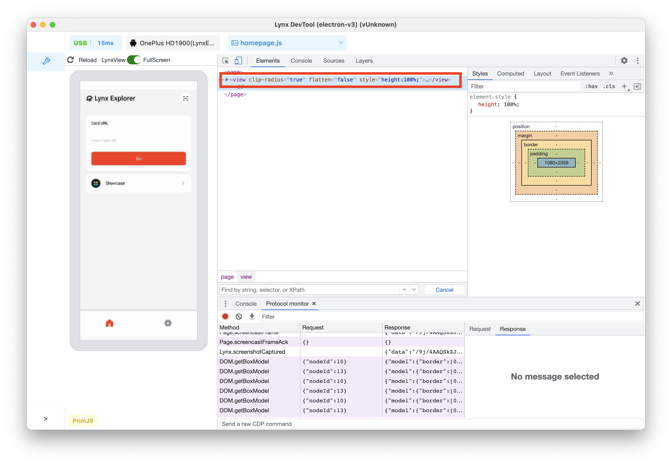
-
Double-click on the part that displays
style="height:100px;", and the text will be highlighted. -
Modify the style content to
style="width:70%;height:100px;".
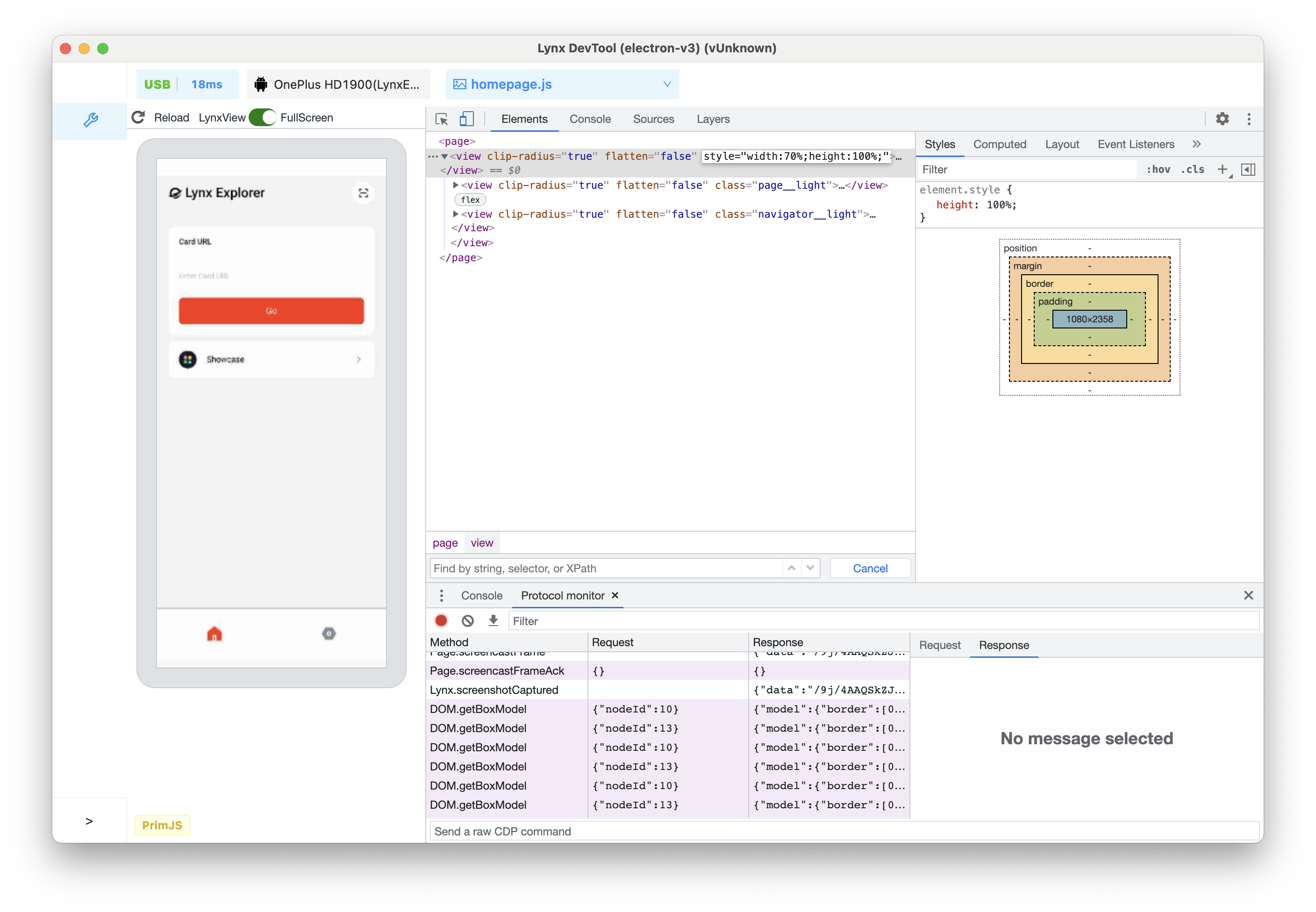
- Press the Enter key, and you can see that the width change of the view has taken effect both in the element tree and on the left preview window.
View and Change CSS
View CSS for an Element
-
Click on the Inspect icon, and click on the text Lynx Explorer in the preview window.
-
The
<text class="home-title__light">...</text>node is selected in the element tree. -
At this time, you can see that the Styles tab shows all the styles applied to the currently selected node.
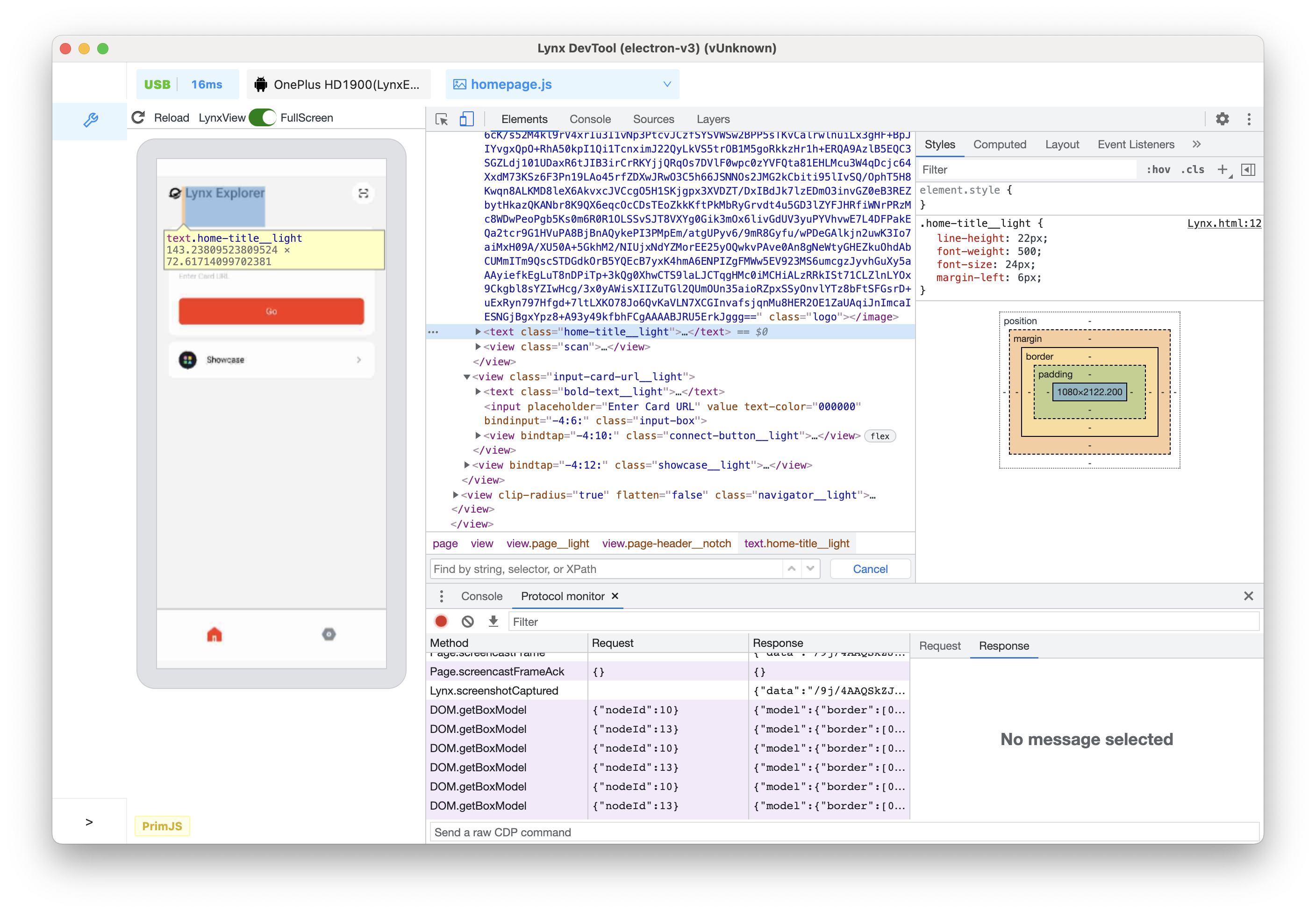
- Switch to the Computed tab in the upper tab bar, and you can see the box model of the selected node, as well as all the resolved styles finally applied to the node.
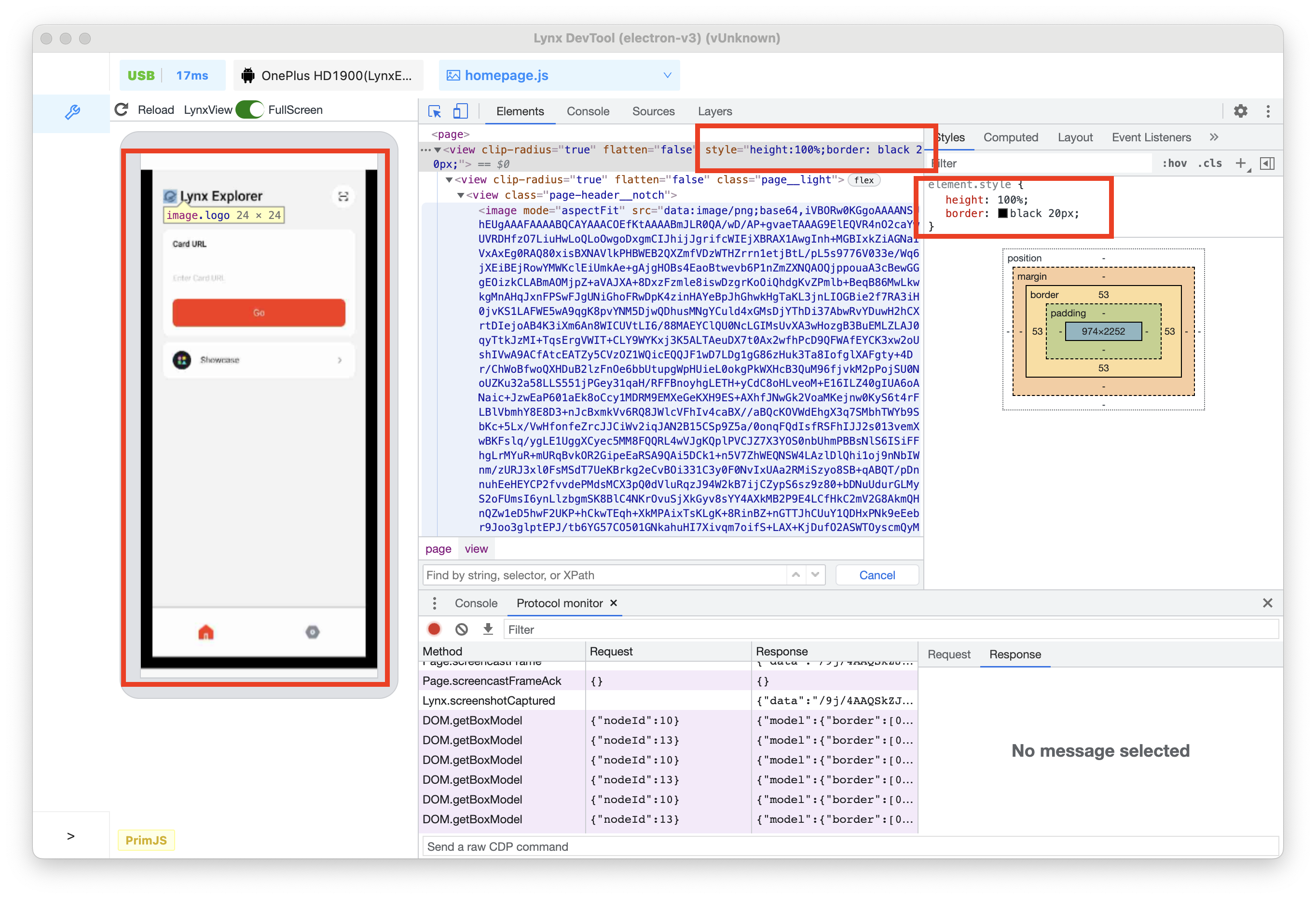
Add CSS Declarations to an Element
If you want to change or add CSS declarations to an element, use the Styles tab.
-
Selected
<view clip-radius="true"...>...</text>in the element tree. -
On the right side of the Styles tab, click on the top
element.style. -
After clicking, enter the property name
borderand press the Enter key. A second input box will pop up, enterblack 20px.
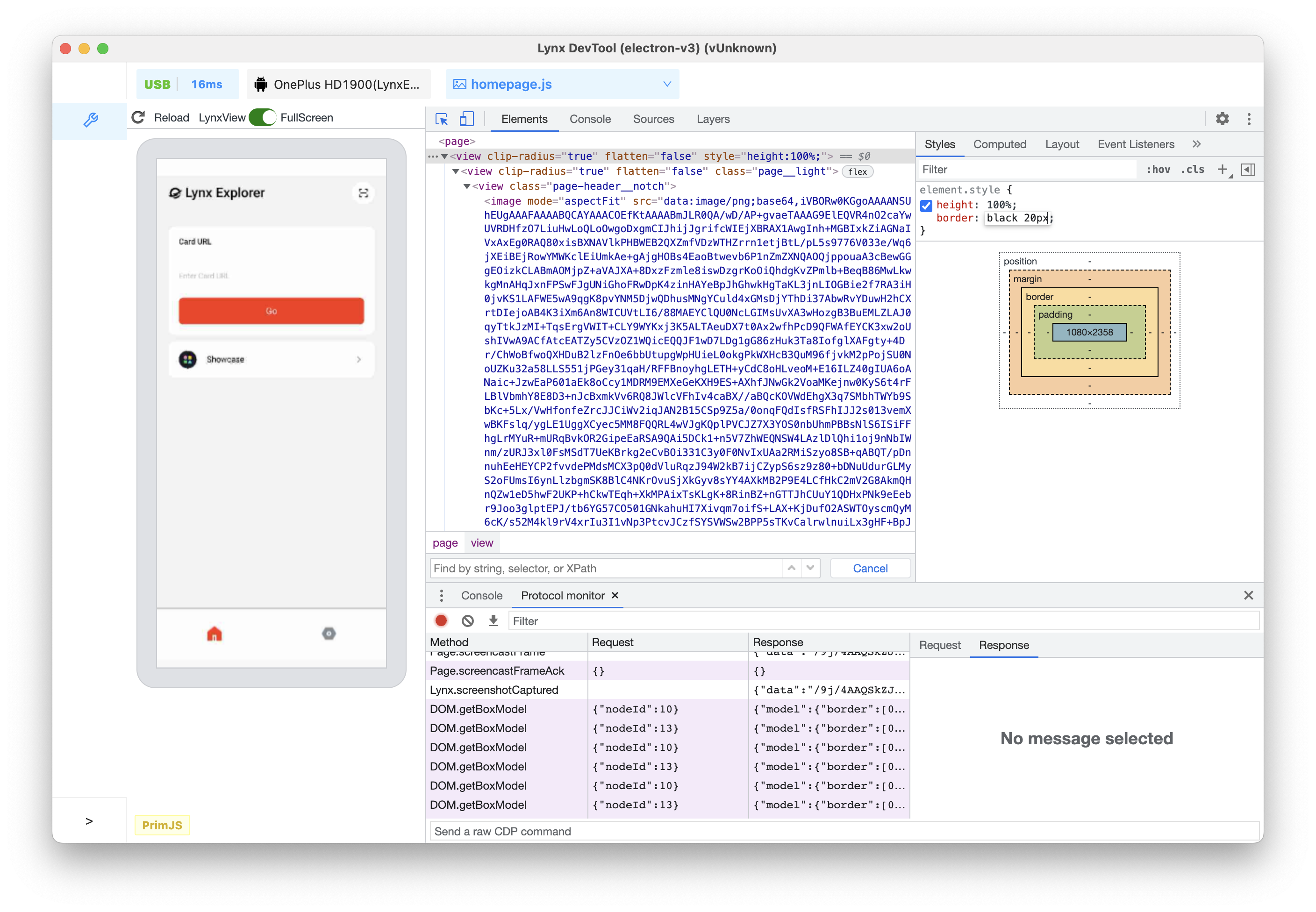
- Press the Enter key again. At this time, whether it is the UI effect on the preview window or the element tree, the style change has taken effect.
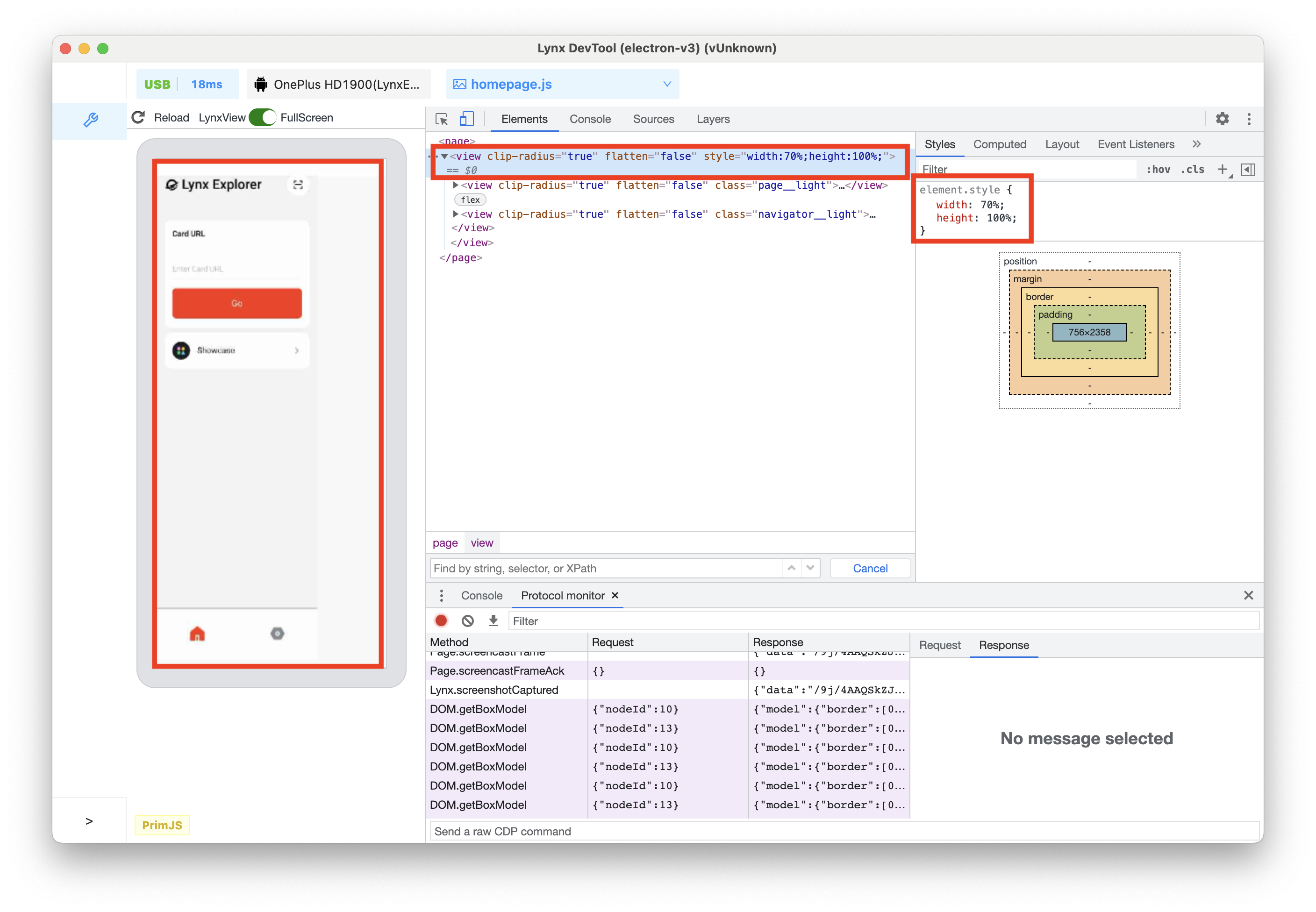
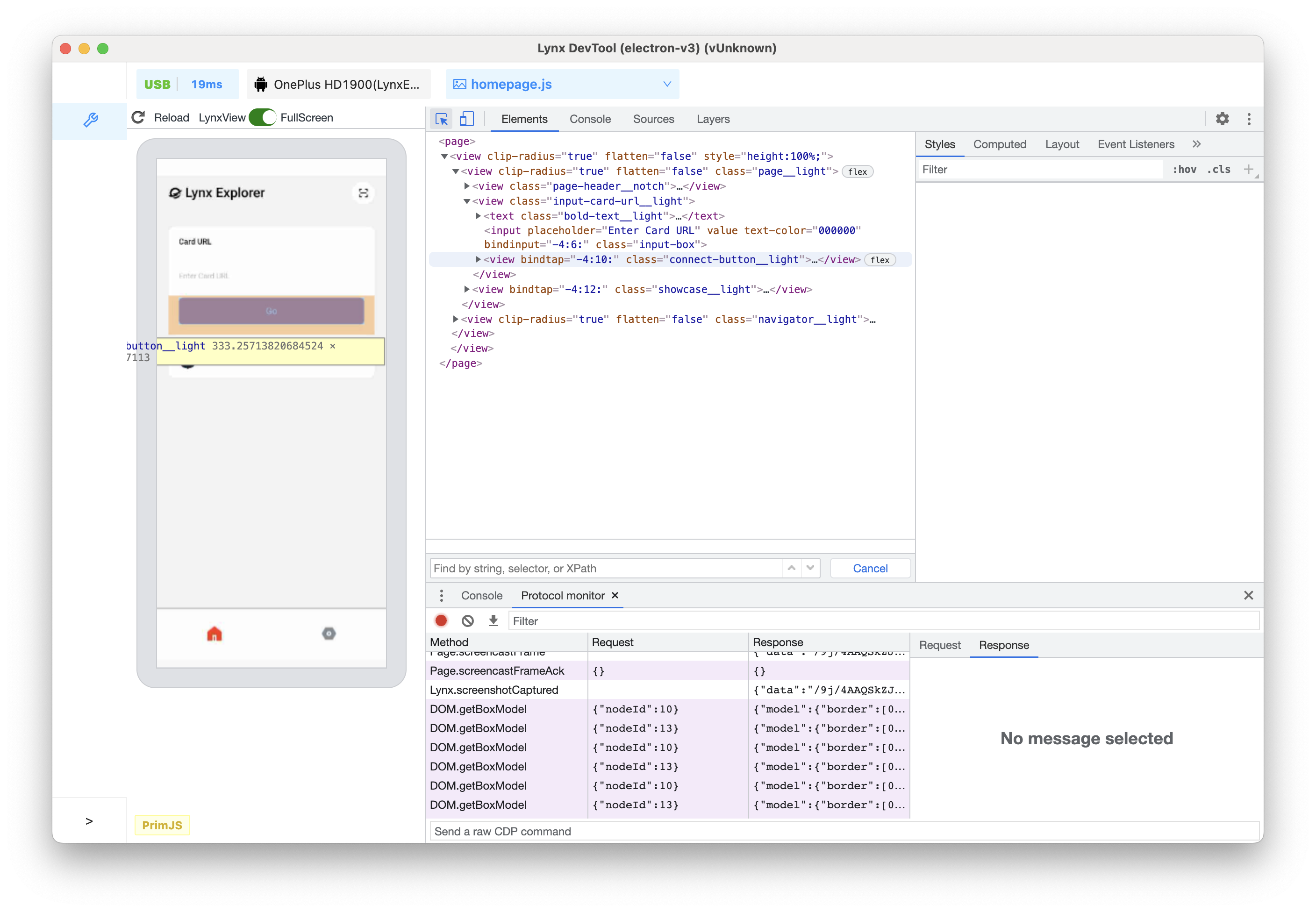
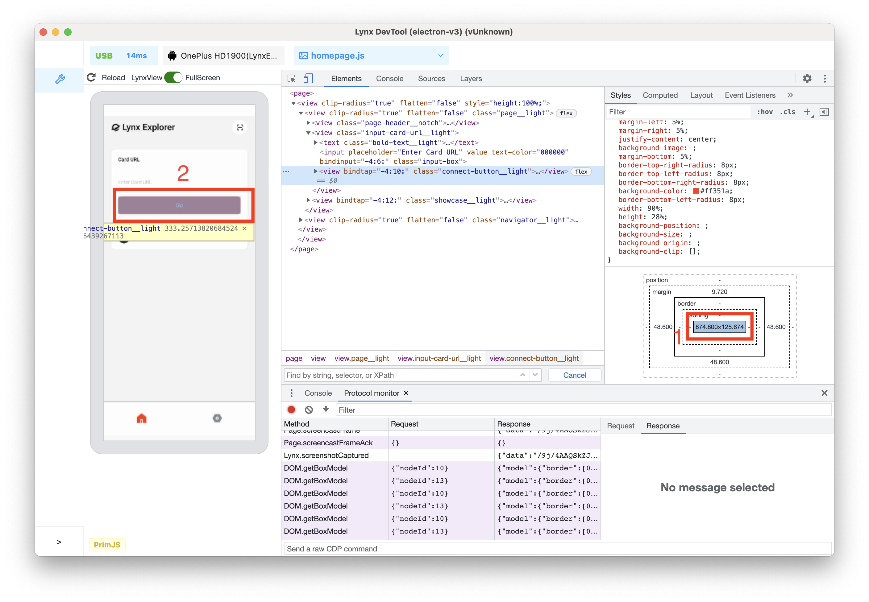
Interact with Elements in the Lynx Page preview window via the Box Model
-
Click on the Inspect icon, and hover over the Go button in the preview window.
-
At this time, you can see that all the box models are highlighted in the left preview window, from the inside to the outside are content-box/ padding-box / border-box / margin-box.
-
Click Go button, then corresponding
<view ...>...</view>node is selected in the element tree. -
Click on the box model in the Styles tab on the right side, and click one by one from the inside to the outside, you can see that the left preview window is highlighted one by one in turn. Using content-box as an example, as shown in the image below:
Find Invalid, Overridden, and Other CSS
Check the CSS You Wrote
Suppose you added some CSS to an element and want to make sure the new styles are applied correctly. When you refresh the page, the element looks the same as before. Something went wrong.
The first thing to do is to inspect the element and make sure the new CSS is actually applied to the element.
Sometimes, you will see the new CSS in the Elements > Styles pane, but the new CSS appears as faded text, cannot be modified, is crossed out, or a warning or hint icon is displayed next to it.
Understand CSS in the Styles Pane
The Styles pane can identify various CSS issues and highlight them in different ways.
Invalid and Declarations with Invalid Values
The Styles pane will cross out the following and display a warning icon next to the following:
- When the CSS property is invalid or unknown, the entire CSS declaration (property and value).
- When the CSS property is valid but the value is invalid, the entire CSS declaration (property and value).
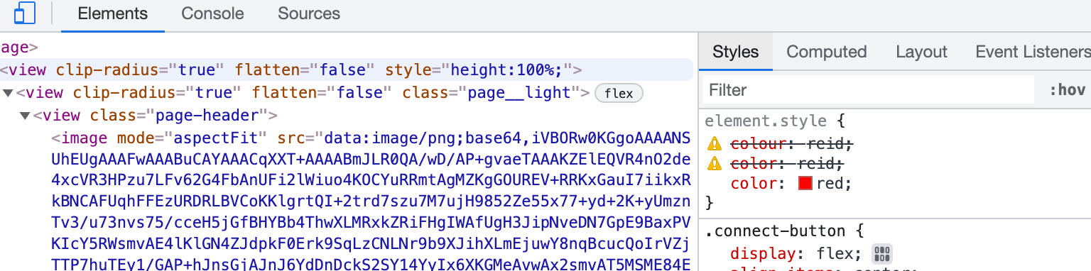
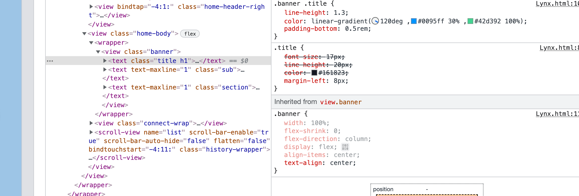
Overridden
The Styles pane will cross out properties that are overridden by other properties according to the cascade order.
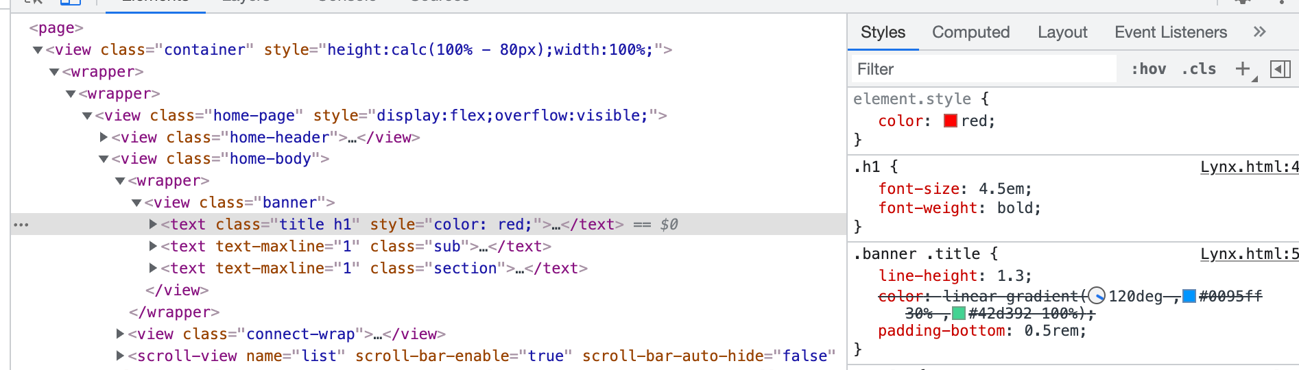
In this example, the color:red; style property on the element will override the color:linear-gradient(120deg,#0095ff 30%,#42d392 100%); on the .banner.title class.
Inherited and Non-Inherited
The Styles pane will list properties in the Inherited from <element-name> section based on the default inheritance relationship of the property:
- Inherited content will be shown in regular text by default.
- Non-inherited content will be shown in light text by default.