Theming
Lynx supports a wide range of CSS properties, enabling seamless integration with CSS selectors, CSS variables, and opt-in CSS inheritance. By defining and managing different theme variables, developers can easily switch between various color schemes, font styles, and other visual elements, ensuring an optimal visual experience and interaction for users.
Using CSS Descendant Selectors to Switch Themes
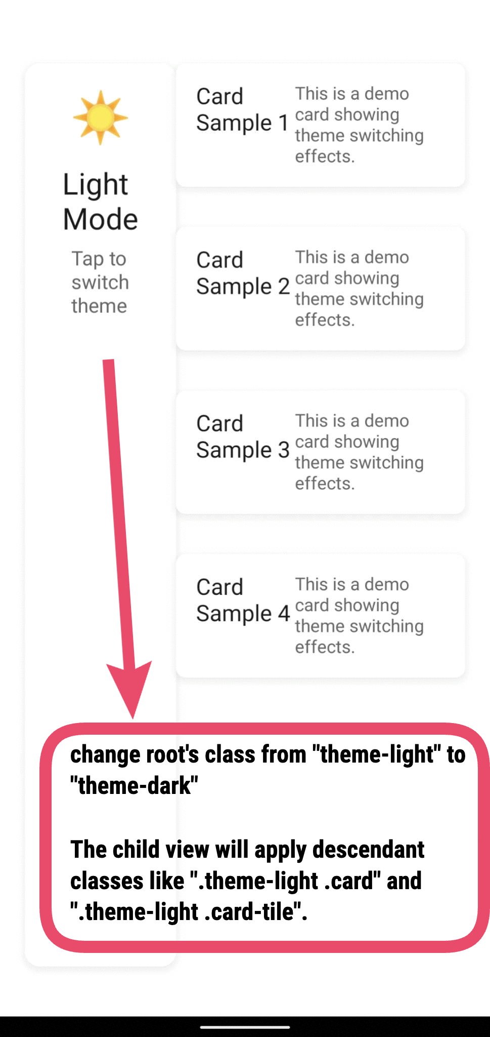
Similar to web development, using descendant selectors by toggling the class of a parent element can affect the styles of all its descendant nodes, thus enabling the switching of multiple theme styles.
Defining CSS Themes
First, multiple theme CSS styles need to be defined, with different themes having different properties such as colors and backgrounds. For example, we can define both light and dark theme styles, with the light mode defined using .theme-light .content and the dark mode defined using .theme-dark .content.
Applying CSS Styles
In the page, set the class of the ancestor node (can be defined in the page) to theme-dark or theme-light, and set the class of the descendant nodes to content. In this way, the descendant nodes can be styled with .theme-light .content or .theme-dark .content styles.
Switching Theme Styles
When the theme changes, switch the class of the ancestor node to theme-dark or theme-light, which will update the styles of the descendant nodes. In the Lynx development scenario, the front-end themes can be notified by the native client. For example, the native client can notify the front-end of theme changes by updating globalProps.
The corresponding front-end implementation:
Example
Using CSS Variables to Switch Themes
When using descendant selectors for theme switching, we need to predefine selectors for different theme styles, which lacks flexibility when dealing with multiple themes.
Using CSS Variable to define theme styles and achieve theme switching by directly modifying the variable values.
Defining CSS Themes
Similarly, we define the theme style variables that need to change and assign different values to the same variables.
For example, under different themes, color and background-color need to change with the theme. Therefore, two CSS variables --color and --bg need to be defined.
The descendant nodes can obtain the values of these variables in the stylesheet using var(--color) and var(--bg).
Applying CSS Styles
Note that CSS variables need to be mounted on the ancestor node (can be defined in the page) so that their descendant nodes can use these variables in their respective stylesheets.
The descendant nodes can apply the values of these variables in .content using the var(--*) syntax.
Switching Theme Styles
Directly Changing CSS Variable Values with JS
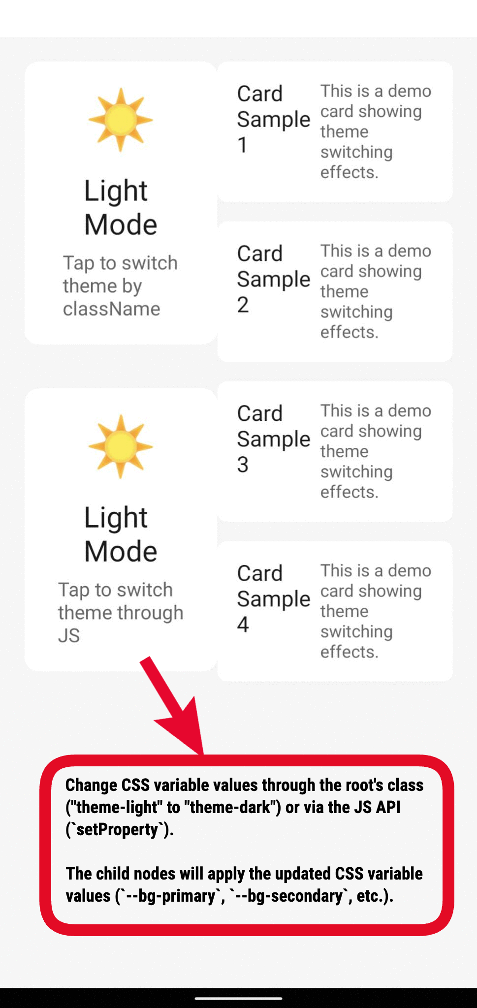
Use JS API (setProperty) to directly modify CSS variable values, allowing flexible batch updates of CSS variables.
Indirectly Changing Variable Values by Switching Classes
Alternatively, you can indirectly modify variable values by switching classes on the ancestor node that define different CSS variables, triggering style updates for all child nodes using these variables when theme switching is needed.
For example, use .theme-light and .theme-dark to define CSS variable values for different themes:
Switching between .theme-light or .theme-dark on the ancestor node changes the values of --color and --bg, which updates the styles for corresponding .content elements.
Example
Leveraging CSS Inheritance As Needed
In pages with complex styles, using CSS inheritance can simplify development. However, implementing inheritance logic adds complexity to the style processing flow and can introduce some performance overhead. To optimize performance, Lynx does not enable inheritance for ordinary CSS properties by default, developers must enable it as needed. CSS custom properties (also known as CSS variables) are inherited by descendant nodes by default.
Inheritance of CSS Custom Properties
CSS Custom Properties (CSS variables, e.g., --primary-color) adhere to Web standards and are inherited by descendant nodes by default without additional configuration. Developers can define CSS custom properties in ancestor nodes to achieve dynamic style management.
Inheritance of Regular (Non-Custom) Properties
To enable inheritance, configureenableCSSInheritance.
Default-Inheritable Properties
After enabling enableCSSInheritance, these properties can be inherited:
direction,color,font-family,font-size,font-style,font-weight,letter-spacing,line-height,text-align,text-decoration,text-shadow
Default inherited properties inherit behavior alignment with 🌐W3C definition
Custom-Inheritable Properties
In addition to the default inheritable properties, you can configure the page with customCSSInheritanceListto define custom inheritable CSS properties. When there are custom inheritance declarations, only the CSS properties listed in the customCSSInheritanceList will be inheritable.
Example:
Limitations of CSS Inheritance
- Elements with
position: fixedwill always inherit properties only from the page. - The keyword "inherit" is not supported.
- In addition to the default inheritable properties, only CSS properties with types enum or boolean support custom inheritance.