Grid Layout
If you want a responsive layout where multiple elements are staggered both vertically and horizontally, the grid layout is your best choice. This layout is based on a two-dimensional grid, and it is the most powerful CSS layout on the Web.
For further details, please refer to MDN's css grid layout.
In Lynx, the grid layout largely follows with web standards. Currently, Lynx does not support [line-names] and grid-area. Please refer to the Reference section for supported properties.
Here is a brief guide on using the grid layout.
How to Build a Grid Layout?
Before you build a grid layout, it's important first to understand the basic concepts.
Basic Concepts
-
Grid Containers and Grid Items
The parent element using grid layout is called a "grid container." The children within the container that are layouted using grid layout are called "grid items".
-
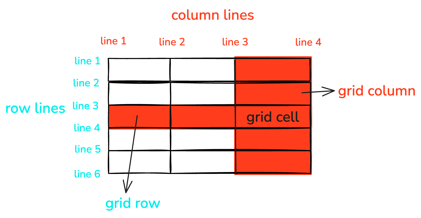
Grid Lines
The lines that divide the grid layout are called "grid lines." Typically, x rows have x+1 horizontal grid lines, y columns have y+1 vertical grid lines, as shown in the image below with 6 horizontal and 4 vertical grid lines.
-
Grid Rows and Grid Columns
The spaces between two grid lines are called grid tracks. The horizontal tracks in the container are called "grid rows," and vertical tracks are called "grid columns."
-
Grid Cells
The intersection of rows and columns forms a grid cell.
-
Grid Areas
The area occupied by one or more grid cells by a grid item is called a grid area.
-
Inline Axis and Block Axis
As Lynx does not support
writing-mode, the inline axis is horizontal, and the block axis is vertical.
Step 1: Apply display: grid
To implement the grid layout, set display: grid on the parent element.
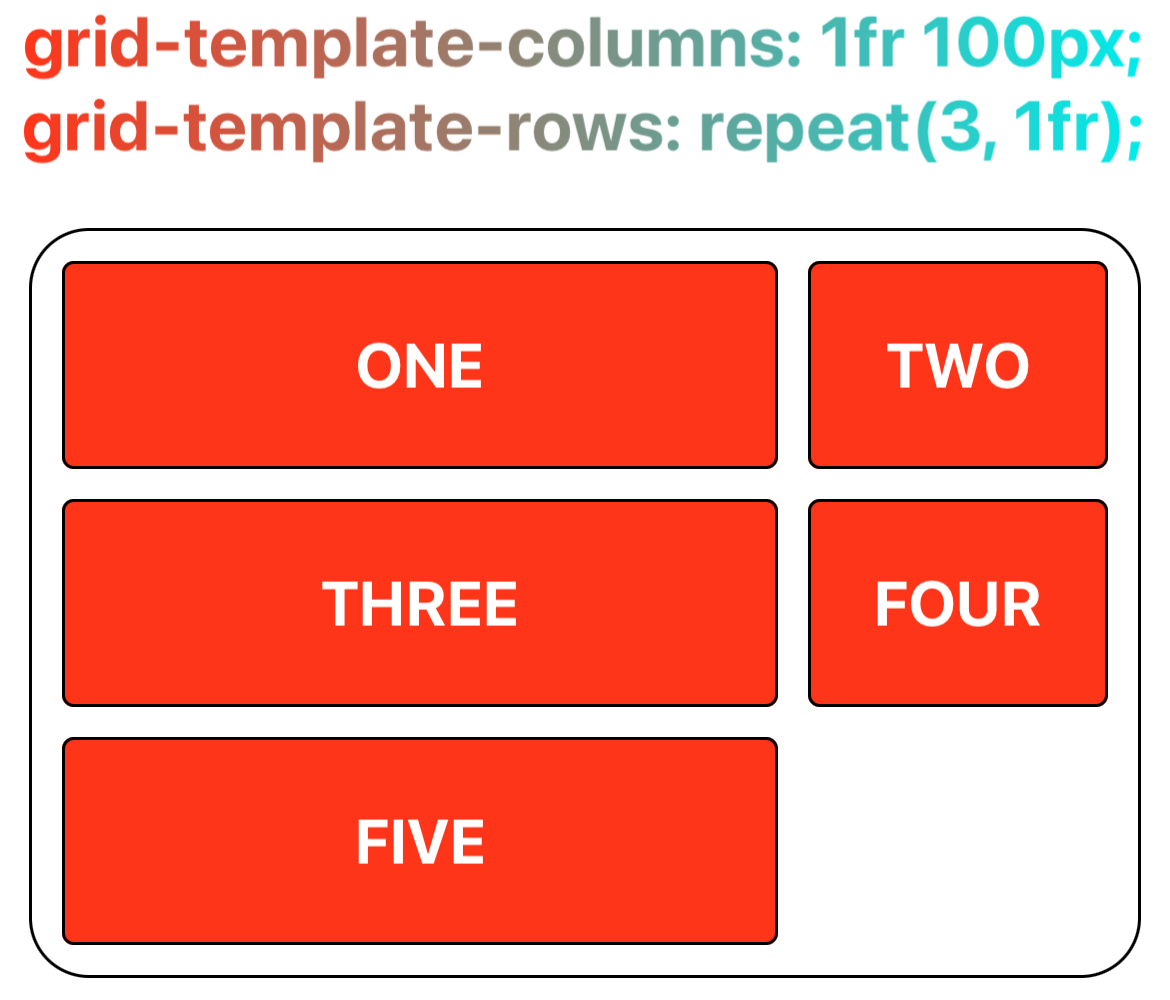
Step 2: Specify the Size of Rows and Columns
Once the container has the grid layout specified, define the rows and columns. The grid-template-columns property specifies each column's width, while the grid-template-rows property defines each row's height.
If grid-template-columns or grid-template-rows are not explicitly used to define dimensions, the grid layout uses grid-auto-columns and grid-auto-rows for determining column widths and row heights.
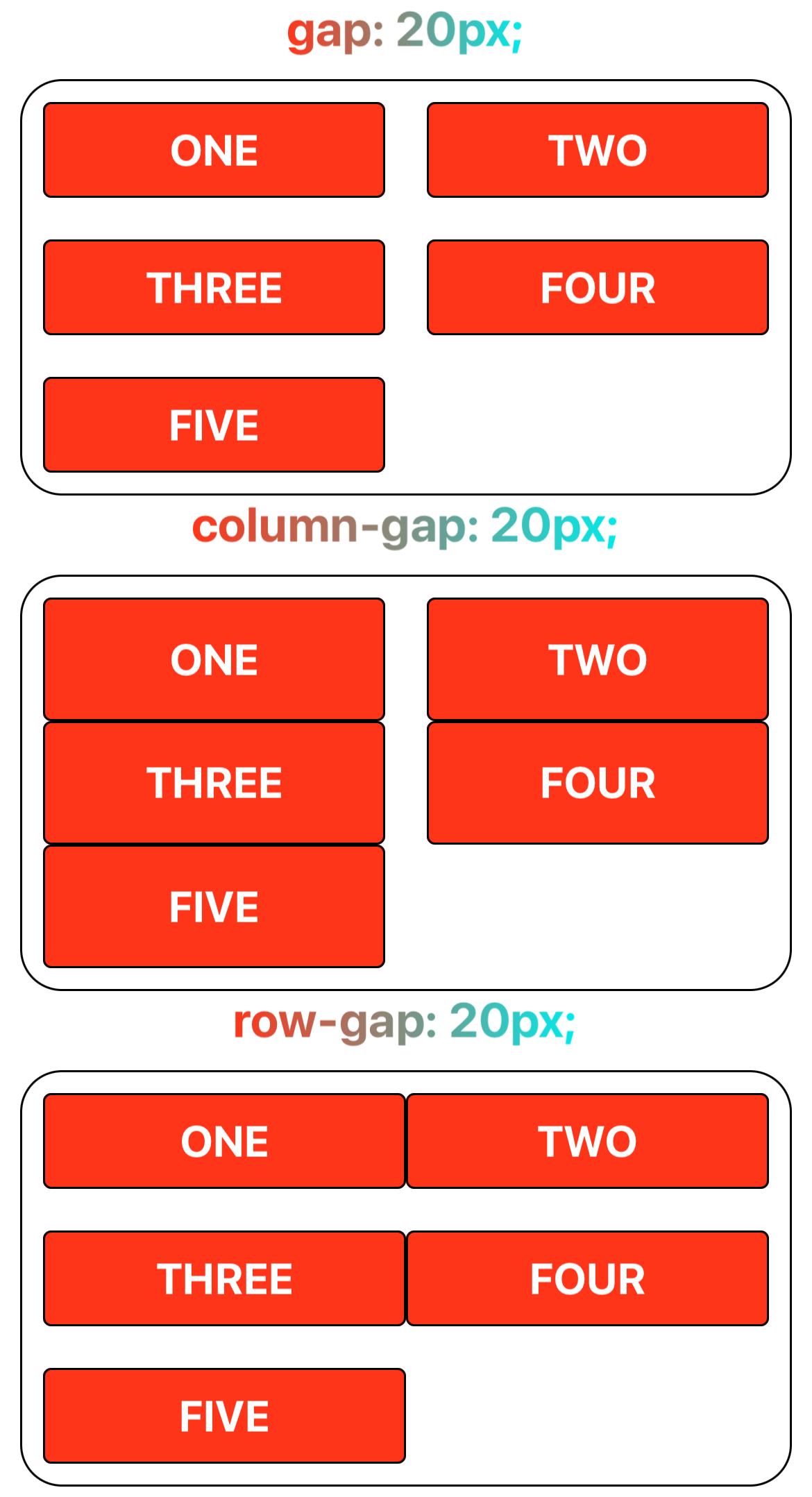
Step 3: Specify Grid Gaps
Grid gap is the spacing between grid tracks. It can be indicated by column-gap for columns, row-gap for rows, or gap for both columns and rows.
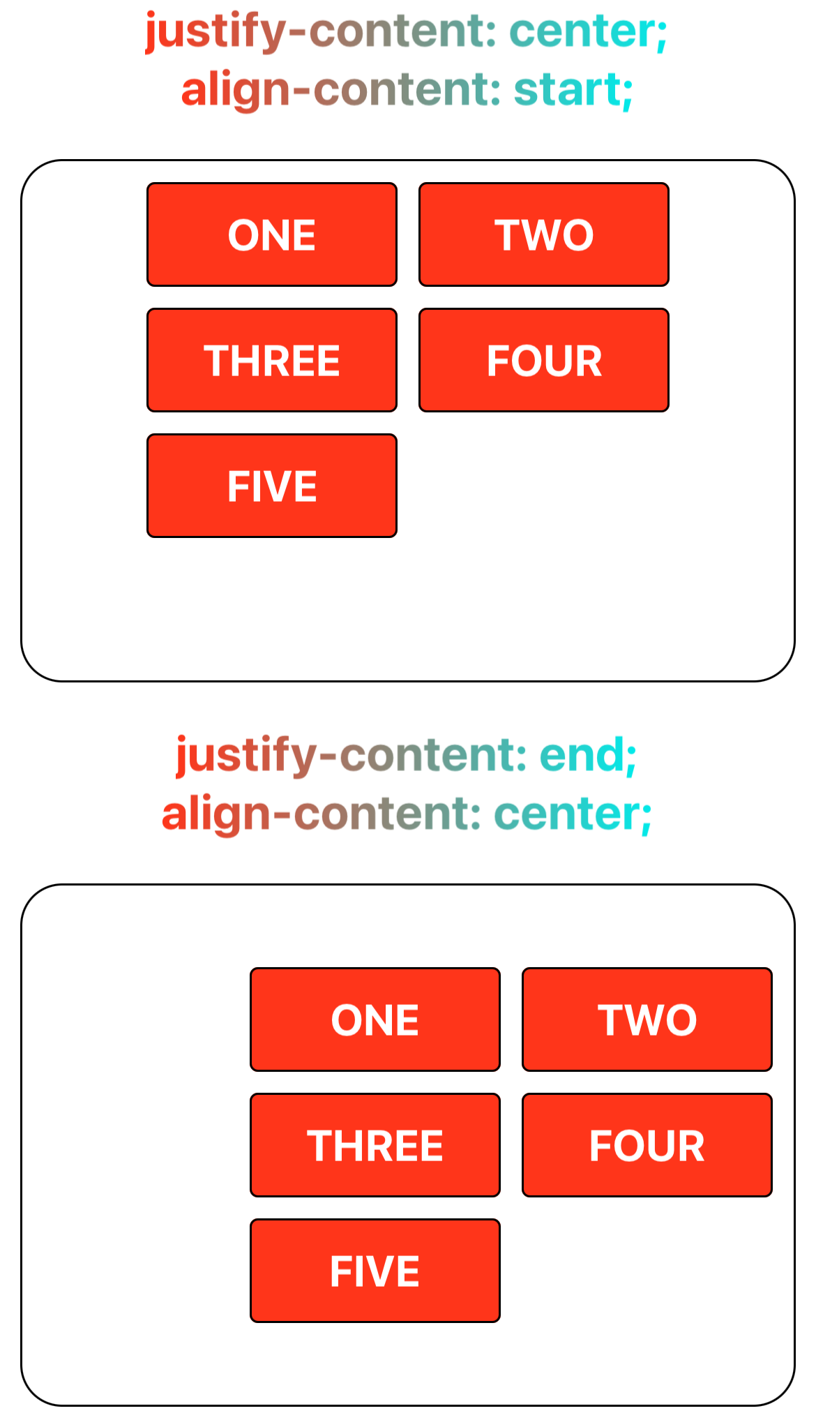
Step 4: Align Grid Tracks to Inline and Block Axes
Align the grid tracks with the inline (horizontal axis) and block (vertical axis) using justify-content and align-content.
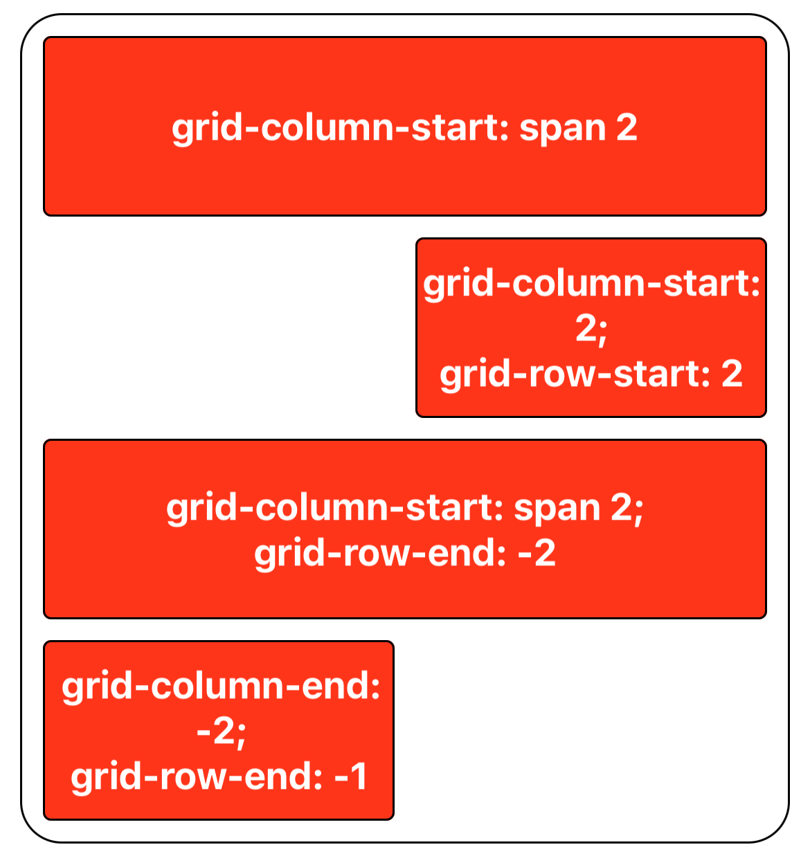
Step 5: Specify the Grid Lines for Grid Items
The positions of grid items can be specified. Use grid-column-start and grid-column-end to set the columns a grid area spans, and grid-row-start and grid-row-end to define rows.
Step 6: Align Grid Items to the Grid Area
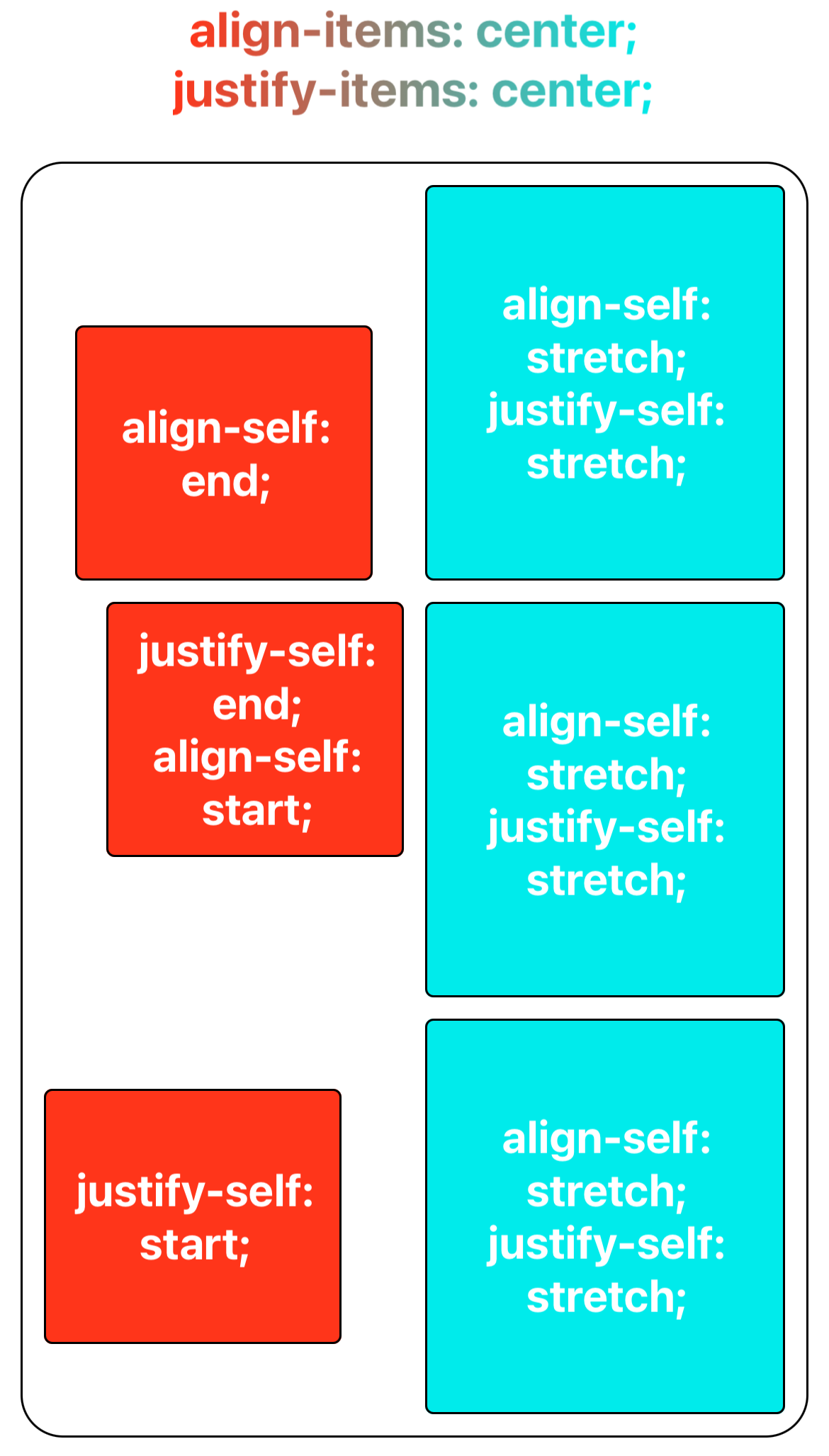
Having established the grid items' respective grid areas in previous steps, you can now use align-items and align-self to vertically align grid items to the grid area, and justify-items and justify-self to horizontally align them as well. It's notable that align-self and justify-self settings on grid items will override those set by align-items and justify-items on the container.
Reference
Currently, Lynx supports the following common grid layout properties:
-
CSS Properties
-
Alignment Properties
For more information on usage, please refer to MDN's css grid layout.