gap
Introduction
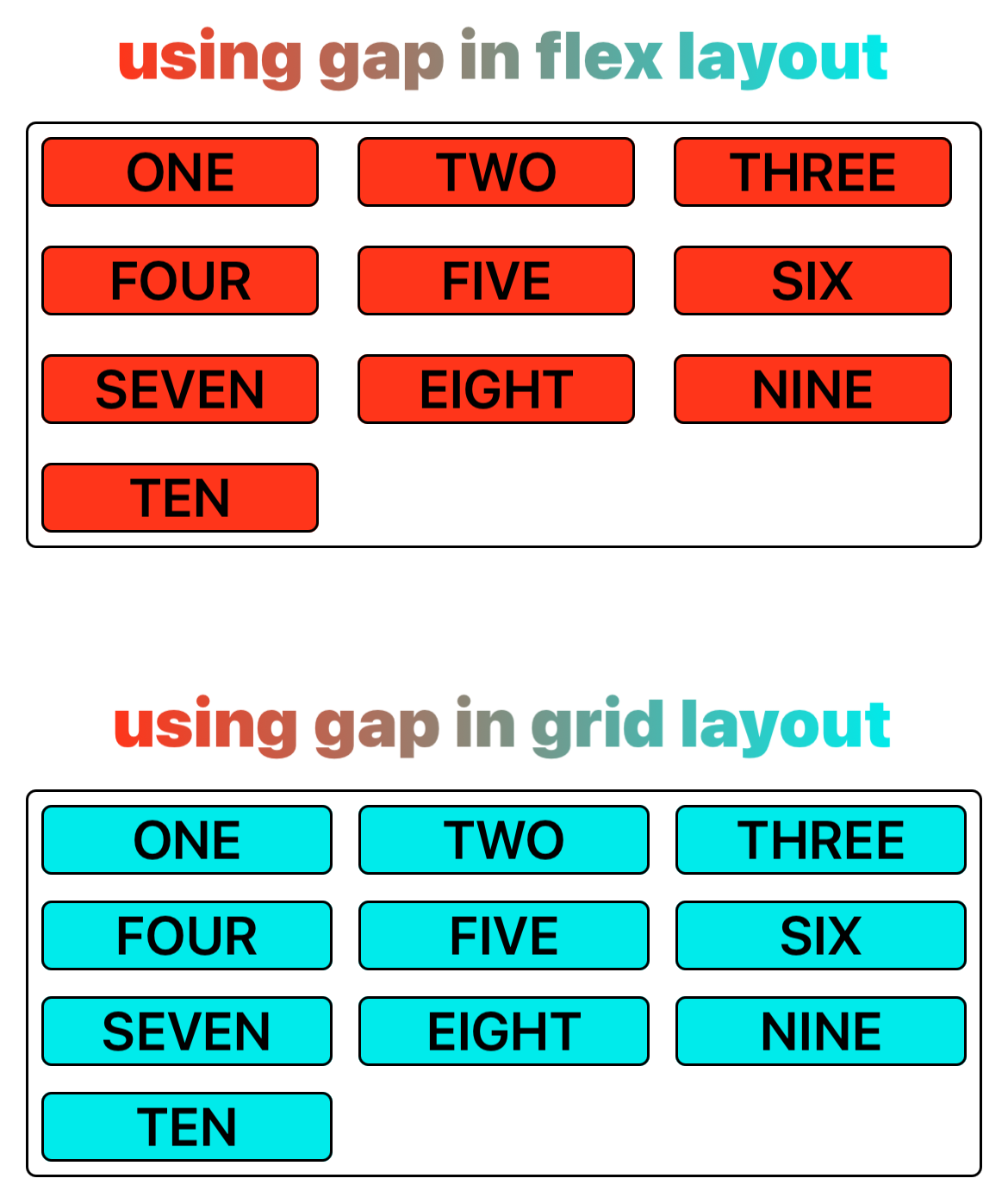
The gap CSS shorthand property sets the gaps (gutters) between rows and columns in flexible box layout and grid layout.
This property is a shorthand for the following CSS properties: row-gap and column-gap, this property is specified as a value for row-gap followed optionally by a value for column-gap. If column-gap is omitted, it's set to the same value as row-gap. row-gap and column-gap are each specified as a <length> or a <percentage>.
Examples
Syntax
Values
-
<length><length>is the width of the gutter in flexible box layout or grid layout. -
<percentage><percentage>is the width of the gutter separating the lines, relative to the dimension of the element.
Formal definition
| Initial value | as each of the properties of the shorthand:
|
| Applies to | flex containers, grid containers |
| Inherited | no |
| Animatable | |
| Percentages | refer to corresponding dimension of the content area(e.g.,row-gap refer to column axis size) |
Formal syntax
Compatibility
LCD tables only load in the browser