<list>
The <list> component is a high-performance scrollable container that optimizes performance and memory usage through element recycling and lazy loading. It supports horizontal and vertical scrolling with single-column, grid, and waterfall layouts, making it ideal for infinite-scroll feeds and similar use cases.
Usage
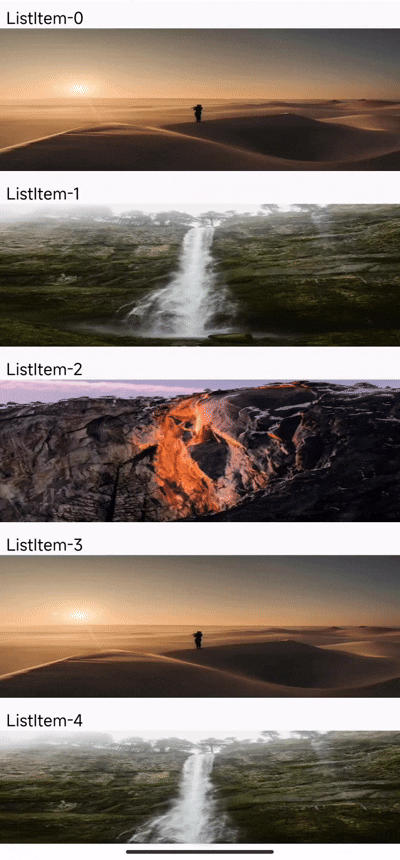
Single-Column Layout
1. Set width and height: The width and height of <list> represent the size of its viewport, so they need to be fixed values and cannot be expanded by internal content. Only child nodes visible in the visible area will be rendered.
2. Set scroll direction and layout form: Set the attribute scroll-orientation to specify the layout and scroll direction, and set list-type and span-count to specify the layout form.
3. Configure child nodes: Use the <list-item> tag as a direct child node of <list> , and set item-key and key for <list-item>, ensuring they are consistent.
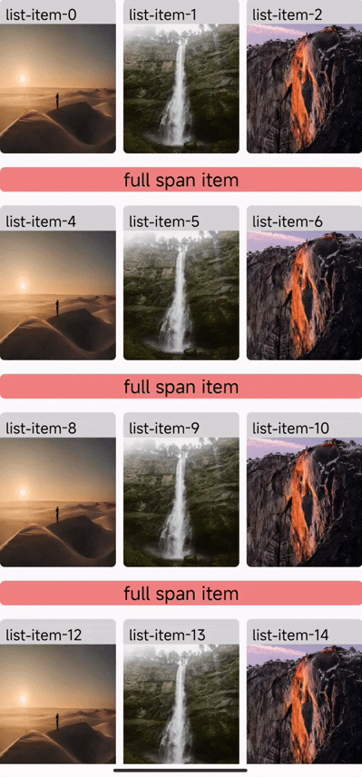
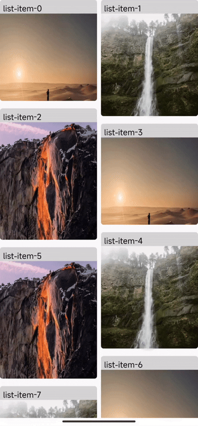
Multi-Column Layout
1. Set layout type and column count: Set the layout type list-type to flow (grid layout) or waterfall (waterfall layout), and set span-count >= 2.
2. Full-span child nodes in multi-column layout: Set the full-span attribute for <list-item/> to make it occupy a full row or column in the layout.
Grid Layout Example:
Waterfall Layout Example:
List-specific CSS Properties
List-specific CSS properties are a set of CSS properties designed exclusively for styling the <list> component. These properties, such as list-main-axis-gap and list-cross-axis-gap, provide fine-grained control over the layout and spacing of items within the list. It is important to note that these properties will only work on <list> and will be ignored on any other component.
list-main-axis-gap
Specifies the spacing of <list> child nodes in the main axis direction, which needs to be written in the style.
list-cross-axis-gap
Specifies the spacing of <list> child nodes in the cross axis direction, which needs to be written in the style.
Attributes
list-type Required
Controls the layout type of the <list> component, which needs to be used in conjunction with span-count.
You can find real world examples in the Multi-Column Layout section to see the difference between flow and waterfall more clearly.
span-count Required
Sets the number of columns or rows for the <list> component layout.
scroll-orientation Required
Sets the scrolling direction and layout direction of the <list> component.
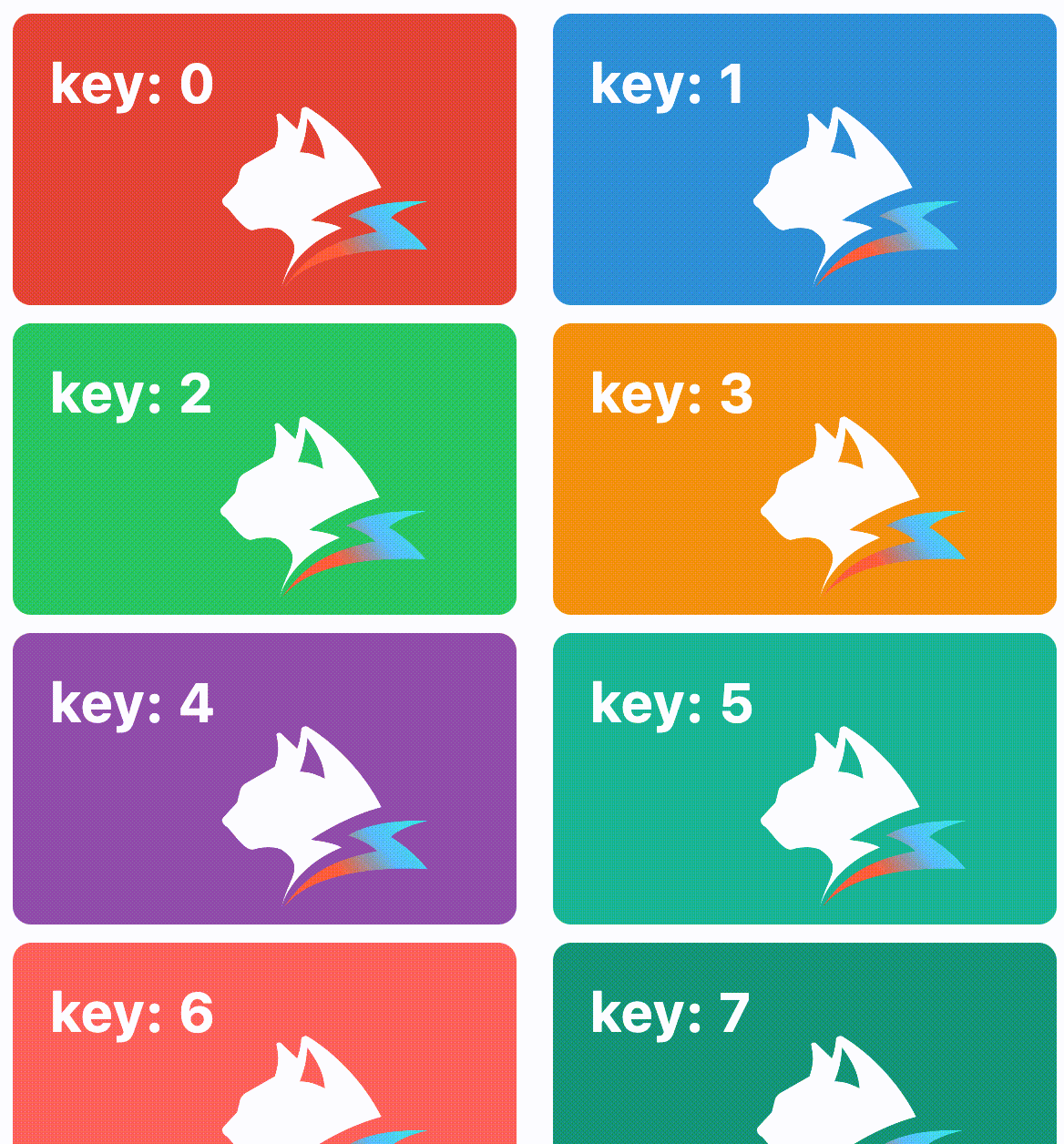
item-key Required
The item-key attribute is a required attribute on <list-item>.
Developers need to set a unique item-key for each <list> child node. It is used to help <list> identify which <list> child nodes have changed, been added, or removed. Therefore, developers need to ensure the correct setting of item-key. Incorrect settings may lead to disorder and flickering issues.
key Required
Use the key attribute to help the framework identify which elements have changed, been added, or removed.
In the list scenario, key and item-key should remain consistent.
enable-scroll
Indicates whether the <list> component is allowed to scroll.
enable-nested-scroll
Indicates whether <list> can achieve nested scrolling with other scrollable containers. When enabled, the inner container scrolls first, followed by the outer container.
sticky
Declared on the <list> component to control whether the <list> component as a whole is allowed to be sticky at the top or bottom.
sticky-offset
The offset distance from the top or bottom of <list> for sticky positioning, in px.
sticky-top
Declared on the <list-item> child node to control whether the node will be sticky at the top.
sticky-bottom
Declared on the <list-item> child node to control whether the node will be sticky at the bottom.
recyclable
Declared on the <list-item> node to control whether the node can be recycled, and if set to false, the <list-item> will not be recycled when it is scrolled out of the viewport of <list>.
bounces
Enables edge bounce effect.
initial-scroll-index
Specifies the node position to which <list> automatically scrolls after rendering, effective only once.
need-visible-item-info
Controls whether the scroll event callback parameters include the position information of the currently rendering node. The scroll events include: scroll, scrolltoupper, scrolltolower.
Scroll event callback parameter format:
upper-threshold-item-count
Triggers a scrolltoupper event once when the number of remaining displayable child nodes at the top of <list> is less than upper-threshold-item-count for the first time.
lower-threshold-item-count
Triggers a scrolltolower event once when the number of remaining displayable child nodes at the bottom of <list> is less than lower-threshold-item-count for the first time.
scroll-event-throttle
Sets the time interval for the <list> callback scroll event, in milliseconds (ms). By default, the scroll event is called back every 200 ms.
When the engineVersion version is less than 3.4, this attribute will not take effect, and the scroll event will not be intercepted. When the engineVersion version is greater than or equal to 3.4, if this attribute is not set, it will use default value 200 ms.
item-snap
Controls the paginated scrolling effect of <list>.
Pagination parameters
factor: The parameter for paginated positioning, with a range of[0, 1]- A value of
0means the paginated scrolling<list>child node aligns with the top of<list> - A value of
1means the paginated scrolling<list>child node aligns with the bottom of<list>
- A value of
offset: Additional offset parameter added on top offactor
When the 'engineVersion' version is less than '3.2', there will be inconsistencies in the scrolling speed on the mobile platform.
update-animation
This property controls whether the list runs animations while the data source is being updated. It currently supports insert, delete, and update animations.
Example of update-animation:
 delete |  update |  insert |
Currently, update-animation can only work when list-type is single or flow.
need-layout-complete-info
Controls whether the layoutcomplete event includes the node layout information before and after this layout, the <list> Diff information that triggered this layout, and the current <list> scroll state information.
layout-id
Used to mark the unique identifier for this data source update, which will be returned in the layoutcomplete event callback.
preload-buffer-count
This attribute controls the number of nodes outside <list> that are preloaded.
-
The larger the value of
preload-buffer-count, the more off-screen nodes can be preloaded, but it will also increase the memory usage of<list>. -
The recommended value for
preload-buffer-countis the number of nodes that fill one screen of<list>. -
Only effective when
list-type='single'/'flow'.
scroll-bar-enable
Indicates whether the <list> component scroll bar is displayed.
harmony-scroll-edge-effect
On Harmony, when the contentSize is smaller than its own container size, set whether to enable the scroll effect.
reuse-identifier
Sets the reuse id for <list-item>. When rendering child nodes, the <list> component reuses <list-item> based on the reuse-identifier attribute value. Only <list-item> with the same reuse-identifier attribute value will be reused.
By default, developers do not need to provide a reuse-identifier, as the framework determines it during the compilation phase. For example, when <list-item> is within a loop (e.g., Array.prototype.map), since they have the same form and position during the compilation phase, we generate the same reuse-identifier for them, allowing this group of <list-item> to be reused with each other.
Use case: <list-item> with significant structural differences perform poorly when reused. Therefore, it is recommended to set different reuse-identifier values for them to avoid mutual reuse.
full-span
The full-span attribute is used to indicate that a <list-item> occupies a full row or column.
estimated-main-axis-size-px
Specifies the placeholder size in the main axis direction for <list-item> before it is fully rendered, in px. If not set, the default value is the size of <list> in the main axis direction.
It is strongly recommended that developers set estimated-main-axis-size-px to a value close to the actual size of the child nodes.
experimental-recycle-sticky-item
When there are multiple sticky nodes, after a sticky node is pushed out of the <list> area by other sticky nodes, the node is recycled to address the memory overhead issue caused by too many sticky nodes. This optimization is enabled by default when engineVersion version is greater than or equal to 3.4.
 sticky nodes not recycled, the ui count will keep increasing | 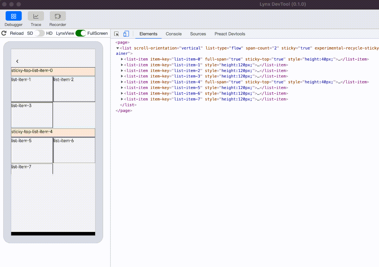 sticky nodes is recycled and reused, the ui count will not keep increasing |
Events
Front-end developers can bind corresponding event callbacks to components to monitor runtime behavior. The usage is as follows.
scroll
<list> scroll event.
-
The frequency of scroll event triggers can be controlled by
scroll-event-throttle. -
If
<list>enablesneed-visible-item-info, the callback parameters will include the position information of the currently rendering child nodes.
scrolltoupper
Callback triggered when scrolling to the top of <list>. The trigger position of this callback can be controlled by upper-threshold-item-count.
scrolltolower
Callback triggered when scrolling to the bottom of <list>. The trigger position of this callback can be controlled by lower-threshold-item-count.
scrollstatechange
Callback triggered when the scroll state of <list> changes. The state field in the event parameter's detail indicates the scroll state: 1 for stationary, 2 for dragging, and 3 for inertial scrolling, 4 for smooth animation scrolling.
layoutcomplete
Callback triggered after <list> layout is complete.
snap
Callback when pagination scrolling is about to occur.
Methods
scrollToPosition
Scroll the <list> component to the specified position. Parameter description:
autoScroll
Trigger <list> auto-scrolling. Parameter description:
getVisibleCells
Get information about all currently displayed <list> child nodes. The returned information is as follows:
scrollBy
Continue scrolling the distance specified by offset based on the existing offset, in px. The returned information is as follows:
More Features
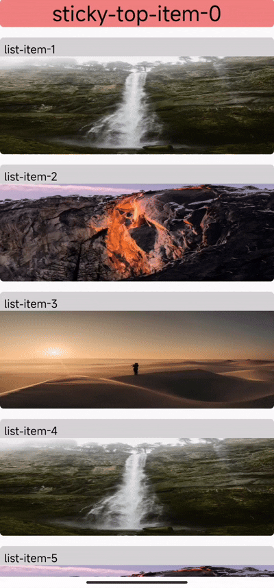
Sticky Elements
In the <list> component, you can achieve sticky top or sticky bottom node effects by setting the sticky-top or sticky-bottom attributes on <list-item>.
Ensure that the sticky attribute of the <list> component is set to true to allow child nodes to be sticky. You can also set the sticky-offset to determine the sticky position.
Set the sticky-top or sticky-bottom attributes on <list-item> to make the node sticky top or sticky bottom when scrolling. Since sticky nodes must be a full row item, you also need to set the full-span attribute for the node.
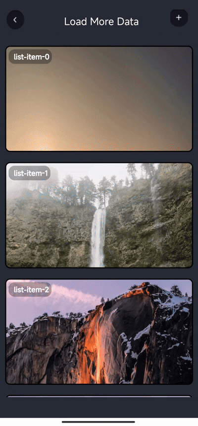
Loading Content When Scrolling to Edge
The <list> component supports infinite scroll loading functionality through two key steps:
First, set an appropriate value for the lower-threshold-item-count attribute on the <list> component. This determines how close to the bottom the scroll needs to be before triggering the load more event. Then, bind the scrolltolower event handler which will be called when scrolling reaches the bottom threshold, allowing you to load additional data.
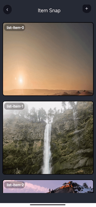
Pagination with item-snap
Set the factor to determine the parameter for paginated scrolling positioning, with a range of [0, 1]. 0 means <list-item> aligns with the top of <list>, and 1 means <list-item> aligns with the bottom of <list>. You can also set offset to add a scrolling offset on top of factor.
Example of vertical orientation:
Example of horizontal orientation:
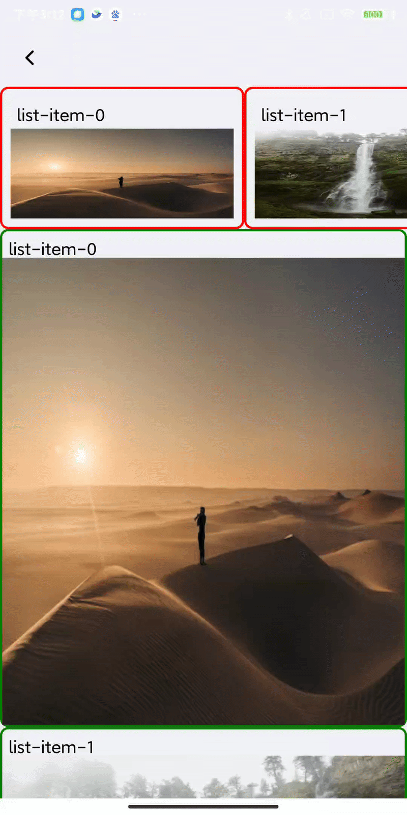
Use z-index
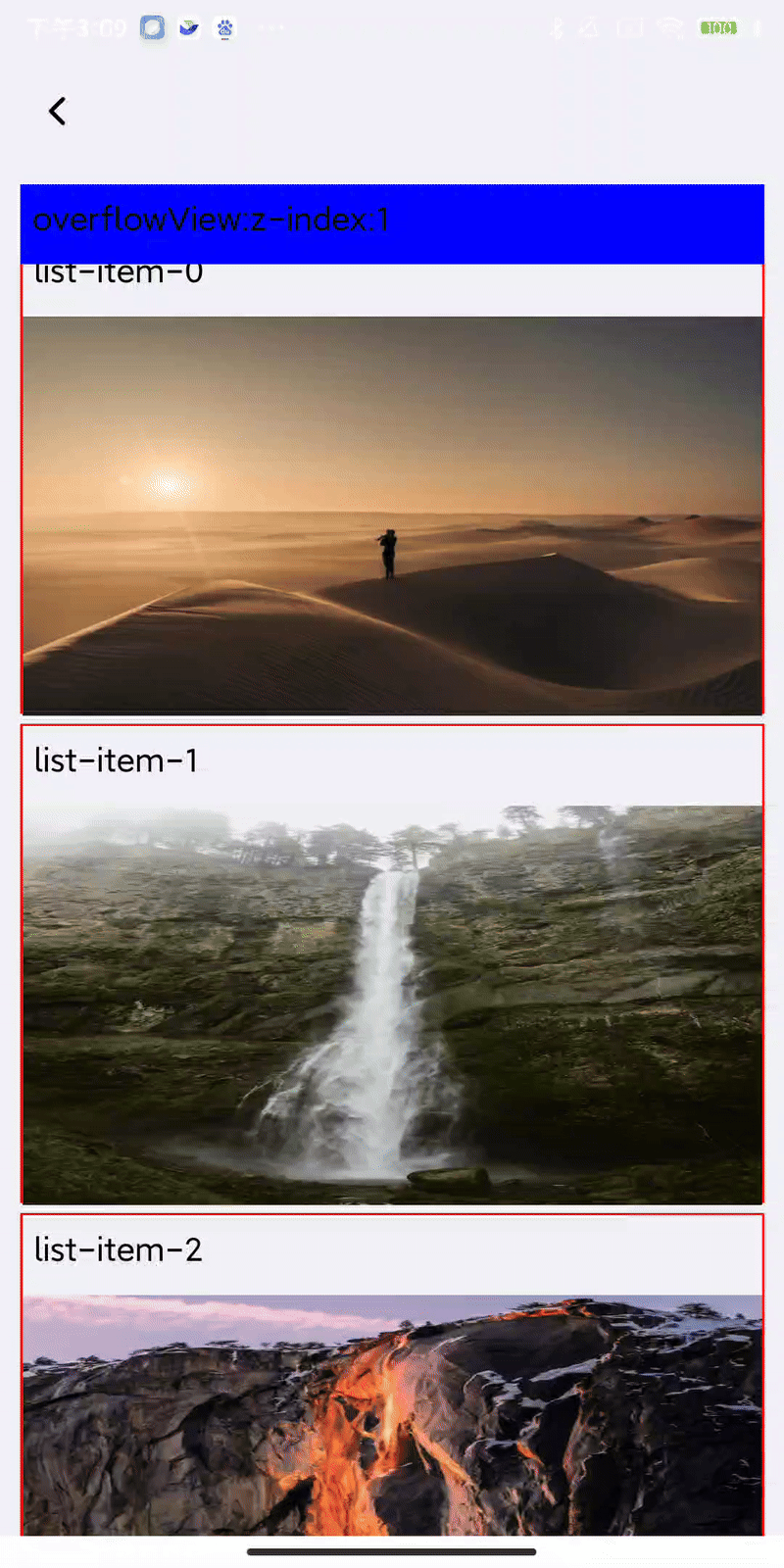
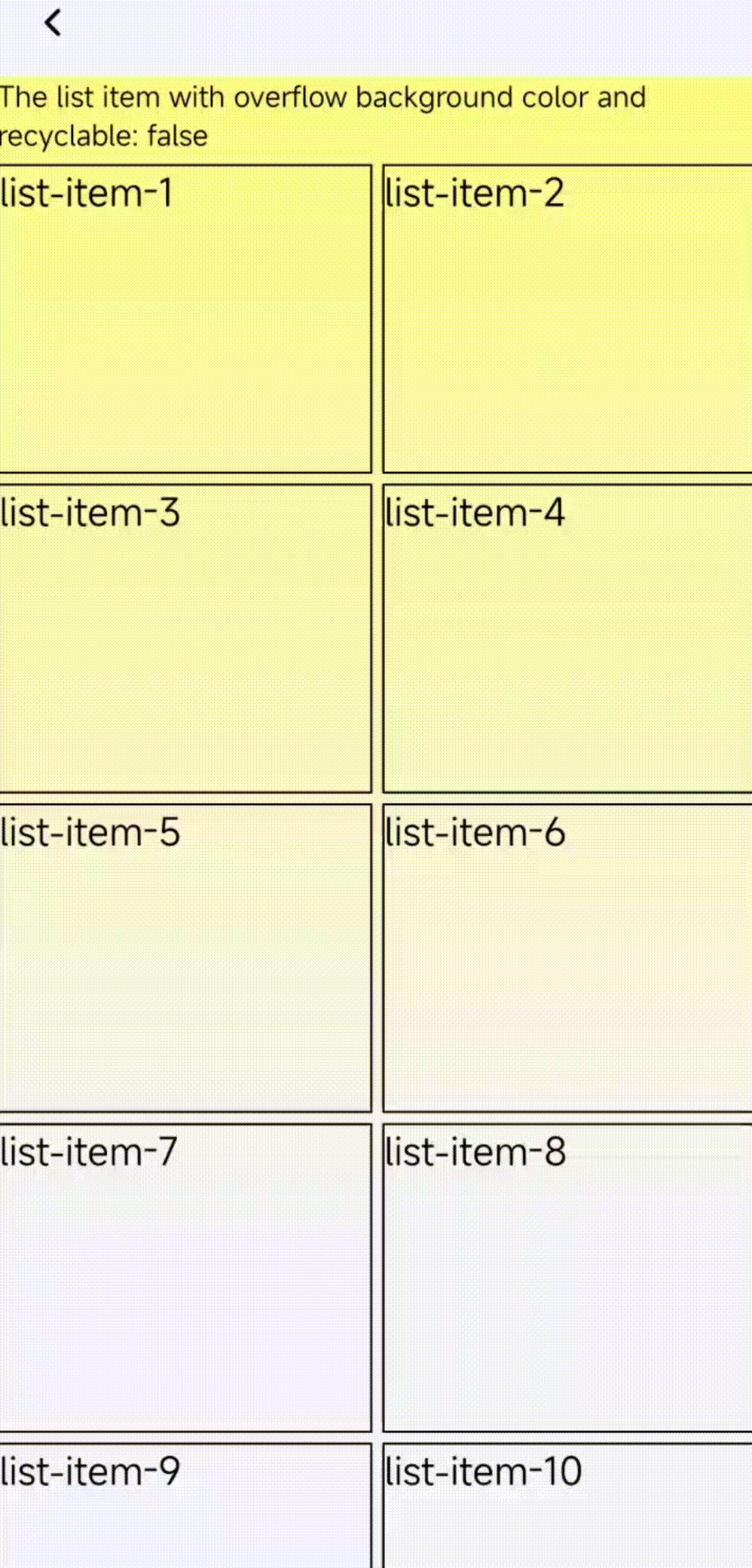
Not recycle <list-item>
By setting the recyclable property of <list-item> to false, you can prevent the node from being recycled. In this example, we added an overflowing <view> with a background color to the first <list-item>. When this <list-item> is scrolled off the screen, we can still see the <view> with background color on the screen.
Compatibility
<list>
LCD tables only load in the browser
<list-item>
LCD tables only load in the browser