<text>
<text> is a built-in element in Lynx used to display text content. It supports specifying text style, binding click event callbacks, and can nest <text>, <image>, and <view> elements to achieve relatively complex text and image content presentation.
Usage
The <text> element has its own layout context similar to the Web's inline formatting context. It does not support display properties like <view>. For advanced text styling with <text> element, see the Text and Typography guide.
Nested <text>
Nested <text> refers to <text> subelements within a <text> element.
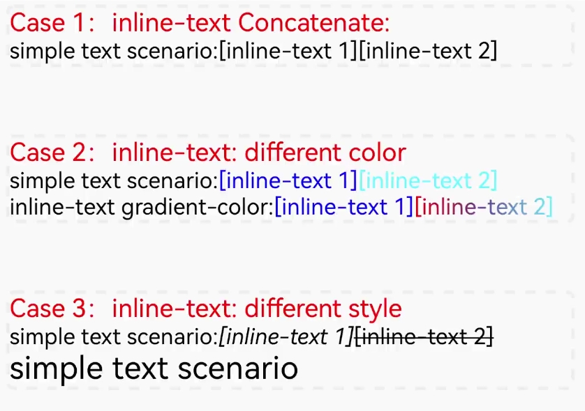
Since the CSS inheritance is not enabled by default in Lynx, it's recommended to explicitly declare the required styles for <text>, as it will not inherit the text-related properties from its parent node.
However, nested <text> is special. Even when CSS inheritance is not enabled, it will still apply <color> and <font-family> properties of the parent <text>. To maintain consistency, it is recommended to explicitly override the properties of the parent <text> in the inline <text>.
Nested <image>
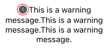
Nested <image> refers to <image> subelements within a <text> element. It can be used for mixed text and image layout.
Nested <view>
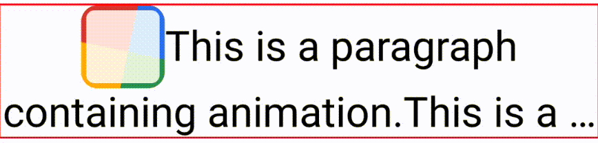
A <view> written inside a text element will have inline characteristics and participate in text layout. It also supports all functionalities of the <view> tag, including adding borders, rounded corners, and any other element content inside it.
<inline-truncation>
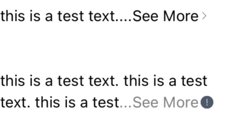
<inline-truncation> tag is used to customize the content that needs to be displayed at the end of the text when truncation occurs.
RTL
The text element supports RTL (Right-To-Left) language layout display. By default, the text element will determine the text language based on the content and use the corresponding layout method. Developers can also specify the use of RTL layout by setting the direction style.
When direction is set to rtl or lynx-rtl, text-align:start will be converted to text-align:right, and similarly, text-align:end will be converted to text-align:left.
When direction is set to lynx-rtl, text-align:left will be converted to text-align:right, and similarly, text-align:right will be converted to text-align:left.
Attributes
Attribute names and values are used to describe the behavior and appearance of elements.
text-maxline
Limits the maximum number of lines displayed for the text content, overflow:hidden should be set simultaneously.
include-font-padding Android
Add additional padding for Android text on top and bottom. Enabling this may cause inconsistencies between platforms.
tail-color-convert
By default, if the text is truncated, the inserted ... will be displayed with the color specified by the closest inline-text's style. If this attribute is enabled, the color of ... will be specified by the outermost text tag's style.
text-single-line-vertical-align
Used to set vertical alignment for single-line plain text. It can be changed by setting 'top' | 'center' | 'bottom'. It is recommended to use this only when the default font does not meet the center alignment requirements, as it increases text measurement time.
text-selection
Sets whether to enable text selection. When enabled, flatten={false} should be set simultaneously.
custom-context-menu
Used to set whether to turn on the custom pop-up context menu after selection and copying. It takes effect after enabling text-selection.
custom-text-selection
Used to set whether to enable the custom text selection function. When it is enabled, the element will no longer handle the gesture logic related to selection and copying. Developers need to control it through APIs such as setTextSelection. It takes effect after enabling text-selection.
Events
Frontend can bind corresponding event callbacks to elements to listen to runtime behaviors. All basic events are supported.
layout
The layout event returns the result information after text layout, including the number of lines of the current text, and the start and end positions of the text in each line relative to the entire text.
selectionchange
This event is triggered whenever the selected text range changes.
Methods
You can invoke element methods from the frontend using the SelectorQuery API.
setTextSelection
This method sets the selected text based on start and end positions and controls the visibility of selection handles. The response res contains:
getTextBoundingRect
This method retrieves the bounding box of a specific range of text. The response res includes:
getSelectedText
This method retrieves the string content of the currently selected text.
Loading Custom Fonts
You can specify custom font resources using @font-face and utilize them with the font-family property.
The client needs to implement the corresponding font resource loader using GenericResourceFetcher to download web font resources.
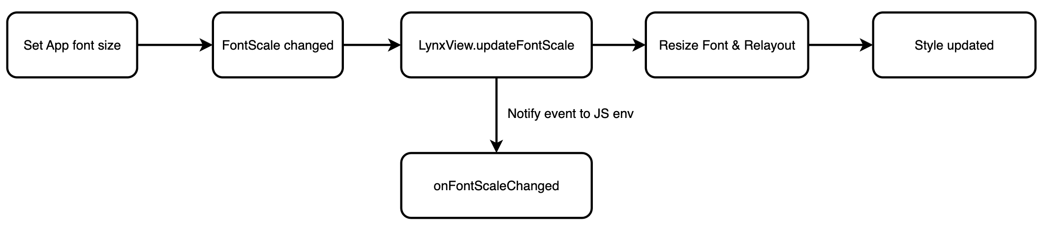
Big Font
Clients can use font scaling related APIs to modify the font scaling ratio after users change the system or application font size. This will also trigger the onFontScaleChanged event.
Usage
-
Client-side: Use
LynxViewBuilder.setFontScale()to set the font scale when creating the LynxView.Update the font scale withLynxView.updateFontScale(). -
Front-end:
font-sizeandline-heightwill zoom in and out according to the font scale. The front-end can obtain the updatedfontScalefrom the client by listening to theonFontScaleChangedevent.
The front-end to listen to onFontScaleChanged:
More Features
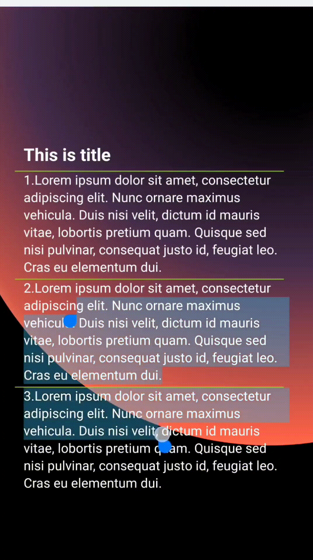
<text> selection and copying
The <text> element supports text selection and copying. You can enable this feature by setting the text-selection attribute on the <text> element, and make sure to set flatten={false} as well:
Long-pressing the text will highlight the selected area and trigger the default context menu, which includes options like "Select All" and "Copy".
Text selection is currently not supported for RTL (Right-to-Left) mode.
If you want to implement a custom context menu, you need to set the custom-context-menu attribute and bind the selectionchange event along with the getTextBoundingRect method to determine the position for rendering your custom menu.
cross <text> selection and copying
For more advanced scenarios, such as supporting cross-node selection across multiple <text> elements, you need to implement custom selection logic.
Step-by-Step: Implementing Cross-Text Selection
- Enable Custom Text Selection Mode
Set the custom-text-selection attribute on each <text> element. This disables the built-in selection and gesture handling, allowing you to define your own.
- Bind Gesture Events on the Wrapper
<view>
Bind long-press, tap, and touch events on the outer <view> container. These will be used to control your custom selection and gesture logic.
- Handle Selection and Copying Logic
- On component mount, retrieve metadata for all selectable
<text>nodes, including their ID, dimensions, and positions:
- On Long Press: Start Selection
handleLongPress()is triggered on long press. It initiates the selection state, records the starting point, and performs the first selection update:
- On Drag: Update Selection Area in Real Time
As the user drags, handleTouchMove() is called. If a selection is in progress, it updates the highlighted area accordingly:
- On Finger Release: Finalize Selection
handleTouchEnd() is triggered on finger release. This finalizes the selected region and exits selection mode:
On Tap Blank Area: Clear Selection
Tapping outside the text elements triggers a selection clear:
- On Handle Drag: Adjust Selection Range
In handleTouchStart(), determine if the touch point is near one of the draggable handles. If so, allow real-time adjustment of the selection:
Compatibility
<text>
LCD tables only load in the browser
Nested <text>
LCD tables only load in the browser
nested <image>
LCD tables only load in the browser
<inline-truncation>
LCD tables only load in the browser