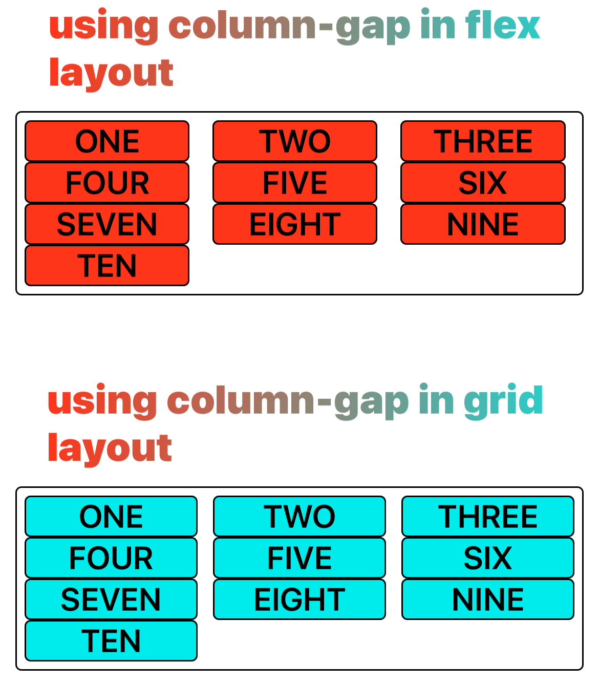
column-gap (grid-column-gap)
Introduction
The column-gap/grid-column-gap CSS property sets the size of the gap (gutter) between an element's columns in flexible box layout and grid layout.
For compatibility, column-gap or grid-column-gap can be used both.
Examples
Syntax
Values
<length>
Is the width of the gutter separating the columns.
<percentage>
The size of the gap between columns, defined as a percentage. The percentage property's value must be non-negative.
Formal definition
| Initial value | 0 |
| Applies to | flex containers, grid containers |
| Inherited | no |
| Animatable | no |
| Percentages | refer to row dimension of its own content area |
Formal syntax
Difference with the web
normalis not supported.
Compatibility
LCD tables only load in the browser