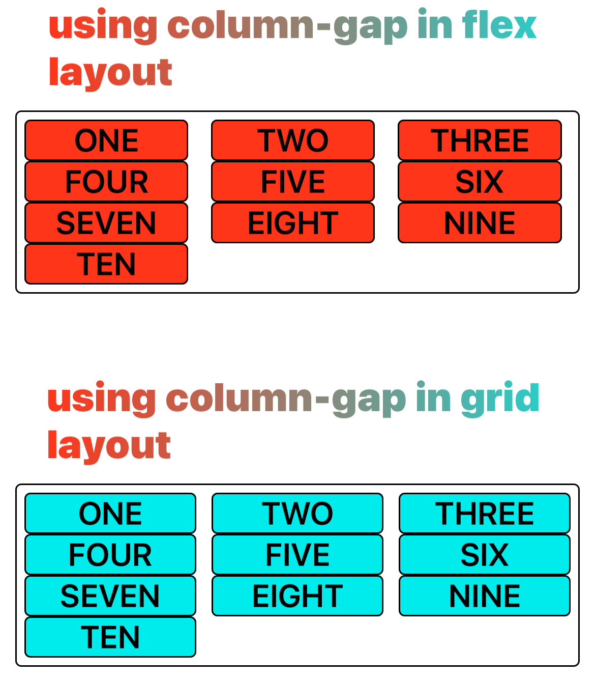
column-gap (grid-column-gap)
介绍
column-gap/grid-column-gap 属性用来设置弹性布局和网格布局元件列之间的间隙(gutter)大小。
为了兼容性,可使用 column-gap 或 grid-column-gap。
使用示例
语法
取值
<length>
<percentage>
列之间直接的间隙宽度,相对容器自身 content area 横向大小的百分比。
形式定义
| 初始值 | 0 |
| 适用元素 | 弹性容器和网格容器 |
| 是否支持继承 | 否 |
| 是否支持动画 | 否 |
| 百分比 | refer to row dimension of its own content area |
形式语法
与 Web 的区别
- 不支持
normal。
兼容性
LCD tables only load in the browser