text-shadow
Introduction
The text-shadow CSS property adds shadows to text.
Examples
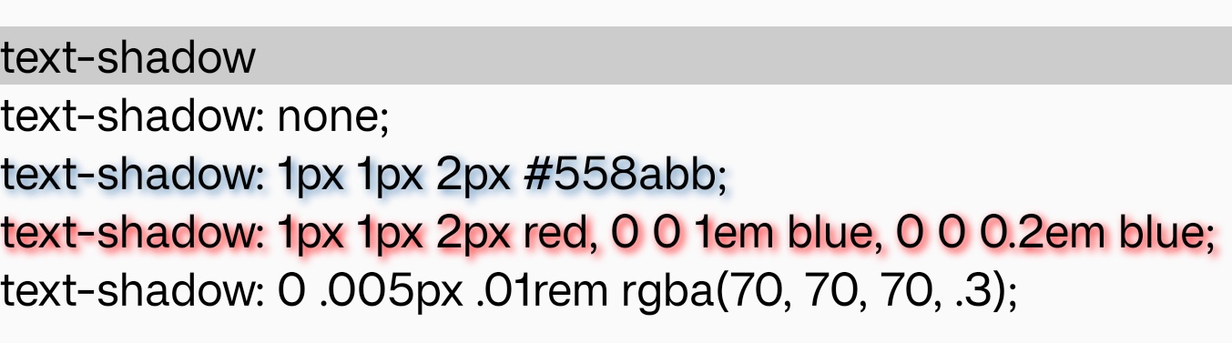
Syntax
Formal definition
| Initial value | empty value |
| Applies to | text |
| Inherited | yes |
| Animatable | no |
Formal Syntax
Differences from Web
-
Only support one shadow layer.
-
For now both
offset-x,offset-y,blur-radiusandcolorare mandatory. Andcolormust be the last value.
Notes
- In some old version Android platform,
text-shadowmay not be rendered whenblur-radiusis 0.
Compatibility
LCD tables only load in the browser