<view>
A container element similar to HTML's <div>. Like <div>, <view> is a versatile container element that can hold other elements and serves as the foundation for building layouts. All attributes, events, and methods available on <view> can be used by other elements.
Usage
As a Drawing Container
As a Layout Container
Attribute
Attributes and their values are used to describe the behavior and appearance of elements.
name
Used to specify the name of the element, generally for native to operate the corresponding node from the native side through findViewByName.
id
Used to specify the unique identity of the element, which can be used by the front-end API to find and operate the corresponding node, such as invoke.
style
Used to apply inline styles to elements.
class
Used to specify one or more class names for an element, which can be used in CSS to apply styles.
className ReactLynx
In ReactLynx, use className to set CSS class names, equivalent to class.
data-*
Used to specify additional information for the element, which can be obtained in Event.
flatten Android
Only available on Android platform, used to force specific nodes to create corresponding Android Views.
exposure-id
Specify whether the target node needs to listen to exposure/disexposure events.
exposure-scene
Specify the exposure scene of the target node, and use it together with exposure-id to uniquely identify the node that needs to monitor exposure.
exposure-ui-margin-*
Specify the boundary scaling value of the target node itself in the exposure detection, which affects the viewport intersection judgment of the target node. Each node can have its own boundary scaling value.
On both Android and iOS platforms, you need to set enable-exposure-ui-margin for the current node; otherwise, it won't take effect. On the HarmonyOS platform, setting enable-exposure-ui-margin is not required for it to take effect.
exposure-screen-margin-*
Specify the screen boundary scaling value referenced by the target node in the exposure detection task, which affects the viewport intersection judgment of the target node. Each node can have its own screen boundary scaling value.
On both Android and iOS platforms, you need to set enable-exposure-ui-margin for the current node; otherwise, a positive value represents the scaling value of the target node's own boundaries, and a negative value represents the scaling value of the screen boundaries. On the HarmonyOS platform, setting enable-exposure-ui-margin is not required for it to take effect.
exposure-area
Specify the viewport intersection ratio of the target node that can trigger the exposure event. When it is greater than this ratio, the exposure event is triggered. When it is less than this ratio, the reverse exposure event is triggered. By default, the exposure event is triggered when the target node is exposed.
enable-exposure-ui-margin
Specify whether the target node supports the exposure-ui-margin-* properties.
Setting this to true will change the behavior of exposure-screen-margin-* on Android and iOS platforms, potentially causing lazy loading of scrollable containers to fail.
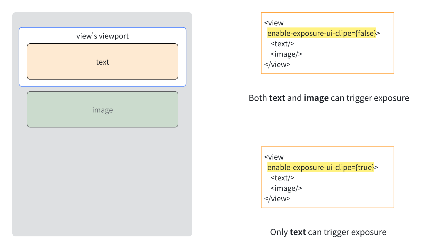
enable-exposure-ui-clip
Specify whether the exposure detection task takes into account the viewport clipping of the parent node. When set to true, nodes outside the parent node viewport cannot trigger exposure, and when set to false, nodes outside the parent node viewport can trigger exposure.
By default, exposure detection only considers the viewport clipping of scrollable parent nodes. The viewport clipping of other parent nodes with width and height and overflow: visible has no effect on exposure detection. Setting enable-exposure-ui-clip for these parent nodes allows for more accurate viewport clipping determination.
accessibility-element
Set whether the node supports accessibility.
accessibility-label
Set the content of the node voice broadcast.
If the <text/> node does not set this attribute, the <text/> node defaults to the <text/> content.
When a node turns on the accessibility-element attribute, it is recommended to set the accessibility-label at the same time, so that the meaning of the current node can be more clearly expressed.
accessibility-trait
Set the type characteristics of the node. The system will have specific supplements to the playback content for different types of nodes.
accessibility-elements
Customize the focus order of child nodes. This property is set on the parent node, and the focus order of its child nodes will be focused according to the order of the child node id specified by the accessibility-elements property.
If the parent node is set with the accessibility-elements property, only the child node with the id specified by the accessibility-elements property can be accessed, and other child nodes cannot be focused.
accessibility-elements-a11y
The same as accessibility-elements, but the corresponding id is a11y-id.
accessibility-elements-hidden
Marks the current node and all its child nodes as non-accessible nodes.
accessibility-exclusive-focus
This property can be set for any node. In accessibility mode, sequential navigation will only focus on the child nodes under these nodes.
Usage scenario: Solve the problem of focus penetration in the pop-up mask: You can set this property to true for the mask node, so that the focus circulates inside the mask node and does not penetrate to other nodes under the mask.
a11y-id
Different from id, it is used to identify barrier-free nodes separately.
ios-platform-accessibility-id iOS
Used to specify the accessibility identifier of a UIView in iOS. It is only used when the platform-level accessibility framework is accessed.
user-interaction-enabled
Specify whether the target node and its child nodes can respond to Lynx touch events. This property does not affect platform-level gestures (such as scrolling of scroll-view).
It is recommended to use pointer-events instead of user-interaction-enabled.
native-interaction-enabled
Specify whether the target node consumes platform-layer touch events, affects platform-layer gestures (such as scrolling of scroll-view), does not affect Lynx touch events, and can achieve similar platform-layer gesture penetration/interception effects.
On the Android platform, this setting only applies to view elements, and the corresponding Android View needs to be created for the node to take effect. It may also require setting flatten to false for it to work.
Gesture interception effects only apply to sibling nodes, not parent-child nodes.
pan-intercept-direction
Specify which direction to block platform-layer swipe gestures, you need to use pan-intercept-scope. When the swipe direction matches pan-intercept-direction, pan-intercept-scope will be used to determine whether to block platform-layer swipe gestures on the corresponding node.
For example, when pan-intercept-direction is set to 0, indicating a horizontal swipe direction, the pan-intercept-scope of the node closest to the user in the event response chain will be used to determine whether to block platform-layer swipe gestures on the corresponding node.
On the Android platform, this setting only applies to view, scroll-view, and list elements, and the corresponding Android View needs to be created for the node to take effect. It may also require setting flatten to false for it to work.
pan-intercept-scope
Specify the scope within which platform-layer swipe gestures in a particular direction will be blocked. It must be used in conjunction with pan-intercept-direction. For example, setting pan-intercept-scope to 0 means that platform-layer swipe gestures will only be blocked on the target node, while setting it to 1 means that platform-layer swipe gestures will be blocked on all ancestor nodes of the target node.
block-native-event
Specify whether to block platform layer gestures outside Lynx when the target node is on the event response chain, which can achieve an effect similar to blocking the platform layer side sliding back.
block-native-event-areas
Specify a touch area that blocks platform-layer gestures outside of Lynx. When the target node is in the event response chain and a touch is placed in the specified area of the target node, platform-layer gestures will be blocked, achieving an effect similar to preventing platform-layer side-swipe back.
This two-dimensional array contains arrays containing 4 elements. The 4 elements are x, y, width, and height, in units of px or %, representing the position, width, and height of the touch area within the target node.
For example, [['0px', '0px', '50%', '50%'], ['50%', '50%', '50%', '50%']] indicates that platform-layer gestures outside of Lynx will be blocked when touches are placed in the upper left and lower right areas of the node.
consume-slide-event
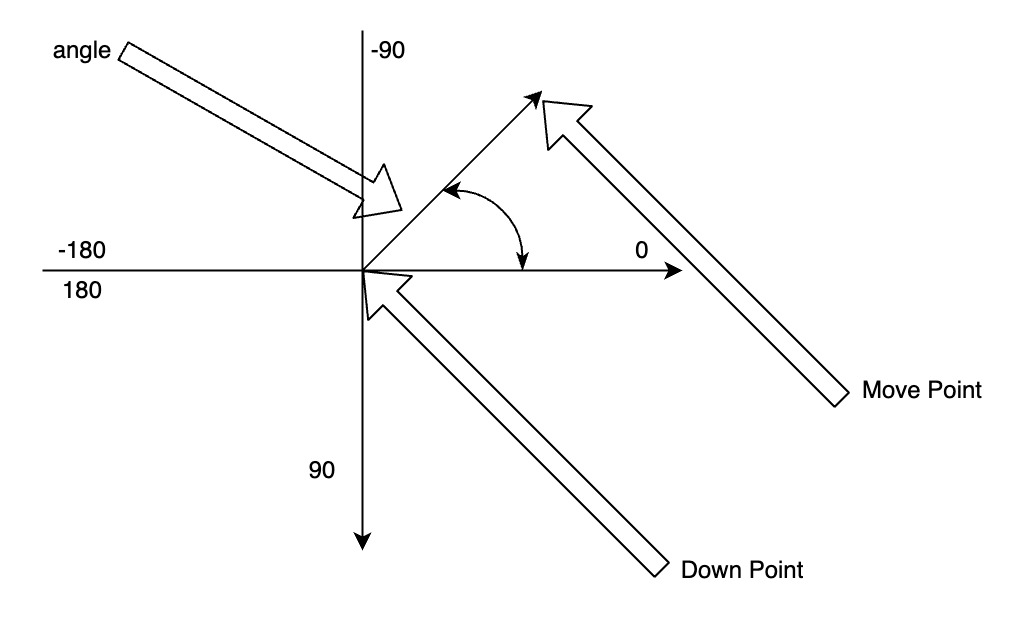
Specify the angle range within which all platform-level swipe gestures are blocked. When the target node is in the event response chain and the swipe angle is within this range, all platform-level swipe gestures are blocked. However, Lynx touch events continue to function, allowing front-end scrolling containers that consume swipes in the specified direction. However, native scrolling based on platform-level gestures is blocked.
This two-dimensional array contains several 2-element arrays, where the 2 elements are start and end, representing the start and end angles, respectively. The swipe angle is determined by the finger's press position and the finger's movement position.
For example, [[-180, -135], [-45, 45], [135, 180]] indicates that all platform-level swipe gestures are blocked when the swipe direction is horizontal, but they are enabled when the swipe direction is vertical.
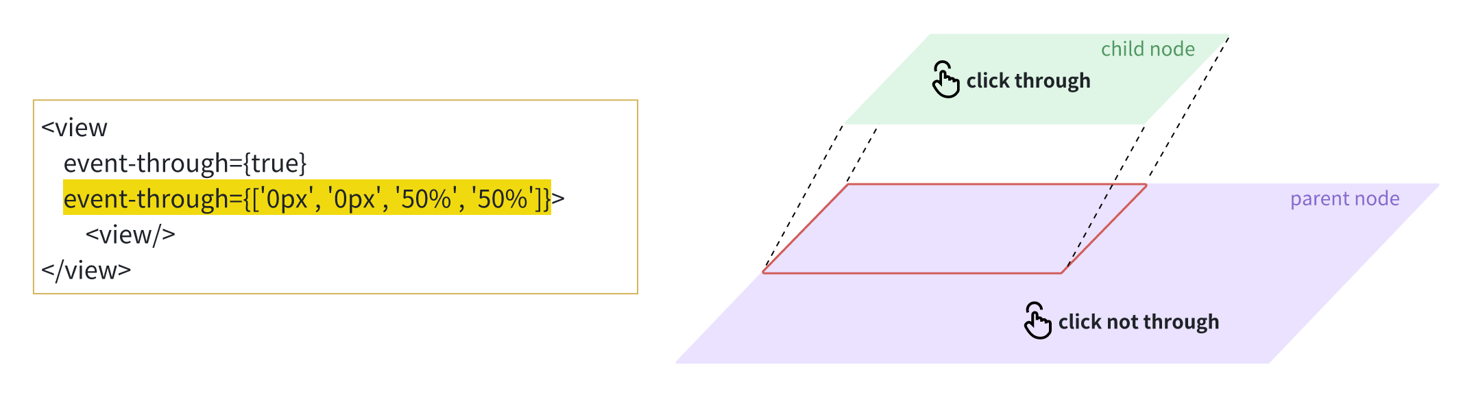
event-through
Specify whether Lynx consumes touch events from the platform layer when a touch is on the target node, allowing for effects similar to display-only, non-interactive displays.
This property supports inheritance; that is, if event-through is not set for a child node, it inherits the event-through value from its parent node. Its active region is affected by event-through-active-regions. If not set, it defaults to the entire region of the target node.
Setting this property to true only ensures that Lynx does not consume touch events from the platform layer. However, Lynx's parent node may consume touch events, causing touch-through to fail.
event-through-active-regions
Specify the effective area for event-through.
This two-dimensional array contains several arrays containing 4 elements, where the 4 elements are x, y, width, and height, in units of px or %, representing the position, width, and height of the touch area within the target node.
For example, [['0px', '0px', '50%', '50%']] indicates that if the touch is in the upper left area of the node, Lynx will not consume touch events from the platform layer.
enable-touch-pseudo-propagation
Specify whether the target node supports the :active pseudo-class to continue bubbling up on the event response chain.
hit-slop
Specify the touch event response hotspot of the target node, without affecting the platform layer gesture.
For example, {top: '10px', left: '10px', right: '10px', bottom: '10px'} or 10px means the touch hotspot of the node is expanded by 10px.
Other factors with higher priority may cause the hot zone modification to fail, such as the node's view hierarchy (z-index, translateZ, fixed) is relatively high, the parent node's overflow is hidden, etc.
ignore-focus
Specify whether to not grab focus when touching the target node. By default, the node grabs focus when clicking on it, which can achieve a similar effect of not closing the keyboard when clicking other areas.
This property supports inheritance, that is, when ignore-focus is not set on a child node, it will inherit the ignore-focus value of the parent node.
ios-enable-simultaneous-touch iOS
Specify whether to force trigger the touchend event when the target node is on the event response chain, which can solve the problem that the iOS end does not trigger the touchend event but triggers the touchcancel event (the touchmove event is also not continuous) in some scenarios.
__lynx_timing_flag
Add this flag to the current element to monitor the performance of the lynx pipeline it participates in.
When flagged, the lynx engine generates a PipelineEntry event once the element completes its final painting phase.
This event can be observed and analyzed by registering a PerformanceObserver().For more detailed usage, see the Marking Lynx Pipeline.
Events
The front end can set event handler property on the element to monitor the runtime behavior of the element.
touchstart
It belongs to touch event, which is triggered when the finger starts to touch the touch surface.
touchmove
It belongs to touch event, which is triggered when the finger moves on the touch surface.
touchend
It belongs to touch event, which is triggered when the finger leaves the touch surface.
touchcancel
It belongs to touch event, which is triggered when the touch event is interrupted by the system or Lynx external gesture.
tap
It belongs to touch event, which is triggered when the finger clicks on the touch surface.
longpress
It belongs to the touch event, which is triggered when the finger is long pressed on the touch surface, and the time interval between long press triggers is 500 ms.
click
This belongs to the touch event, triggered when a finger clicks on the touch surface.
layoutchange
It belongs to custom event, which is triggered when the target node layout is completed, and returns the position information of the target node relative to the LynxView viewport coordinate system.
uiappear
It belongs to custom event, which is triggered when the target node appears on the screen.
uidisappear
It belongs to custom event, which is triggered when the target node disappears from the screen.
animationstart
It belongs to animation event, which is triggered when the Animation animation starts.
animationend
It belongs to animation event, which is triggered when the Animation animation ends.
animationcancel
It belongs to animation event, which is triggered when the Animation animation is canceled.
animationiteration
It belongs to animation event, which is triggered every time the Animation animation is executed in a loop.
transitionstart
It belongs to animation event, which is triggered when the Transition animation starts.
transitionend
It belongs to animation event, which is triggered when the Transition animation ends.
transitioncancel
It belongs to animation event, which is triggered when the Transition animation is canceled.
Method
The front end can execute the element method through the SelectorQuery API.
boundingClientRect
The front end can call this method to obtain the width, height and position information of the target node.
takeScreenshot
The front end can call this method to obtain the base64 image of the target node.
This operation will take up time in the main thread, so you need to pay attention to the calling frequency.
On Android, you must set flatten to false on the target node. For SDK versions 3.5 and newer, you can enable screenshots via PixelCopy by setting the androidEnablePixelCopy parameter, which solves the issue of inability to take screenshots in Video/Surface nodes.
requestAccessibilityFocus
The front end can call this method to focus the accessibility focus on a barrier-free element.
Compatibility
LCD tables only load in the browser