Composing Elements
A Lynx page may contain various visual elements such as text and images, presented in different layouts to create diverse page styles. This section aims to help everyone understand how to construct the most basic views.
Element tag: UI Building Blocks
Lynx defines content and structure using a markup language, with the most basic unit being an element tag. The concept of an element tag is similar to HTML elements, which can be used to encapsulate different parts of the content to present or operate in a specific manner.
Unlike HTML, Lynx uses some unique element tags such as <view>, <text>, and <image> to display different content. For example, in Lynx, the following source code can be used to display a piece of text:
Anatomy of an Element tag
The basic usage of element tags is very similar to HTML elements:
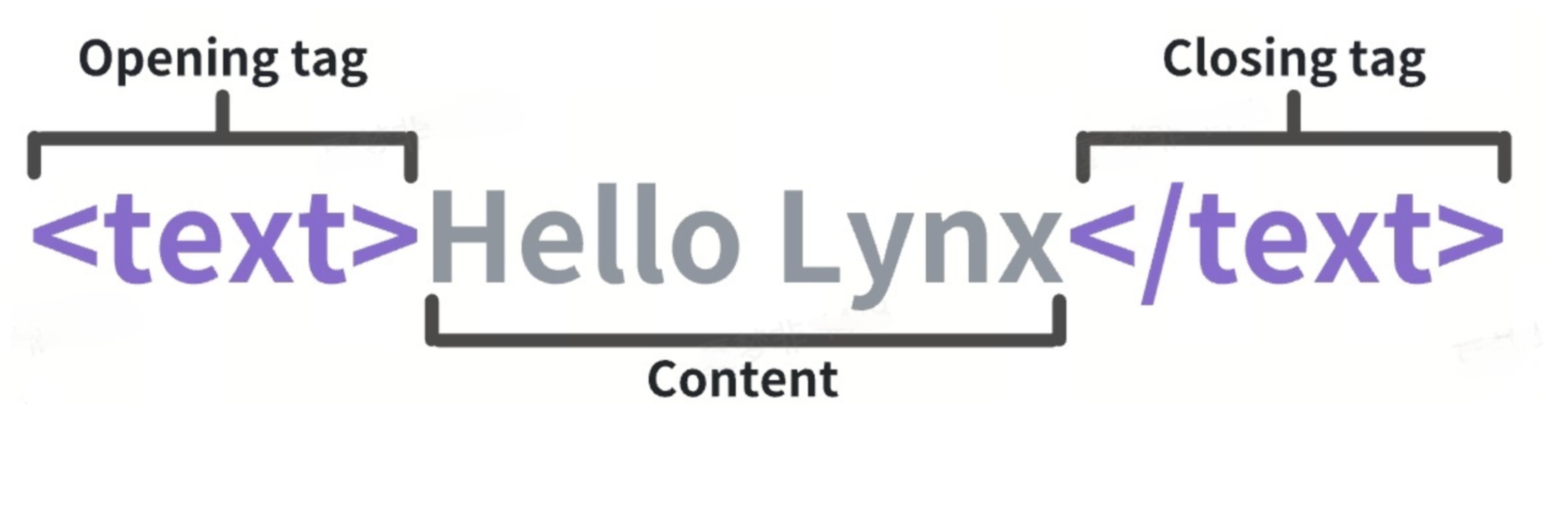
Each element tag consists of the following parts:
- Start tag: Includes the name of the element tag (in this case, text) surrounded by angle brackets, indicating where the element tag begins.
- End tag: Similar to the start tag but includes a forward slash before the element tag's name, indicating where the element tag ends.
- Content: The content of the element tag, which for the
<text>element tag is the text itself.
Combining the start tag, end tag, and content forms a complete element tag.
Attributes
Each element tag has its own attributes that can be set by adding attribute names and values within the element tag's tag to describe its behavior and appearance.
For example, each element tag can use attributes such as style and class to set background, border-radius, shadow styles, and support some CSS syntax. The following code sets the background color of an element tag to red:
In this example, style is the attribute name, and background:red is the attribute value.
For more attributes, refer to the API Reference.
Empty Element tags
Some element tags do not have content, such as the <image> element tag:
It does not use an </image> end tag, nor does it have any content inside because the <image> element tag uses an attribute src to display an image rather than content.
Nested Element tags
Element tags can be nested within other element tags. For example, multiple <text> element tags can be nested inside a <view> element tag:
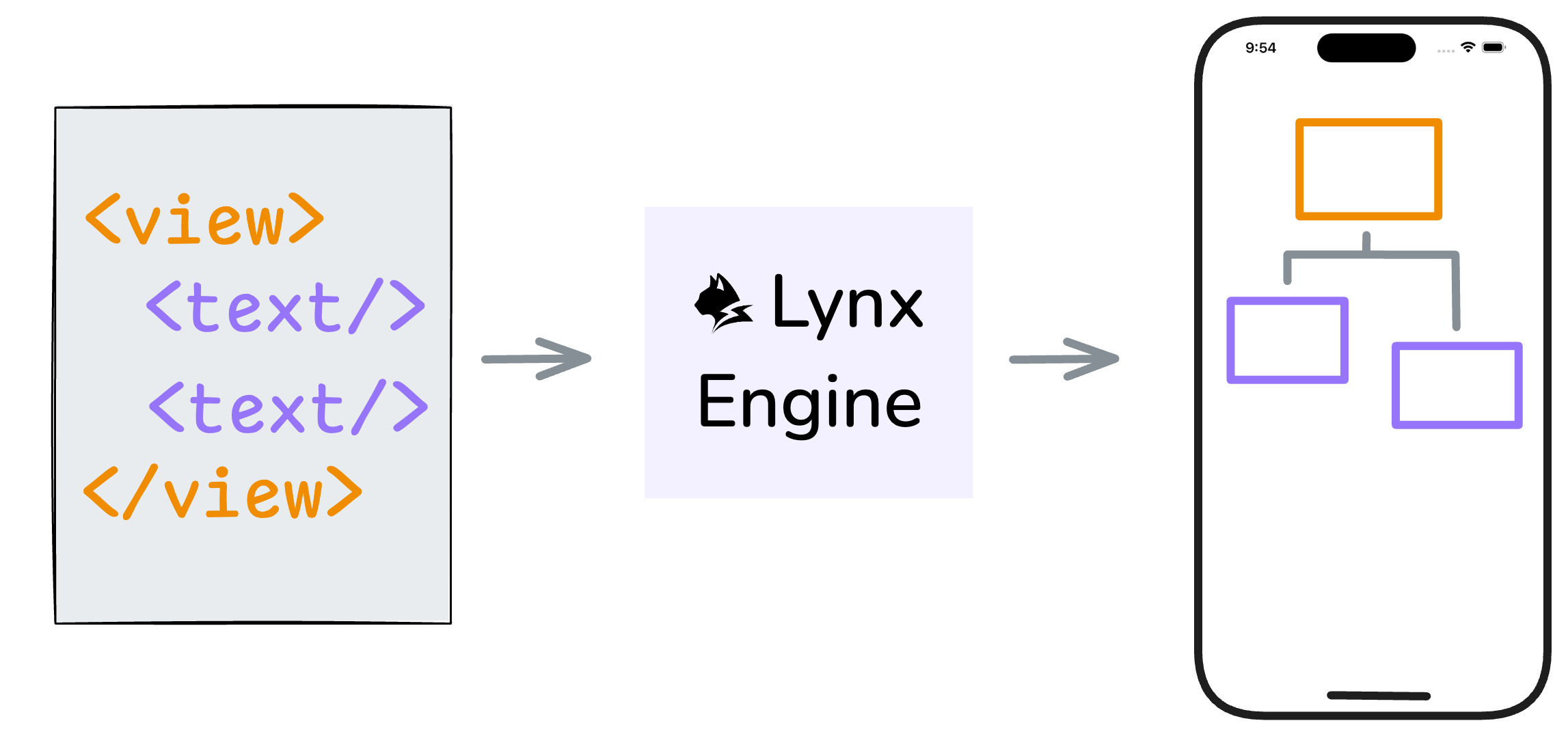
Element Tree
The element tags in the source code will be parsed by the Lynx engine at runtime and translated into elements for rendering. Nested element tags will form a tree composed of elements, which we refer to as the element tree. We rely on this tree structure to build and manage more complex interfaces.
Built-in Elements
The Lynx Engine comes with some built-in elements by default to help you quickly build pages.
View
The <view> is the most basic element, commonly used to wrap other elements and carry some drawing capability. For example, the following code sets the entire view's background color to gray and adds some padding within the view:

Text
As mentioned earlier, the <text> element is used to display text content. For instance, the following code can be used to display a piece of text:

Image
The <image> element is used to display images. For example, the following code can be used to display an image:
More Built-in Elements
For all built-in Lynx elements, refer to Built-in Elements Documentation.
XElement
XElement is an extended native elements library maintained by the Lynx team. It provides richer component capabilities, enabling faster adoption of Lynx in production environments and enhancing the vibrancy of the Lynx ecosystem.
To use XElement, it needs to be integrated into your native project first. See Integrate with Existing Apps for setup instructions.
Behind the Elements: Native Rendering
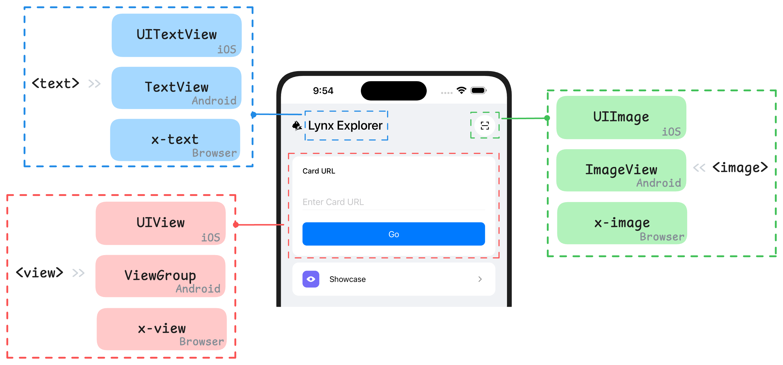
Lynx elements are designed to be platform-agnostic. They are rendered natively by the Lynx Engine into the UI primitives for each platforms, such as iOS and Android views, or HTML elements (including custom elements) on the Web.
Lynx enables cross-platform application development based on the web technology, with its core being the establishment of a unified rendering system through element abstraction. Understanding the mapping relationship between the native views of the platform and Lynx elements is crucial to mastering the design concepts of elements within this framework. Below are some of the built-in elements and their corresponding concepts or analogues in different platforms:
Extending with Custom Elements
If built-in elements can't meet your needs, you can expand Lynx's capabilities by implementing native elements customarily. This is one of Lynx's powerful features.
For more details, refer to Extending Native Elements Documentation.
Components: Composition of Elements
In more complex Lynx view structures, various types of elements are often nested and combined layer by layer to form richer and more diverse interface units. This is the core idea of component-based development in front-end frameworks: achieving modular construction of interfaces through reusable encapsulation units.
In ReactLynx, we follow the React development paradigm. By using a function and JSX to assemble the elements and define a component, its design philosophy and basic principles follow the React Component Design Documentation. For example:
In the next chapter, we will add more elaborate styles to the interface.