

Foldables
At its September event, Apple unveiled its first foldable iPhone, iPhone Duo. Unfold the screen and the page you were reading gains a fresh canvas; fold it back and the content has to settle into a smaller space. The job of an app is to make the interface flow gracefully between the two.
Lynx now fully supports foldable scenarios, proven in production inside TikTok. Our goal was simple: keep the integration effortless. The host passes new dimensions to Lynx, the frontend keeps its familiar layout tools, and the page reflows with the window on its own.

Folding

Unfolding
New screen sizes
Adaptation starts with the host. When the window changes size, the host finishes native layout first, then updates Lynx's screen metrics, viewport, and GlobalProps together, keeping the engine's sizing bases in step with the dimensions the frontend reads.
Start with the data the frontend needs. GlobalProps carries environment information from the host to the page, which reads it through lynx.__globalProps. In TikTok, we distinguish the window's dimensions from the space available to an individual page. The community can use the same convention:
These host-defined fields use logical pixels: Lynx CSS px, corresponding to iOS pt. Set initial values through LynxLoadMeta.globalProps, then update each LynxView as its dimensions change. The frontend treats them as read-only.
Updates merge the fields and emit onGlobalPropsChanged. With the default globalPropsMode: 'reactive', ReactLynx automatically re-renders the entire page; components simply read the latest dimensions during render. The optional 'event' mode disables this automatic render.
The host also refreshes screen metrics for rpx and the viewport for vw and vh. ReactLynx applies UI changes through Element PAPI, then the engine resolves styles and runs Layout using the new dimensions. The platform paints the result.
- Host updatescreen metricsviewportGlobalPropsSync dimensions together
- ReactLynxAutomatic re-renderRead new dimensions and compute UI changes
- Element PAPIApply changes to the Element tree
- Resolve · LayoutResolve styles and calculate sizes and positions
- PaintApply UI updates and paint the new frame
On iOS, this uses updateScreenMetricsWithWidth:height:, updateViewport, and updateGlobalPropsWithDictionary. Once the view is attached and native layout is complete, call them on the main thread. Here, screen metrics use the window size, and the viewport uses the LynxView's size:
Initialize the same rpx basis through LynxViewBuilder.screenSize, and skip unchanged dimensions. Screen metrics updates do not trigger layout themselves; the example uses needLayout:YES. With enableAutoLayout enabled, constraints drive viewport updates.
Familiar layout units
Once this flow is connected, frontend adaptation usually takes little work. For pages that already use flexible layouts and relative units, the frontend does not need to detect the folding state or trigger updates manually — the layout adjusts to the newly available space on its own.
That leaves a single decision: what each dimension should follow — its parent container, the whole viewport, or the size of the text. Pick the right reference, and your existing responsive layout keeps doing its job.
In the table below, automatic adaptation describes how each unit follows its sizing basis once the host integration is in place.
In practice, Flex and width: 100% make a good starting point, with max-width to keep content from stretching too far on wider screens. Font sizes, buttons, and spacing can keep sensible px values, so the content area grows with the screen while reading and interaction stay a constant size.
rpx follows screen metrics: 1rpx equals 1/750 of the configured logical width. When the host updates screen metrics, Lynx recalculates rpx values during layout, so the frontend does not need to recompute them.
See length units for more detail.
Media queries
Flexible layouts let content grow with the available space. When a wider window should also show more columns, reveal a sidebar, or use larger headings, use media queries to apply styles at specific viewport widths. The same component tree can serve both folded and unfolded layouts, without reading dimensions in JavaScript to choose CSS classes.
The large-screen media query example starts with a small-screen layout and adds styles at 600px and 1024px. These breakpoints use the Lynx viewport width in CSS pixels, so choose them according to the space your content needs.
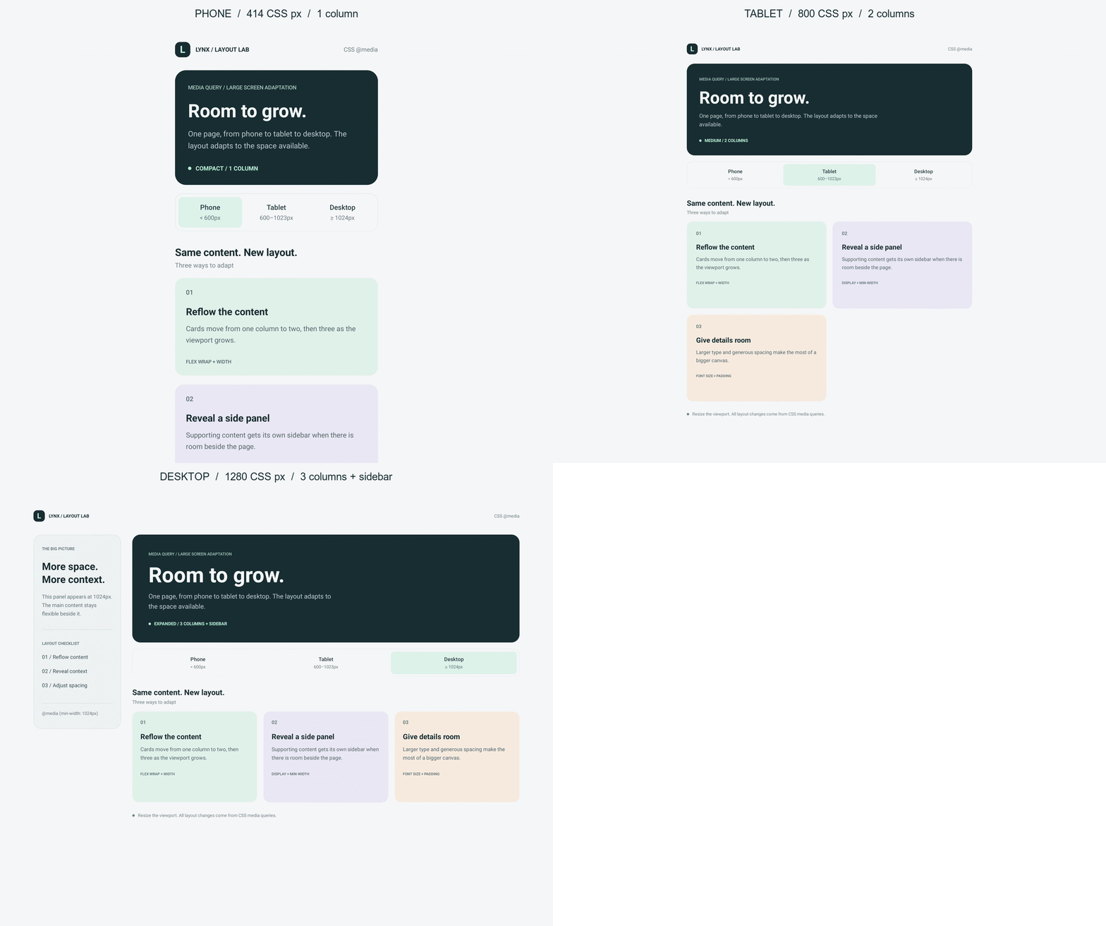
The GIF cycles through Lynx Sandbox screenshots loaded separately at 414px, 800px, and 1280px viewport widths.
The full example also centers content with max-width: 1440px and reduces vertical padding when the viewport is at least 1024px wide and at most 700px tall. This keeps wide, short windows usable while preserving the larger layout.
Use Lynx SDK 4.0 or later and enable CSS Rule encoding with pluginLynxConfig({ enableCSSRule: true }). The example already includes this configuration. The host must keep the Lynx viewport up to date as described above. When testing Android display-size overrides in Lynx Sandbox, reload the page after each change so the media-query environment picks up the new dimensions.