

Flexible Box Layout
If you need to make the size of child elements adapt to the space of the parent element (such as expanding child elements to fill the unused space or shrinking child elements to avoid overflow), you can set the display: flex property to the parent element and use the flexible box layout.
For more information, please refer to the CSS Flexible Box Layout on MDN. Lynx supports common flexible box layout properties and in most cases aligns with Web standards. For the supported properties, please refer to the Reference section.
The following examples show typical features of the flexible box layout.
Typical Features
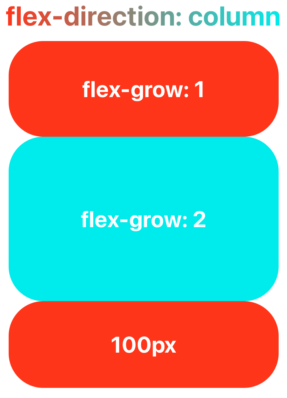
Filling the Parent Element with flex-grow
The flex-grow property helps you allocate the remaining space of the parent element to the size of the sub-elements based on the weight declared by flex-grow.
Shrinking Child Elements with flex-shrink
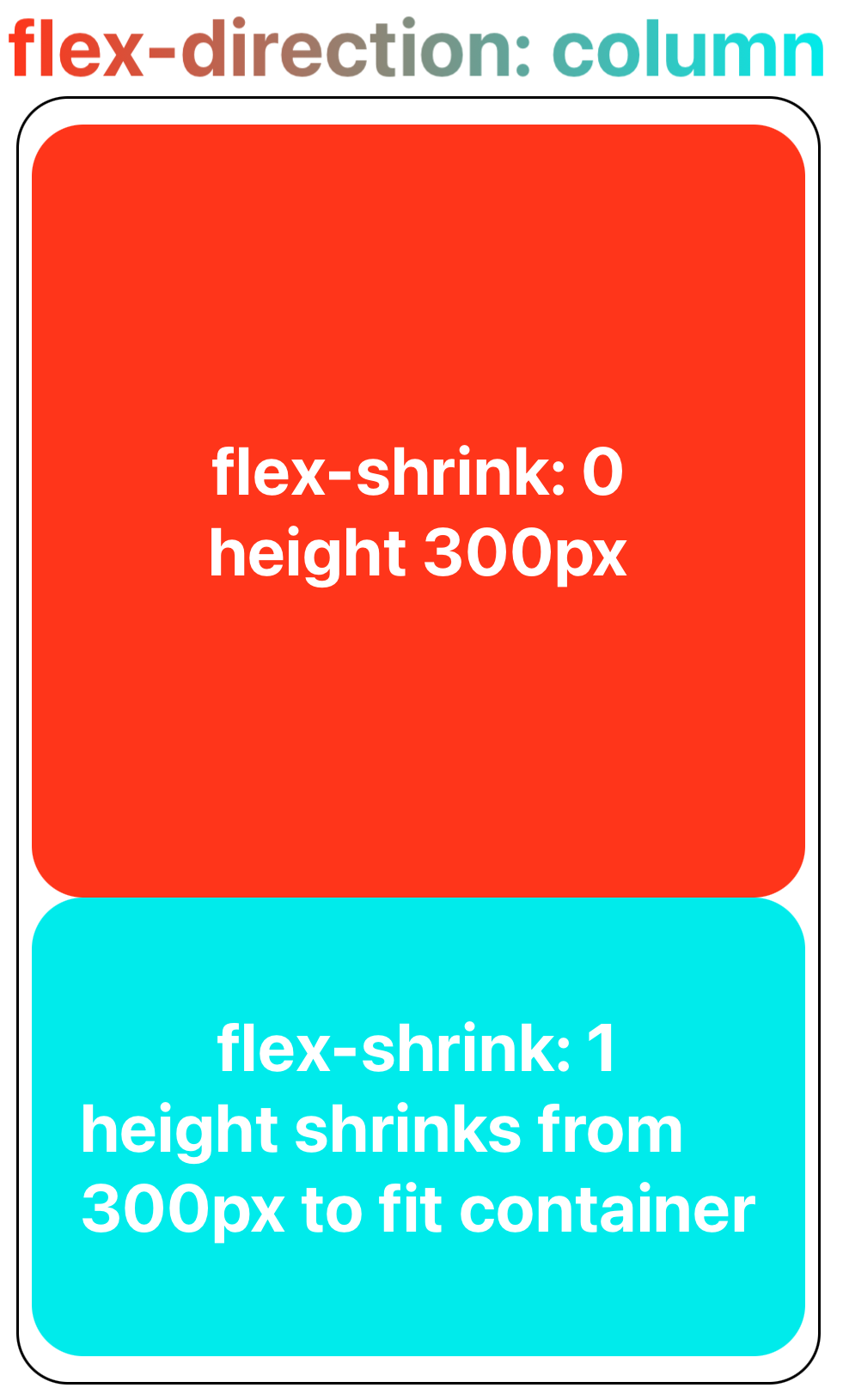
When the child elements are about to overflow the parent element, the child elements can shrinked according to the weight declared by flex-shrink to fit the size of the parent element.
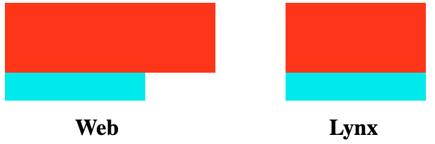
Lynx differs from Web in the minimum value for shrinking sub-elements.
Lynx currently does not support min-content, and therefore treats it temporarily as 0px. This means that while the Web can ensure sub-elements do not shrink below their minimum content width when fitting the parent element size, Lynx cannot guarantee this at present.
Wrapping with flex-wrap
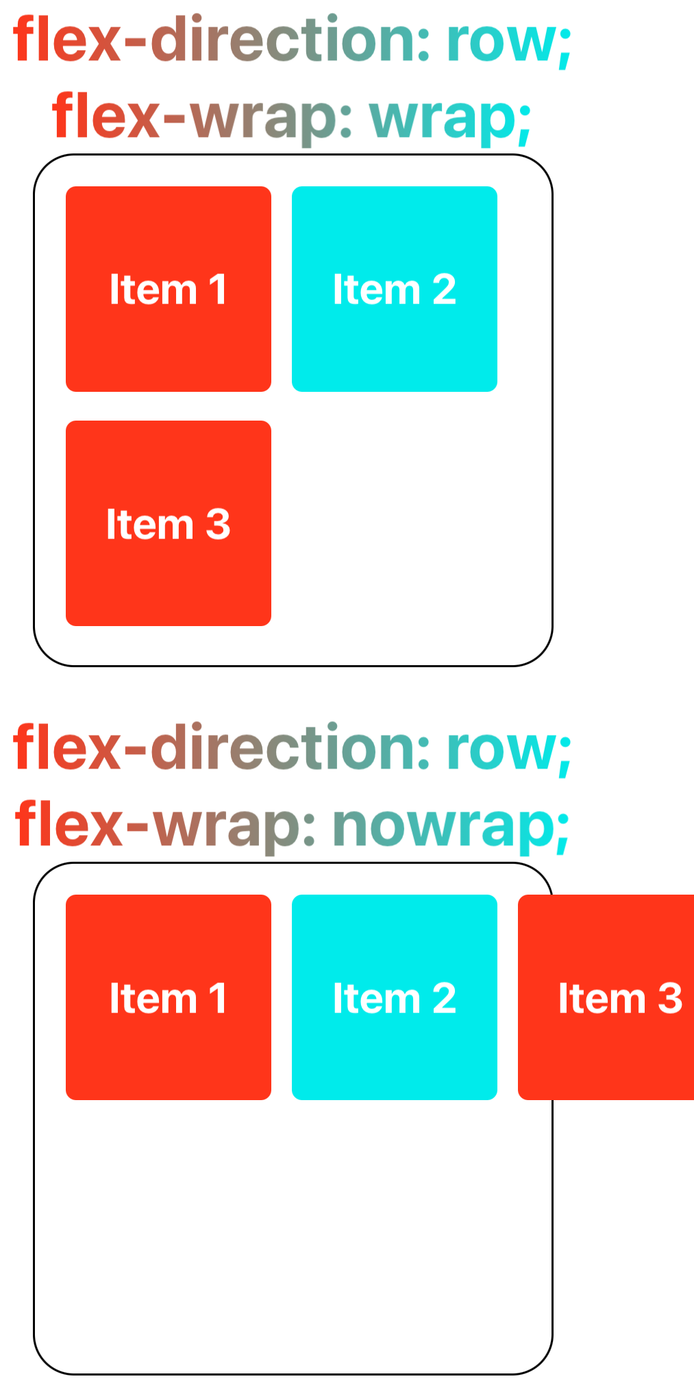
The flex-wrap property allows content that doesn't fit on a single line to be displayed on subsequent lines. This attribute specifies whether flex elements are shown in a single or multiple lines. When allowed to wrap, this attribute can control the stacking direction of the lines.
Reference
Currently, Lynx supports the following common flexible box layout properties:
-
CSS Properties
-
Alignment Properties
For more usage details, please refer to the CSS Flexible Box Layout on MDN.