Tutorial: Payment Details
After completing the Gallery tutorial, you should have mastered the basics of Lynx. Now, let's learn some more advanced features through a payment details page, including:
- Building an interactive scrolling list
- How to create 3D interactive animations
- How to pass data between different components
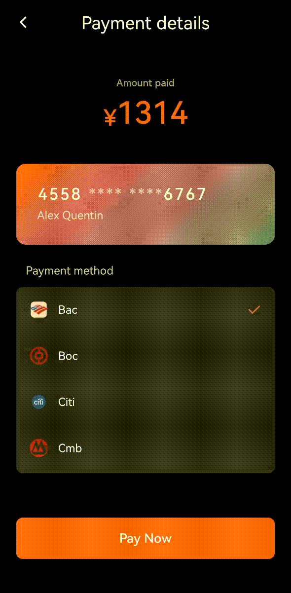
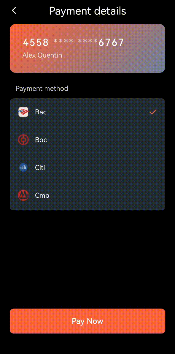
What are we building?
Let's first take a look at the final effect of this application. To experience it, please download and install Lynx Explorer App first, then scan the QR code below.
Let's Get Started
Let's look at the composition of this page. If you want to build such a page, you can break it down into these three components and implement them step by step:
- Card Details
- The card can perform flip animation
- Here we'll learn how to use CSS animations to create smooth flip effects
- Card List, wrapped in a scroll-view element
- Can scroll up and down to browse all cards
- When clicking a card, the top card details will update with corresponding card information
- Here we'll learn how to build an interactive scrolling list and how to pass data between components
- The top amount display and bottom buttons, these components are relatively simple, we'll implement them using the view element.
Let's focus on three technical points: building an interactive scrolling list, implementing 3D flip animation effects, and passing data between components.
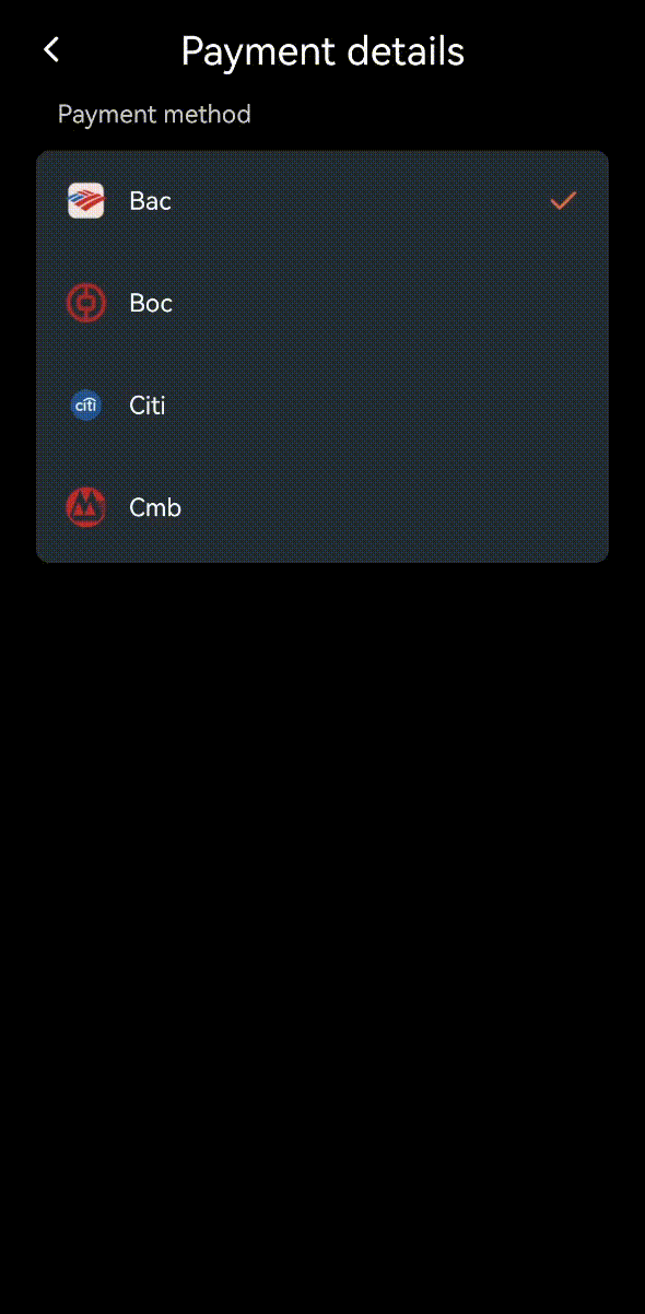
Building an Interactive Card List
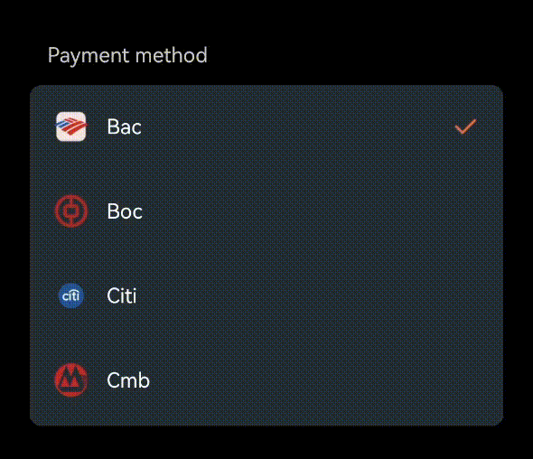
First, let's create a bank card list. This list needs to display basic information for each card, including:
- Bank type (like Bac, Boc, etc.)
- Card number (showing first and last four digits)
- Cardholder name
- Whether it's a primary card
Let's organize this information into a data structure:
BankCardScrollView.tsx
export interface BankCard {
  type: string; // Bank type (like Bac, Boc, etc.)
  number: string; // Card number
  name: string; // Cardholder name
}
Then, prepare some card data for display:
BankCardScrollView.tsx
const cards = [
  { type: "bac", number: "4558 **** **** 6767", name: "Alex Quentin" },
  { type: "boc", number: "6222 **** **** 8058", name: "Alex Quentin" },
  ...
];
Next, let's use the <scroll-view> element to create a vertically scrollable list to display all card information:
BankCardScrollView.tsx
export default function BankCardScrollView() {
  return (
    <view className="payment-wrapper">
      <text className="title">Payment method</text>
      <view className="payment-container">
        <scroll-view scroll-y className="payment-sv">
          {cards.map((card, idx) => (
            <view
              key={idx}
              className="card"
              bindtap={() => handleCardSelect(card)}
            >
              <view className="card-info">
                <image className="card-icon" src={getUrlByType(card.type)} />
                <view className="card-details">
                  <text className="card-name">
                    {card.type.charAt(0).toUpperCase() + card.type.slice(1)}
                  </text>
                </view>
              </view>
            </view>
          ))}
        </scroll-view>
      </view>
    </view>
  );
}
To let users know which card they've selected, we need to add an icon to indicate selection:
BankCardScrollView.tsx
<image className="check-icon" src={checkIcon} />
Then, we need to define a selectedCard state to track the currently selected card:
BankCardScrollView.tsx
const [selectedCard, setSelectedCard] = useState(cards[0]);
After that, we need to add a handleCardSelect function in the <BankCardScrollView> component to handle card selection events:
BankCardScrollView.tsx
const handleCardSelect = (card: BankCard) => {
  setSelectedCard(card);
};
When a user clicks a card, it will trigger the handleCardSelect function, which will update the selectedCard state:
BankCardScrollView.tsx
<view
  className={`card ${selectedCard === card ? 'selected' : ''}`}
  bindtap={() => handleCardSelect(card)}
>
  ...
</view>
Let's combine the above logic. When a user selects a card, it will show a small check mark on the right to indicate the current selection:
BankCardScrollView.tsx
export default function BankCardScrollView() {
  const [selectedCard, setSelectedCard] = useState(cards[0]);

  const handleCardSelect = (card: BankCard) => {
    setSelectedCard(card);
  };

  return (
    <view className="payment-wrapper">
      <text className="title">Payment method</text>
      <view className="payment-container">
        <scroll-view scroll-y className="payment-sv">
          {cards.map((card, idx) => (
            <view
              key={idx}
              className="card"
              bindtap={() => handleCardSelect(card)}
            >
              <view className="card-info">
                <image className="card-icon" src={getUrlByType(card.type)} />
                <view className="card-details">
                  <text className="card-name">
                    {card.type.charAt(0).toUpperCase() + card.type.slice(1)}
                  </text>
                </view>
              </view>
              {selectedCard === card && (
                <image className="check-icon" src={checkIcon} />
              )}
            </view>
          ))}
        </scroll-view>
      </view>
    </view>
  );
}
Now, we've completed building this interactive card list. Let's see how it works!
3D Flip effects
Now let's recreate this interesting 3D flip effect. First, we need to understand the key steps to implement this effect — CSS animation.
CSS Animation Collections in Lynx
Lynx supports various CSS animation collections. To explore more animation techniques, check out CSS Animation.
To achieve this flip effect, we need two key steps:
First, let's create a <Card/> component
- Define the flip animation:
- Use keyframes to describe the process of flipping the card from front to back (and vice versa), which includes rotation keyframes.
- The transform property defines the rotation angle of the element.
Cards.scss
.front {
  animation: backToFront 0.5s both;
}

.back {
  animation: frontToBack 0.5s both;
}

@keyframes frontToBack {
  0% {
    transform: rotateY(0deg) translateZ(1);
  }

  100% {
    transform: rotateY(180deg) translateZ(0);
  }
}

@keyframes backToFront {
  0% {
    transform: rotateY(-180deg) translateZ(0);
  }

  100% {
    transform: rotateY(0deg) translateZ(1);
  }
}
- Make the card responsive to clicks:
- Trigger the flip animation when the bottom button is clicked
- Control whether the card shows front or back by switching className
Cards.tsx
export default function Card({ isFront, isFirstRender }: CardProps) {
  return (
    <view className="card-content">
      <view className={`card-back ${isFront ? 'back' : 'front'}`}>...</view>
      <view
        className={`card-front ${!isFirstRender ? (isFront ? 'front' : 'back') : ''}`}
      >
        ...
      </view>
    </view>
  );
}
This way, we've created a practical and fun card flip effect! Every time users click the bottom button, they'll see a smooth flip animation, making the entire interaction experience more lively and engaging.
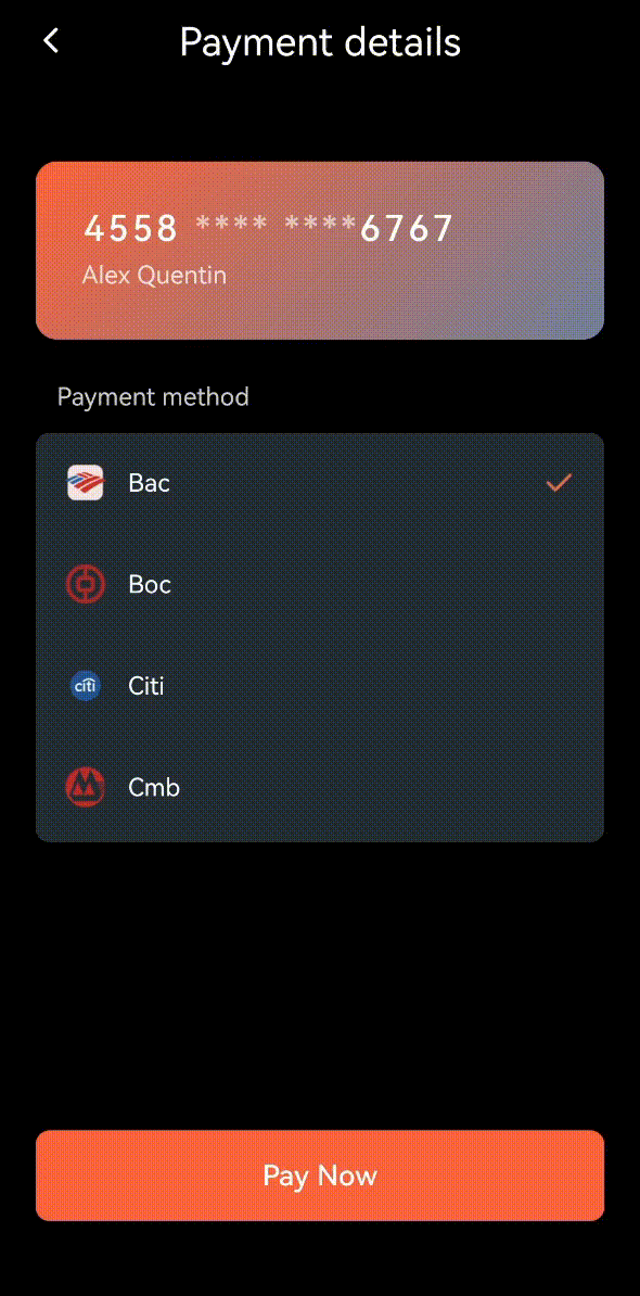
Component Data Interaction
You might have noticed an issue: when clicking a card in the list, the card details don't update with the new card number. We need to solve this synchronization problem.
In this application, we have two main components:
- Card List: the
<BankCardScrollView/> component that displays all available bank cards
- Card Details: the
<Card/> component that shows detailed information of the currently selected card
When a user clicks a card in the list, the card details at the top need to synchronously update to display that card's information. To achieve this functionality, we need to enable data transmission between these two components.
First, let's define a callback function to notify other components which card the user has selected:
BankCardScrollView.tsx
export interface BankCardScrollViewProps {
  onCardSelect?: (card: BankCard) => void;
}
Then, we call this callback function in our previously defined handleCardSelect function:
BankCardScrollView.tsx
const handleCardSelect = (card: BankCard) => {
  setSelectedCard(card);
  onCardSelect?.(card);
};
Next, we add onCardSelect as a property in the <BankCardScrollView> component:
BankCardScrollView.tsx
export default function BankCardScrollView({
  onCardSelect,
}: BankCardScrollViewProps) {
  const [selectedCard, setSelectedCard] = useState(cards[0]);

  const handleCardSelect = (card: BankCard) => {
    setSelectedCard(card);
    onCardSelect?.(card);
  };

  return (
    <view className="payment-wrapper">
      <text className="title">Payment method</text>
      <view className="payment-container">
        <scroll-view scroll-y className="payment-sv">
          {cards.map((card, idx) => (
            <view
              key={idx}
              className="card"
              bindtap={() => handleCardSelect(card)}
            >
              ...
            </view>
          ))}
        </scroll-view>
      </view>
    </view>
  );
}
After handling the <BankCardScrollView> component, we need to handle the <Card> component to update the card number when switching cards in the list.
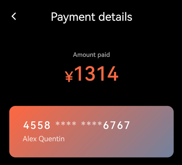
It receives a selectedCard property to display the details of the currently selected card, showing the last four digits of the card number.
Card.tsx
interface CardProps {
  isFront: boolean;
  isFirstRender: boolean;
  selectedCard: BankCard;
}
Let's define a utility function to extract the first and last four digits of the card number.
Card.tsx
const getCardNumberParts = (number: string) => {
  const parts = number?.split(' ') || [];
  return {
    firstFour: parts[0] || '4558',
    lastFour: parts[3] || '6767',
  };
};
Then, we'll use this utility function to display the first and last four digits from the selectedCard number.
Card.tsx
export default function Card({
  selectedCard,
  isFront,
  isFirstRender,
}: CardProps) {
  const { firstFour, lastFour } = getCardNumberParts(selectedCard.number);

  return (
    <view className="card-content">
      <view
        className={`card-back ${!isFirstRender ? (isFront ? 'back' : 'front') : ''}`}
      >
        ...
      </view>

      <view
        className={`card-front ${!isFirstRender ? (isFront ? 'front' : 'back') : ''}`}
      >
        <view className="card-number">
          <text className="first-digits">{firstFour}</text>
          <text className="middle-digits">**** ****</text>
          <text className="last-digits">{lastFour}</text>
        </view>
        <view className="card-info">
          <text>{selectedCard?.name || 'Card holder'}</text>
        </view>
      </view>
    </view>
  );
}
Finally, let's combine these two components in the parent component:
- Use
selectedCard state to store the currently selected card
- Update this state when the
onCardSelect of <BankCardScrollView> notifies that a new card has been selected
- Pass this state to
<Card> to display the selected card's information
index.tsx
function BankCards() {
  const [selectedCard, setSelectedCard] = useState<BankCard>({
    type: 'visa',
    number: '4558 **** **** 6767',
    name: 'Alex Quentin',
  });

  const [isFront, setIsFront] = useState(true);
  const [isFirstRender, setIsFirstRender] = useState(true);

  const handleCardSelect = (card: BankCard) => {
    setSelectedCard(card);
    setIsFront(true);
  };

  const handlePayNow = () => {
    if (isFirstRender) {
      setIsFirstRender(false);
    }
    setIsFront(!isFront);
  };

  return (
    <view class="page">
      <Card
        selectedCard={selectedCard}
        isFront={isFront}
        isFirstRender={isFirstRender}
      />
      <BankCardScrollView onCardSelect={handleCardSelect} />
      <BottomNode onPayNow={handlePayNow} />
    </view>
  );
}
This way, we've established an efficient collaboration mechanism:
- User selects a card from the card list
- Card list immediately notifies the parent component
- Parent component updates the state and notifies the card details component
- Card details component immediately updates its display
Let's see this seamless coordination in action:
We'll add the top amount display, and we're done!
Summary
Through implementing this payment details page, you've mastered these core technical points:
- Building interactive lists
- Developing complex CSS animation effects
- Implementing data transmission between components
Now you're ready to develop more complex applications with Lynx.