<page>
<page> element is the root node, only one <page> element is allowed per page. You can omit the explicit <page> wrapper, as the frontend framework will generate the root node by default.
Usage
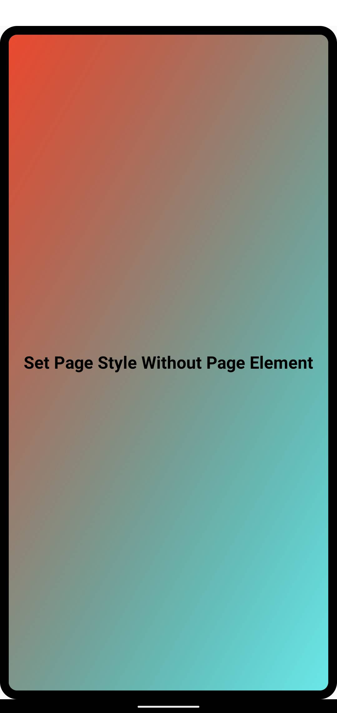
Omitting the <page> Element
By default, you don't need to manually add the <page> element as the frontend framework generates the root node automatically.
In this case, while direct style and class attributes cannot be set explicitly, you can still style the root node using page and :root selectors, or select it via SelectorQuery:selectRoot().
Using <page> Element Explicitly
For more flexibility in styling the root node or binding events, you can add <page> as the outermost element. It works similarly to <view> and supports all its styles and attributes except for width, height, and position. See No Direct Size Modification for details.
Similar to <view>, you can add style, class and bind events to <page>. Note that you can only have one <page> element.
No Direct Size Modification
The size constraints of <page> element are specified by its parent native view. You cannot directly modify its width, height, left, or top styles through style or class. This design allows Lynx pages to be embedded into native views, enabling better adaptation to the native app's layout flow.