For AI agents: the complete documentation index is available at /next/zh/llms.txt, the full documentation bundle is available at /next/zh/llms-full.txt, and this page is available as Markdown at /next/zh/api/css/properties/flex-flow.md.
Lynx
  • 简体中文
  • flex-flow

    介绍

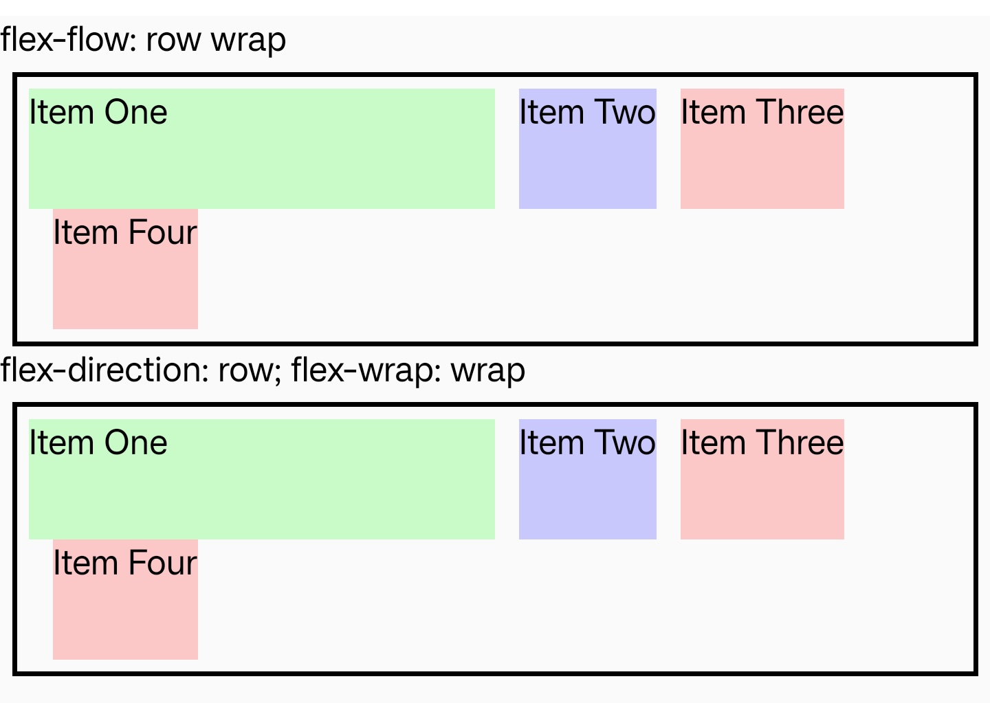
    定义弹性容器中的元件排列方向及单或多行(列)堆叠方向,是 flex-directionflex-wrap 的简写属性。

    使用示例

    语法

    /* flex-flow: <'flex-direction'> */
    flex-flow: row;
    flex-flow: row-reverse;
    flex-flow: column;
    flex-flow: column-reverse;
    
    /* flex-flow: <'flex-wrap'> */
    flex-flow: nowrap;
    flex-flow: wrap;
    flex-flow: wrap-reverse;
    
    /* flex-flow: <'flex-direction'> and <'flex-wrap'> */
    flex-flow: row nowrap;
    flex-flow: column wrap;
    flex-flow: column-reverse wrap-reverse;

    取值

    更多取值信息请查看 flex-directionflex-wrap

    形式定义

    初始值as each of the properties of the shorthand:
    • flex-direction: row
    • flex-wrap: nowrap
    适用元素弹性容器
    是否支持继承
    是否支持动画

    形式语法

    flex-flow =
      <'flex-direction'>  ||
      <'flex-wrap'>
    
    <flex-direction> =
      row             |
      row-reverse     |
      column          |
      column-reverse
    
    <flex-wrap> =
      nowrap        |
      wrap          |
      wrap-reverse

    兼容性

    LCD tables only load in the browser

    除非另有说明,本项目采用知识共享署名 4.0 国际许可协议进行许可,代码示例采用 Apache License 2.0 许可协议进行许可。