text-shadow
介绍
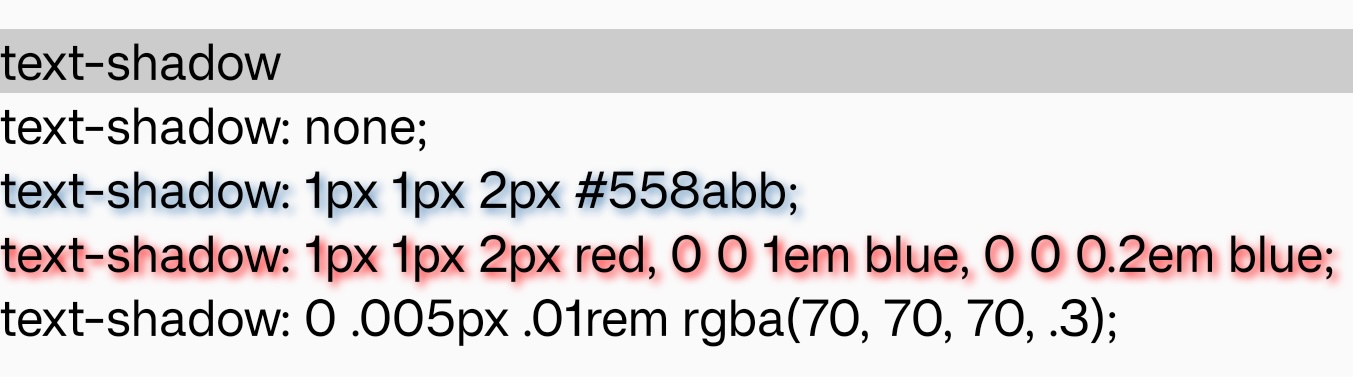
text-shadow 属性为文字添加阴影。阴影值由元件在 X 和 Y 方向的偏移量、模糊半径和颜色值组成。
使用示例
语法
形式定义
| 初始值 | 空值 |
| 适用元素 | text |
| 是否支持继承 | yes |
| 是否支持动画 | no |
形式语法
与 Web 的区别
-
暂时只支持指定单层阴影,即使指定了多层阴影,也只有第一层会生效。
-
指定阴影时,
offset-x,offset-y,blur-radius和color都不能省略。
注意事项
- 在某些 Android 平台上,
blur-radius的值为 0 时,阴影可能无法绘制。
兼容性
LCD tables only load in the browser